
I was proud of the 2 minutes video pitch and logo I did for the project within 48 hours of working on the project.
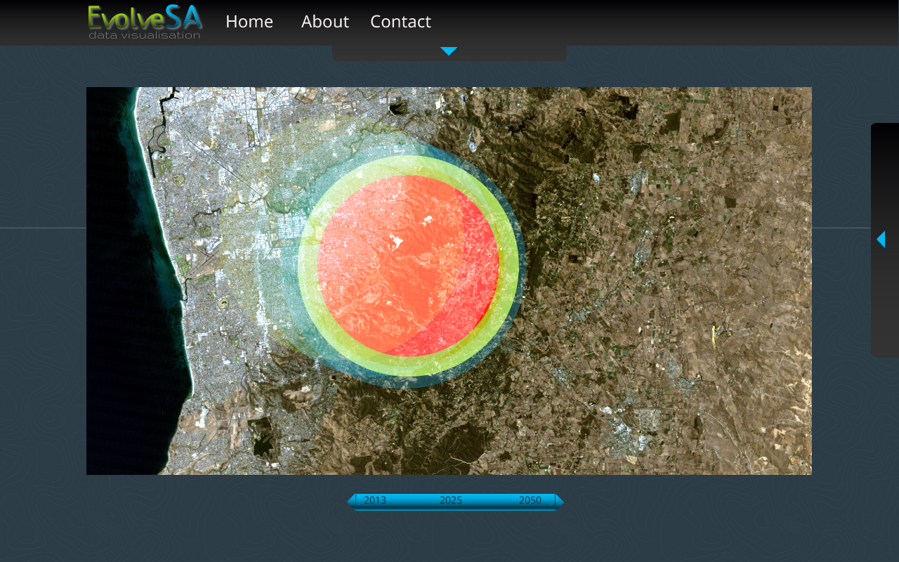
This data visualisation tool can be used to make decisions on where infrastructure is required for the changing population over time. The current data we have is based on SA data until 2025 but this can be expanded Australia wide once we acquire further data. Currently the data we have is on hospitals, however we can also add in more services (ie. Schools, open spaces, child care centres, roads, fire services etc). The heat map displays the current data on the location of hospitals and the demographics and density of population living in local government areas.


Log in or sign up for Devpost to join the conversation.