
Inspiration
We live in NUS halls and colleges, and they all have the same problem. The common room lights stay on all night. Someone's aircon runs with the window open. Nobody switches anything off, and honestly, why would they? The electricity bill goes to the school. You never see it.
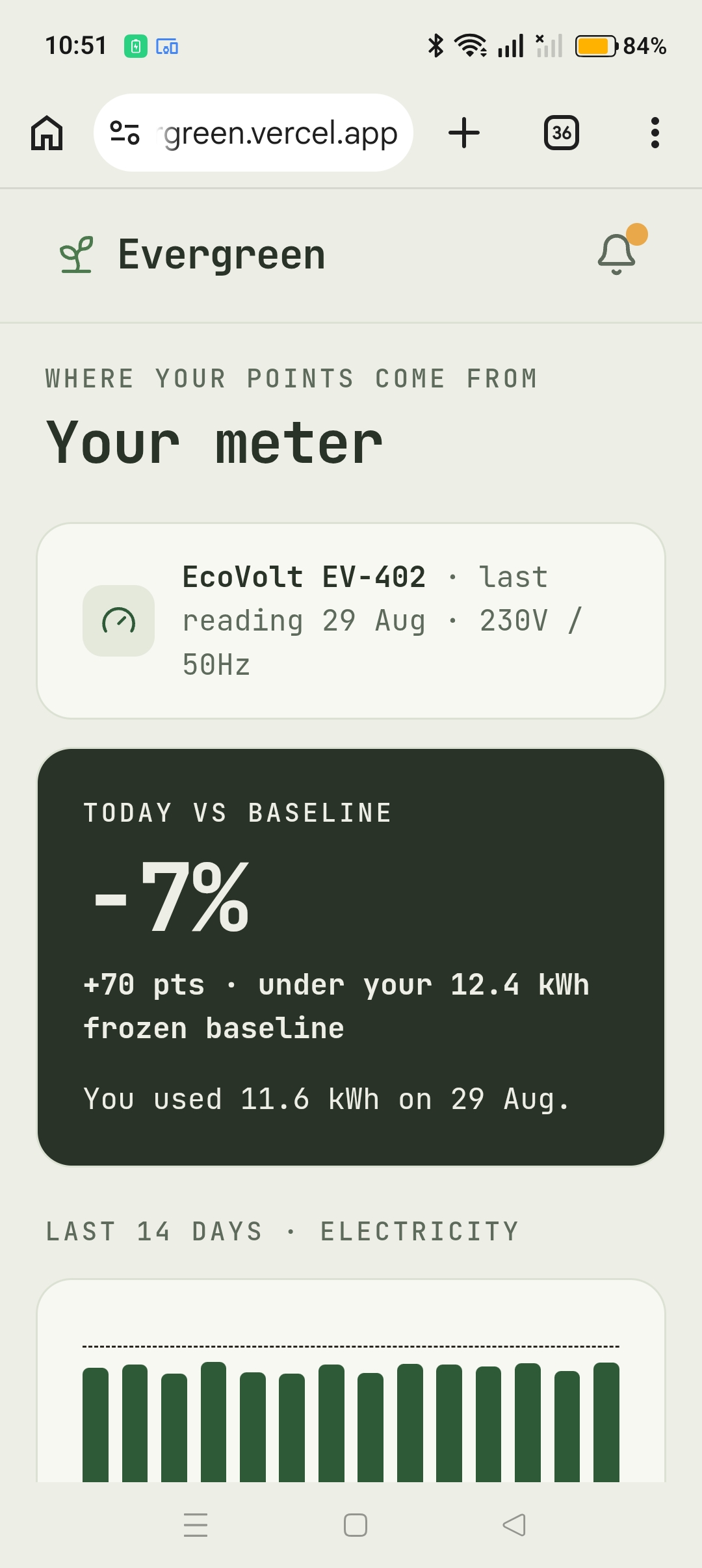
Smart meters like EcoVolt already measure this stuff room by room, every day. So the data isn't really the missing piece. The missing piece is that nobody has a reason to care about a number they've never been shown, for a bill that isn't theirs.
The other thing we kept coming back to is that saving energy on your own is completely invisible. Nobody claps when you turn off a light. There's no version of it anyone else notices.
So we stopped trying to build a nicer dashboard and built a garden instead. You don't check your usage. You check on your tree, and so does everyone else on your floor.
What it does
Every metered place, a hall floor or a college or a school, becomes a Community in Evergreen. The people in it share the footprint.
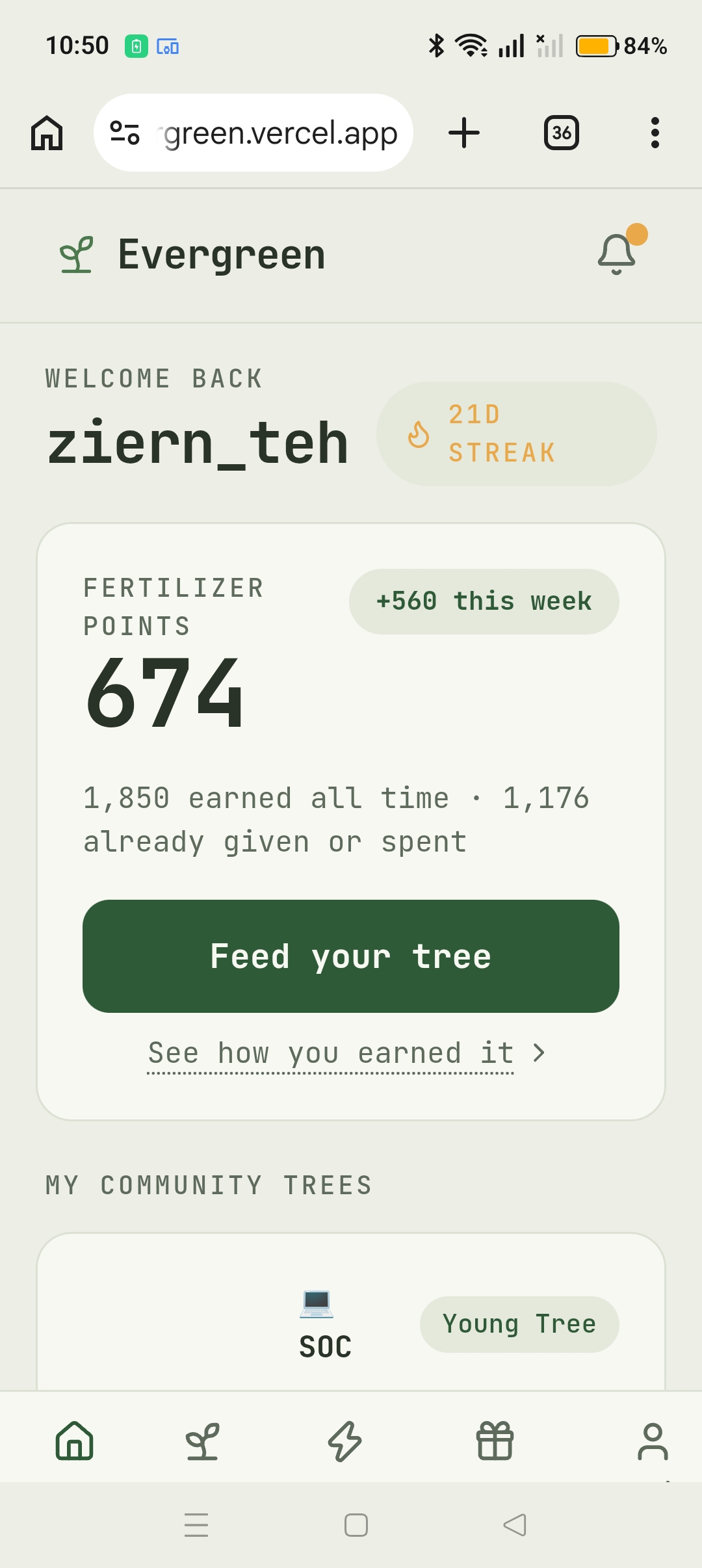
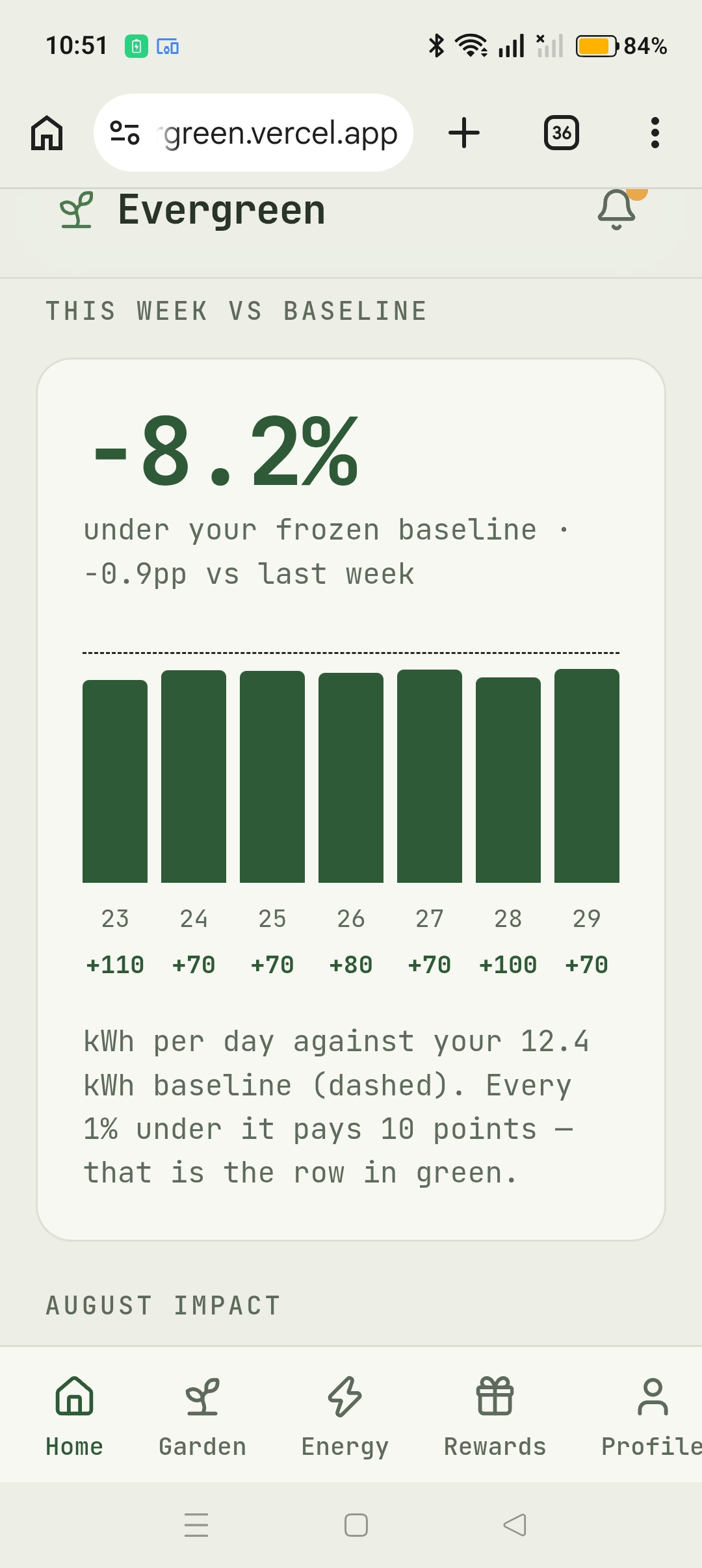
Use less electricity than your baseline and you earn points every day. 1% under baseline is 10 points. Points work like fertilizer: you can spend them on yourself, or plant them in your community's garden where everyone benefits.
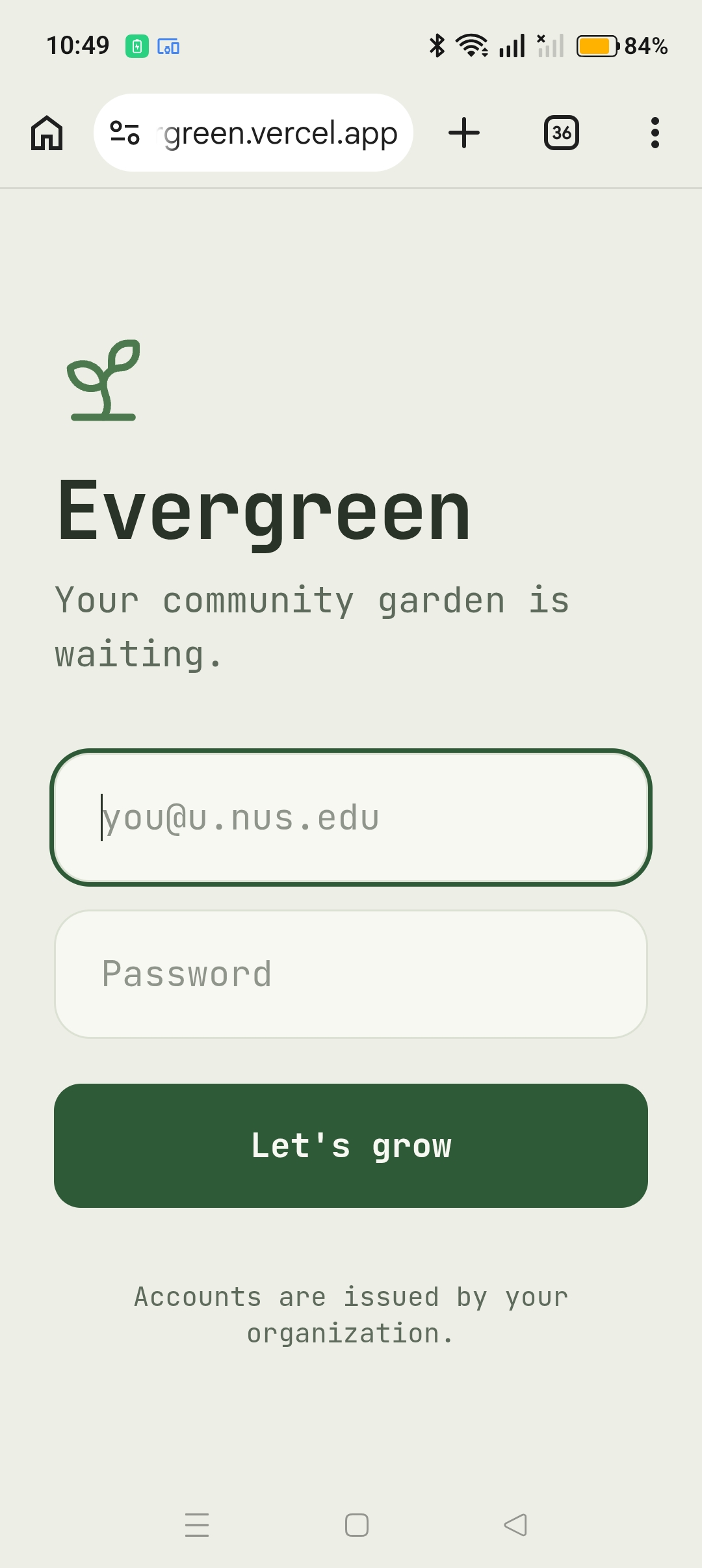
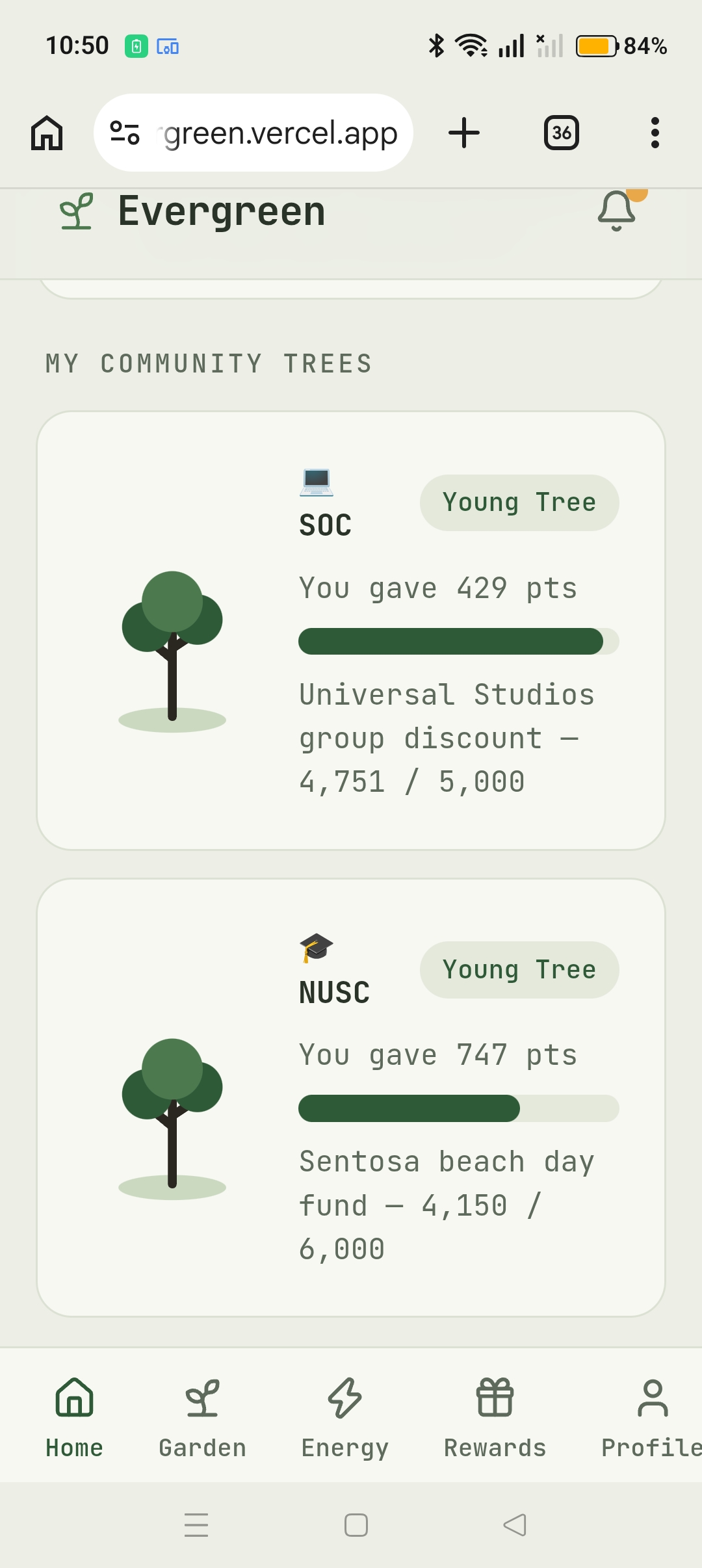
The part that makes it work socially is that your tree grows from what you give away, not what you earn. You can sit on 3,000 points and still have a seed. Everyone can see that.
Here's what's in it:
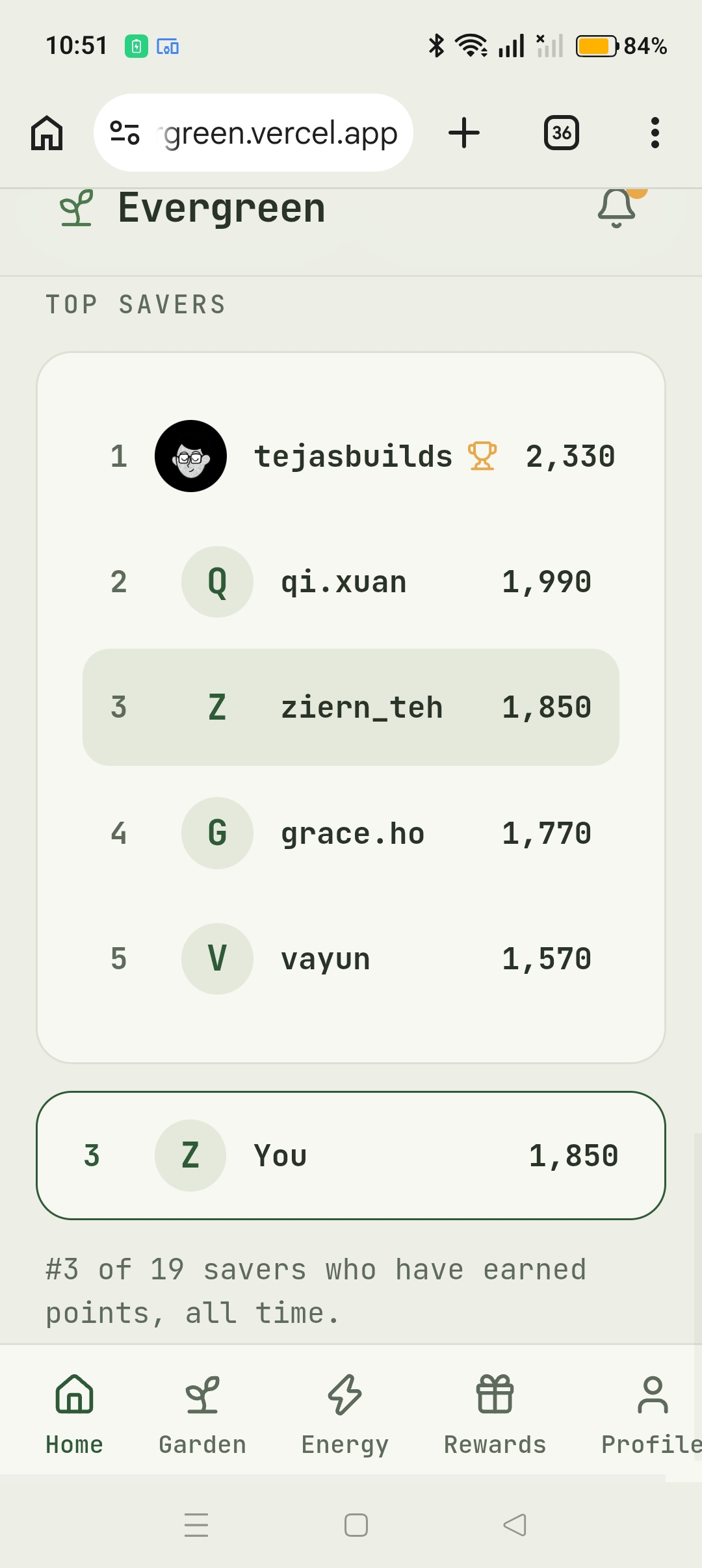
- Home. Your points, a small tree for each community you're in, a 7-day chart against your baseline, your monthly kWh / litres / CO2, and where you sit on the leaderboard.
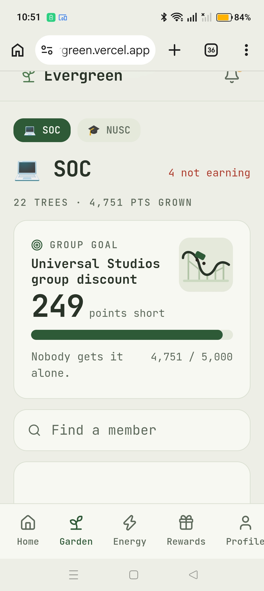
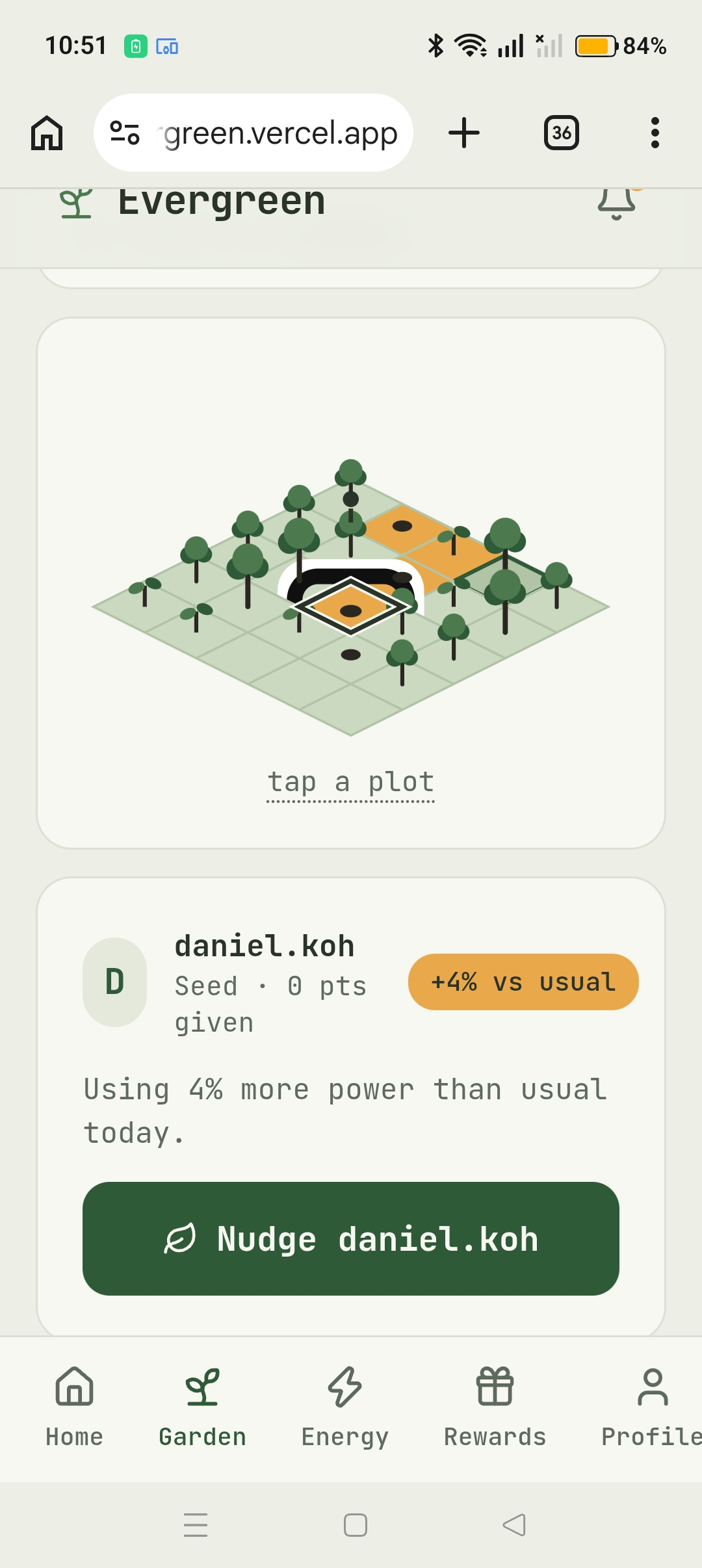
- The Garden. A 5×5 isometric plot where everyone's tree is drawn at its real growth stage, so you can tell who's contributing just from how tall things are. You can search someone's name to find their plot, tap any plot to see their stats, and send them a leaf if they didn't save anything yesterday. If someone's over their usual usage their tile goes amber, so waste shows up as a spot on the map instead of a notification you'd swipe away.
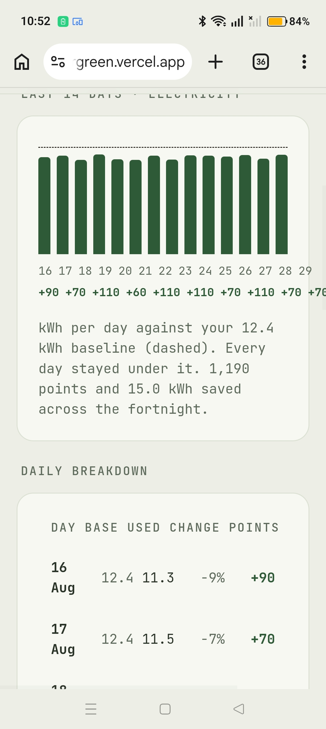
- Energy. Two weeks of electricity and water against your baseline, plus a row-by-row breakdown of how each percentage turned into points. We wanted the maths visible rather than asking people to trust a number.
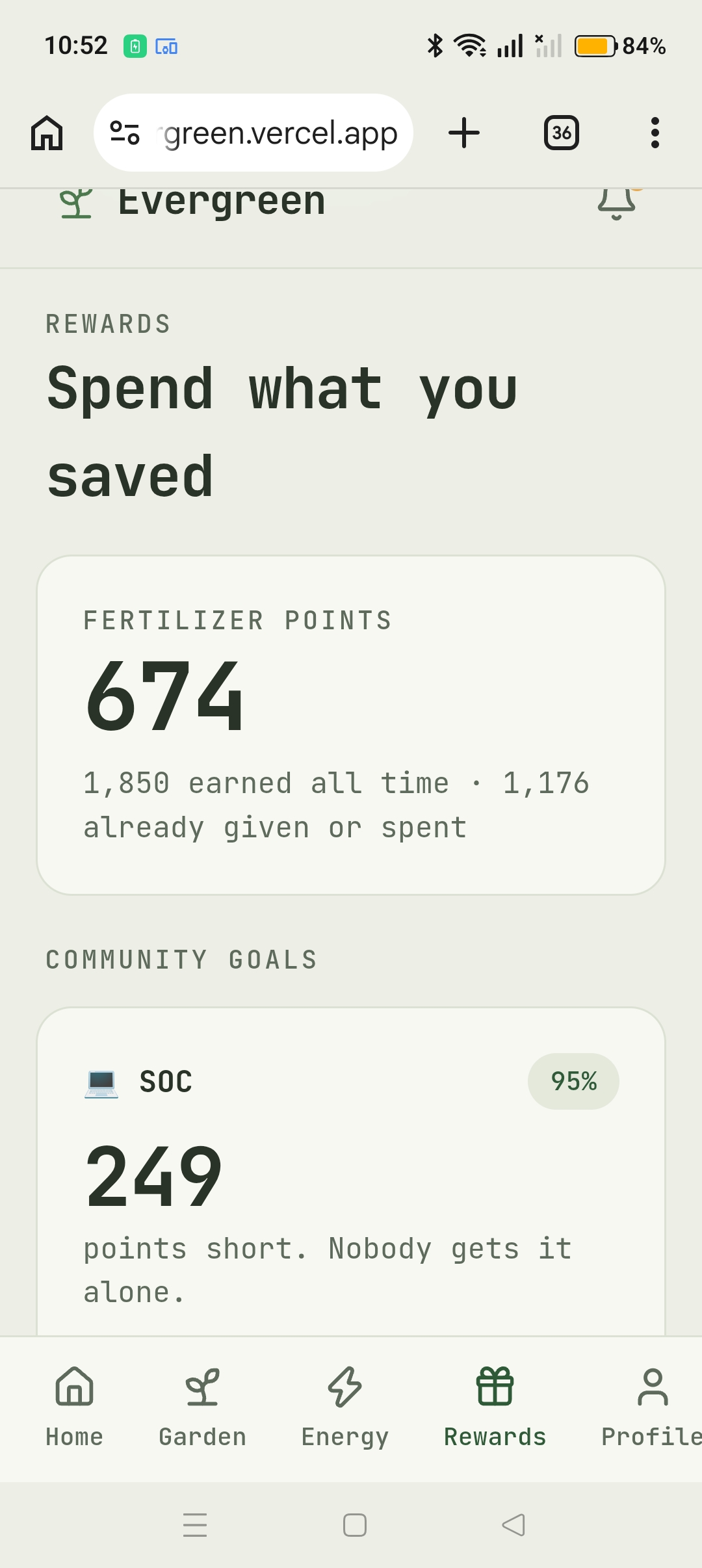
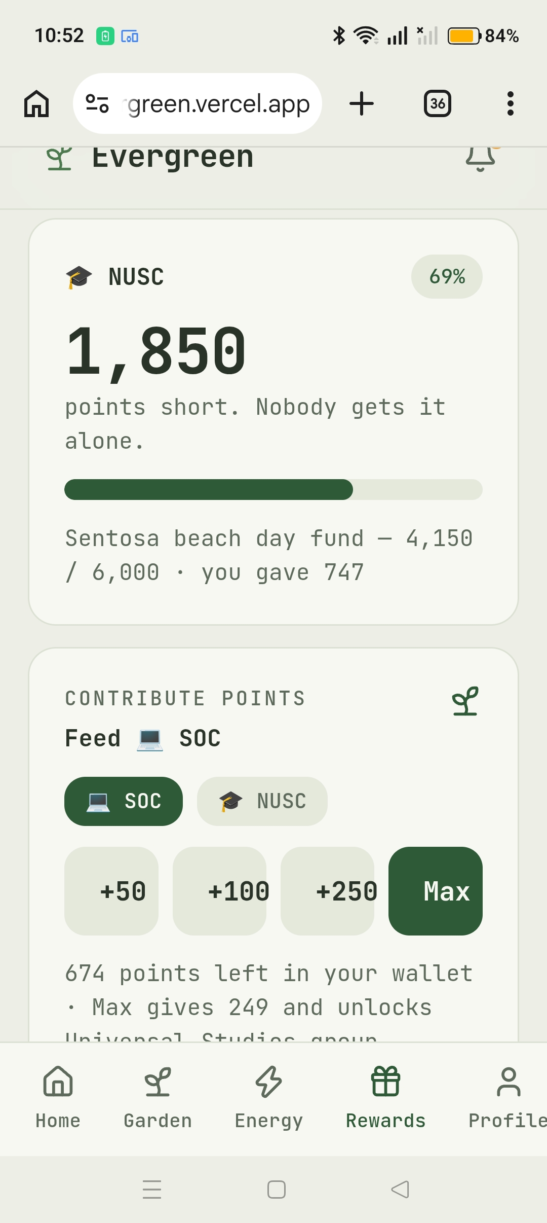
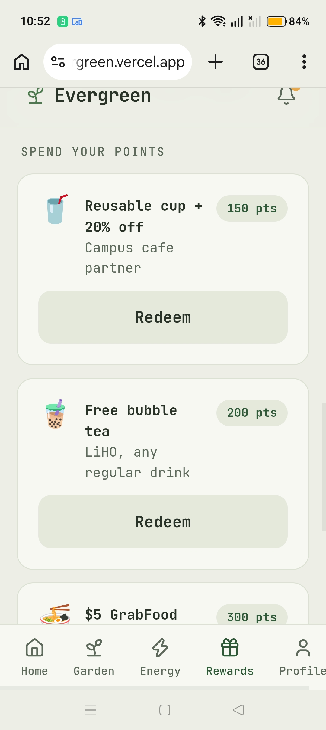
- Rewards. Redeem points for bubble tea, GrabFood, Kopitiam credit and so on, or put them into your community's goal. When the group crosses the goal, the reward unlocks for everyone in it at once, and you get a proper celebration for it.
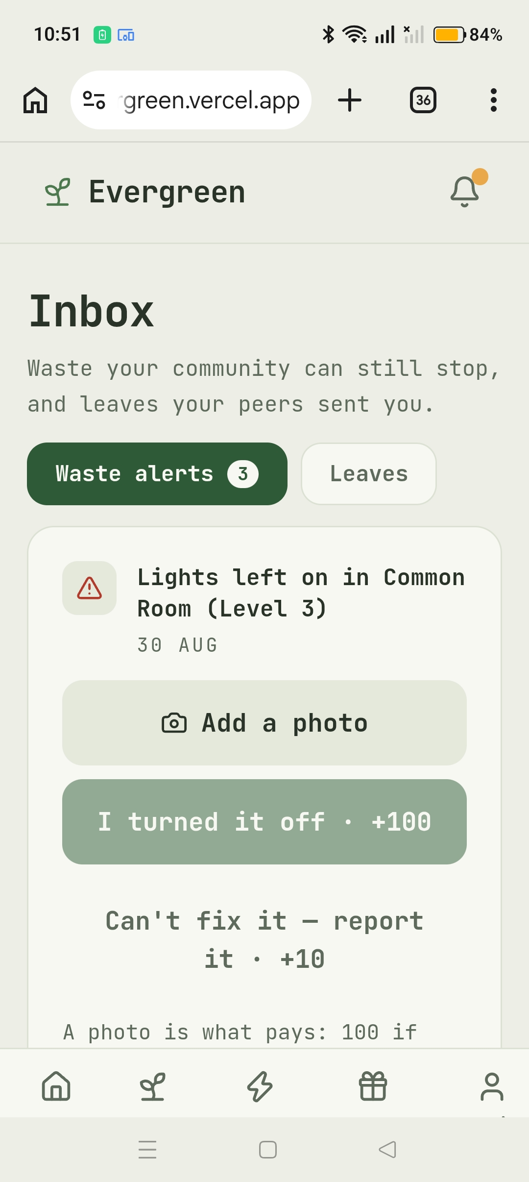
- Alerts. Waste reports and nudges from people in your community. Resolving a report pays based on what you can prove: a photo showing you turned it off is 100 points, a photo showing it's still broken is 50, and just reporting it is 10.
We spent a while on that last ladder. If you only pay the person who fixes it, nobody reports anything they can't fix themselves. If you pay everyone the same, people tap "reported" from their room and never get up. Paying for proof was the version that made sense.
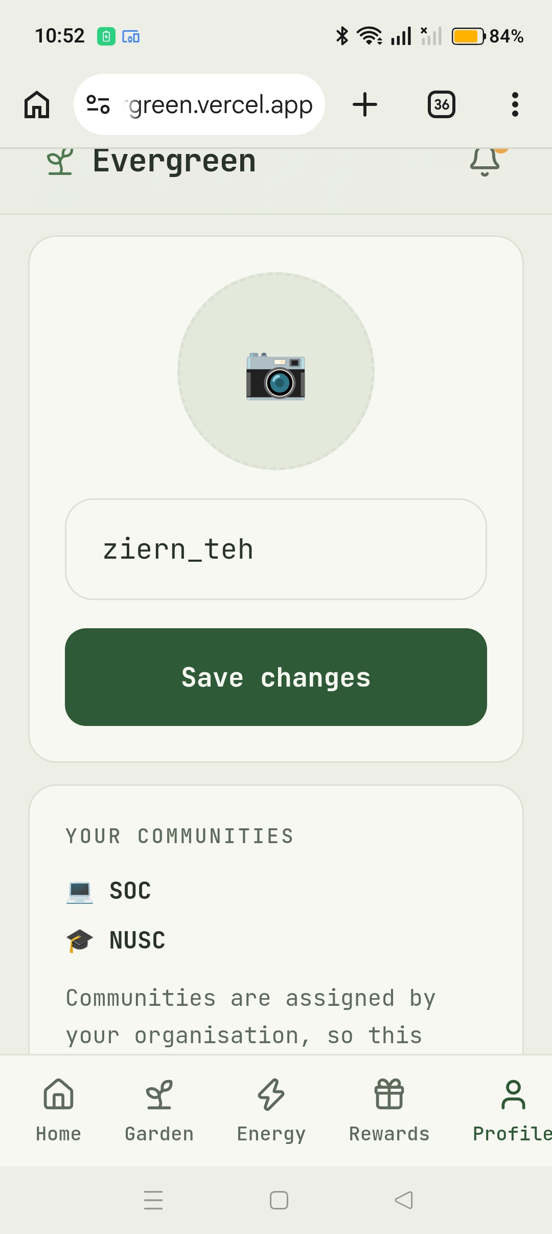
Two other things worth mentioning. Points you give to a group are never taken back when the goal unlocks, so the garden doesn't reset itself after a win. And there's no sign up button, which is deliberate: an account is only meaningful once it's tied to an actual meter. Without one you have no baseline, nothing to measure, and no reason to be standing in a particular hall's garden. So the org creates the accounts and assigns them to locations. Users pick their own username and avatar, and that's it.
How we built it
Next.js 16 with the App Router, React 19, Supabase for Postgres and auth, Tailwind v4, all in TypeScript on Bun. We ended up with seven runtime dependencies. No chart library, no game engine, no component kit, so every tree, tile and chart in the app is SVG or CSS we wrote.
Pages are async Server Components that query Postgres directly through Row Level Security, and anything interactive is a small client component inside them.
The decision that saved us the most pain was making one ledger table the only source of truth for points. Nothing stores a running total. Your balance is earn minus contribute minus redeem, the leaderboard is the sum of earns, and a tree is the sum of contributions to that group. It's a bit more query work on every page, but no two screens can ever disagree, and there's no cached number to go stale.
RLS is on all eight tables. Clients can insert contributions and redemptions but can never mint earn points. The one place a user's action does create points, resolving a waste alert, runs inside a Postgres security definer function that holds the payout amounts itself, so the app can't ask for a number of its own choosing. It also claims the alert in the same statement, so if two people hit the button at the same time only one gets paid.
We also froze the baseline at enrolment instead of recalculating it from recent usage. We tried it the other way first and realised it eats itself: if your baseline follows your habits down, then the better you do, the smaller your measured saving, until you're earning nothing for behaviour you worked at.
On the design side we locked ourselves to one monospace typeface, 14 colours, and no gradients or shadows anywhere. Depth comes from the isometric projection. It sounds restrictive and it was, but it's why the app looks like one thing rather than seven screens built by different people.
Animations run through a single motion config at the root that respects prefers-reduced-motion, so the celebration doesn't become a problem for anyone who's turned that on.
The seed script is deterministic, so we get identical demo data every run, and it checks at the end that the demo is actually winnable before we rely on it.
Challenges we ran into
The database wouldn't connect from campus wifi. NUS blocks port 5432, so the Supabase CLI just sat there printing Initialising login role... forever with no error. Switching to the pooler on 6543 got us connected, and then the CLI sent our whole schema file as one prepared statement, which Postgres refuses for multi-statement DDL. We gave up and wrote our own script to push the schema.
The trees on the left and right of the garden slid sideways whenever you tapped one, but the ones in the middle were fine. That took a while, because "wrong only at the edges" isn't an obvious symptom. It turned out motion quietly sets transform-box: fill-box on SVG elements as soon as you animate a transform, so the coordinates we'd given for the transform origin were being measured from each tree's own bounding box instead of the whole plot. The further a tree was from the centre, the more it jumped. We only found it by reading the library's source. Switching to percentage origins fixed it.
Our energy chart looked enormous on a phone and we couldn't work out why the font size wasn't helping. The chart was an SVG with a 168×105 viewBox being stretched to about 316px wide, which scales everything inside it including text, so our 8px labels were rendering around 15px. And since the stretch depends on screen width, there was no font size we could have picked that would be right. We rebuilt the chart in plain CSS so the bars flex and the text is just text.
Two of our worst bugs were in seeding and neither one threw an error. One user sat in third place on the leaderboard with no name at all, because we upserted profiles with ignoreDuplicates and a row that already existed with a null username could never be fixed by re-running the seed. Separately, our memberships table has a composite primary key and no id column, so it slipped through the cleanup routine we were using and old memberships kept surviving reseeds, quietly mixing up who was in which group.
Renaming our groups to real NUS ones looked like a five minute job and wasn't. The group name was being used as a join key in three different places, so a careless rename would have left the group rewards pointing at nothing and every goal falling back to placeholder art.
Accomplishments that we're proud of
The garden looks like a garden. It's a 5×5 isometric plot with everyone's tree at its real height, drawn by hand in SVG with no game engine and nothing pulled off npm. You can look at it for a second and know who's been contributing, which is the whole social mechanic without a single leaderboard row.
Every number in the app adds up. We checked the wallet, the tree stages and the leaderboard position by hand against raw ledger queries, and they matched, because there's only ever one table doing the work.
The alert payout ended up stricter than we'd planned. The amounts live in the database rather than the client, and the race between two people resolving the same alert is handled properly instead of hopefully.
We stuck to the design system. Seven screens, 14 colours, one typeface, no gradients, no shadows, and it still doesn't look like a template. When we did want a dark full screen celebration we wrote the exception down instead of quietly breaking our own rules and forgetting why.
The celebration also doesn't get in the way. You can dismiss it by tapping, by hitting the button, or with Escape, and it drops to a still frame if you've asked for reduced motion.
And the seed script tells us if the demo is broken. It prints exactly how many points are needed for the unlock and checks the account can afford it, so we find out in a terminal rather than in front of judges.
What we learned
Put the rules in the database. Everything we pushed into RLS or a security definer function stopped being something we had to remember in application code. We also know exactly where we didn't do this: contributing and redeeming still check your balance in the server action, which is a race and a UX guard rather than real protection. It's fine for a hackathon, but we'd rather say where it stops than pretend it doesn't.
Libraries will change CSS properties you never touched. We'd never have guessed transform-box on our own.
A viewBox is a zoom factor for everything inside it, text included.
Incentives can quietly break themselves. The rolling baseline seemed obviously correct until we followed it forward two weeks and saw it punish the people doing best.
Look at things at phone size. We only caught the oversized chart by measuring actual rendered pixels at 390px wide, not by eyeballing it on a laptop.
And you can get most of the feeling of a mobile game out of timing alone. We wanted the reward moment to feel like opening a chest, in a design system that forbids basically every visual trick those games use. Turns out the anticipation and the pause and the order things appear in were doing most of the work anyway.
What's next for Evergreen
- Make water actually count. We record and chart it but it earns nothing, and it needs its own baseline story before we can pay for it properly.
- Close the balance hole by moving contributions and redemptions into a single database function that checks everything atomically, then removing the direct insert permission entirely.
- Realtime updates. Right now a nudge only appears when the other person navigates. It should land while they're holding the phone.
- Some way to verify evidence. We trust the photo, and a photo is easy to fake. Peer confirmation or a check against the meter would make the 100 point award mean more.
- More than one goal per group, so a community that finishes its quest has somewhere to go next.
- More of the game feel: a reveal for personal vouchers, a payout moment for alerts, and an animation when a tree actually changes stage.
- An admin view for facility managers. Accounts are provisioned by a script at the moment, and a real deployment needs a way to register meters, set up communities and choose what each group is working towards.
Built With
- nextjs
- supabase

Log in or sign up for Devpost to join the conversation.