Inspiration
While on a casual call with a few friends, we found ourselves going down a rabbit hole of animal trivia which eventually led us to the topic of endangered species. A few quick Google searches later, we were shocked to discover that over 240 species are endangered in Ontario alone. We had no idea. In fact, most of the names were completely unfamiliar to us, animals we had never even heard of before.
This surprising realization made us reflect on the disconnect between the biodiversity crisis and public awareness, especially at the local level. This inspired us to set out to build a tool that bridges that gap — something that’s visually engaging, easy to use, and informative.
We believe that awareness is the first step toward action, and that starts by helping people truly see the scope of the problem. With our project, we hope to make biodiversity loss more visible.
What it does
The Endangered Species Visualizer is an interactive web application that allows users to explore endangered species based on their geographic location, with a particular focus on Ontario, Canada.
Using the Mapbox API, the app displays:
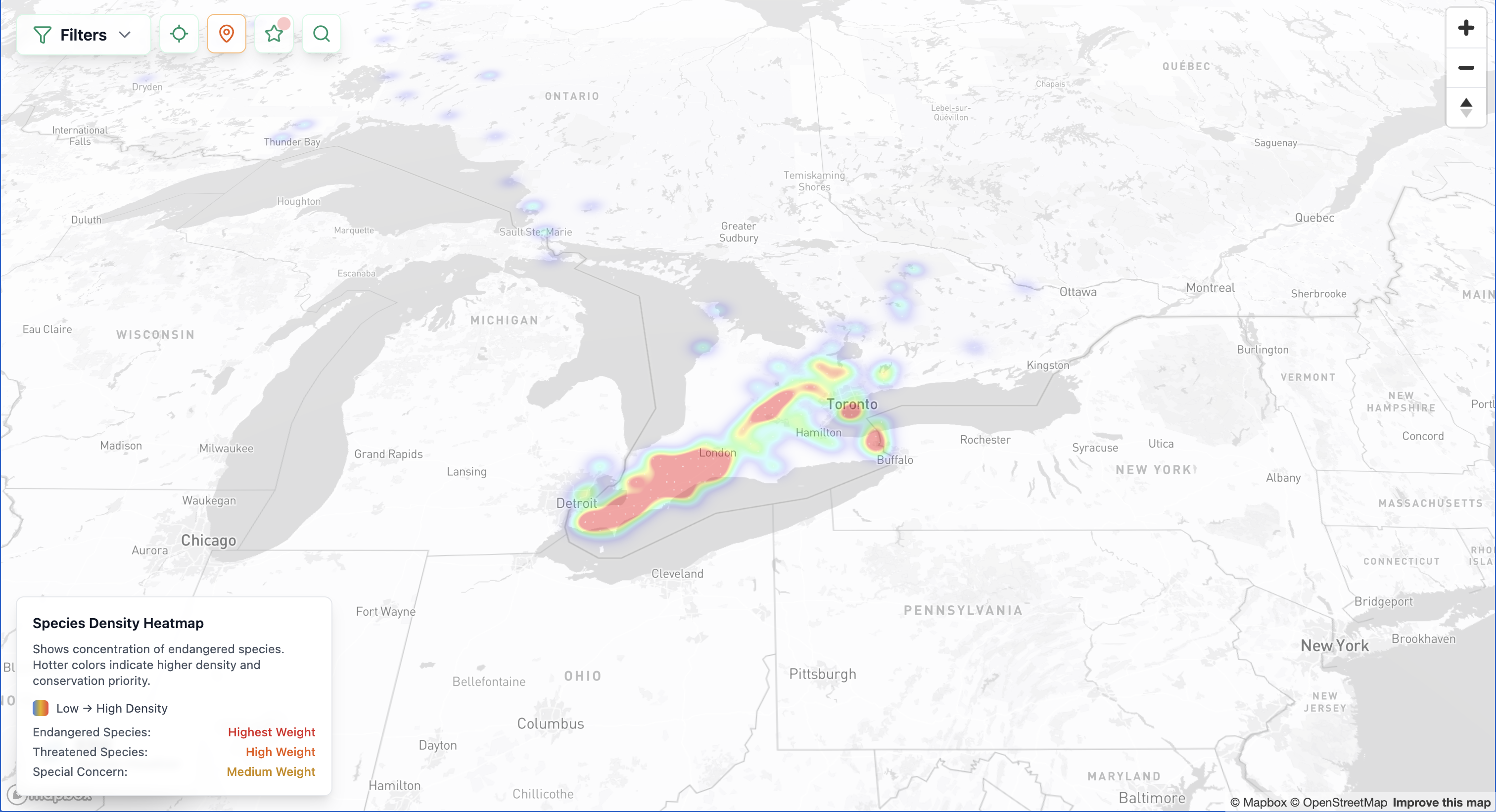
A dynamic heatmap that visualizes species concentration and threat levels across different regions.
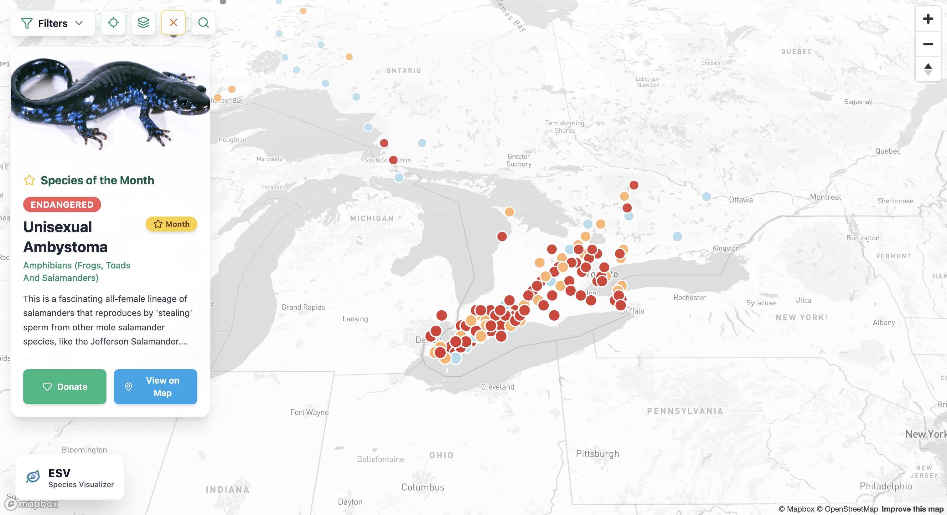
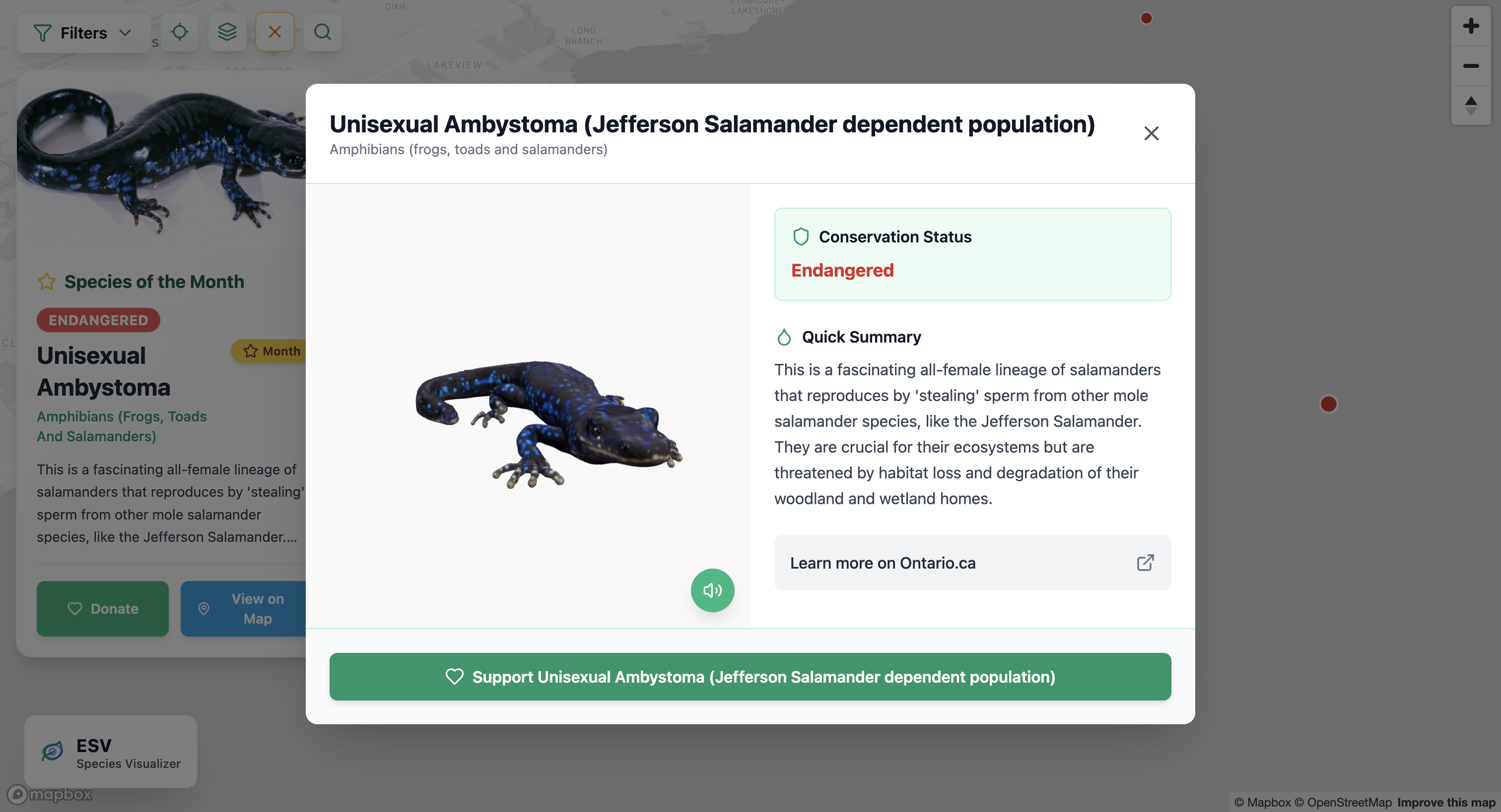
Interactive map points that display rich, species-specific information including their name, biological classification (e.g., mammal, bird, reptile), conservation status, natural habitat, the sounds they make, and a 3D model to visualize what they look like in the real world.
Filters that let users explore species by type or region.
A zoomable map that encourages users to discover which species are endangered near their own communities.
How we built it
Frontend: React and Tailwind CSS
Mapping/Visualization: Mapbox GL JS
Data Source: We gathered endangered species data from Species at Risk Ontario Website
3D Animals: MeshyAI
Backend: JSON, Typescript and SQL
Challenges we ran into
This was our first time working with the Mapbox API, and while it came with a learning curve, it opened up exciting possibilities for visualizing data in a meaningful way. We faced challenges around cleaning geospatial data, and integrating media like species sounds and 3D models.
Accomplishments that we're proud of
We’re incredibly proud to have built an engaging, visually compelling, and fully interactive map using the Mapbox API for the first time. Taking on a real-world issue like endangered species awareness and turning it into a functional, educational tool was both challenging and rewarding. The 3D models turned out really cool. Overall, we’re proud that our project has the potential to make a meaningful impact.
What we learned
We learned so much about endangered species and were fascinated by the wide variety of unique and lesser-known animals that exist, especially in our own region. This project gave us the opportunity to explore a topic we previously knew little about and turn that curiosity into something meaningful. Mapbox was a completely new tool for us, and diving into its capabilities was both exciting and rewarding—we now see its huge potential for interactive visualizations. We also gained valuable hands-on experience with React and Tailwind CSS, learning how to build responsive, intuitive interfaces that enhance user engagement.
What's next for ESV- Endangered Species Visualizer
Expand the scope beyond Ontario to a global scale, incorporating endangered species data from diverse ecosystems worldwide.
Drive adoption within educational environments, providing teachers and students with an engaging tool to explore biodiversity and conservation.
Collaborate with conservation organizations to ensure data stays current and actionable.
Enable community contributions to foster greater engagement and real-time data updates.
Built With
- gemini
- javascript
- jsx
- mapbox
- plpgsql
- react
- tailwindcss
- typescript

Log in or sign up for Devpost to join the conversation.