
Inspiration
After brainstorming, we discovered the opportunities of boosting sales at many locations via analyzing people-counter sensor data and dispenser sensor data. We then planned to use machine learning models to cluster the locations that share the same features to further investigate the discrepancy.
What it does
The goal of this project is to discover new aspects of each location to pave ways for future upsell by taking a deeper dive into the existing sensor data. We first obtained two features by calculating: the flow of people at each location and the time when the status light turns green to red on each device. Later, we obtained the relationship between the two by fitting the exponential and obtained the pattern of data distribution by clustering. The clustering results and visualization suggest that by looking at each group, if one location is offering a lower-quality product compared to the rest of the cluster, it indicates a potential opportunity of upgrade.
How I built it
We used pandas and datatime package in python to process csv and dataframes, sklearn for machine learning analysis, matplotlib for data visualization.
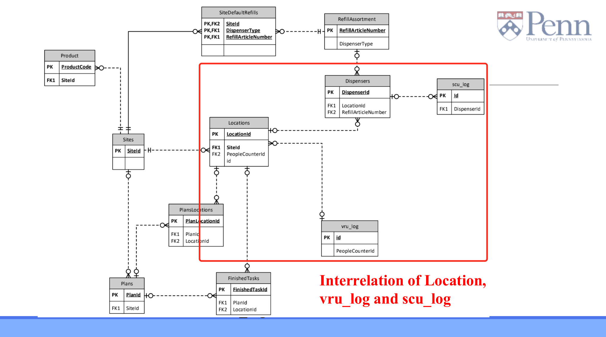
We first placed our focus on the status of sensors and the count of people and chose four data frames of interest. \ We then calculated two important features, average time for status to turn from red to green and average count of people per hour. Based on the given structured data the timestamp and its corresponding sensor status or people counter
We discovered that the two features above are inversely related. And we further quantified the relation between them, that is: minutes_green_to_red = 0.486 * exp(2.505* hourly people) - 0.136
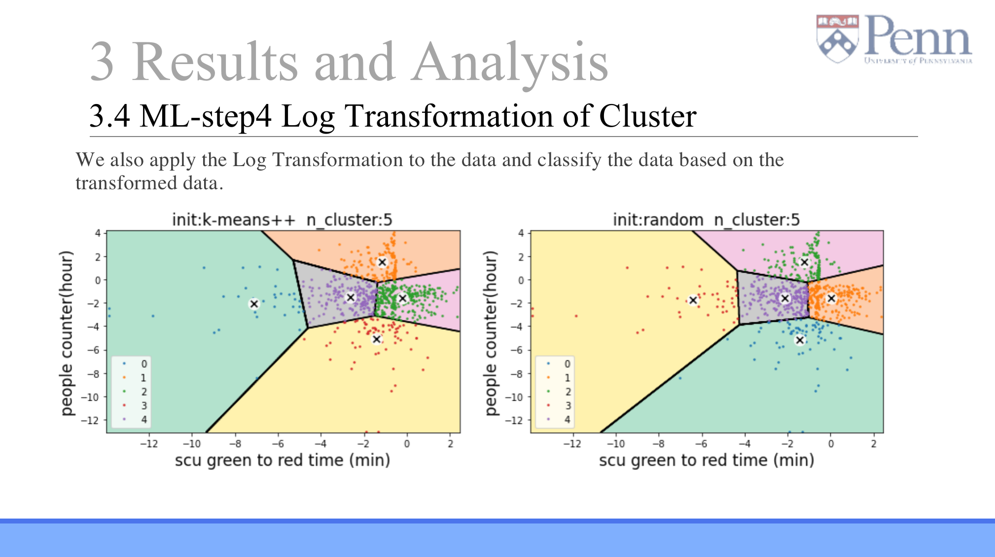
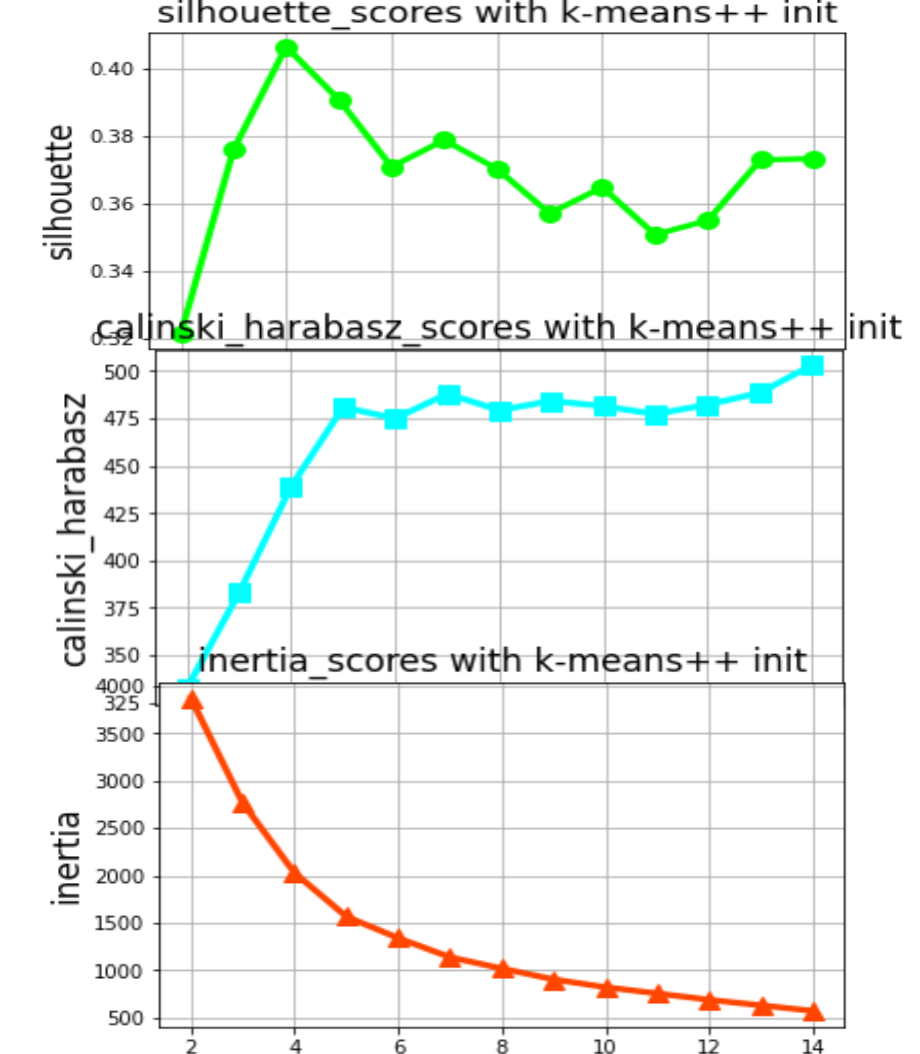
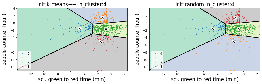
We found the best number of clusters (4 or 5) supported by three scores and took the natural log on the two calculated features to better cluster the locations.
We provided direction for further data analysis and actionable insights.
In Retrospect
It was challenging for us to decide which theme to pursue, given the volume and variety of data that we encountered. However, we demonstrated convincing data analytics and clear data visualization results in a short time interval, and we found useful insights that would suggest potential upsells by comparing the products within each group.
What's next for Essity Datathon
Analyze the depletion rate of different types and whether the cluster can be upgraded to reduce the exhaustion speed Analyze the time distribution of red lights in the cluster, weekday and weekend analysis, and optimize the maintenance schedule.
Thank you for reading our story! We look forward to our further discussion.
Built With
- cluster
- machine-learning
- polyfit
- python
- visualization


Log in or sign up for Devpost to join the conversation.