Inspiration
Course enrollment is a struggle. CAPE, a UCSD database generated from student evaluations, is the only widespread tool available for getting more information on courses. However, a huge pain point of this tool was the overwhelming amount of data to sort through, and overall lack of good UI. It would take a considerable amount of time manually searching through a list of unorganized data points. Enrolling in courses is an extremely stressful time for everyone, because there are so many factors to consider. What teacher has the best ratings? Is the GPA average higher during Fall, or Winter quarter?
We were all freshman once, and much of what we know about our classes came from word-of-mouth. Students should have access to information that will help them plan their best educational experience possible, and no one wants to get stuck with the notoriously evil professor with the lowest grade average. This is where we come in. Our tool, EsCAPE, spits out all the things you wish you heard about before enrolling.
What it does
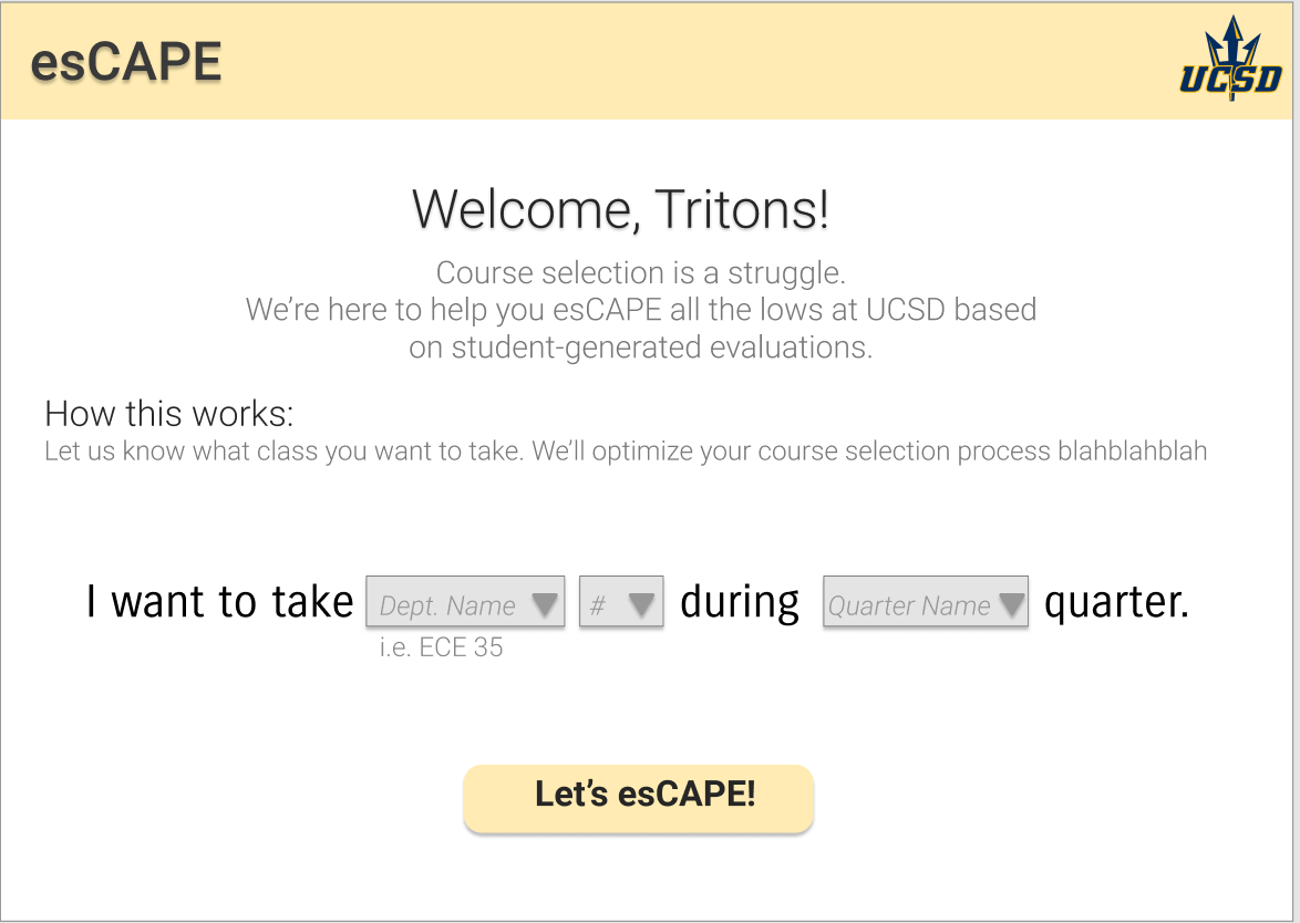
As an all-in-one enrollment guide, EsCAPE lets you know a variety of metrics that are pulled from the CAPE system, pushed through a series of calculations that generate data analytics and visual guides, and presented to students in a friendly, fool-proof manner. The user simply has to input the course information, and EsCAPE handles the rest.
How we built it
EsCAPE is a website built with HTML and JQuery/Javascript. The idea was to base the backend work around making EsCAPE as user friendly as possible, implementing conditional dropdown menus that live update an HTML template run with Python. The HTML template generates a link to an HTML file, where students have access to EsCAPE's metrics based on their input.
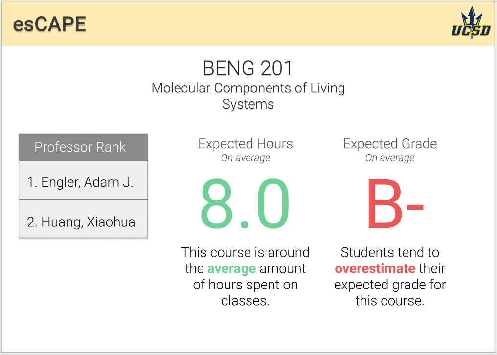
For the data analysis and calculations, our team played around with the CAPE database in Jupyter Python/PANDAS. We wrote functions that return a list of professors' names in order of highest satisfaction to lowest satisfaction, compare the average hours spent for that particular course compared to the average hours spent for all courses, and compare the the average grade earned for that particular course compared to average grade earned for other professors teaching that course. These are all translated into user-friendly visuals that are displayed on our website, and act as a guide to course enrollment for UCSD students.
Challenges we ran into
The backend of programming the website in the exact way we wanted to was a struggle! For a team of primarily beginner hackers, figuring out the "how" aspect of our project was most difficult for us. We got help from a great mentor here at SD Hacks and consulted Stack Overflow, Google, W3 School etc. for help with getting our website to work. We also faced some struggles having functions sort and return the exact data we wanted, and troubleshooted how to display them.
Accomplishments that we're proud of + what we learned
We learned a lot! For many of us, it was our first time getting very involved with Flask/HTML/Python/programming in general, as well as fleshing out a project from ideation to implementation all in 36 hours. Course enrollment is often overlooked in considering what stresses students out, and we're happy to make a tool that will help alleviate stress in any way possible.
.tech Domain
Check out our work in Github!
Built With
- figma
- flask
- html
- javascript
Log in or sign up for Devpost to join the conversation.