-
-
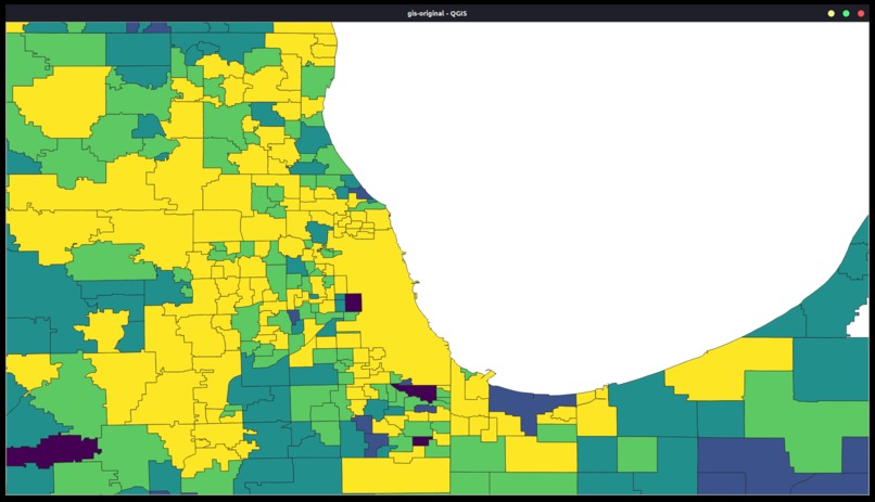
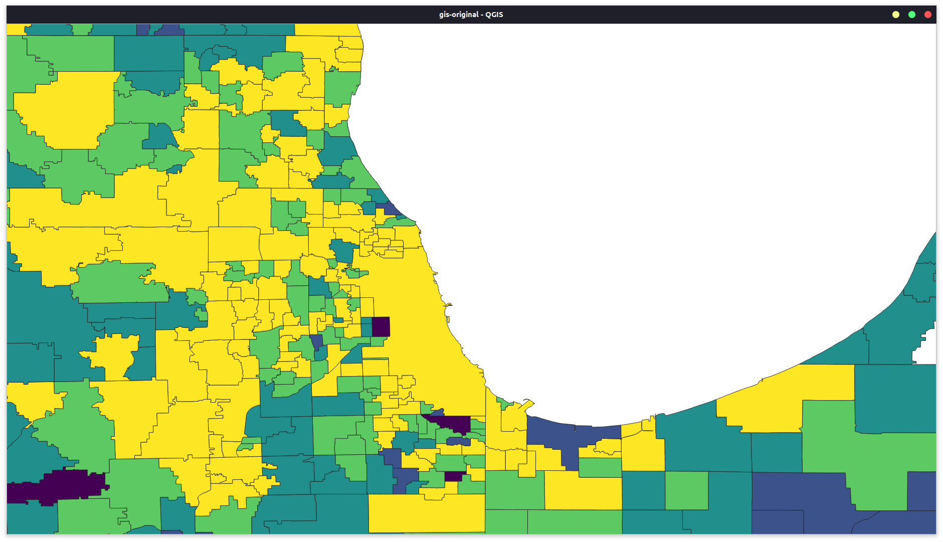
Districts Before GerryAI
-
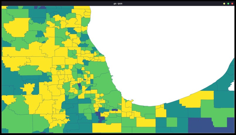
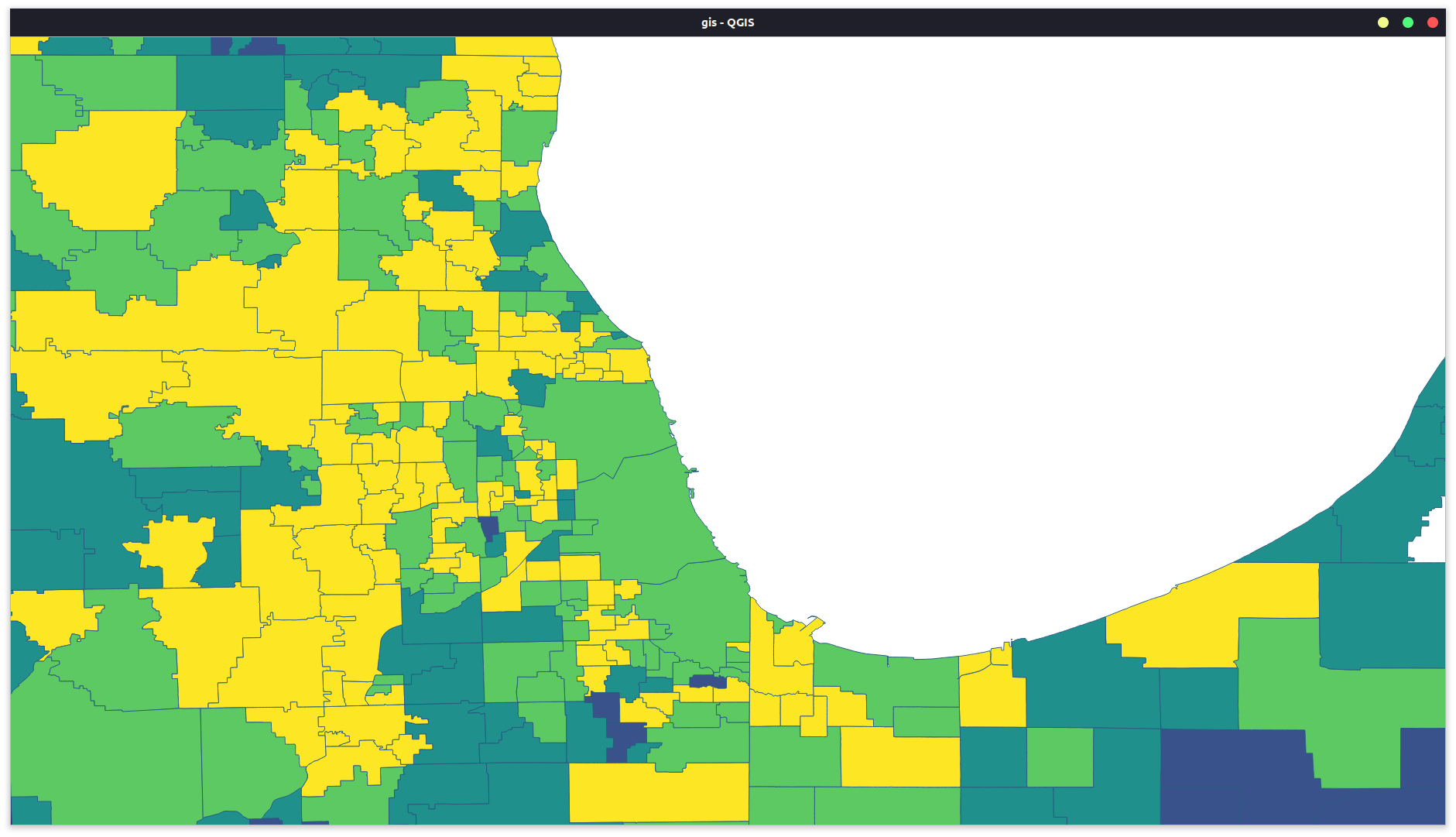
Districts After GerryAI
Inspiration
With all of the social strife that is occurring throughout the nation, the current situation with the #BlackLivesMatter movement got us thinking about the institutional discrimination that occurs in almost every community. Even as students in the diverse environments that are the Silicon Valley and New York, we all know of specific schools that are looked down upon due to their poor academic standing and lack of funding. More often than not, these schools have been separated from other schools as a school for African-Americans or Latinos. This discriminatory of "gerrymandering" the school district lines can be seen all around the US. There are districts that are using their power to decrease the racial divide, but far more that are reinforcing it.
What Does It Do?
GerryAI has been trained to look at a set of school districts and look at their Ethnic Diversity Index. The Ethnic Diversity Index is intended to measure how much "diversity" or "variety" a school or district has among the ethnic groups in its student population. More specifically, the Index reflects how evenly distributed these students are among the race/ethnicity categories and is used by many states including California. Please refer to here for more information on how the calculation is made. Using this data, GerryAI will create predictions for how to combine or split districts to create more diverse districts.
How We Built It
For our data, we used source for the diversity data for all of the school districts in the nation. Our shapefile for the districts came from The National Center for Education Statistics' Education Demographic and Geographic Estimates (EDGE) dataset. Finally, using the TensorFlow models and many trial-and-errors models, we were able to get the model to decently combine and separate the districts.
Challenges We Had
There were many challenges. For one, there was regularly missing data, so we had to combine datasets to create a more complete dataset for most of the country. Moreover, when using Plotly to graph the maps, the python server would crash and kill all chrome processes. Hence, we had to use the open-source QGIS that allowed us to easily view the shapefiles and input the data from the CSV file to alter the coloring. Moreover, as I said before, the model that we used and trained caused many troubles as the dropout layer started dropping all of the neurons, so moved to a simplified and somewhat basic design on 3 dense hidden layers, which limited our accuracy.
What We Learned
We learned to combine datasets, use QGIS as this was completely new, and to train a model on a very complicated problem that we simplified by using a network. The datasets combination was done by Mihir, which took a lot of time. Ojasw learned very basically how to create joins between CSV files and shapefiles and using the attributes in the CSV file to apply a color scale to the map. Finally, with training the model, Ojasw learned to always start with a very basic starting model and move up from complexity making sure that the model worked at each interval.
Accomplishments
We accomplished the following
- creating a combined dataset for calculating EDI
- compiling all the data into a single CSV with FIPS, LEAID, and EDI information
- using the single CSV to create the original map
- creating and training a basic model
- running the model on a test case
What's Next?
The next steps would be to optimize the model, increase its capabilities, open the inputs to GeoJSON files and other formats. We also want to use different metrics to determine district merges, including financial data, staff metrics, and special needs education capabilities. In addition to new data and methods, we want to make this project accessible, so that findings can be easily transferred to political changes to school districts. There are very few precedents to this change and that is exactly why we start now.


Log in or sign up for Devpost to join the conversation.