-
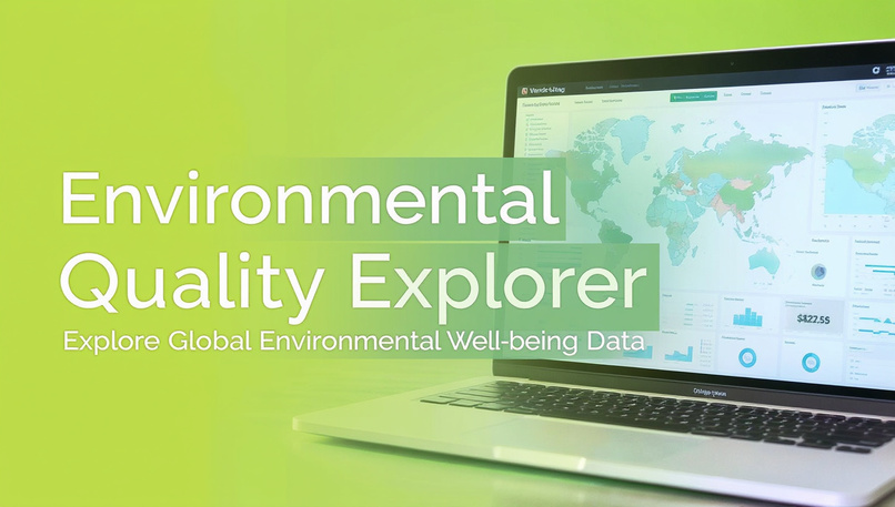
Environmental Quality Explorer

Inspiration
I have always been fascinated by how environmental conditions shape the quality of life. With growing concerns around sustainability, access to green spaces, and rising air pollution levels, I wanted to create a data storytelling tool that allows users to visualize and compare how countries perform in these critical areas. The OECD Well-being dataset provided the ideal foundation, offering multidimensional insights into the “Environmental Quality” domain across nations and years. This inspired me to develop an interactive platform where data can tell a meaningful story about the health of our environment and its impact on people’s lives.
What it does
The Environmental Quality Explorer is an interactive data app that visualizes how OECD nations perform on key environmental well-being measures. With this app, I allow users to: Compare countries based on Access to Green Space, Exposure to Air Pollution, and Extreme Temperature. Explore trends over time and discover correlations with other well-being domains. Gain meaningful insights through interactive visualizations, from choropleth maps and bar charts to heatmaps and scatter plots. I designed it to make environmental analytics accessible, intuitive, and actionable, empowering policymakers, researchers, and sustainability advocates.
How I built it
Dataset: OECD Well-being Dataset (Environmental Quality domain) Tech Stack: Python, Pandas, Plotly, and Streamlit Design: Nature-inspired UI with green–blue palette and clean typography
Deployment:
Each visualization was thoughtfully designed to ensure clarity, responsiveness, and visual appeal, giving users a seamless exploratory experience.
Challenges I ran into
Cleaning and filtering large, multi-domain, multi-country datasets Designing responsive and interactive visualizations that maintain performance Striking a balance between data depth and user-friendly design Managing deployment performance on cloud infrastructure
Accomplishments that I’m proud of
Built a fully interactive, publicly accessible data storytelling app Created an interface that turns data into insights for sustainability Successfully merged data science, design, and UX principles Leveraged AI-assisted app generation while maintaining creative control
What I learned
How to transform static datasets into dynamic, story-driven dashboards Advanced usage of Plotly for analytics and interactivity Importance of UI/UX design in effective data communication
What's next for Environmental Quality Explorer
Integrate climate resilience and energy efficiency metrics Add AI-generated insights for deeper storytelling Introduce policy recommendation layers driven by correlations Include forecasting and predictive analytics for future trends


Log in or sign up for Devpost to join the conversation.