-
-

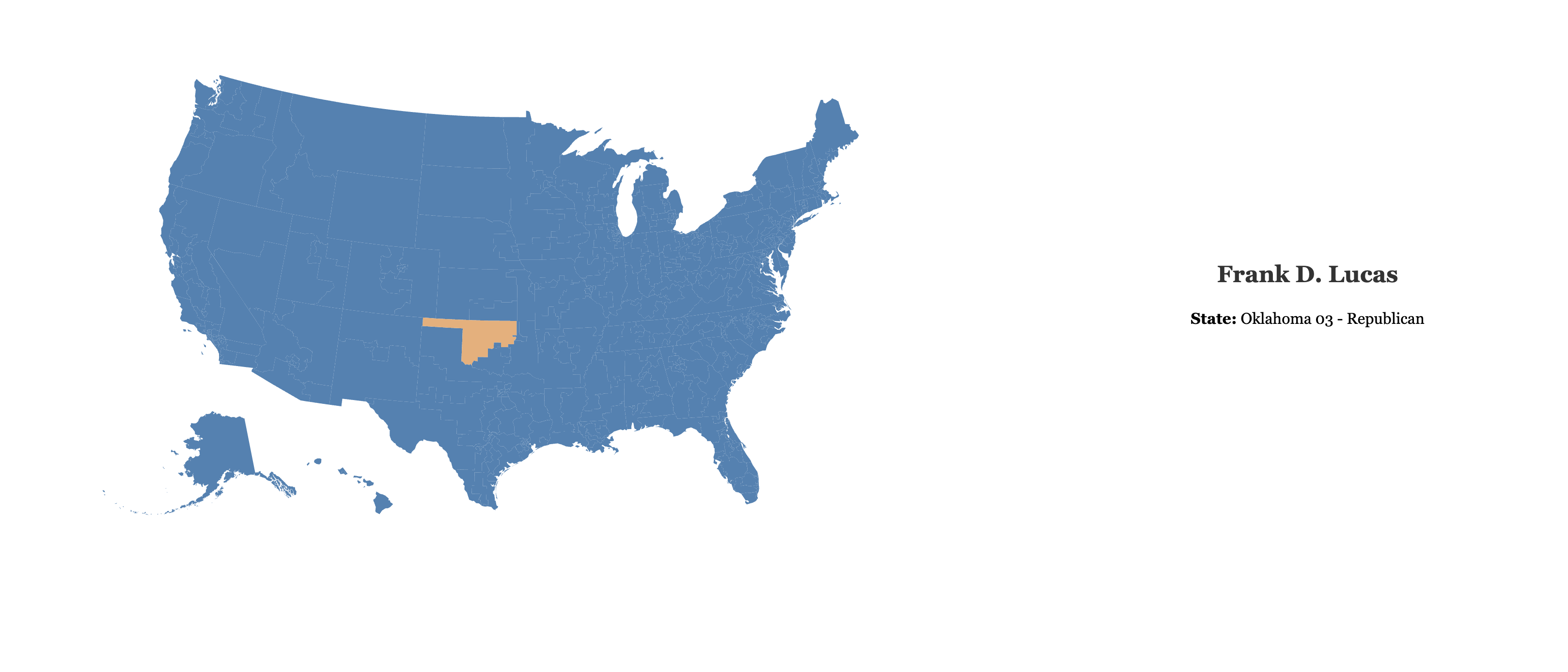
what happens when you click on a district
-
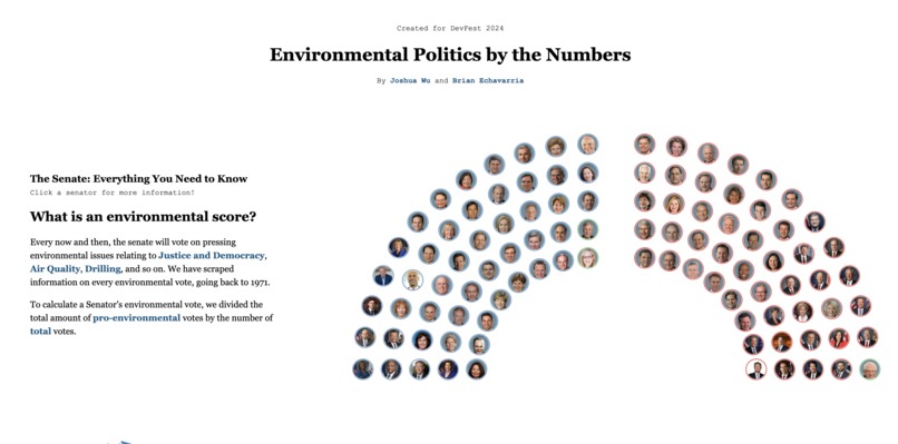
Screenshot of our website on localhost
-
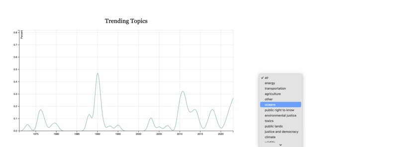
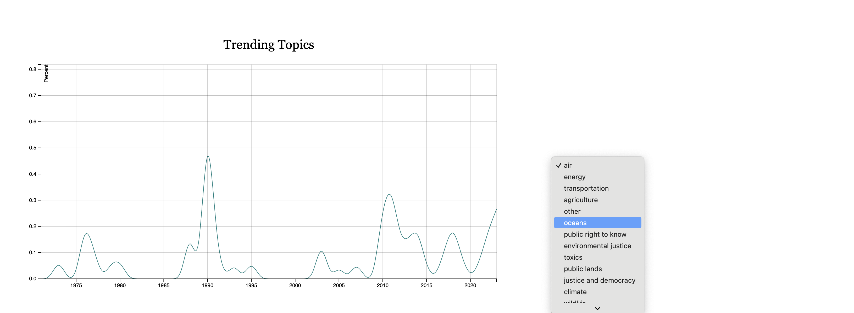
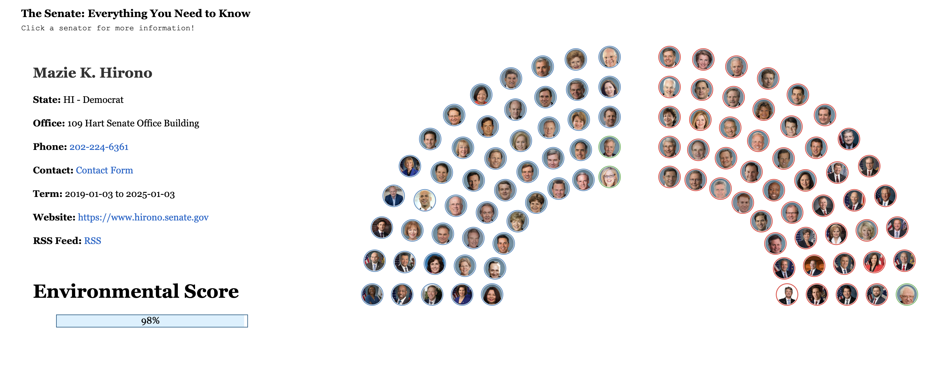
Screenshot of our website on localhost
-
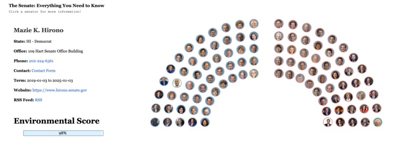
What happens when you click on a senator

Inspiration
We were particular inspired by Katie Marriner during the Wednesday workshop. Because of the complex nature of politics, we thought that making a data visualisation hack that provides novel insight into Washington DC would be both useful and interesting.
What it does
Our project serves as a tool for users to discover more about environmental politics. In particular, it gives them the ability to check in on whether their representatives generally vote in favor of environmental initiatives. However, we have built models that can predict how senators and representatives will vote on future issues. Unfortunately, we were unable to incorporate the model into our findings at this time.
How we built it
We used a series of python scripts that scraped a score card website to build .csv files that the frontend draws upon. The frontend is built with svelte allowing us to represent our data in a visually pleasing manner.
Challenges we ran into
We struggled with deploying our web app thus for demonstration purposes we've chosen to stick with a local host. Additionally, there were definitely challenges rendering d3 objects with svelte, but we were able to overcome this hurdle.
Accomplishments that we're proud of
We're very proud of the the user interactive elements of the web app. In particular, the ability to click on the face of each current senator to bring up additional information about them and the drop down menu allowing the user to take a look at the historical relevance of different political issues.
What we learned
We both grew our Fullstack development skills. On the backend, we both had our first experience processing and cleaning moderately sized data (the house of representatives .csv file ended being ~400 mb). The sheer size was definitely a bit troublesome, since we knew we did not want to spend too much time procressing the data.
On the front end, we learned a lot about SVGs and how to build them. While we were able to refactor code obtained from Observable HQ for the Senate and House map, we created a multi-series line chart from a .csv file with 14 columns by ourselves, which took much longer than anticipated! Additionally, we had to add interactive capabilities (such as on mouse clicks or hover) to both the Senate and House of Representative map, which took a while to figure out as well.
What's next for Environmental Politics by the Numbers
As of right now, our data visualisation on the House of Representatives members is incompletely, due to the sheer size (435 members) of the House when compared to the Senate (100 members). However, the base logic for the House is present in our code, as we can refactor our machine learning models and data exploration scripts to account for the number of members in the House.
After expanding on the House of Representatives, we would like to fine-tune our machine learning model to increase accuracy, as it has an accuracy of 60% right now. Ideally, we hope to bolster that percentage by another ~10% before trying to predict outcomes on future proposed bills.
Credit and GitHub Link
- Katie Marriner for providing useful tips and tricks about svelte, d3.json and topojson - all tools we have used in this hackathon!
- Jeremiah Kimelman for providing the congressional district map, which we have only slightly altered
- Herb Susmann for providing the current Senate Map
- The @unitedstates project for providing images for the senators (and all the other information!)
Built With
- d3.js
- javascript
- python
- svelte

Log in or sign up for Devpost to join the conversation.