Employee Morale Dashboard
Inspiration
The inspiration for this project came from the challenge given by ADP but also the growing need for businesses to understand and monitor employee well-being through communication channels. In modern workplaces, employees' emotions and tones often reflect their morale, which is pivotal in understanding productivity and addressing concerns. By analyzing data from employee communication, HR teams can better assess and improve the overall work environment. This project aims to bring this concept to life by creating a dashboard that offers insights into employee morale using real-time data.
What it does
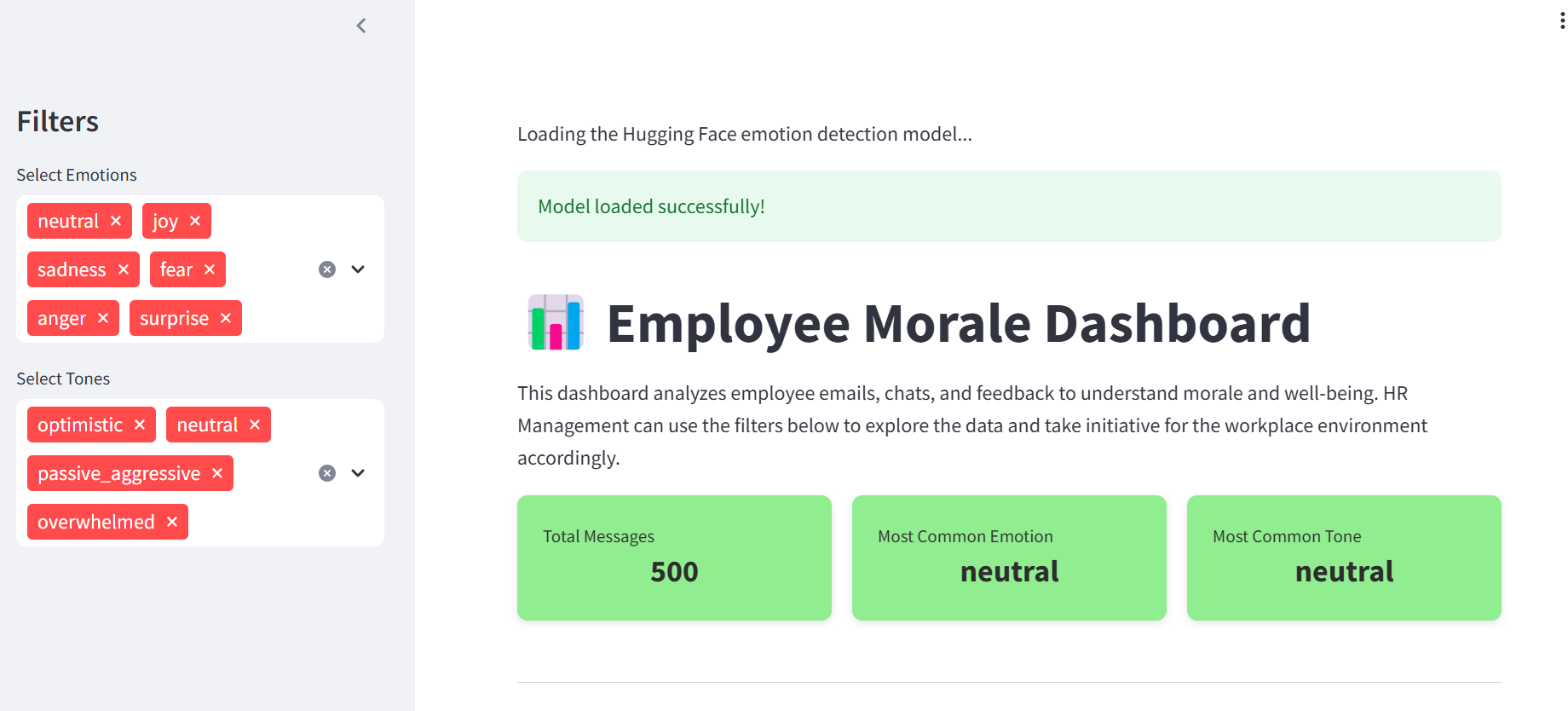
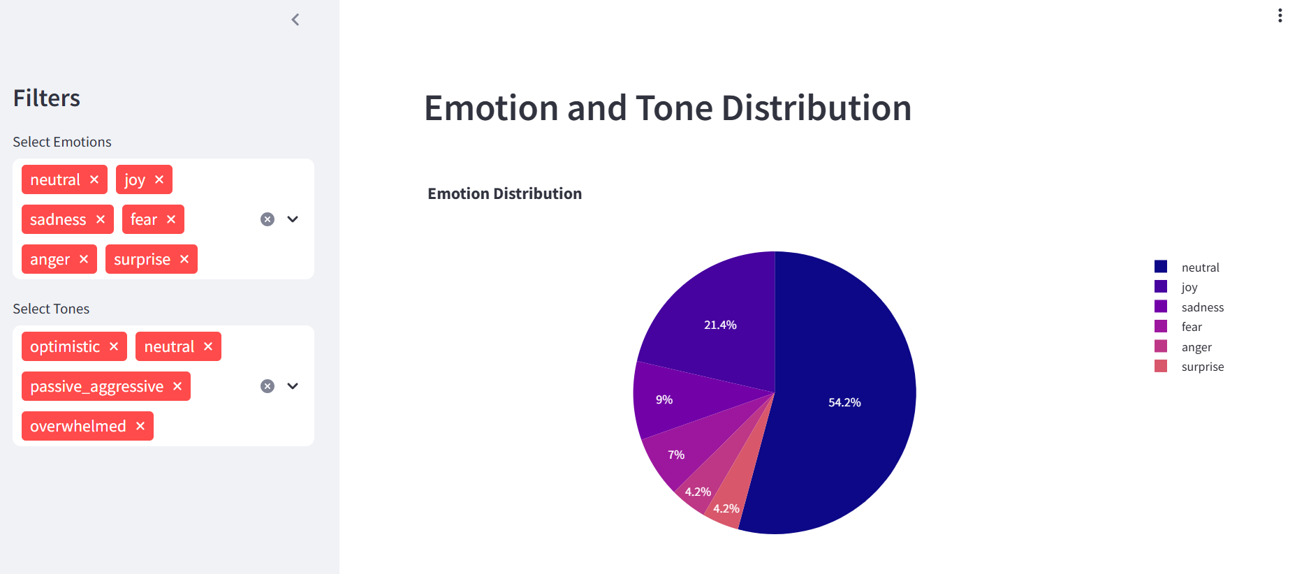
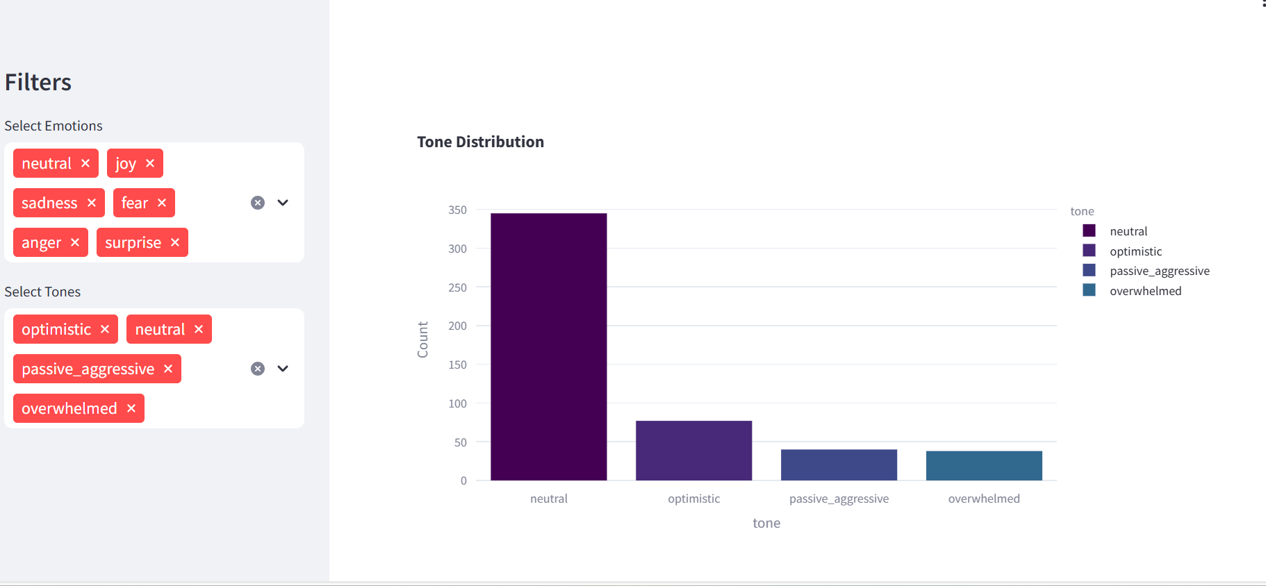
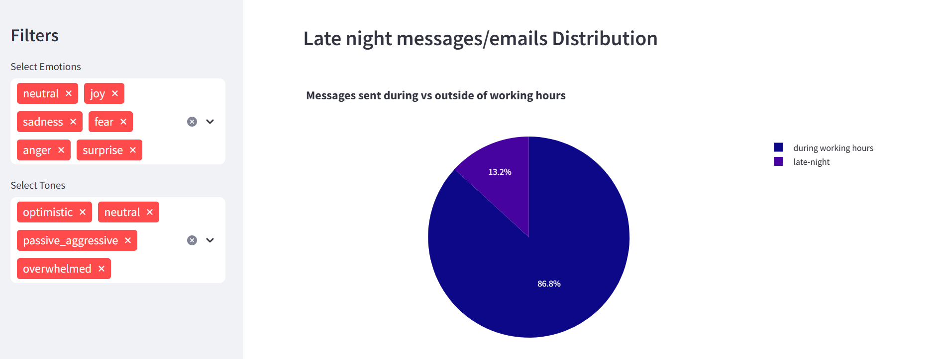
The Employee Morale Dashboard analyzes text data from employee emails, chats, and feedback to gauge their emotions and tone. By using natural language processing (NLP) models, it classifies the emotions (e.g., happy, sad, angry) with a pre-built model and tones we manually provided (e.g., overwhelmed, optimistic, relaxed). The dashboard allows HR teams to filter through this data to uncover trends and take action where necessary. Visualizations such as pie charts and bar graphs help to present the distribution of emotions and tones, making it easier to understand the workplace's current mood. Additionally, it includes overtime analysis, tracking messages sent after working hours, which can indicate stress or work-life imbalance.
How we built it
We built the Employee Morale Dashboard using Python, Streamlit, and Plotly. We used synthetic data generation by leveraging AI and feeding chat-gpt common workplace messages with good, bad or neutral connotations, so that the generated data has a human aspect. We then had it produce 500 rows of data with these labels: subject, body, timestamp, communication channel. Next we needed to use sentiment analysis and NLP to generate a column for tone and emotion. The core of the dashboard relies on the Hugging Face NLP model for emotion detection. We used pipeline from the transformers library to load a pre-trained model that classifies text into various emotional categories. Additionally, we incorporated keyword-based tone detection by scanning messages for specific phrases related to different tones (e.g., "urgent" for overwhelmed or "looking forward" for optimistic). Lastly, we used the timestamp label to filter out emails written past 8pm to help keep track of the number of late-night emails. The dashboard visualizes the analysis results through Plotly charts, displaying emotion and tone distributions, along with a breakdown of late-night messages. The frontend is powered by Streamlit, which makes it easy to deploy interactive web applications.
Challenges we ran into
One challenge we encountered fine-tuning the emotion and tone detection logic to improve its accuracy, especially when dealing with nuanced language or ambiguous phrases. Additionally, integrating the Hugging Face model into the Streamlit app took some time due to performance issues, as processing large datasets could lead to delays in generating the results. However, we optimized the code and implemented efficient data loading and processing techniques to address these concerns.
Accomplishments that we're proud of
We are proud of successfully creating a working, interactive dashboard that is capable of processing and analyzing employee communication data in real time. The ability to visualize complex emotions and tones in a user-friendly format is a key accomplishment. We also managed to integrate a powerful NLP model into the app and deploy it with minimal delay, which was a major milestone for us. Additionally, the overtime analysis feature added an extra layer of insight that highlights the importance of work-life balance.
What we learned
Throughout the project, we gained valuable experience in natural language processing, particularly in text classification and sentiment analysis. We learned how to leverage pre-trained models from Hugging Face and adapt them to our specific use case. Streamlit proved to be an excellent tool for quickly building and deploying apps, and we enhanced our skills in creating dynamic and interactive visualizations using Plotly. The project also taught us about handling real-world data, cleaning it, and applying filters to extract meaningful insights. We also learned the importance of keeping the user experience in mind when designing dashboards and reports.
What's next for Employee Morale Dashboard
In the future, we plan to extend the functionality of the Employee Morale Dashboard by incorporating more advanced features such as:
- Trend analysis: Adding time-series analysis to monitor morale changes over time could help HR teams identify patterns in employee behavior.
- Predictive analytics: Implementing machine learning models to predict future morale trends based on historical data could help HR proactively address potential issues.
Built With
- huggingface
- natural-language-processing
- openai
- pandas
- python
- pytorch
- streamlit

Log in or sign up for Devpost to join the conversation.