Inspiration
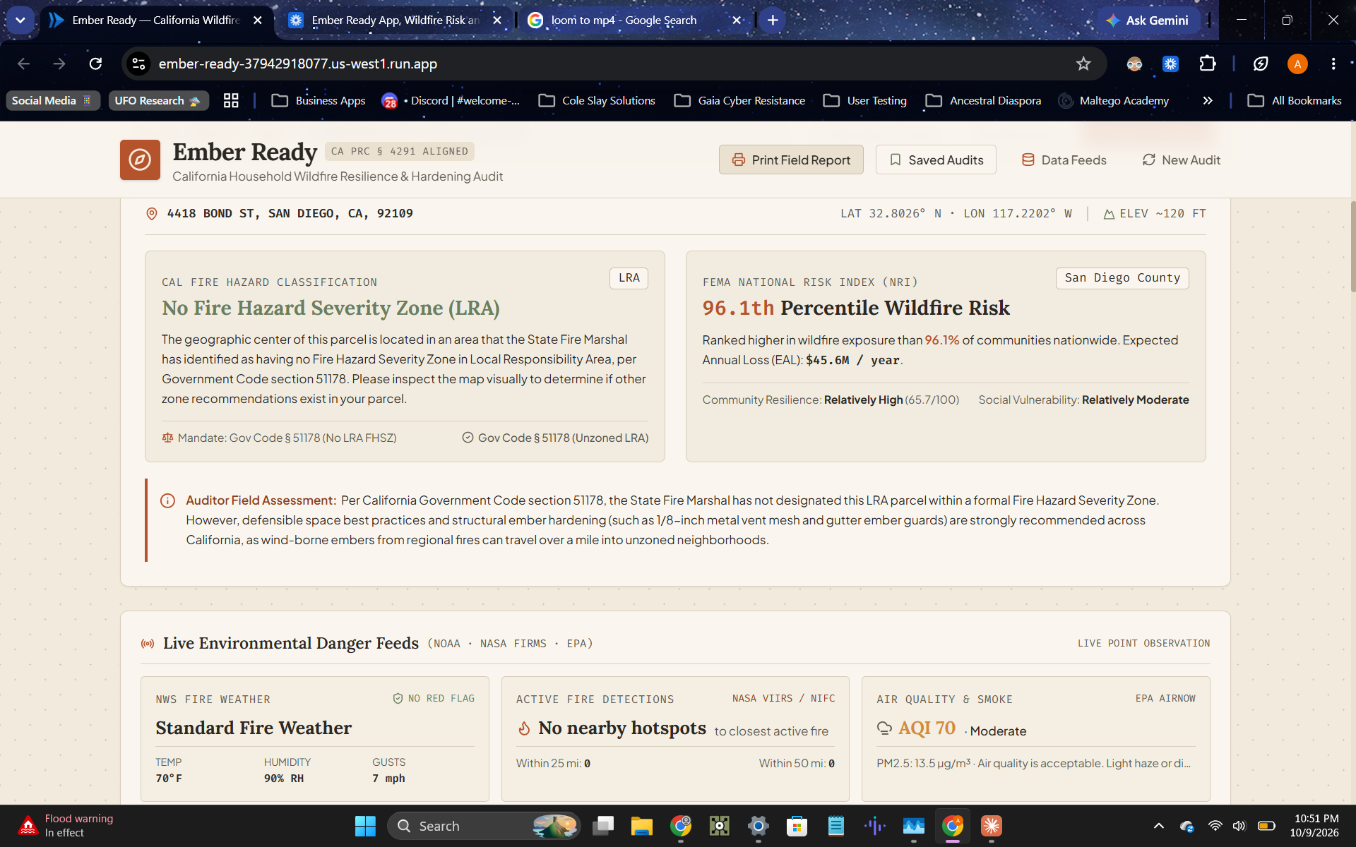
I live in California, which means wildfire risk isn’t a hypothetical for me, it’s a fact of the state I call home. Every fire season, the advice available to homeowners is the same generic PDF checklist from Ready.gov or FEMA: not personalized, not scored, not tied to the actual hazard data that exists for your specific address. Meanwhile, CAL FIRE has published a real, detailed home-hardening standard (PRC § 4291, AB 3074, CBC Chapter 7A) that most homeowners have never seen, let alone been scored against. I wanted to close that gap: take the real government data that already exists, FEMA’s National Risk Index, CAL FIRE’s Fire Hazard Severity Zones, NOAA’s fire weather alerts, and turn it into something a person could actually act on.
What it does
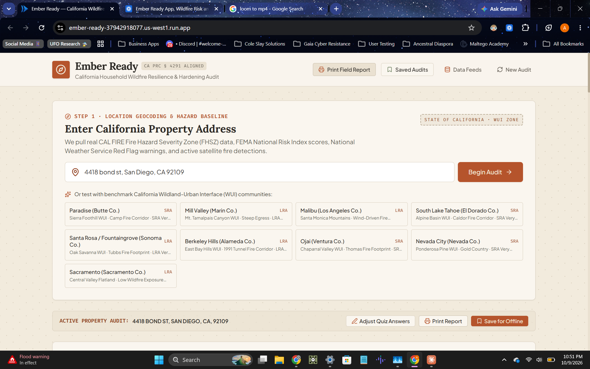
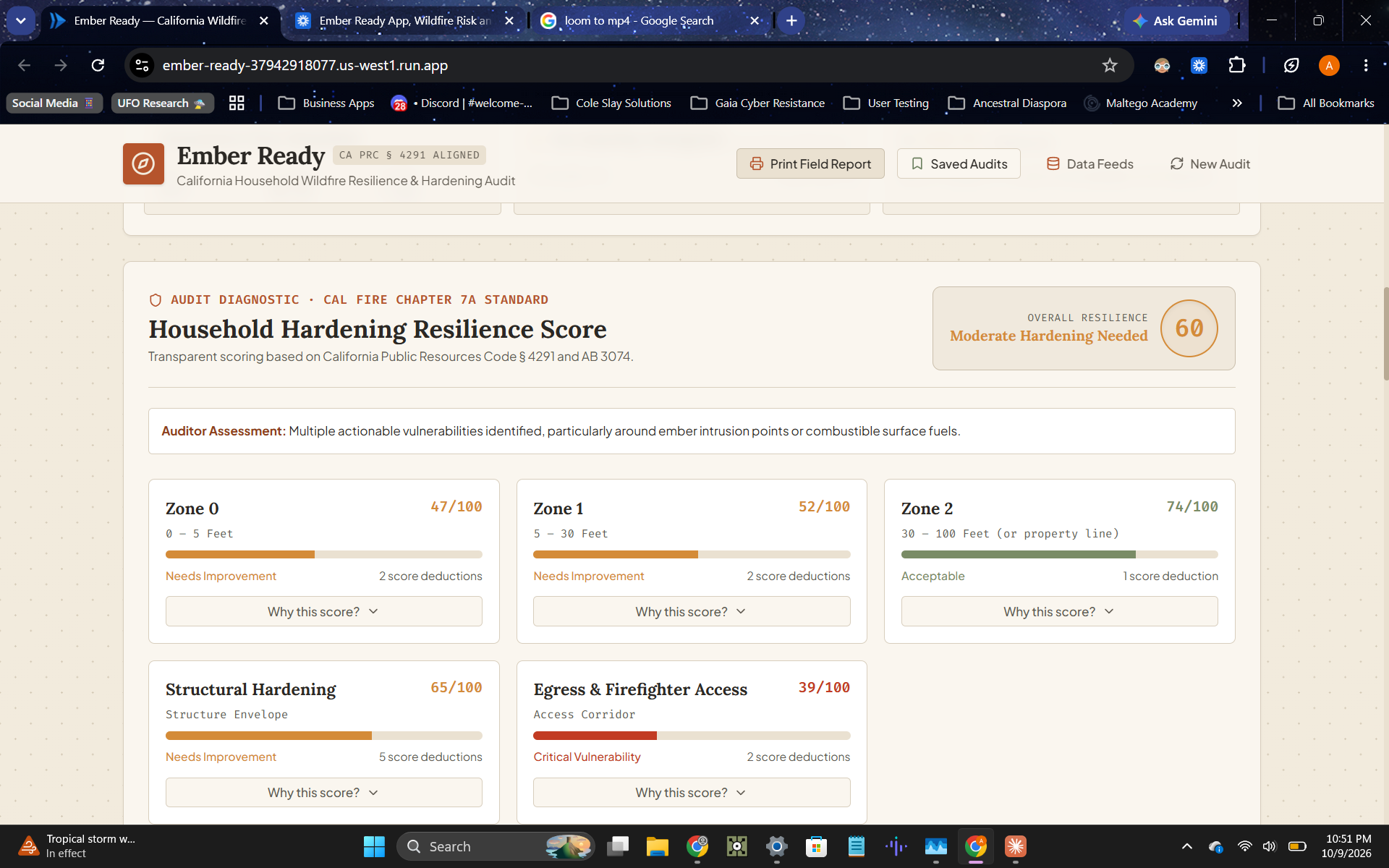
Ember Ready takes a California address and builds a personalized wildfire resilience audit around it. It pulls the parcel’s official CAL FIRE Fire Hazard Severity Zone classification and FEMA National Risk Index percentile, then layers live conditions on top: nearby active fire detections from NASA FIRMS, current NWS Red Flag Warning status, and real-time air quality. The homeowner then completes a structured quiz, built directly from CAL FIRE’s defensible space and home-hardening standard, covering ground material, vegetation clearance, roof and vent construction, and egress access. Every answer feeds a transparent, zone-by-zone resilience score, with an expandable breakdown showing exactly which factors lowered the score and which legal code section backs each one. The output is a prioritized, cost-ranked action checklist, real resource links for the homeowner’s specific county, and a print-ready field report formatted for an actual go-bag.
How we built it
I built Ember Ready in Google AI Studio, using its full-stack app capability to wire a real backend to real data, not placeholders. The hazard data layer calls CAL FIRE’s official FHSZ feature service, FEMA’s National Risk Index, NASA FIRMS, the National Weather Service API, and AirNow directly. The scoring engine was built from CAL FIRE’s own published home-hardening criteria rather than an invented rubric, so every point deduction traces back to an actual statute or building code section. The design system, a warm, topographic field-guide aesthetic in terracotta and sage rather than alarming red, was a deliberate choice: calm, legible design is an actual risk-communication finding, not just a style preference, and a tool meant to be read under stress shouldn’t visually panic the person using it.
Challenges we ran into
The hardest bug wasn’t a crash, it was a quietly wrong answer. Early on, every San Diego County address was returning “Very High Fire Hazard Severity Zone,” which didn’t match what I knew about the area. Digging in, I found the app was hitting an invalid API endpoint, failing silently, and falling back to a hardcoded “Very High” default for the entire county. The real CAL FIRE data for an address with no designated hazard zone returns an empty result, and the app had been treating “empty” as “failure” instead of as its own valid state: no designation at all, which is itself a real Local Responsibility Area classification under Government Code § 51178. That’s a dangerous kind of bug for a tool whose entire credibility rests on accurate data, and catching it before judging mattered more than almost anything else I fixed. I also had to rebuild the print output from scratch after discovering it was printing the entire app shell, navigation and all, instead of a clean report, and had to go back and add real per-factor reasoning to the score breakdowns after realizing the UI was rendering empty panels with nothing bound to them.
Accomplishments that we're proud of
I’m proud that nothing in this app is synthetic. Every hazard tier, every live fire detection, every air quality number traces back to an actual government data source, which is a harder path than seeding placeholder data, but it’s the only version of this tool that’s actually trustworthy. I’m also proud of catching the false “Very High” bug through real address testing rather than shipping it, that’s the difference between a demo that looks impressive and a tool that tells people the truth about their own risk. And I’m proud the scoring system is fully transparent: a homeowner doesn’t just get a number, they get the exact reasoning and legal citation behind every point lost.
What we learned
The biggest lesson was that “real data” isn’t just a sourcing decision, it’s a testing discipline. Synthetic data can’t surprise you, but real data can and will, and the only way to catch a silent fallback bug like the false Very High result is to actually test against addresses you know something about and notice when the output doesn’t match reality. I also learned that transparency is a feature in its own right: adding the “why this score” reasoning didn’t just fix a bug, it made the tool meaningfully more trustworthy and more useful, since a homeowner who understands why they lost points is far more likely to act on the fix than one who’s just handed an unexplained number.
What's next for Ember Ready
Next we will expand to all 50 states & will integrate Google Vision so users can upload a photo of their set up and conduct the same audit.
Built With
- ai-studio
- cal-fire-api
- epa-airnow-api
- fema-api
- nasa-firms-api
- national-weather-service-api
- tsx
- typescript

Log in or sign up for Devpost to join the conversation.