Inspiration
Journaling is one of the most effective tools for mental health. Therapists recommend it, research backs it, and yet most people abandon it within weeks. The reason is straightforward: you open an app, or notebook, type into a blank page, close it, and nothing happens. There is no feedback, no reward, no reason to come back tomorrow. I wanted to fix that specific problem. Not by adding streaks or badges, but by making the act of reflection itself produce something meaningful — a living visual environment that responds to what you write.
What it does
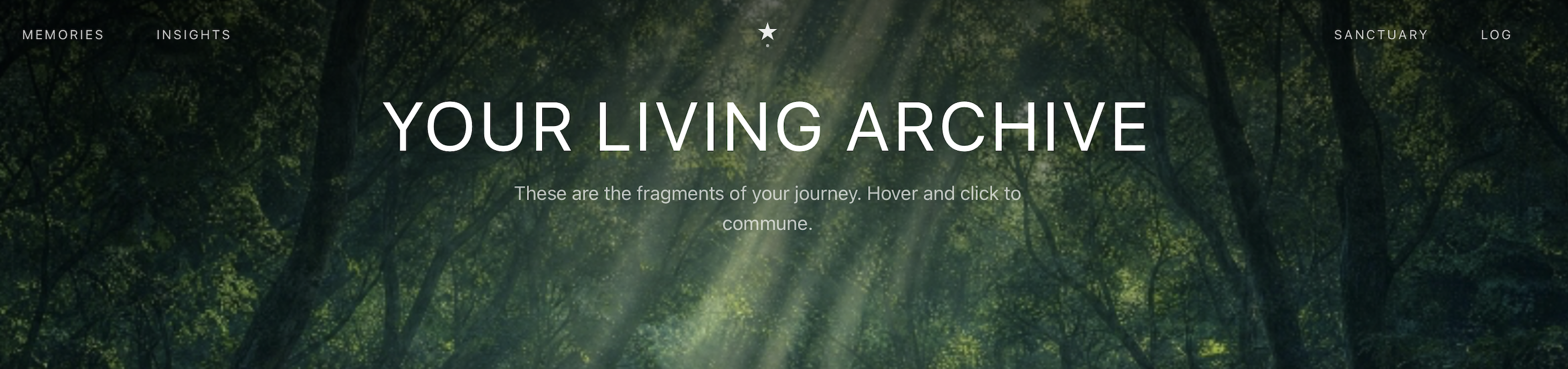
Every time you log an entry, Ember's AI reads the emotional weight of your words and uses it to shape a visual world. Your entries become arranged along a sweeping arc, each one colored by the AI — warm ambers for lighter days, deep violets for heavier ones. As your archive grows, your world grows with it.
The key difference from other journaling apps is the feedback loop. You don't write into a void. You write, and you immediately see your world change. Over time, scrolling through your archive becomes a powerful experience: you can literally see that heavy periods end, that lighter days follow dark ones. Your own emotional history becomes visual proof that things shift.
Ember also features:
- A dedicated logging space: A full-screen, distraction-free environment for writing. No cluttered dashboards, no sidebar widgets.
- Emotional Topography: A dedicated insights page showing the balance between your positive and negative entries over time.
- The Deep Void: The most emotionally intense entry in your archive is surfaced at the deepest scroll point, giving you a moment to revisit and process your most significant experience.
How I built it
- Frontend: Next.js and Tailwind CSS. The entire parallax world runs on optimized
requestAnimationFrameloops and custom interpolation math — no WebGL, no game engines, just precise DOM manipulation. - AI: Alibaba's Qwen API for natural language processing. Each journal entry is analyzed for emotional intensity (scored 1–10) and classified into a positive or negative zone. These values directly drive the color, positioning, and visual weight of every element in the world.
- Safety: The AI is strictly analytical. It scores sentiment to generate visuals — it does not reply with advice, does not engage in therapeutic dialogue, and does not attempt to act as a counselor. This is a deliberate design decision to avoid the well-documented risks of unsupervised AI mental health guidance.
Challenges I ran into
- Making the feedback feel earned, not gimmicky: The visual response to a journal entry had to feel meaningful, not like a toy. Early prototypes changed colors too dramatically per entry — a single slightly negative log would turn the entire arc deep purple, which felt punishing. I ended up implementing a weighted intensity scale where the AI's 1–10 score maps to a constrained HSL range, so the visual shifts are subtle enough to feel honest but visible enough to feel rewarding.
- Performance: The parallax environment spans 700vh and renders every memory card on a mathematical arc using trigonometric positioning (
Math.sin/Math.cosagainst a virtual radius). Running this inside arequestAnimationFrameloop alongside mouse-trackinglerpinterpolation without dropping below 60fps required eliminating all React re-renders from the animation path and storing all mutable state in a singleuseRef.
Accomplishments that I'm proud of
- A hypothesis worth testing. I believe the visual feedback loop could meaningfully improve journaling retention — not because I have data to prove it yet, but because the mechanic is fundamentally different from other products in the space. Streaks and badges exploit guilt. Ember rewards the act of reflection itself. Whether that hypothesis holds at scale is the next question to answer.
- Responsible AI in a sensitive space. Ember uses AI purely for visual generation. No chatbot therapy, no unsupervised advice, no risk of harmful AI-generated guidance.
What I learned
- That building for mental health requires extreme design restraint. Every visual decision carries emotional weight — a color that's too dark can feel punishing, an animation that's too playful can feel dismissive. The hardest engineering wasn't the parallax math; it was calibrating the emotional tone of the output.
- Data privacy as a design priority. Because mental health data is highly sensitive, i learned how to design the architecture so that data is processed client-side and mapped immediately to visuals, rather than being stored on an unencrypted, vulnerable backend database.
What's next for EMBER
Two priorities. First, I want to run a small-scale A/B test comparing Ember's retention rates against a traditional text-only journal app over 30 days to validate the visual feedback hypothesis with real data. Second, I want to add an optional "check-in" prompt system — where Ember gently surfaces a past entry at a relevant moment (e.g., "You wrote something similar three weeks ago. Want to revisit it?"), turning the archive from a passive gallery into an active tool for recognizing emotional patterns.


Log in or sign up for Devpost to join the conversation.