What it does Energize 2026 is an AI-powered Smart Energy web platform that helps households monitor, predict, and reduce their electricity consumption — all from the browser, with zero setup. It has five integrated modules:
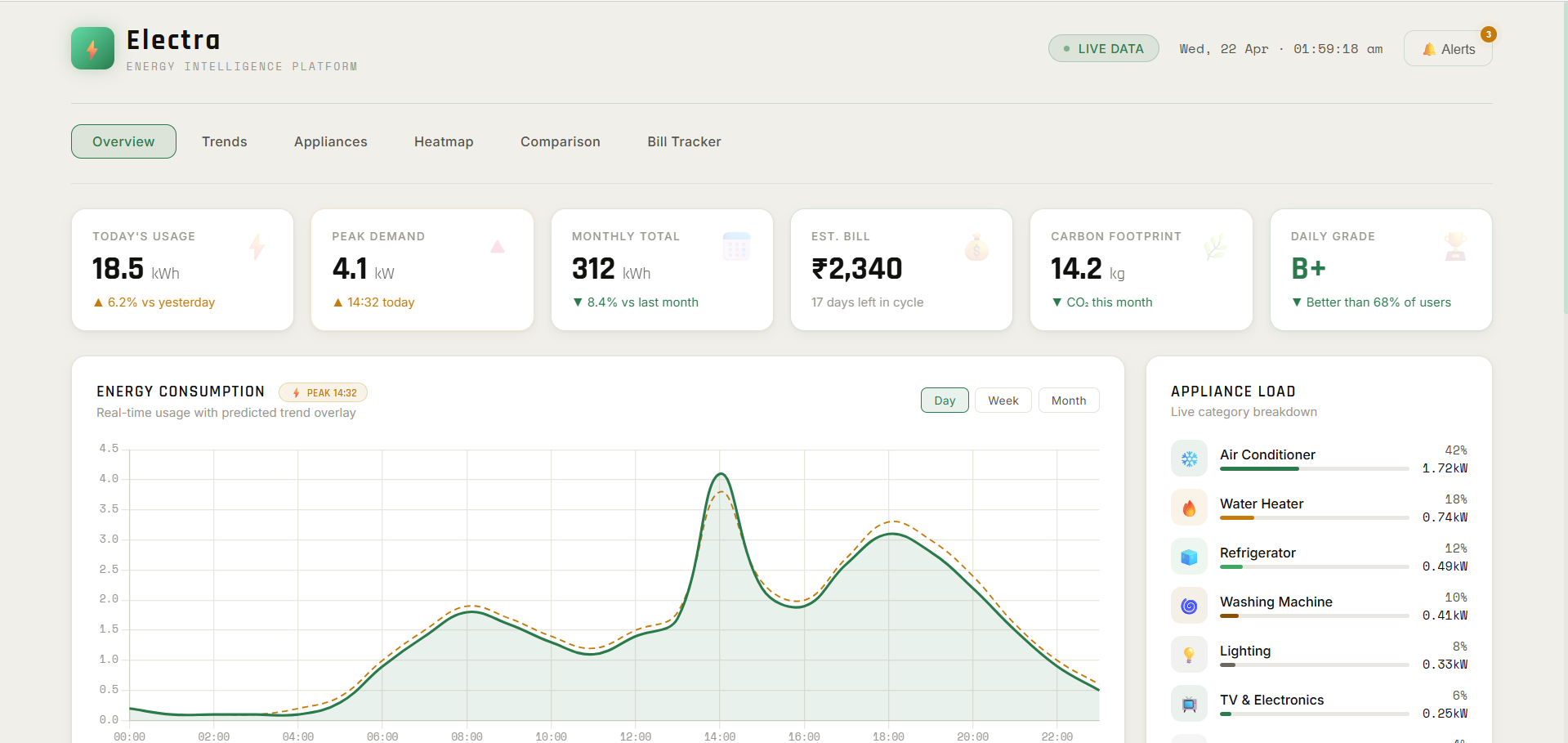
Dashboard — visualises daily, weekly, and monthly consumption trends alongside an AI forecast, a 24-hour peak heatmap, and appliance-category breakdown AI Prediction — forecasts the next 7 days of energy usage using historical patterns and weather data, with confidence intervals and hourly resolution for tomorrow What-if Simulator — lets users drag appliance start times across the day and instantly see how the load curve, peak demand, and rupee cost change in real time Recommendations — surfaces six personalised, AI-generated energy-saving actions ranked by monthly savings potential, filterable by type Carbon Footprint Tracker — converts kWh into CO₂ equivalent using the Tamil Nadu grid emission factor, tracks progress against a personal target, and suggests green habits
How we built it The entire platform runs as a single-page web app with no framework, no backend, and no build tools — just HTML, CSS, and vanilla JavaScript.
Chart.js powers all interactive visualisations — line charts, bar charts, doughnut charts, and the heatmap Simulated data engine generates realistic consumption patterns with seasonal variance, weather correlation, and peak-hour skew TNEB two-tier tariff logic (₹6.2/unit peak, ₹3.8/unit off-peak) is baked directly into the simulator's cost calculations Tamil Nadu grid emission factor (0.82 kg CO₂/kWh) drives the carbon module Google Fonts (DM Sans + DM Mono) and a custom CSS design system give it a clean, professional finish with zero UI libraries
Challenges we ran into
Real-time simulator performance — recalculating load curves, tariff costs, and peak reduction on every single slider movement required careful optimisation to stay smooth Simulating credible AI predictions — generating confidence intervals and weather-correlated forecasts without a real ML backend, while still feeling realistic and explainable to judges Information overload — energy dashboards can drown users in numbers; the hardest design challenge was deciding what not to show, and distilling everything into one actionable insight per screen Tariff accuracy — mapping TNEB slab rates correctly across 24-hour periods required careful research to make the cost savings meaningful and realistic
Accomplishments that we're proud of
Built a fully functional five-page web app in a single hackathon window with no external backend The What-if Simulator gives instant, rupee-accurate feedback — users can see exactly how shifting their washing machine to 11pm saves ₹60/month, which makes the recommendation tangible rather than abstract The carbon tracker animates from zero on load, making the environmental impact feel visceral rather than academic Clean, professional UI that looks production-ready — not a hackathon prototype Every recommendation ties a behaviour change to a specific monthly saving in rupees, making the advice genuinely actionable
What we learned
Narrative beats data — users don't want thirty numbers on a screen; they want one clear answer to "what should I do differently tomorrow?" Every feature was filtered through that question Simulated data, when modelled thoughtfully, is a perfectly valid substitute for live sensor data in a proof-of-concept — and judges respond to realism, not just functionality The What-if Simulator was the feature that took the most iteration but generated the most excitement — interactive tools that give instant feedback are far more compelling than static charts CSS custom properties and a consistent design token system saved enormous time and kept the UI cohesive across five very different pages
What's next for Electra
Real smart meter integration via TNEB's API or Modbus/RS-485 adapters for live data ingestion True LSTM model trained on publicly available Indian household energy datasets (IEAPD, ECBC benchmarks), served via a lightweight Python FastAPI backend WhatsApp / SMS alerts when predicted next-day usage exceeds a user-set threshold Multi-home support — a landlord or property manager view aggregating multiple meters on one dashboard Renewable overlay — add rooftop solar generation data to show net consumption and grid export in real time Mobile app (React Native) wrapping the same core logic for on-the-go monitoring


Log in or sign up for Devpost to join the conversation.