-
application logo
-
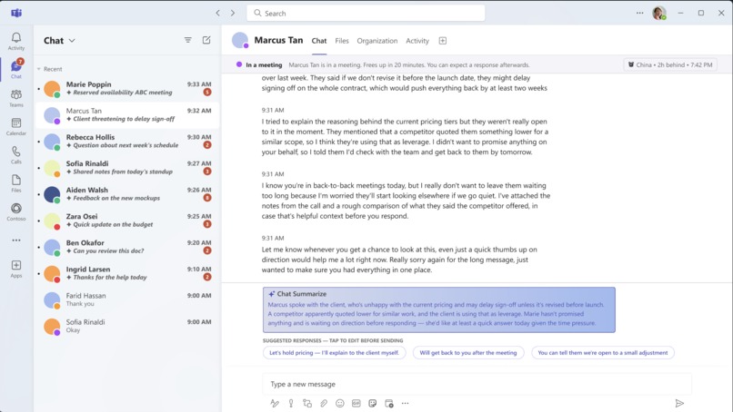
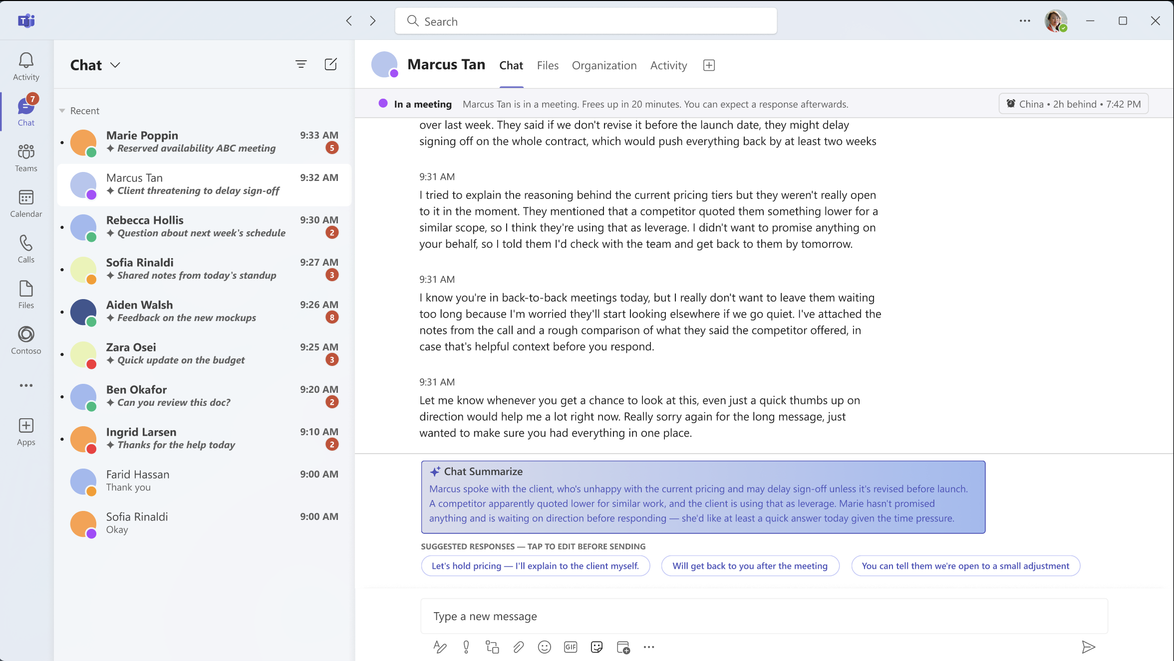
chatbox preview
-
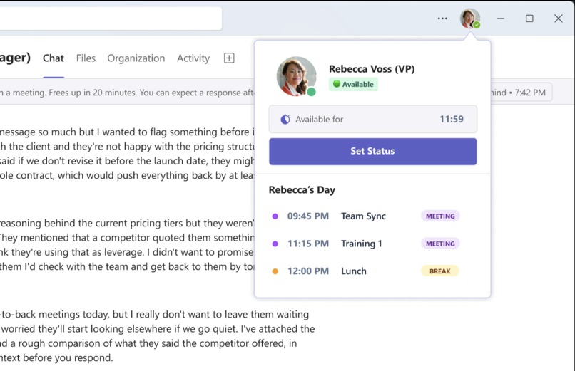
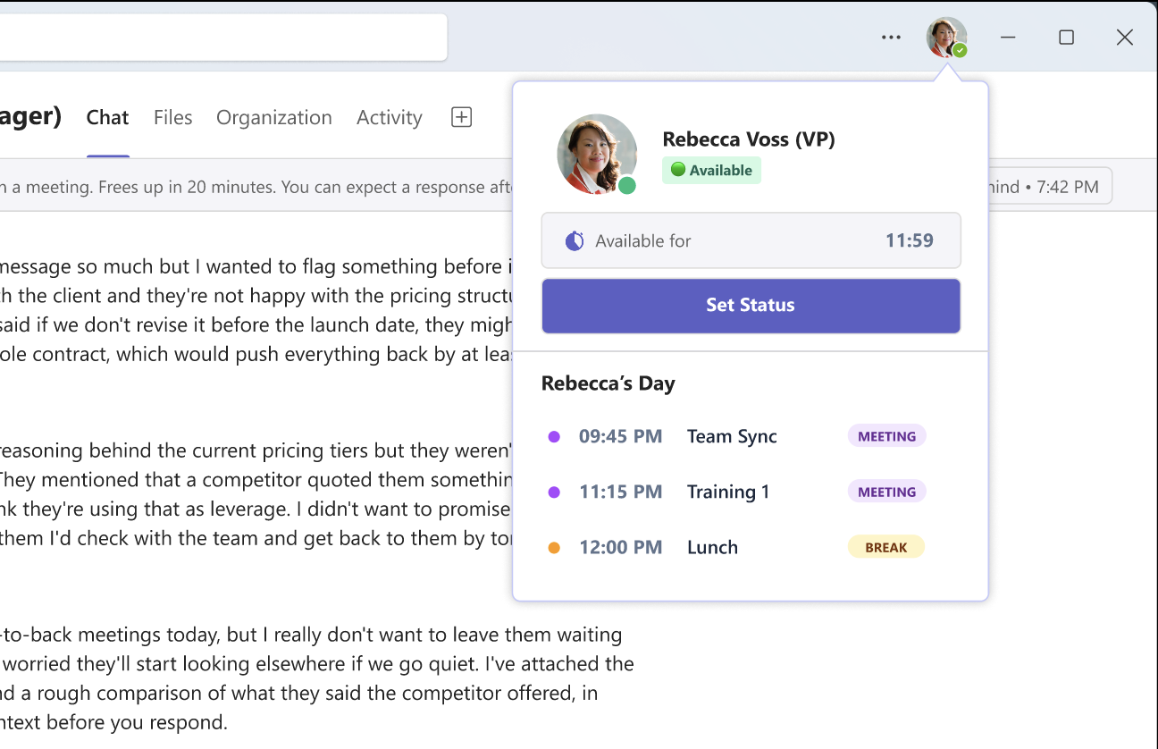
personal status update
Inspiration
We kept coming back to the same unwritten rule: if someone doesn't reply, it means something. In reality, it usually just means they're in a meeting, driving, or having a packed day — but the silence gets filled with worry anyway. At work, this shows up constantly: a message sent to a manager sits on "read" for hours, or an inbox fills up faster than anyone can realistically read it in order. We wanted to design something that removes the guesswork from waiting, without asking people to change how they already communicate, no new platform to learn, just a little more context layered into the tools people already use, like Microsoft Teams.
What it does
Eko adds two things to an existing chat experience: context for the sender, and speed for the receiver.
On the sender's side, Eko shows a live status next to whoever you're messaging, "in a meeting, frees up in 20 minutes", so silence has a reason attached to it before you've even sent anything. A status card shows their current availability, their day at a glance, and even their local time if they're in a different timezone, so waiting for a reply feels informed instead of uncertain. If someone's about to send a message during the other person's likely-sleep hours, Eko gently asks first — a small nudge, not a block, designed to build awareness without dictating behaviour.
On the receiver's side, Eko compresses a crowded inbox into one-line, AI-generated summaries, like email subject lines, so a person returning from back-to-back meetings can scan ten conversations instead of opening ten. For longer messages, a Chat Summarize button condenses a wall of text into a few sentences, paired with AI-suggested quick replies so responding takes one tap instead of a paragraph. Crucially, Eko never tells anyone what's "urgent." What counts as urgent depends entirely on personal context that no algorithm can fully know, so Eko summarizes, but the human still decides what matters.
How we built it
We prototyped the full experience in Figma, the Chat Summarize panel expanding, the status card appearing, a drag-based duration slider for setting how long a status lasts. We designed around an existing platform (Microsoft Teams) rather than proposing a new app, treating our screens as an extension of a tool people already trust, not a replacement for it.
Challenges we ran into
Our biggest challenge was identifying features that were most important and features we can hold off on designing now. We had came up with a lot of supporting ideas yet we were still quite confused on what our primary idea should be. This created a divergent of what to do, this made our idea complicated and unstructured and most importantly, it had no clear sense of what it truly was. We had over complicated ourselves and made this idea less realistic with every new idea that we made, without actually fixing the holes we saw in the ideas
Accomplishments that we're proud of
We're proud that Eko's core mechanic works for more than one relationship, the same design serves a manager and employee, two coworkers, or even a freelancer and a client, without needing separate versions. We're also proud of how the two-sided flow forces a genuinely different design each time: the sender needs context, the receiver needs speed, and Eko never solves one at the expense of the other. Deliberately keeping the AI as a compressor rather than a judge, no priority tags, no urgency scoring, became one of our strongest design decisions, and one we hadn't fully seen articulated elsewhere.
What we learned
We learned that most of the anxiety around unanswered messages isn't really about the message itself, it's about the absence of any signal at all. Even a small, low-effort piece of context (a status, a countdown, a one-line summary) is often enough to defuse the assumption that silence means something negative. We also learned that designing for "less pressure" requires actively removing features as much as adding them: we cut real-time notifications to receivers, exact urgency scoring, and full calendar access specifically because each one would have quietly reintroduced the pressure we were trying to design away.
What's next for Eko – Team 16
Next, we'd want to test Eko with real workplace teams to see whether the status card and AI summaries genuinely reduce time spent triaging messages. Longer term, we see Eko less as a standalone app and more as a layer that could plug into tools teams already rely on, such as Teams, Slack, and other messaging apps, so the benefit shows up inside existing workflows rather than asking anyone to adopt something new. We'd also like to explore more engaging, interactive elements, like streaks or small rewards for maintaining thoughtful communication habits, to make mindful messaging feel less like a chore and more like something worth sticking with.
Built With
- canva
- figma


Log in or sign up for Devpost to join the conversation.