-
-

1. Visualizing positive and negative correlation showed groups of land cover types and correlation with nitrogen.
-

2. A boxplot of the nitrogen levels broken down by month across all locations shows seasonal change.
-

3. The average nitrogen by station, broken out by month.
-

4. Average nitrogen by station.
-

5. A comparison of hydrological unit code (HUC) sizes. HUC-8 is the largest, followed by HUC-10, with HUC-12 being the smallest.
-

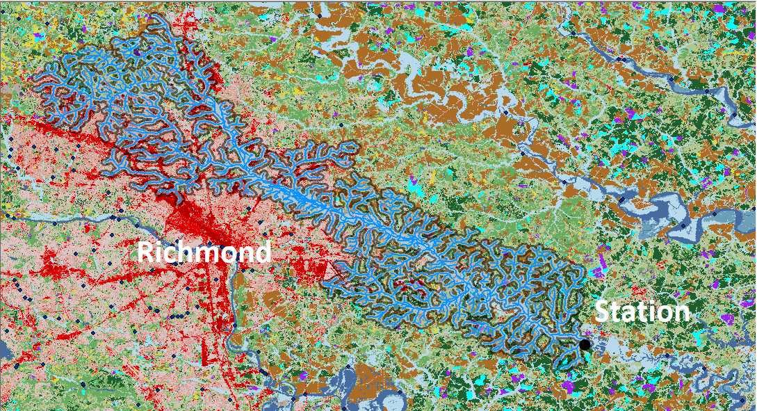
6. Waterways upstream of sampling stations were selected from the NHD and used to identify which watersheds influenced water samples.
-

7. Table of R2 values for the models built on land cover extractions and basic data.
-

8. Table of R2 values for the models comparing different land cover extractions.
-

9. Feature importance graph for the gradient boosting regression model that used upstream land cover as input features.
-

10. The interface allows users to explore how land cover changes would affect nitrogen readings at the station nearest the provided zip code
-

11. Extracting land cover within the buffer zone around rivers may better predict nitrogen levels.
-

12. A gaussian time series model captures seasonal variation.
-

13. Code was written to display heatmaps showing concentrations of land cover types.


Inspiration
We wanted to put our combined skill set to use for an environmentally important goal. Since we all live in and enjoy the Chesapeake Bay watershed, this hackathon had particular meaning for us. Given our background in machine learning, statistics, and GIS, we thought we would try the Challenge 3, the machine learning option. It was important to us that the output could go beyond simply being a model to being a tool for scientific communication with our community. That is why we built an online interface for users to see how the actions within the watershed may affect pollution and improve water quality.
What it does
Our online interface allows a user to predict nitrogen pollution while experimenting with the basic land cover parameters of forest, farmland, and development. The interface runs on a predictive model which uses gradient boosting regression. We trained this model on the land cover contained in the upstream area of sampling stations. In addition to the interface and model, our github submission provides the percent coverage of each land cover type in the HUC12 watersheds encompassing all the upstream waterways for a given station.
How we built it
We iteratively created a workflow to prepare public data for analysis, created and trained a machine learning model to predict nitrogen pollution at sampling sites based on land cover inputs, and then built an online interface for public interaction.
We focused on nitrogen pollution because it is one of the main drivers of ecological impairment in the Chesapeake Bay. Nitrogen pollution is also well predicted by land cover, for which there is a recent USGS provided dataset on which we can build a model. There are also well known and established mitigation measures for nitrogen pollution, such as stream buffers and wetland catchments, which are easy for the public to understand and begin to implement to improve water quality.
To explore relationships between nitrogen and different land covers, we made a heatmap of the pearson correlation to examine the strength of relationship between different land use types as well as between land use types and nitrogen (Fig. 1). The larger squares along the diagonal indicate groups of similar land use types, such as development and forest. We also see that pasture and cropland are positively correlated with nitrogen and that some of the non-agrarian vegetation is negatively correlated with nitrogen levels. This finding supported our decision to use land cover as the main predictor of nitrogen, and to use forest, development, and pasture in our simplified user interface.
Additionally in our data exploration, we found a seasonal effect on nitrogen levels, with lower levels in the summer (Fig. 2-4). We also noticed a bias in that more samples, particularly in the bay itself, were taken in the summer. We began to explore this in our time series analysis using Gaussian models (Fig 12).
To prepare input data for the models, we extracted land cover within watersheds. We used the public National Land Cover Dataset (NLCD) 2016 Science product created by USGS, which provides land cover data at a 30 meter resolution. We used the USGS watershed basin boundaries (which are named using hydrologic unit codes, called HUCs) as boundaries to distinguish which land cover drained into which waterways. The number of pixels of each land cover type and their percentage of area within the HUC boundary were compared to the water quality sampling data taken at stations within those boundaries. We applied various statistical correlation tests and then input this data into a machine learning model using gradient boosting regression. We tested HUC sizes 8, 10, and 12, with 8 being largest regions and 12 being the smallest (Fig. 5).
At first, even using the smallest land cover grouping, the HUC 12 level of boundary, we did not find as strong a relationship between land cover and station sampling data as we expected given the causal relationship recorded in peer-reviewed literature. We considered this may be because the water station samples were influenced by upstream water basins that we had not included.
To address this concern, we additionally extracted land cover in HUCs upstream of each sampling station. This was done by using the National Hydrography Dataset to create an iterative tool to identify which waterways flowed downstream to each sampling station. We used the selected set of streams (for example, in Fig. 6) for each sampling station to identify which HUCs drained into these upstream waterways on their way to the sampling station. We then used the grouped upstream HUCS to examine the land cover type amounts and percentages for the waterways flowing into the sampling stations. The upstream input land cover was then modeled and compared to the three previous inputs that used land cover from single HUCs of different size.
Results are shown in Fig. 7-8. Basic data inputs such as latitude, longitude, month, and year were used to benchmark the new models (Fig. 7). Their R2 showed the best fit was achieved when all extractions were considered. However, the second best fit was achieved using only upstream tracing.
We then compared land cover inputs alone (Fig 8). The R2 values showed the upstream HUC data was most predictive of nitrogen pollution, as suggested by the previous table. In the other three models, the more localized the area, the better the prediction was. This makes sense as the larger HUCs included land cover in the water basin that was relatively distant. However, the smallest HUCs This suggests that upstream land cover was as influential as the land cover immediately surrounding the sampling station and more so than the land included in large HUC areas.
The feature importance graph (Fig 9) indicates that cultivated crops, open water, and wetlands all play an important role in predicting nitrogen levels.
The interface is built using ReactJS and Python. A simple visualization of nitrogen levels over time compares existing land cover from the 2016 NLCD extractions to the user's hypothetical scenario land cover (Fig. 10). These scenarios are then fed to the model (we selected gradient boosting regression model with latitude, longitude, month, year, HUC12, HUC10, HUC8, and upstream HUCs) to project the impact on water quality indicators such as total nitrogen. The current pollution projection can then be compared to hypothetical pollution predictions. A video of the demo is viewable at: link. Upon request, the GUI can be hosted at: http://baywatch.jbarrow.ai .
Challenges we ran into
One challenge was subsetting the land cover upstream from the stations to reflect contributing runoff sources as closely as possible. First, the hydrography data needed to be downloaded in subsets that maintained an intact geometric system, meaning the lines representing streamflow had to be collected logically to indicate directionality. Then we had to learn to manipulate this data using the associated tools. The large number of stations meant this process must be automated. Models were created to batch process our stream selection and to extract land cover for those streams.
Further challenges arose in finding the most appropriate statistical analysis. We needed to measure complex correlations between a large number of land cover types and thousands of samples. This took a great deal of literature review and expertise to select and test appropriate models.
Accomplishments that we are proud of
We are most proud of the combination of GIS, modeling methods, and interface into a usable community-focused tool for data exploration.
What we learned
We learned how the ecological systems of the Chesapeake Bay watershed can be better supported, in particular through the far reaching effects of decisions on human activity and land management. Additionally, we gained understanding of national public geospatial datasets, statistical analysis techniques, and machine learning methods.
What's next for 'Effect of Land Cover on Pollution in Chesapeake Watershed'
Even the smallest watershed units and upstream selection available for this study may be too coarse to capture the influence of the land cover on nitrogen pollution in water samples. We started expanding the study using a similar workflow to land cover within a buffer area of streams rather than the entire watershed units HUC12 area (Fig. 11). Comparing the predictive power of different buffer sizes may support research suggesting that conservation of riverine buffers may have disproportionate benefit and direct conservation efforts. We have also started expanding on the models used to include time series analysis (Fig. 12). This would leverage the seasonality found in the data exploration.
Acknowledgements
We would like to thank Han-Chin Shing and Sharon Cheng for their pandas expertise, data exploration, and model help.


Log in or sign up for Devpost to join the conversation.