Inspiration
The U.S. public education system serves over 50 million students, yet funding disparities between districts can exceed $5,000 per pupil. Rural and high-poverty schools consistently receive fewer resources, leading to lower graduation rates and widening inequality. We were inspired by a simple question: Can AI help identify which schools need the most help - and can it do so transparently and fairly?
Most AI tools in education are black boxes. We wanted to build one that explains its reasoning, audits itself for bias, and empowers policymakers rather than replacing human judgment.
What it does
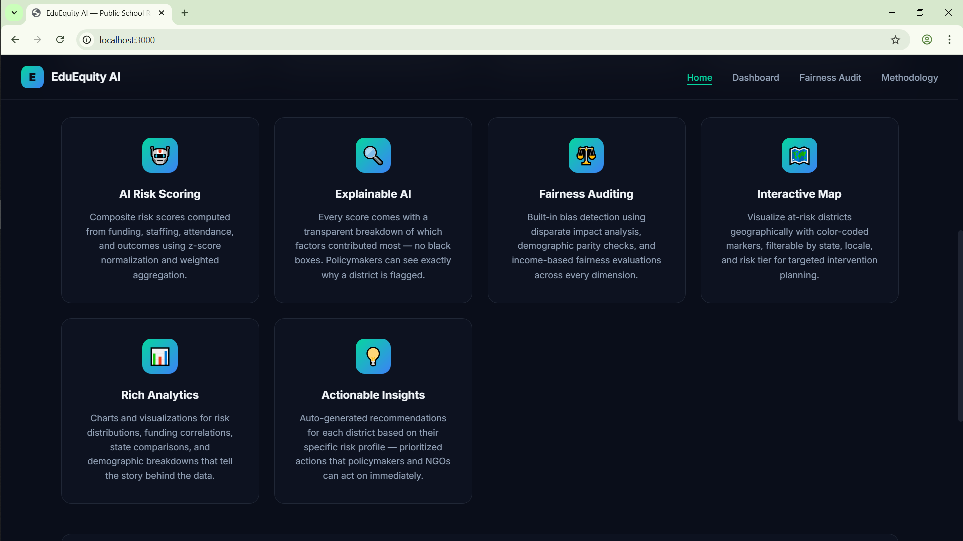
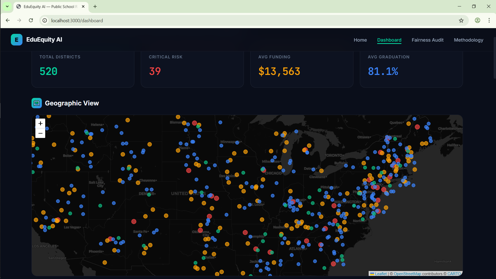
EduEquity AI is a web application that analyzes 520 school districts across 50 states to identify under-supported schools using an AI-driven composite risk score (0–100). Key features:
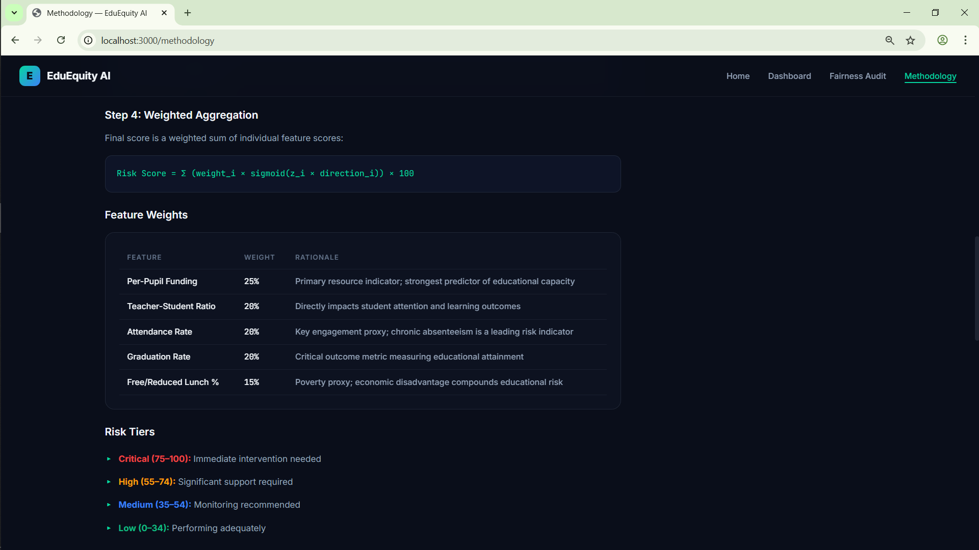
- 🎯 Risk Scoring Engine - Combines funding, staffing ratios, attendance, graduation rates, and poverty levels using z-score normalization and sigmoid mapping
- 🔍 Explainable AI - Every risk score comes with a transparent breakdown showing exactly which factors contributed and by how much
- ⚖️ Fairness Auditing - Runs 6 industry-standard bias checks (Disparate Impact Ratio, Demographic Parity, Equal Opportunity) across race, locale, and income dimensions
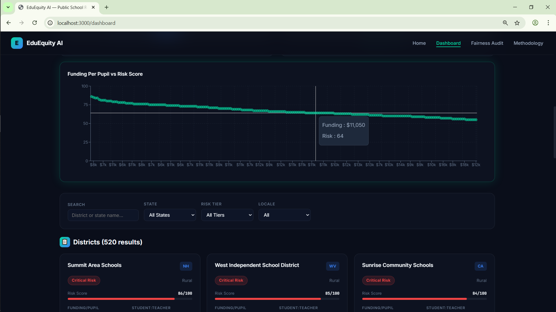
- 🗺️ Interactive Dashboard - Leaflet map with 520 color-coded district markers, Recharts visualizations, filterable district cards with debounced search
- 📋 Clickable Explanation Modals - Every fairness metric is explained in plain language when clicked, making the system accessible to non-technical users
How we built it
| Layer | Technology | Purpose |
|---|---|---|
| Framework | Next.js 14 (App Router) | Server-side rendering, API routes |
| Frontend | React 18, Custom CSS | Dark glassmorphic UI with micro-animations |
| Charts | Recharts 2.12 | Pie, bar, scatter, radar charts |
| Maps | Leaflet + React-Leaflet | Geographic risk visualization |
| Animations | Framer Motion | Smooth page transitions and counters |
| Data | Synthetic dataset (520 districts) | Modeled after NCES Common Core of Data |
The scoring engine uses a 3-step pipeline:
$$\text{Risk Score} = \sigma\left(\sum_{i=1}^{5} w_i \cdot z_i\right) \times 100$$
Where $z_i$ are z-score normalized metrics, $w_i$ are domain-expert weights, and $\sigma$ is a sigmoid function for smooth 0–100 mapping.
The fairness audit implements the 80% Rule (Disparate Impact Ratio must be $\geq 0.8$) and Demographic Parity (max group difference $\leq 10\%$) - both industry-standard thresholds from employment law adapted to education.
Challenges we ran into
Fairness vs. Accuracy tradeoff - Our AI correctly flags rural and high-poverty districts as high-risk (because they genuinely have less funding). This causes the fairness audit to report a Grade D - which initially seemed like a failure. We realized this is actually the system working correctly: it's detecting real structural inequality, not algorithmic bias.
Making AI explainable to non-technical users - Building the scoring engine was straightforward; making its reasoning understandable to policymakers required designing clickable explanation modals, contribution charts, and plain-language callouts.
Map performance with 520 markers - Loading all districts on a Leaflet map while keeping the UI responsive required separating the map data fetch from the paginated list fetch with proper state management.
Dark UI with chart readability - Recharts tooltips default to black text, which was invisible on our dark glassmorphic theme. We had to override
labelStyleanditemStyleacross all chart components.
Accomplishments that we're proud of
- The fairness audit is real, not a checkbox. It runs 6 actual statistical tests and honestly reports a Grade D - because the data reflects real-world inequality. Most projects would either skip fairness or fake a perfect score.
- Every risk score is explainable. Users can see exactly why a district was flagged (e.g., "Funding Per Pupil contributes 25% of the risk score") - no black boxes.
- The UI is production-quality. Dark glassmorphism, smooth animations, responsive design, interactive charts, and working mobile navigation - not a prototype, but a deployable application.
- Clickable explanation modals turn complex fairness metrics into accessible, plain-language explanations that any policymaker can understand.
What we learned
- Trustworthy AI is harder than accurate AI. Building a scoring model took hours; making it transparent, fair, and explainable took days.
- Low fairness scores can be a feature, not a bug. The system's honesty about detecting inequality is more valuable than a fake "100% fair" badge.
- Design matters for trust. A premium UI with clear explanations and transparent methodology makes users trust the system more than raw accuracy numbers ever could.
- Fairness is multi-dimensional. A model can be fair across race but unfair across income - you must audit across multiple dimensions simultaneously.
What's next for EduEquity
- Real NCES data integration - Replace synthetic data with actual Common Core of Data from the National Center for Education Statistics
- Bias mitigation engine - Implement algorithmic debiasing techniques (reweighting, equalized odds) to improve the fairness score while maintaining accuracy
- Temporal analysis - Track how district risk scores change year-over-year to measure policy impact
- Policy recommendation engine - Generate specific, data-driven funding allocation recommendations for state legislatures
- Multi-stakeholder dashboard - Role-based views for superintendents, state officials, and community advocates
- Deployment on Vercel - Make the tool publicly accessible for real-world use by advocacy organizations
Built With
- css
- framer-motion
- javascript
- leaflet.js
- next.js
- react
- recharts


Log in or sign up for Devpost to join the conversation.