Inspiration
We were inspired by a frustrating personal experience one of our own team members spent over 20 minutes trying to open a Scotia iTrade account during the hackathon, and still couldn't deposit money or receive a confirmation email by the end of it. That moment made us realize the problem wasn't motivation or financial literacy it was the door. If we, as finance-interested Gen Z students, nearly gave up during onboarding, what chance does Scotia have with the average 22-year-old first-time investor?
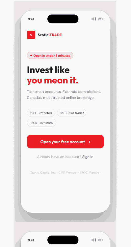
What it does
Our solution redesigns Scotia iTrade's onboarding experience into a mobile-first, beginner-friendly flow that meets Gen Z where they already are. It breaks down the existing single-page onboarding into short guided steps, replaces dense financial jargon with plain language, adds progress indicators so users always know where they are in the process, and ensures confirmation communication at every key step.
How we built it
We built our solution using Figma to prototype the redesigned onboarding flow, and a slide deck to present our research, competitive analysis, and business case. We grounded every design decision in Gen Z user behaviour research and a direct comparison against competitors like Wealthsimple and Questrade.
Accomplishments that we're proud of
We're proud of how clearly we were able to define the problem. It would have been easy to propose a full platform redesign but we stayed focused on onboarding specifically, and built a tight, evidence-backed case for why that single change could meaningfully shift how Gen Z perceives and adopts iTrade. We're also proud of the competitive framing turning a personal frustration into a quantified business problem felt like a real consulting deliverable.
What we learned
We learned that the best product doesn't always win the most accessible one does. Scotia iTrade genuinely has stronger tools and content than Wealthsimple, but that advantage means nothing if users never make it through the front door. We also learned how much friction compounds every confusing step, every missing confirmation, every wall of text isn't just annoying, it's a signal to the user that this platform wasn't built for them.
Built With
- claude
- cursor
- figma
- stitch

Log in or sign up for Devpost to join the conversation.