Inspiration
We noticed a gap between how connected people are digitally and how connected they feel in everyday life. Our research showed that daily in-person interaction has declined, with online communication becoming the norm. We were drawn to the feeling of 2016, when digital spaces felt simpler, brighter, more vulnerable, and closely tied to real human experiences. That inspired us to design a journaling app that treats users with care and authenticity by encouraging reflection, community, and genuine relationships.
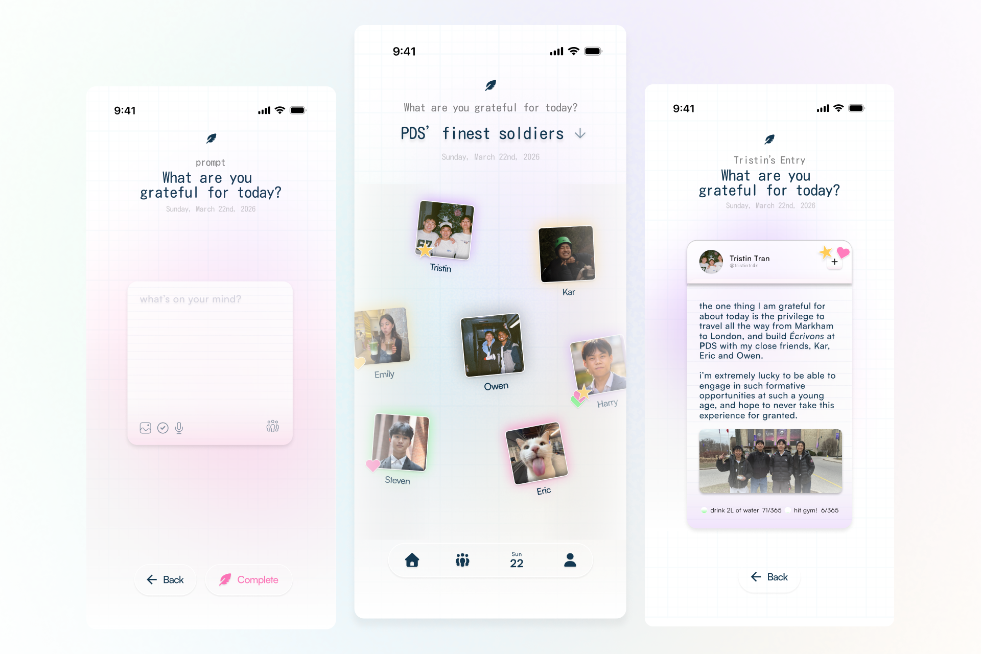
What it does
Écrivons is a collaborative journaling app that helps users reflect on their emotions, document daily thoughts, and stay meaningfully connected with friends. Users respond to simple prompts daily, choose how they feel, and build a record of their emotional patterns over time. Because users can view and respond to each other’s journal entries, this social element allows friends to motivate one another and share in a low-pressure, emotionally safe space. The goal is to make journaling feel approachable, personal, and socially warm.
How we built it
We began with secondary and primary research to understand how people experience connection, reflection, and journaling today. From there, we identified key pain points in existing journaling apps, including cognitive overload, confusing navigation, inconsistent habits, and limited emotional insight. This research informed our user flows, screen structure, and other choices. We then created multiple iterations of the prototype, changing from very bold and bright hues to simpler, inviting ombre. By refining the layout, navigation, and lock screen, the experience felt easier to digest, intuitive, and emotionally inviting.
Challenges we ran into
It was very difficult to translate our ideas to a higher-fidelity page, while considering all the possible user paths. As beginners in UI/UX design, even the fundamentals such as connecting each screen logically, making interactions intuitive, and preserving the emotional tone of the app throughout the full experience, felt challenging.
Accomplishments that we’re proud of
We are proud that our solution directly responds to clear user pain points, inspiring thoughtful design decisions. We are also proud of how our theme of 2016 nostalgia was carried through both the interface and the experience for the user itself, helping the app feel warm, familiar, and human. The branding and intention feel digestible and comprehensible.
What we learned
We learned that strong design comes from understanding real behaviour, emotions, and branding. This project showed us that users also need experiences that feel safe, welcoming, and easy to return to, on top of functional tools. We also learned the value of iteration, since each version helped us make the product clearer and more aligned with our purpose. And above all, we have just begun to grasp the many opportunities and visions that Figma and Framer can help us realize!
What’s next for Écrivons
Next, we would refine features that are more closely personalized to users, such as filtering out old entries, improving long-term reflection tools, and expanding the ways users revisit past emotions and memories. More bullet-journaling characteristics could also be implemented to make the app appear more tactile and provide a more hands-on experience. We would also explore how Écrivons could grow into a stronger community-based platform while keeping user privacy and the core value of authentic connection.
Built With
- figma
- framer

Log in or sign up for Devpost to join the conversation.