-
-
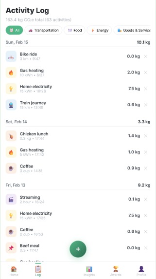
Log
-

Insights
-

Home
-
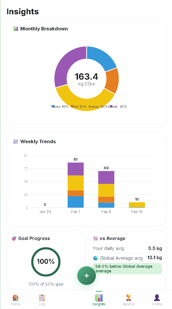
Percentage of carbon emission
-
Deatails
Inspiration Climate change is one of the most pressing challenges of our generation, yet the average person generates approximately ~13 kg of CO₂ daily without any visibility into which activities drive their footprint. We asked ourselves:
"What if everyone could see — in real time — the environmental cost of their daily choices?"
The inspiration for EcoTrace came from a simple observation: people want to live more sustainably, but they don't know where to start. Existing carbon calculators are either too complex (requiring spreadsheets and guesswork) or too vague to be actionable. We wanted to build something that feels as natural as a fitness tracker — but for the planet.
The idea crystallized around the formula:
CO₂e = Σ (Qᵢ × EFᵢ)
where Qᵢ is the quantity of activity i and EFᵢ is its science-backed emission factor. Simple math, but powerful when made personal and visual.
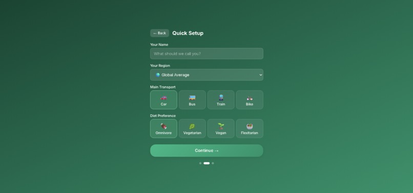
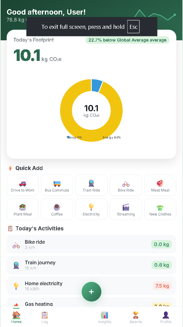
What It Does EcoTrace is a mobile-first web app that turns your daily habits into tangible carbon data. Users can:
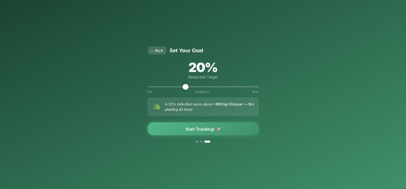
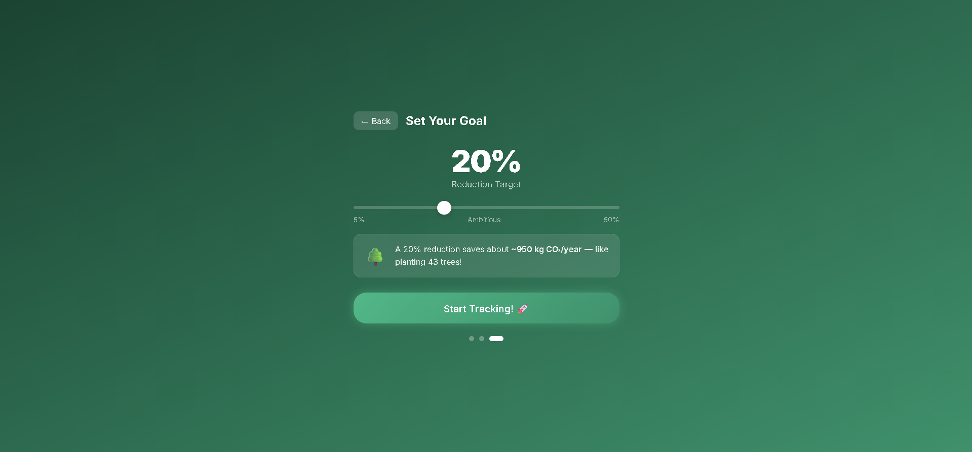
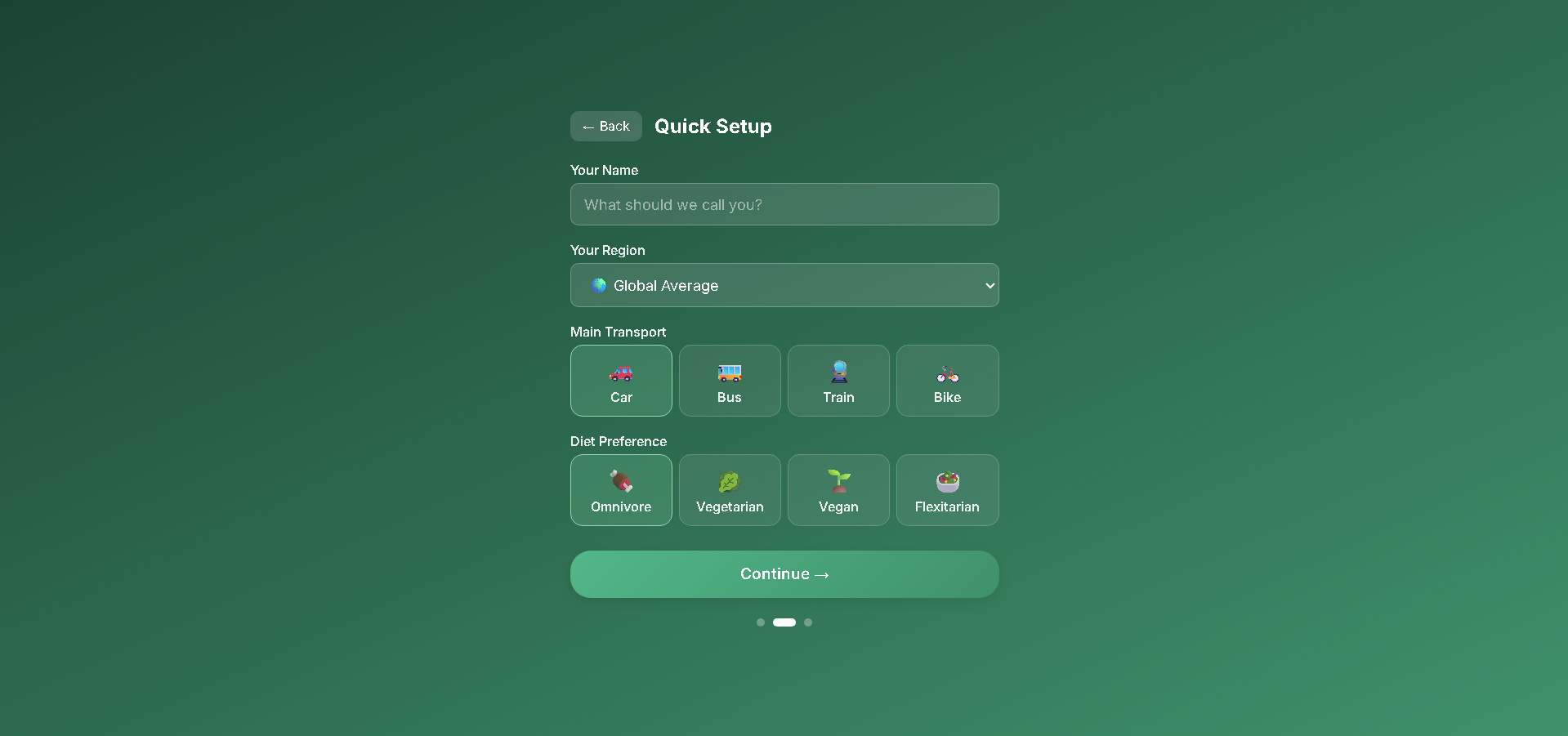
Log activities across 4 categories — Transport, Food, Energy, and Goods — with 50+ activity types See instant CO₂e impact calculated using peer-reviewed emission factors Track trends through animated donut charts, bar charts, and sparklines Get personalized insights — the app identifies your highest-impact habits and suggests alternatives Earn badges and level up — 18 badges, 4 levels, streak tracking, and weekly challenges make sustainability rewarding Compare vs. national averages across 12 countries to see where you stand Set reduction goals and watch your progress ring fill up over time How We Built It We chose a zero-dependency architecture — pure HTML5, CSS3, and vanilla JavaScript (ES6+). No npm, no frameworks, no build step. This was a deliberate design decision for several reasons:
Minimal carbon footprint of the app itself — no 200 MB node_modules folder, no bundler overhead Offline-first — all data lives in localStorage, so it works without internet Instant load times — the entire app is under 100 KB Architecture:
carbon-data.js → Emission factor database (DEFRA 2023, Poore & Nemecek 2018, IEA 2023) calculator.js → CarbonCalculator engine — calculates CO₂e, aggregates, compares, finds reduction opportunities gamification.js → GamificationEngine — badges, levels, streaks, points, weekly challenges insights.js → Pattern recognition and personalized suggestion generator charts.js → Custom Canvas-based chart rendering (donut, bar, sparkline, progress ring) app.js → Main app controller — screen navigation, form handling, UI updates We built all charts using the HTML5 Canvas API — no Chart.js, no D3. This taught us how donut charts, bar charts, and animated progress rings actually work under the hood using trigonometric calculations.
All emission factors are sourced from:
UK DEFRA 2023 — transport, energy, goods Poore & Nemecek (2018, Science) — food lifecycle analysis EPA / IPCC AR6 — global warming potentials IEA 2023 — electricity grid carbon intensities per country Values are in kg CO₂e (carbon dioxide equivalent), accounting for CH₄ and N₂O alongside CO₂.
Challenges We Faced Making It Feel Like an App, Not a Slideshow — Our initial design had screen transitions that felt like flipping through a PowerPoint. We solved this with a single-page architecture using CSS-driven fadeIn animations and a persistent bottom navigation bar — making it feel like a native mobile app. Accurate but Accessible Data — Balancing scientific accuracy with user-friendliness was tough. We solved it by showing the headline number prominently (e.g., "4.2 kg CO₂e") while tucking the source citations and methodology into the data layer. We also added tangible equivalents — "That's like driving 18 km" or "equivalent to planting 43 trees." Gamification Without Greenwashing — We didn't want badges to make people feel good about tracking pollution — they needed to reward reduction. So we designed badges around behavioral goals: Meat-Free Week, Green Commuter, Low-Carbon Weekend. The points system rewards green choices with bonus multipliers. Custom Canvas Charts — Building animated charts from scratch with Canvas 2D was the steepest learning curve. Getting the anti-aliased donut segments, smooth bar transitions, and tiny sparkline charts right took significant iteration. What We Learned Zero-dependency is powerful — it forces you to truly understand every piece of your stack Gamification drives behavior change — even simple streaks and badges create meaningful engagement loops Climate data is messy — emission factors vary by source, region, and methodology. Standardizing them was a research project in itself Mobile-first CSS is an art — designing for 360px screens first and scaling up produces much cleaner layouts than the reverse What's Next IoT integration — connect with smart meters and thermostats for automatic energy logging Social features — group challenges, household tracking, leaderboards Carbon offset marketplace — link reduction goals to verified offset projects PWA with push notifications — daily reminders and achievement alerts ML-based classification — natural language activity entry ("I drove 20 minutes to work")
Built With
- canvas-api
- css3
- defra-2023
- google-fonts
- html5
- iea-2023
- ipcc-ar6
- javascript
- localstorage


Log in or sign up for Devpost to join the conversation.