-
-
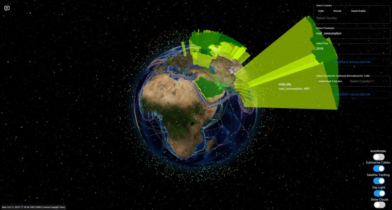
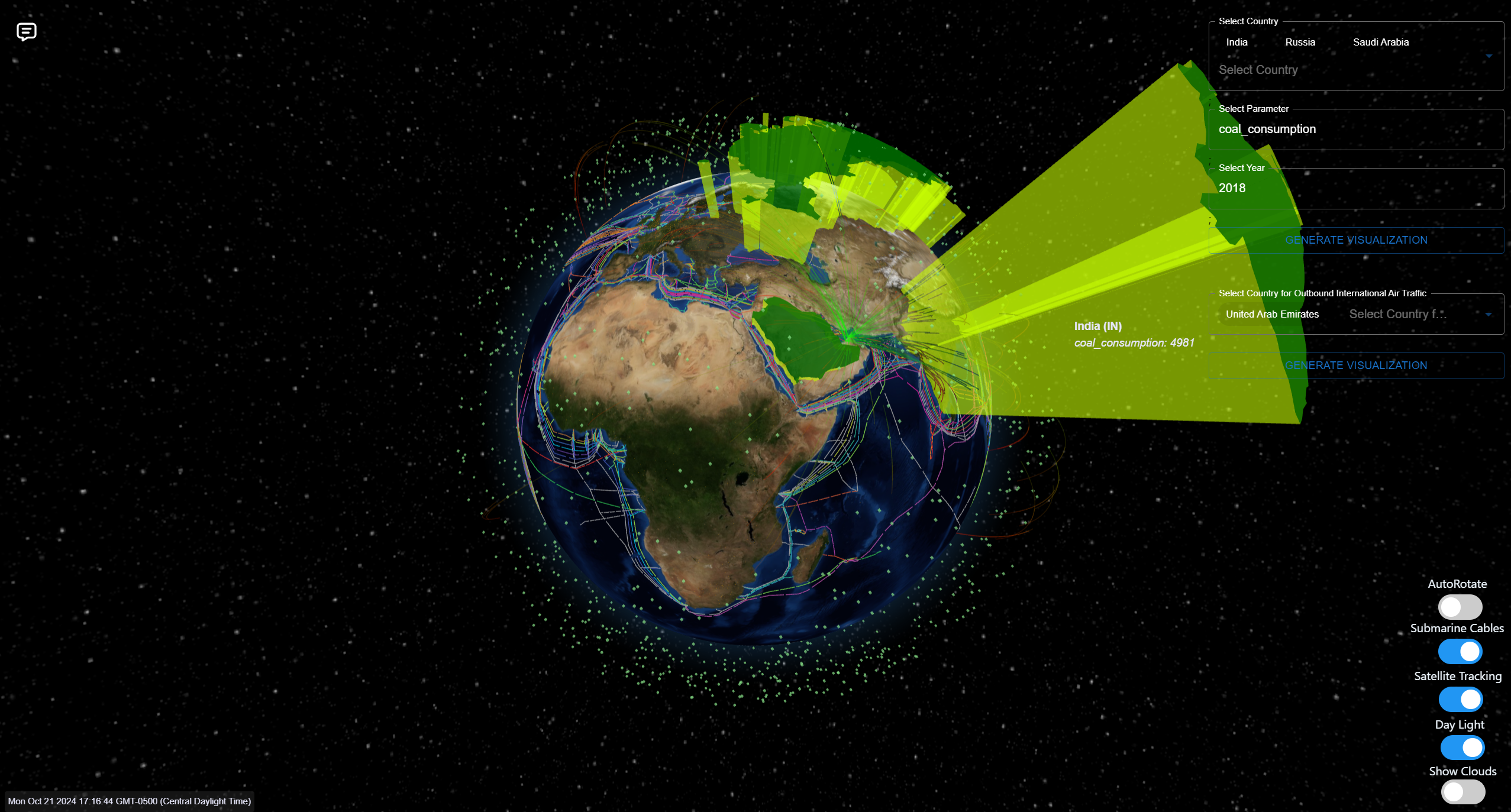
Coal Consumption based 3D Visualization
-
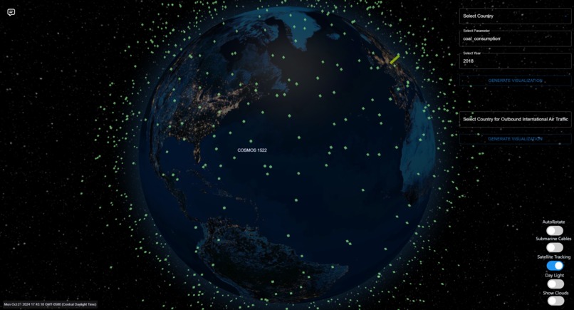
Live Satellite Tracking
-
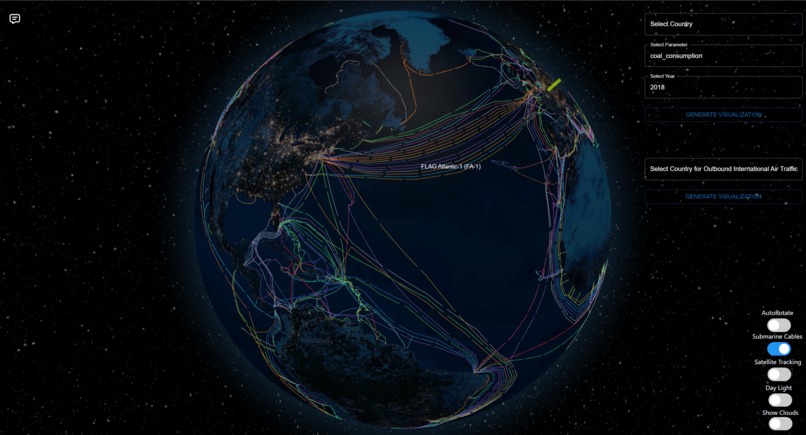
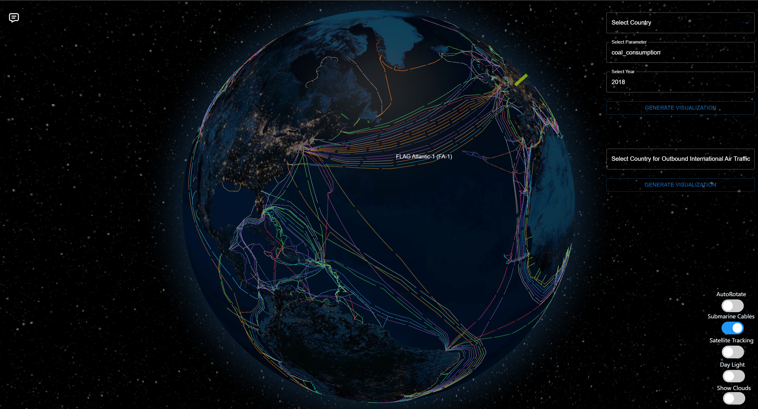
Submarine Cables
-

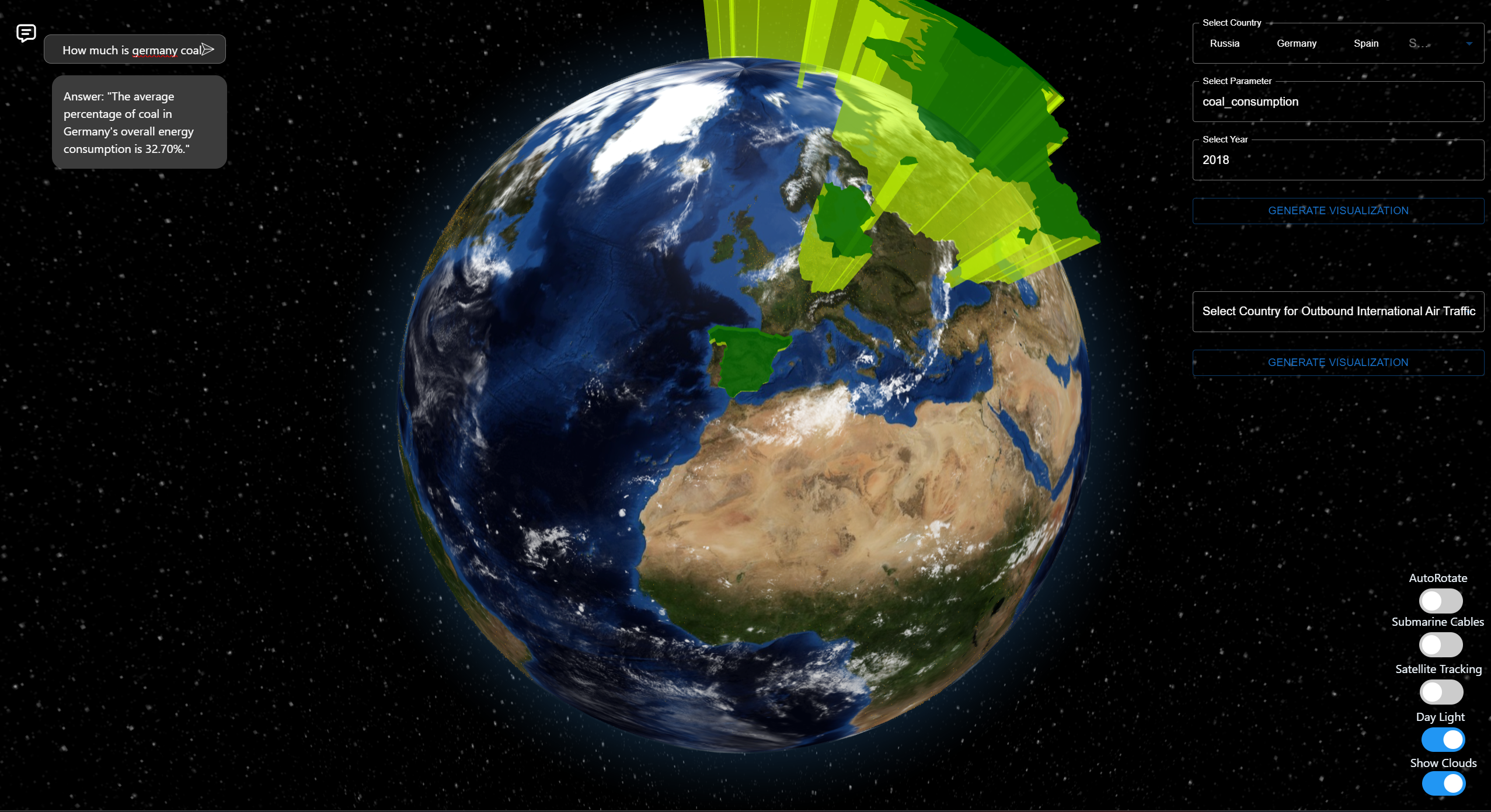
Integrated LLM for NLP processing
-
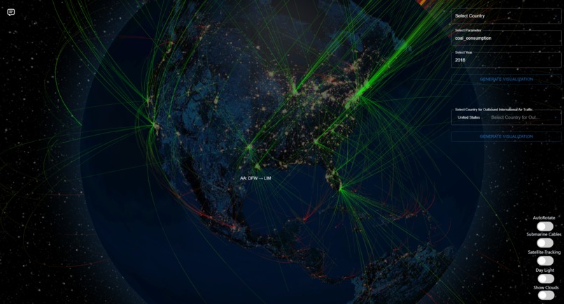
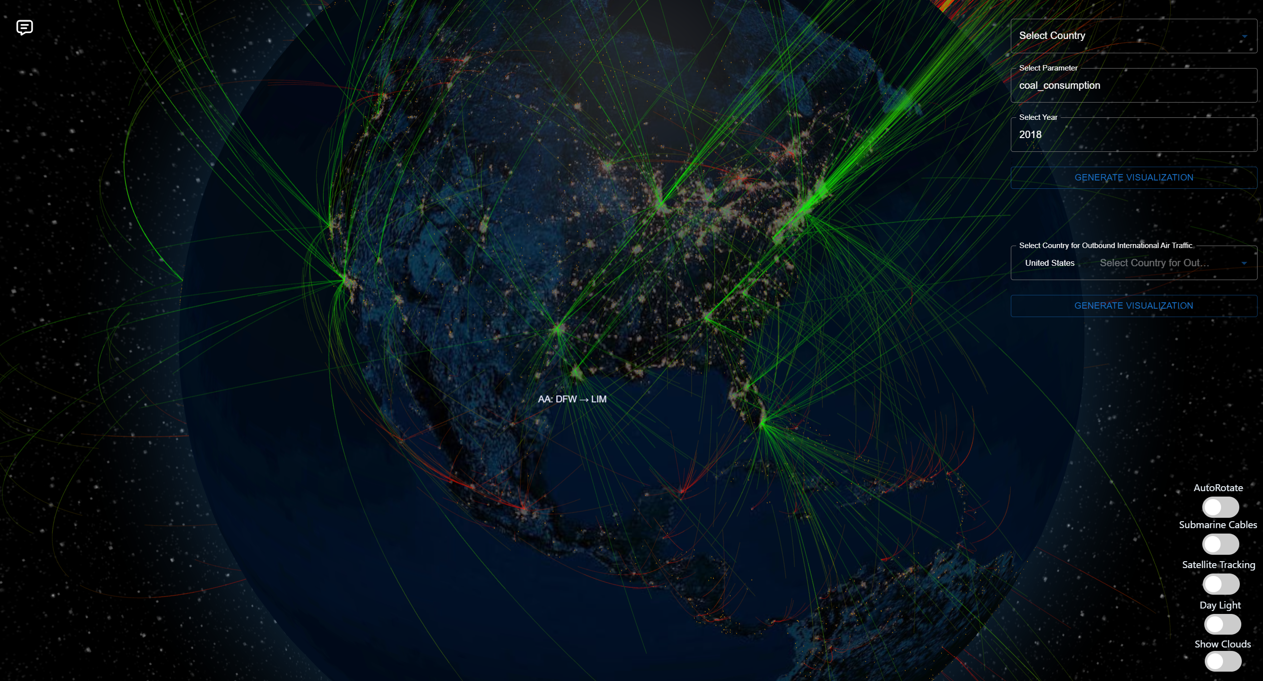
Live International Flights from USA

Inspiration
EcoSphere 360 was born from our commitment to driving social good through accessible environmental data. Our team frequently relied on the OWID climate database for accurate insights, but we envisioned a more dynamic tool to engage users in sustainability efforts. That's why we created EcoSphere 360—a powerful platform that transforms climate data into interactive 3D visualizations, helping users explore key metrics like energy consumption and pollution trends across the globe.
We also wanted to make this data easily understandable, so we integrated AI through a large language model (LLM) to provide tailored insights and analysis. Whether it's tracking pollution levels or understanding biofuel trends, EcoSphere 360 makes it simple for everyone—from individuals to policymakers—to grasp the information they need.
Our project is a step towards inspiring collective action, ensuring that understanding climate data isn't just for experts, but for anyone looking to make a positive impact.
What it does
EcoSphere 360 is an innovative platform designed to visualize and analyze the impact of human activities on the planet. It transforms climate data into immersive 3D visualizations, allowing users to explore global metrics such as energy consumption, pollution trends, and biofuel usage over time.
One of the standout features is its ability to map out submarine cable networks and air traffic routes, offering unique insights into how digital and physical infrastructure influence environmental changes. The platform also incorporates real-time satellite tracking, enabling users to monitor satellite paths and their environmental impacts, adding depth to the understanding of global infrastructure.
EcoSphere 360 leverages AI through a large language model (LLM) to provide tailored insights, making complex climate data easily understandable. Whether you're interested in tracking sustainability metrics or exploring how human infrastructure affects the planet, the platform empowers individuals, researchers, and policymakers with actionable information to drive sustainability efforts and positive change.
How we built it
The development of EcoSphere 360 was an exciting journey that involved a combination of innovative technologies and collaborative efforts from our team. Here’s a breakdown of our approach:
Data Sourcing and Integration: We began by utilizing the OWID climate database, which provided us with accurate and comprehensive environmental data. This foundational dataset allowed us to explore a wide range of sustainability metrics. We also integrated real-time satellite data, submarine cable networks, and air traffic routes to enrich our analysis.
3D Visualization: To create an engaging user experience, we employed Node.js and Three.js for the 3D visualizations. This combination enabled us to build immersive globe graphics that effectively represent complex data. By using these tools, users can interactively explore metrics related to energy usage, pollution, and biofuel increases over time.
AI Integration: We leveraged a large language model (LLM) to enhance user interaction. Utilizing AgentExecutor, we enabled users to pose questions and receive tailored insights from our extensive database. This integration was crucial in making complex data accessible and understandable.
Frontend Development: For the user interface, we used React along with Material UI to create a responsive and dynamic layout. This allowed us to build intuitive navigation and interactive components, ensuring that users could easily access and visualize the data.
Backend Support: We implemented Flask as our backend framework, which facilitated efficient data management and API integration. This setup ensured smooth communication between the frontend and the database, allowing real-time updates and queries.
Challenges and Learning: Throughout the development process, we encountered challenges, particularly in structuring and visualizing data in the GeoJSON format. However, these experiences taught us valuable lessons about adaptability and problem-solving in technology.
Community Engagement: We actively sought feedback during development to ensure that EcoSphere 360 meets the needs of its users. This iterative approach helped us refine features and improve usability.
By combining these technologies and methodologies, EcoSphere 360 emerged as a powerful tool for visualizing and analyzing the environmental impact of human activities, empowering users to make informed decisions for a sustainable future.
Challenges we ran into
Our team encountered countless challenges while developing our software. However we believe in overcoming adversity and were able to solve all the technical issues through teamwork and hard work.
One major challenge we ran into was how to train and execute our LLM in real time.
We wanted our tool to be able to parse the database efficiency and return the most accurate data.
After trying many options, we eventually settled on a solution involving a chain of "thoughts". Each thought invokes some pandas command on the database which incrementally refines the output through a process called the AgentExecutor.
Another challenge we faced was working with the GeoJSON format, which was new to us. We struggled initially to understand how to structure the data and accurately mark countries on the 3D globe. This required additional learning and troubleshooting before we could fully implement it into the platform.
Here is an example output of that process run on the prompt: Which country has the most growth in biofuel in 2019?
> Entering new AgentExecutor chain...
Thought: First, we need to filter the dataframe to only include data from 2019. Then we can sort the dataframe by the biofuel consumption change percentage in descending order.
Action: python_repl_ast
Action Input: df[df['Year']==2019].sort_values(by='biofuel_cons_change_pct', ascending=False)              Country  Year iso_code   population  ...  wind_consumption  wind_electricity  wind_share_elec  wind_share_energy
19910         Ukraine  2019      UKR   44211100.0  ...             5.325              2.24            1.465              0.556
4981          Croatia  2019      HRV    4129749.0  ...             3.868              1.47           11.611              4.037
9339        Indonesia  2019      IDN  269582880.0  ...             1.276              0.48            0.162              0.056
6299          Estonia  2019      EST    1327039.0  ...             1.811              0.69            9.067              2.885
11484        Malaysia  2019      MYS   32804024.0  ...             0.000              0.00            0.000              0.000
...               ...   ...      ...          ...  ...               ...               ...              ...                ...
20892         Vietnam  2019      VNM   95776712.0  ...             1.903              0.72            0.317              0.158
21083  Western Sahara  2019      ESH     544883.0  ...               NaN              0.00              NaN                NaN
21248           Yemen  2019      YEM   31546694.0  ...               NaN              0.00            0.000                NaN
21463          Zambia  2019      ZMB   18380478.0  ...               NaN              0.00            0.000                NaN
21586        Zimbabwe  2019      ZWE   15354606.0  ...               NaN              0.00            0.000                NaN

[221 rows x 101 columns] Now we can see that Ukraine had the highest biofuel consumption change percentage in 2019.
Accomplishments that we're proud of
We are proud of several key accomplishments in the development of EcoSphere 360. First, we successfully integrated real-time satellite tracking, submarine cable networks, and air traffic routes into our platform, providing unique insights into global infrastructure in real time. Our interactive 3D visualizations, powered by Node.js and Three.js, enable users to explore complex climate data intuitively. The integration of a large language model (LLM) allows users to receive tailored insights, making data accessible to everyone. Additionally, our user-friendly interface, built with React and Material UI, enhances the overall experience, ensuring that EcoSphere 360 serves as a valuable resource for sustainability efforts.
Here are some examples of the visualizations possible with EcoSphere 360:

What we learned
Throughout this project, we gained valuable knowledge in several key areas that significantly enhanced our skills. We learned to effectively utilize React hooks for building dynamic and interactive user interfaces, which improved the overall user experience. Our work with Flask for backend support allowed us to create a robust connection between the front end and the database. Additionally, we became familiar with the GeoJSON format, which was essential for accurately visualizing geographic data and marking countries on our 3D globe.
We also explored Material UI, which helped us fine-tune the design and ensure a responsive layout that adapts well to various devices. Moreover, we delved into fine-tuning the large language model (LLM) to tailor its responses to our specific dataset, enhancing its ability to provide relevant insights on environmental trends. These learnings not only contributed to the success of EcoSphere 360 but also equipped us with valuable skills for future projects in web development and data visualization.
What's next for EcoSphere 360
Looking ahead, we have exciting plans to enhance EcoSphere 360 and expand its impact:
Expanded Dataset: We aim to incorporate additional metrics, including real-time air quality data, carbon emissions, and deforestation rates. This will provide users with a more comprehensive understanding of environmental trends.
Enhanced AI Features: We plan to refine our large language model (LLM) to offer deeper analyses and predictions based on user queries, empowering users to explore potential future scenarios related to climate change and sustainability efforts.
Community Engagement: We envision creating a community feature where users can share insights, discuss findings, and collaborate on sustainability initiatives. This will foster collective action and increase awareness about climate change.
Website Development: Our vision includes the launch of a free, dedicated website that offers immersive globe visualizations and comprehensive insights into environmental data. We plan to integrate pollution trails, enabling users to grasp how human activities impact the atmosphere effectively.
Dynamic Visualizations: Our goal is to create a one-stop platform for climate change and global warming data, allowing users to visualize information through various methods, including choropleth maps, link diagrams, and dynamic 3D models. One exciting feature will be the real-time integration of cloud movement, enhancing climate tracking accuracy and user engagement.
Mobile Accessibility: To reach a wider audience, we intend to develop a mobile version of EcoSphere 360, ensuring that users can access critical environmental data anytime, anywhere.
Partnerships and Collaborations: We are exploring partnerships with environmental organizations, researchers, and educational institutions to enhance our dataset and expand our reach.
By pursuing these initiatives, we hope to further establish EcoSphere 360 as a leading resource for understanding and addressing the challenges of climate change, inspiring individuals and organizations to take meaningful action toward a sustainable future.


Log in or sign up for Devpost to join the conversation.