-
-
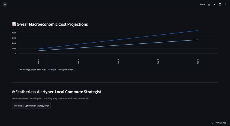
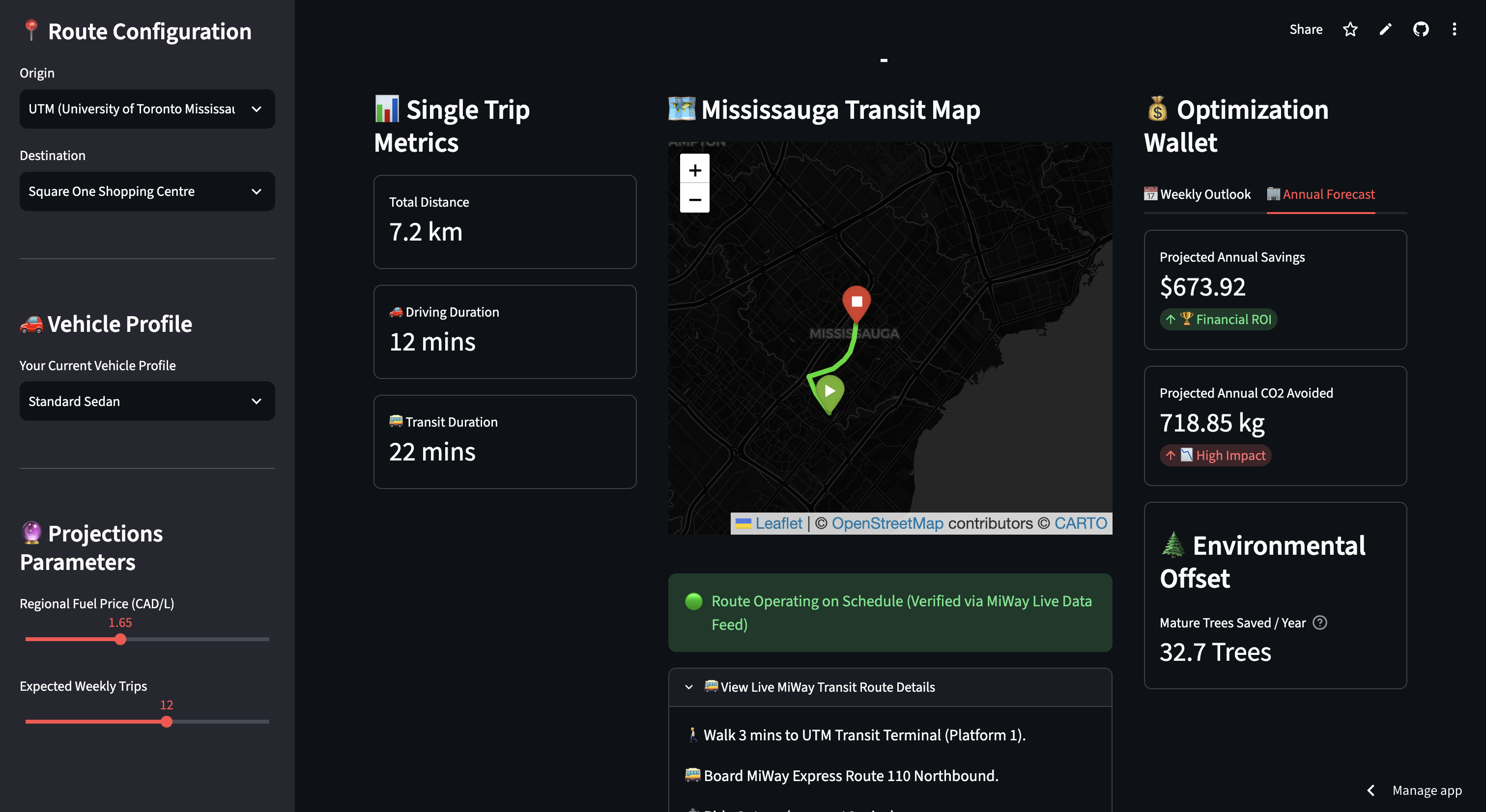
Closed left sidebar pt. 2
-
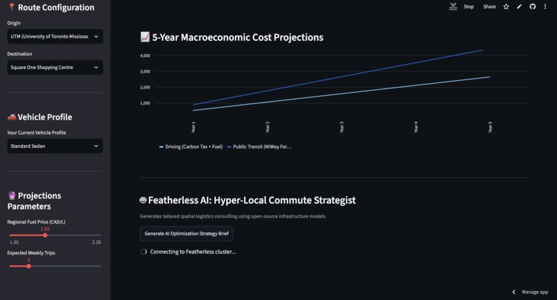
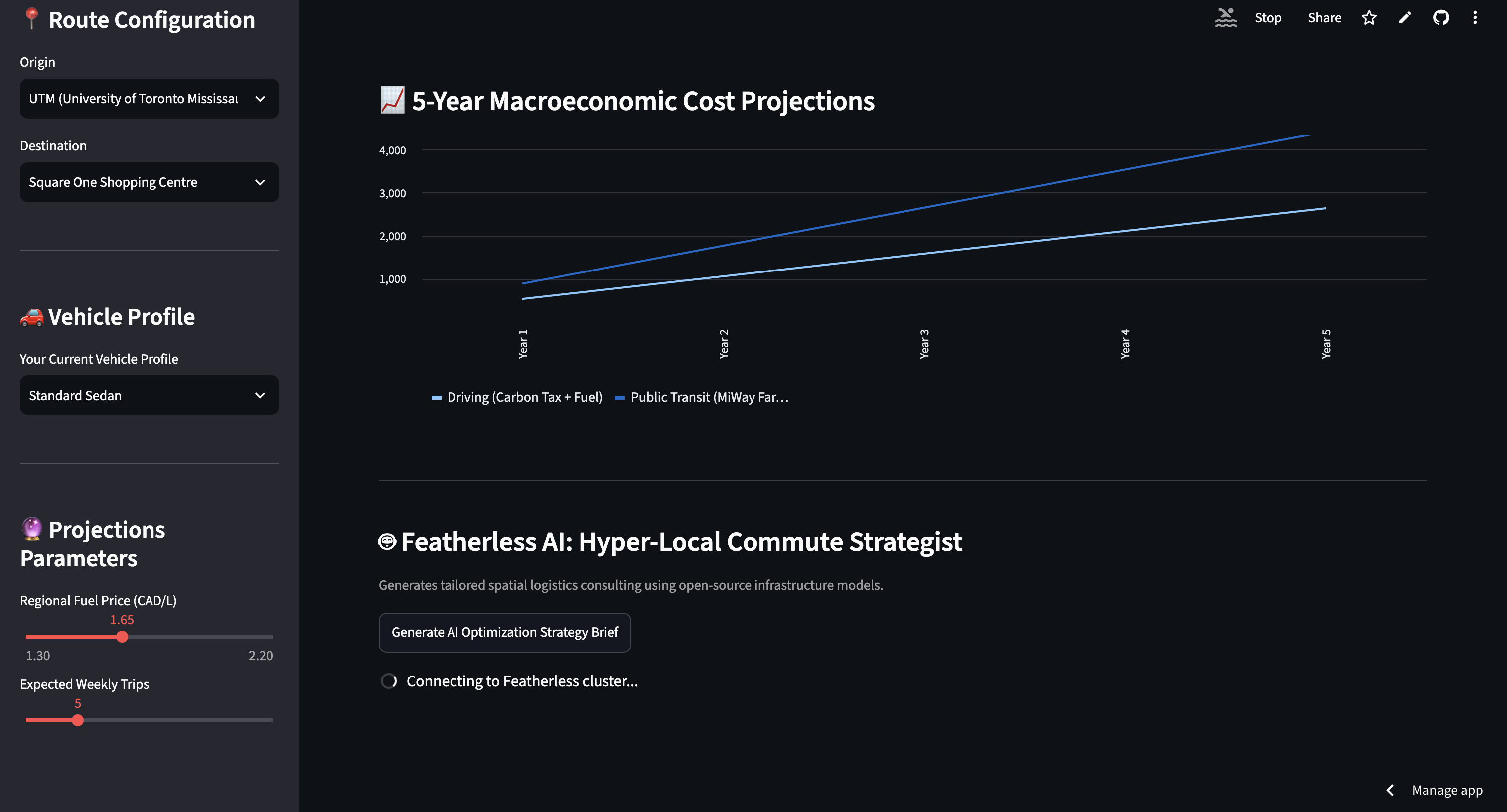
Loading Urban Mobility Advisor Brief
-
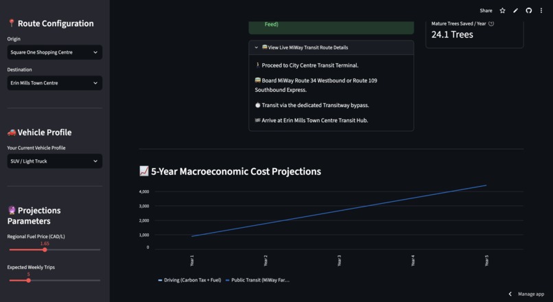
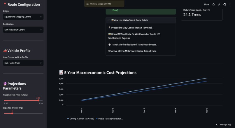
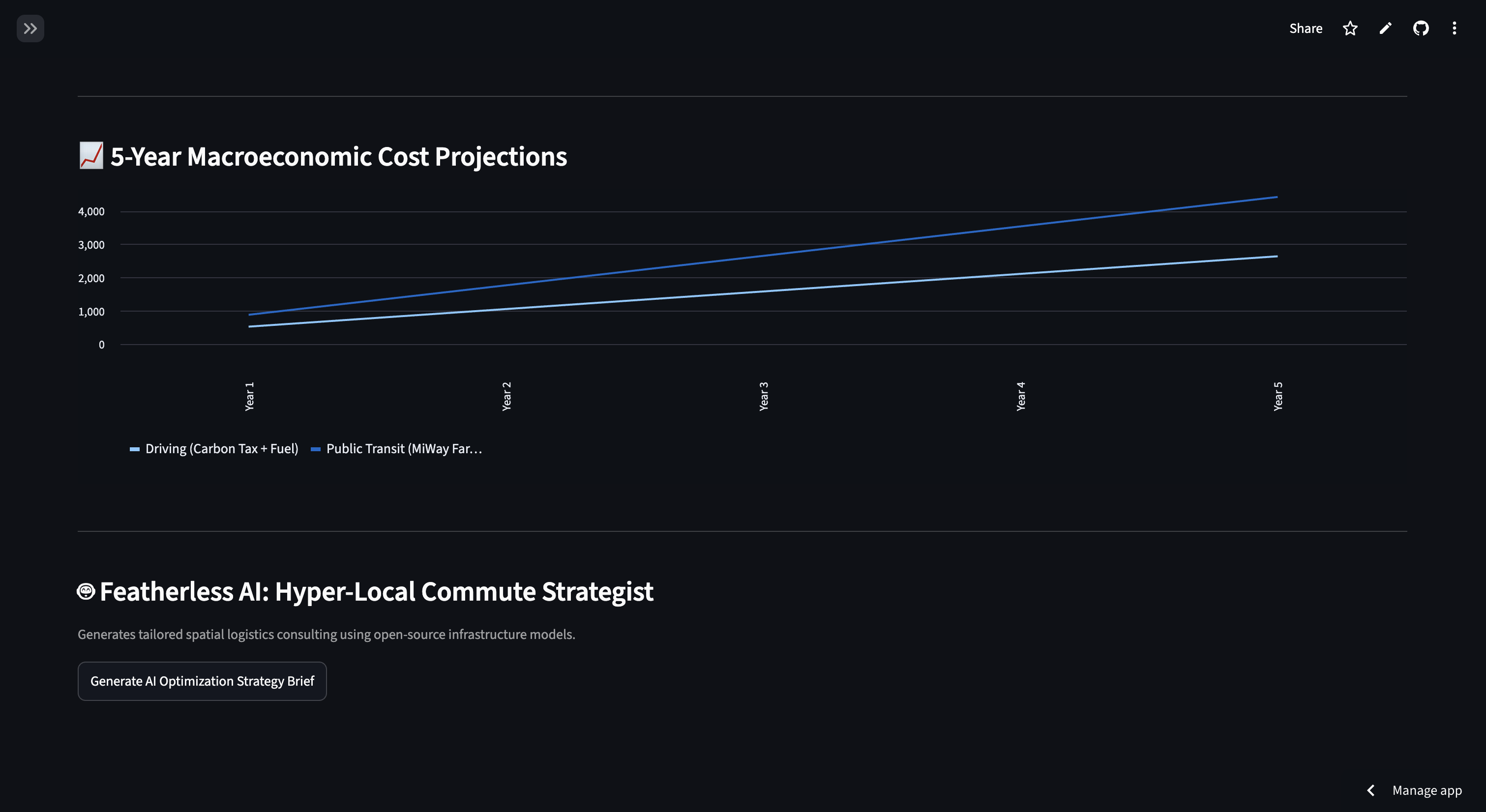
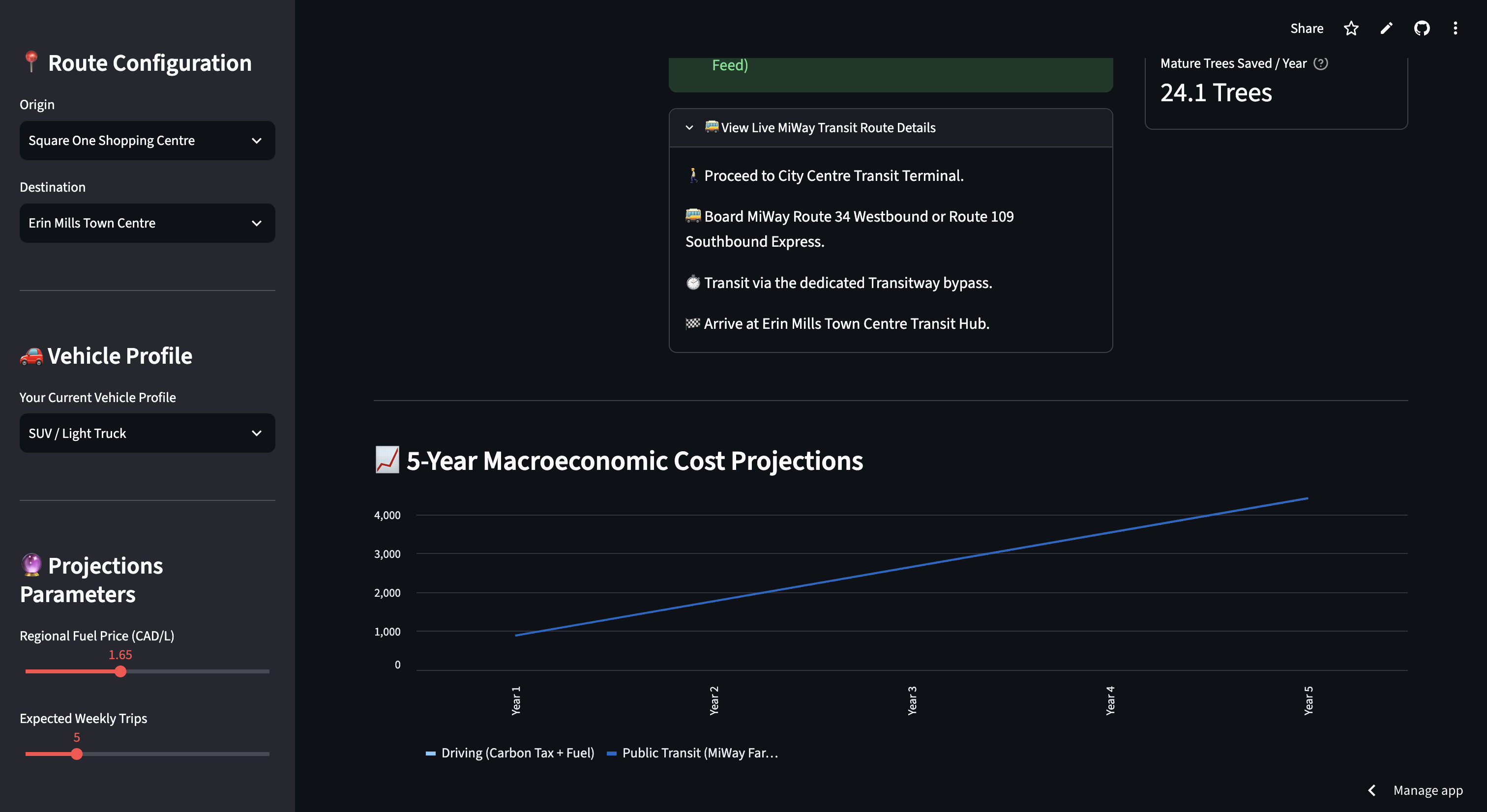
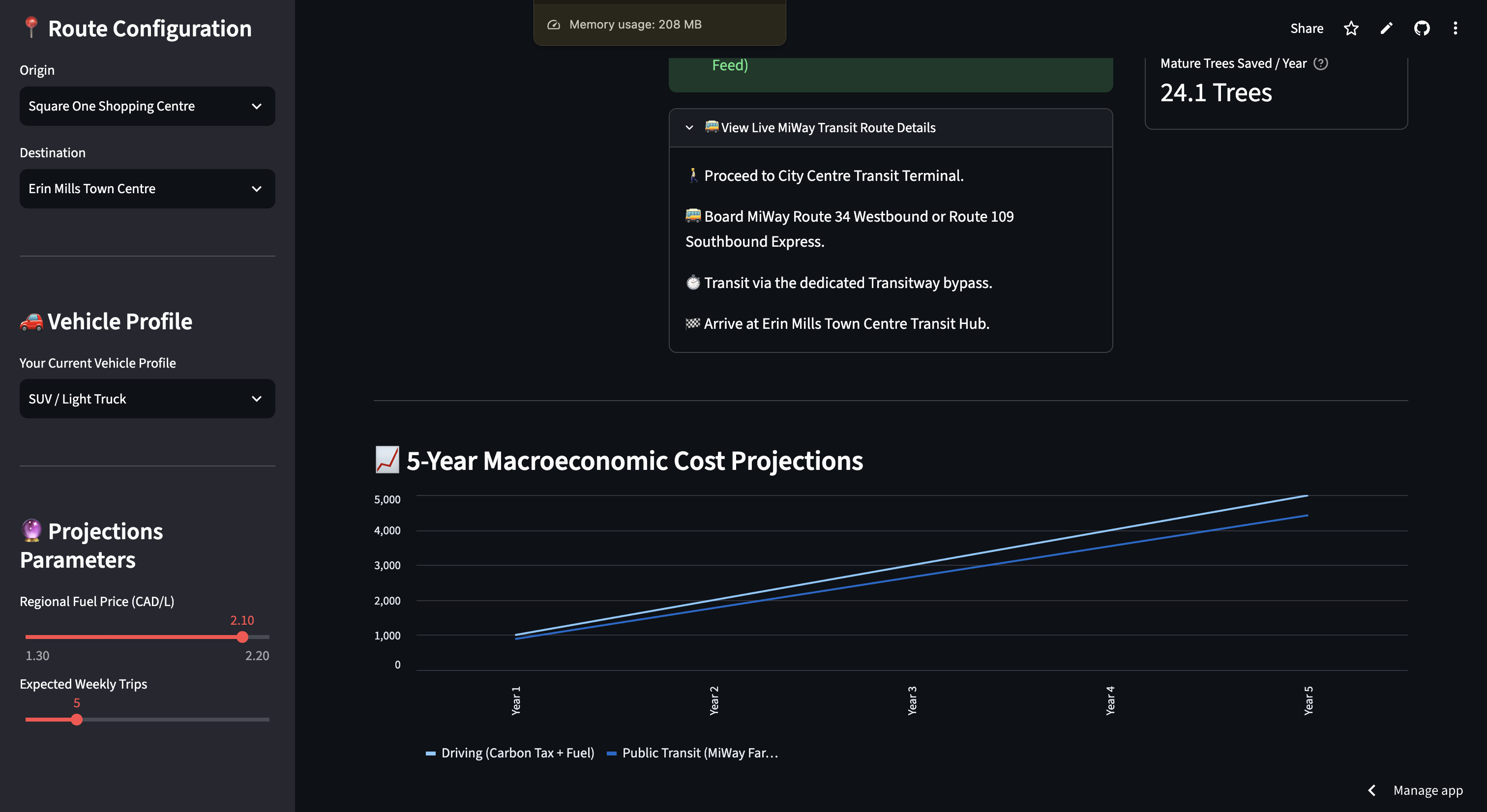
5-year macroeconomic cost projection graph
-
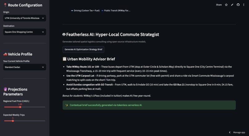
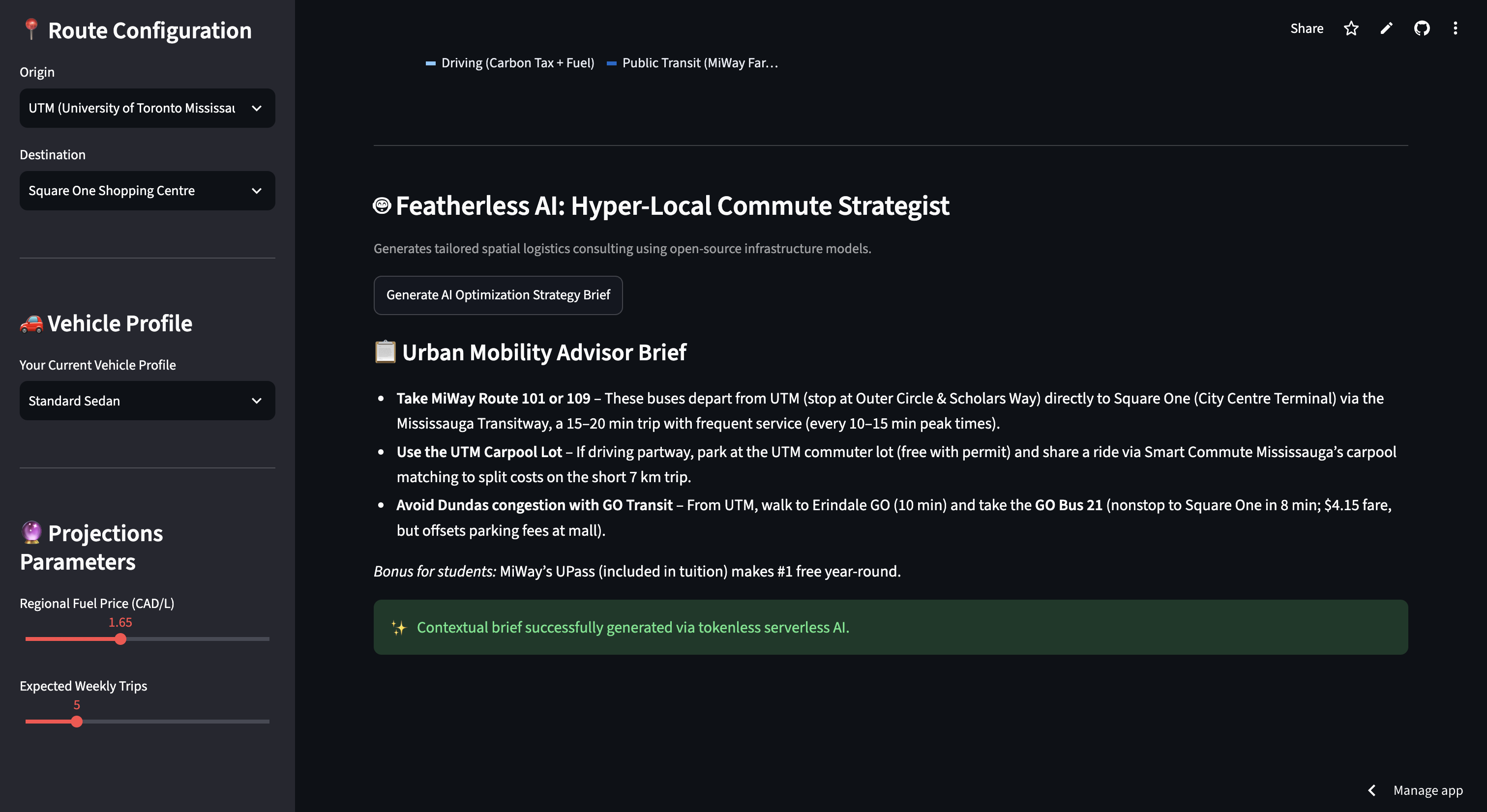
Urban Mobility Advisor Brief Demo
-
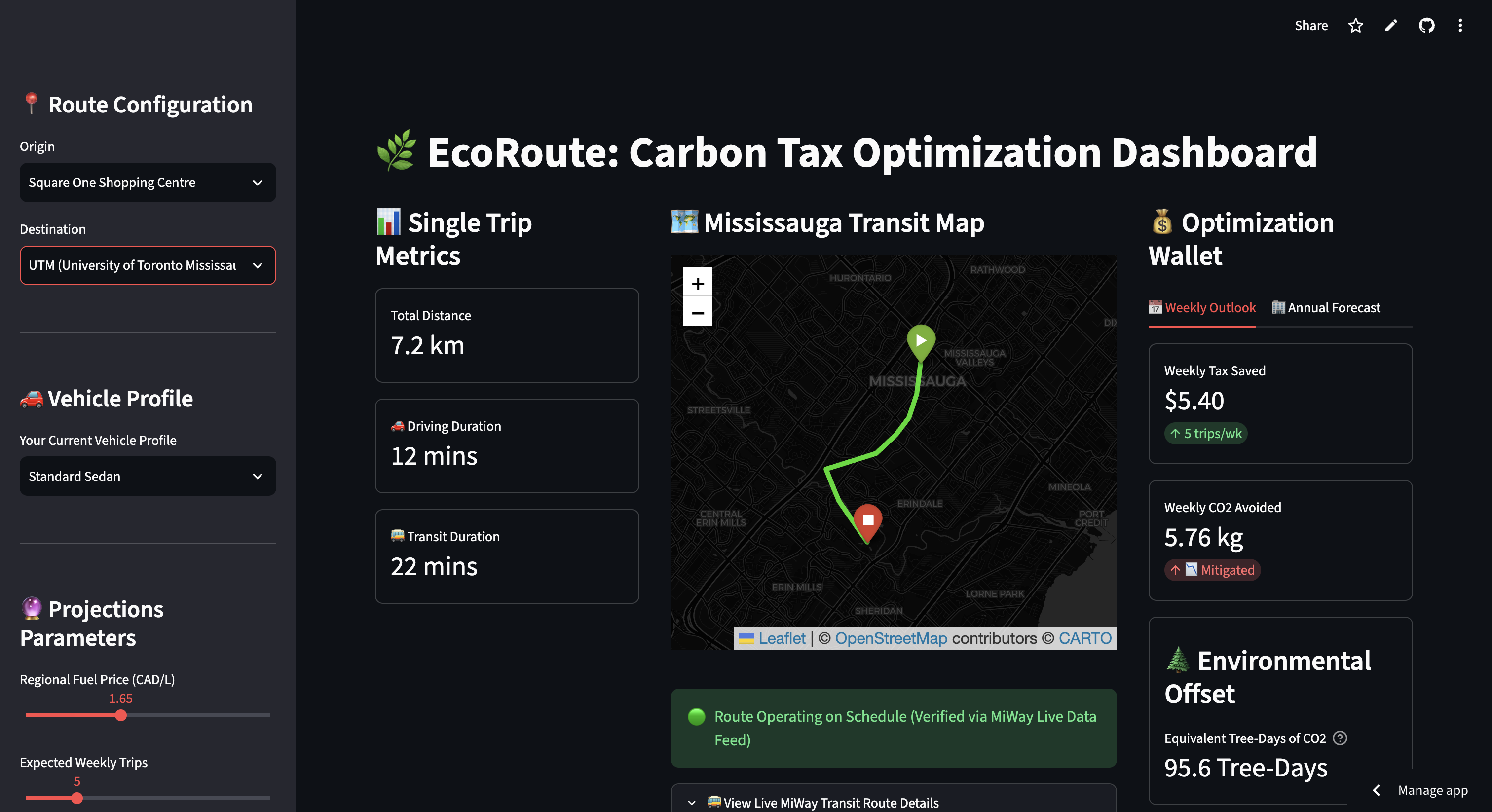
"Regional Fuel Price" slider demonstration
-
"Expected Weekly Trips" slider demonstration
-
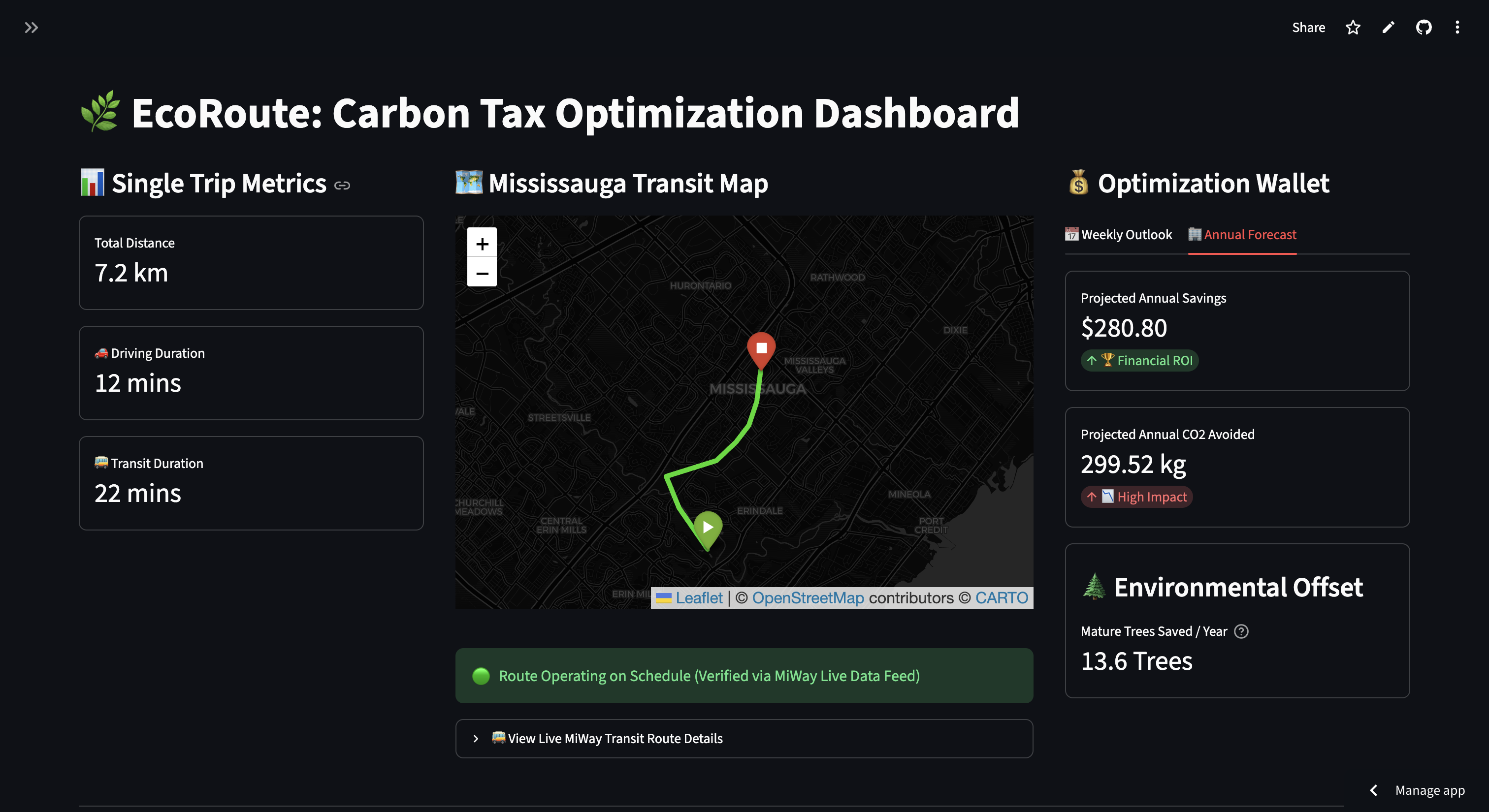
Closed left sidebar pt. 1
-
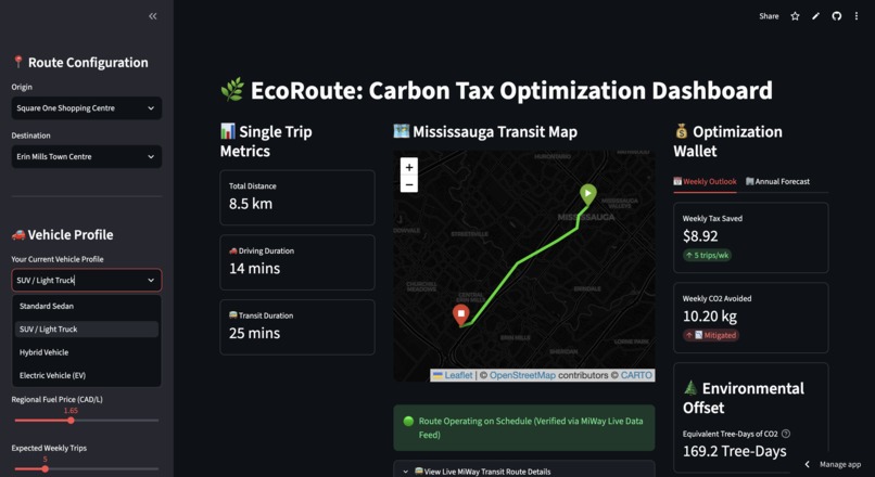
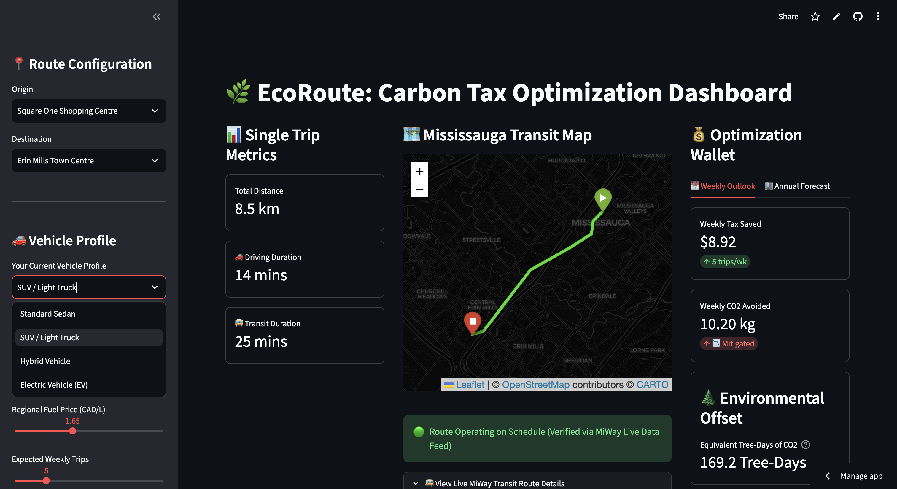
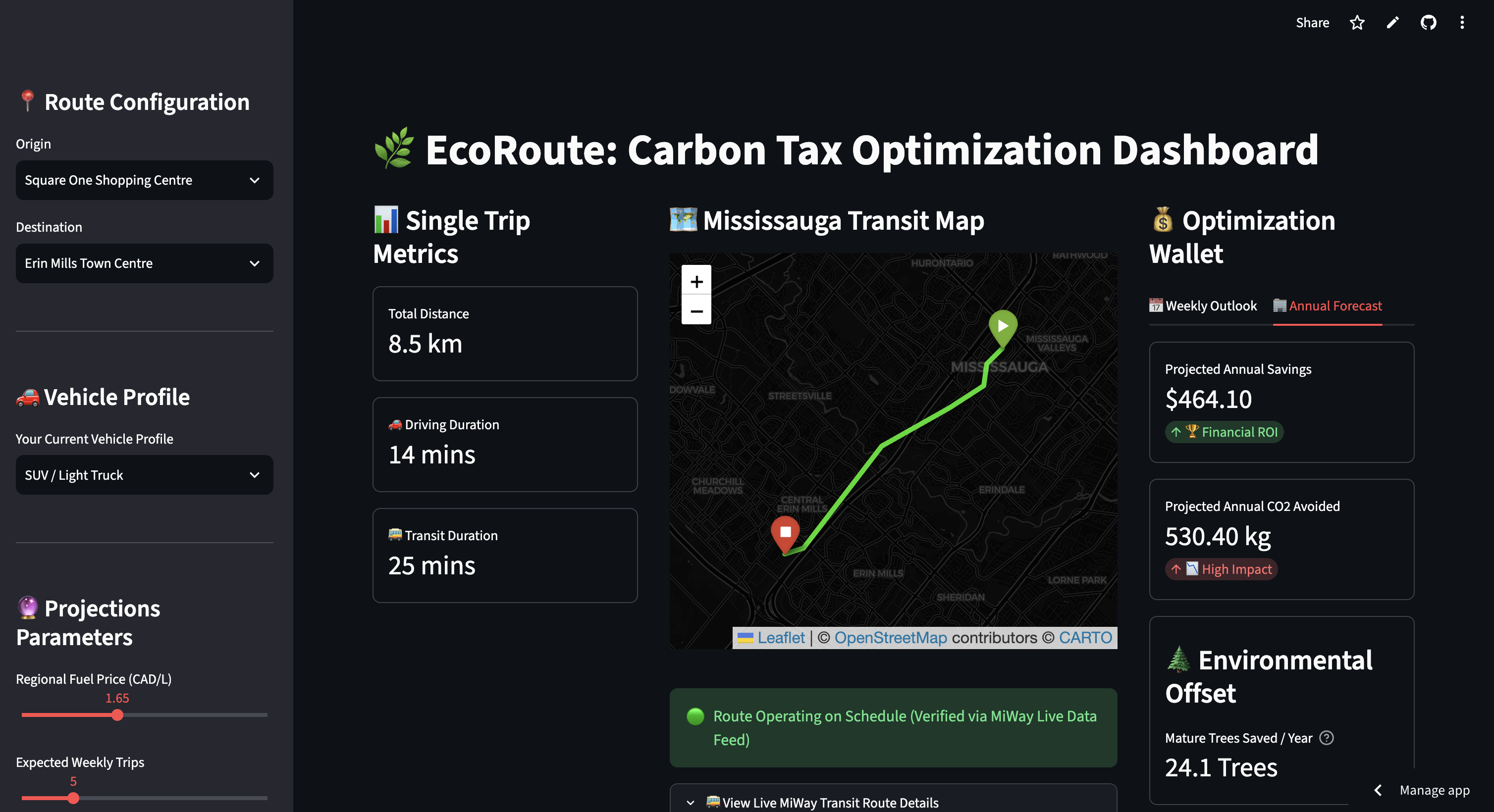
Vehicle Profile dropdown menu
-
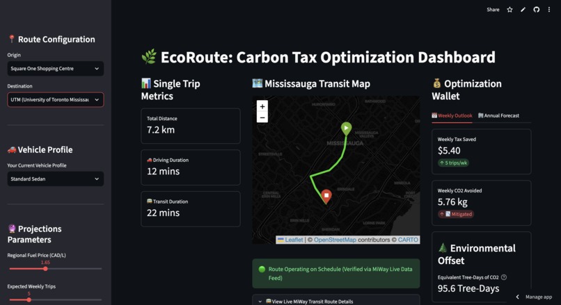
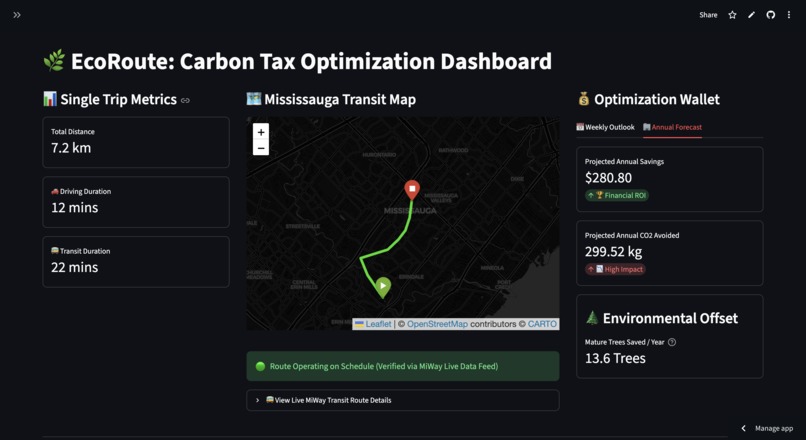
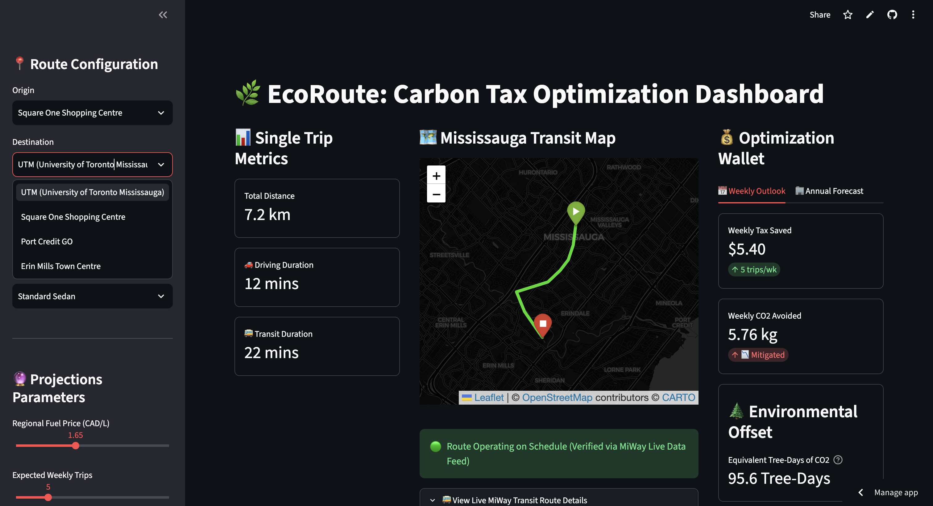
Default Screen with default locations entered
-
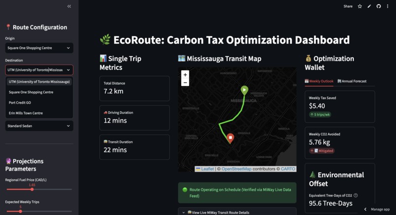
Location entry dropdown menu
-
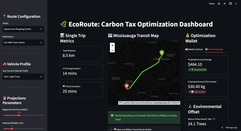
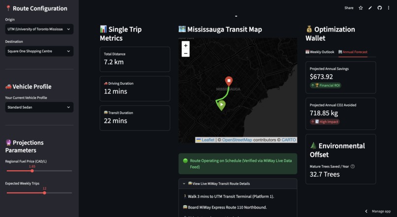
Switched from "Weekly Outlook" to "Annual Forecast" tab
EcoRoute: Carbon Tax Optimization Dashboard
Inspiration
As a Mississauga resident, I live the daily grind of our local roads. Every day, thousands of people crawl along Mississauga Road toward the UTM campus area, get stuck in traffic heading toward Square One, or time their commute around trains at Port Credit GO. The daily commute here is a massive mental and financial burden. With gas prices bouncing up and down at local pumps and the constant conversation around the federal carbon tax, I realized most people view climate policy as an annoying, unavoidable penalty.
I wanted to flip that narrative on its head. What if we could treat carbon tracking not as a chore, but as a practical financial planning tool? I built EcoRoute to give my neighbors a clear look at the trade-offs between driving and taking transit, turning abstract climate targets into personalized estimates that show how small commuting decisions can affect both your wallet and your environmental footprint.
What it does
EcoRoute is an interactive dashboard built for local drivers to map out their routines and compare the estimated cost of driving against taking transit. You choose your starting point and destination, set your vehicle profile, and adjust current local fuel prices.
The dashboard immediately estimates your weekly carbon tax savings, greenhouse gas emissions avoided, and a relatable environmental offset measured in Tree-Days: the amount of carbon dioxide a mature tree would absorb in one day. To provide a longer-term perspective, the app models a five-year projection comparing fuel price inflation against fixed municipal transit fares.
Finally, it uses a built-in AI transit strategist to generate route-specific infrastructure advice tailored directly to Mississauga's transportation network.
How I built it
I built the app on a lightweight Python 3.11 and Streamlit stack. For the mapping engine, I used Folium to visualize predefined road routes connecting major Mississauga transit hubs. Rather than relying on commercial routing APIs for every user interaction, I modeled common local transit itineraries directly inside the application.
That trade-off eliminated API costs, reduced latency, and made the dashboard more responsive while still covering the commuter routes I wanted to analyze, including services like the MiWay 110 Express.
Pandas powers the backend calculations by combining travel distance, vehicle emissions, fuel pricing assumptions, and municipal transit fares into a single estimation model. For the AI advisor, I integrated the DeepSeek-V3-0324 model through Featherless.ai so I could provide contextual route guidance without hosting or maintaining my own inference infrastructure.
The dashboard relies on three transparent estimation models built from publicly available transportation and environmental benchmarks, including Canadian vehicle emissions data and federal fuel charge references. They are designed for comparative trip analysis rather than reproducing official government carbon pricing calculations.
1. Carbon Tax Savings Formula
Rather than calculating the exact federal fuel charge, EcoRoute estimates the relative carbon tax burden associated with driving by combining trip distance with a normalized vehicle emissions profile.
$$Single\ Trip\ Tax\ Saved = Distance\ (km) \times 0.15 \times \left(\frac{Vehicle\ Emission\ Factor\ (g/km)}{200.0}\right)$$
The constants are based on representative Canadian vehicle emissions and federal fuel charge benchmarks, allowing different vehicle profiles to scale naturally against a typical passenger vehicle.
2. Environmental Mitigation Modeling
To calculate the greenhouse gases avoided by choosing public transit, the dashboard compares the selected vehicle's emissions profile against an average per-passenger municipal transit footprint.
$$Weekly\ CO_2\ Avoided\ (kg) = \frac{(Vehicle\ Emission\ Factor - Transit\ Factor) \times Distance \times Weekly\ Trips}{1000}$$
3. Biogenic Sequestration Conversions
Carbon emissions are difficult to visualize, so EcoRoute converts annual savings into Tree-Days. Assuming a mature tree absorbs approximately 22 kilograms of carbon dioxide each year, Tree-Days represent the amount of carbon a mature tree would naturally absorb in a single day.
$$Annual\ Trees\ Saved = \frac{Annual\ CO_2\ Avoided\ (kg)}{22.0}$$
$$Tree\text{-}Days\ of\ Mitigation = Weekly\ Trees\ Saved \times 365$$
Challenges I ran into
My first real headache was a front-end layout bug where long strings of text like "Tree-Days" were constantly getting cut off inside the default Streamlit metric boxes on mobile viewports. I spent hours wrestling with the layout before writing a global CSS override that applies fluid typography so the dashboard scales cleanly across different screen sizes.
The second challenge was keeping the AI engine grounded. Left on its own, a general-purpose language model tends to produce vague suggestions like "consider taking the train." I had to iteratively refine my system prompts, structure the information passed into the model, and inject local context so it consistently produced practical recommendations about the Mississauga Transitway, park-and-ride facilities, and actual MiWay connections instead of generic transportation advice.
Accomplishments that I'm proud of
I am proud that I was able to combine interactive mapping, a transparent estimation engine, long-term cost projections, and serverless AI inference into a single dashboard without sacrificing responsiveness.
Choosing predefined transit routes over live routing APIs kept the application lightweight while still delivering meaningful comparisons, and solving the responsive layout issues ensured the dashboard remained usable on both desktop and mobile devices.
What I learned
This project reinforced that data only changes behavior when people can relate to it. Most commuters will not change their routine because of an abstract statistic about metric tons of greenhouse gases, but they might rethink a trip when they see the estimated money they could keep in their pocket or the environmental impact translated into something tangible like Tree-Days.
From a technical perspective, I also learned the value of making engineering trade-offs explicit. Lightweight frameworks, serverless inference, careful prompt engineering, and transparent estimation models delivered a responsive application without requiring expensive infrastructure, while being open about those assumptions ultimately makes the project more trustworthy.
What's next for EcoRoute
The immediate next step is integrating live schedule and service data from MiWay and Metrolinx so commuters can compare travel costs alongside current transit conditions.
Beyond that, I want to expand support for multi-stop trips across the Greater Toronto Area, incorporate electric vehicle charging costs alongside internal combustion vehicles, and replace predefined transit routes with live routing while preserving the fast, responsive experience that shaped the first version of EcoRoute.

Log in or sign up for Devpost to join the conversation.