-
-
Thumbanail
-
Starting page
-
Ecopulse
Inspiration
Environmental information is plentiful and scattered. Air readings sit in one report, water figures in another, and the people most exposed to a problem rarely see any of it in a form they can act on. Monitoring tells a community that something is wrong. It does not tell them where to act first, what to do, or how they will know it worked.
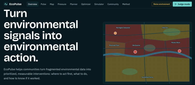
EcoPulse is built around those three questions, under the Earth Forward theme: moving from sensing a problem to measuring whether the fix helped.
What it does
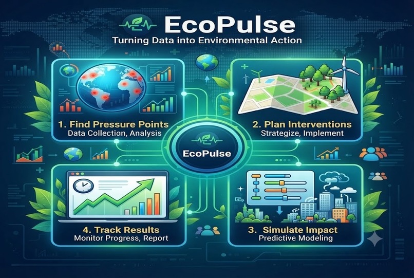
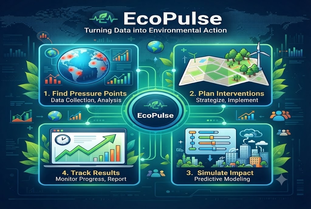
EcoPulse follows one loop: sense, understand, prioritize, act, measure.
- Pulse: six indicators (air quality, water stress, waste, heat, green coverage, biodiversity) are scored 0 to 100 and combined into one Environmental Health Index. A table shows every indicator's weight and contribution, so the score is never a black box.
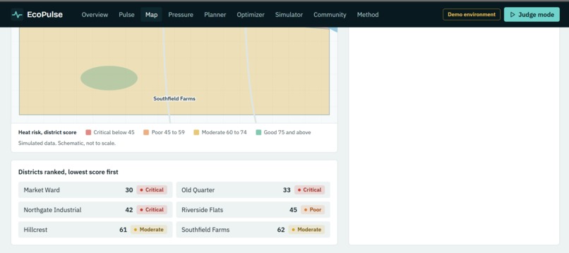
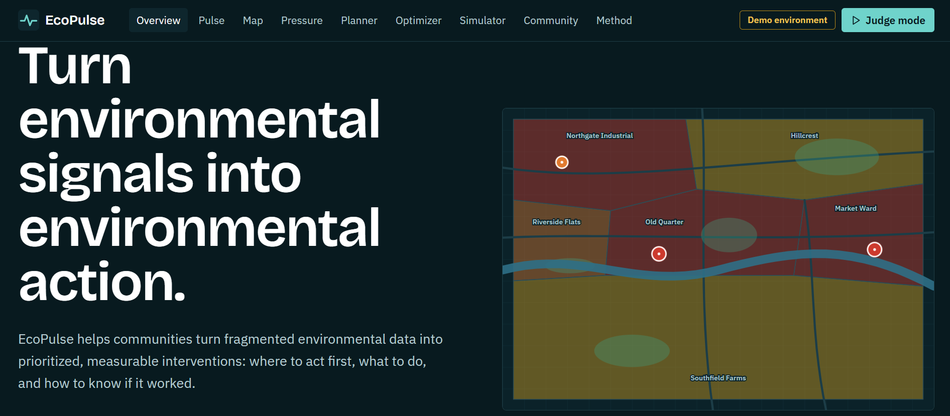
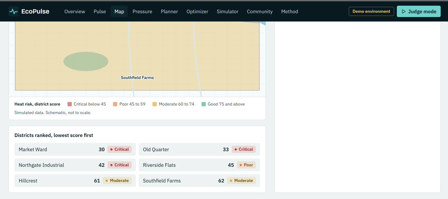
- Map: an interactive map of a fictional district, with a layer for each indicator. Selecting a hotspot shows who is affected, the trend, likely causes, suggested interventions and its monitoring status.
- Pressure points: hotspots are ranked by a transparent priority score.
- Planner and optimizer: compare interventions by effort, benefit and time to impact, or set an effort budget and let the optimizer choose the best mix.
- Simulator: move sliders for tree canopy, waste diversion, water conservation and renewable energy to see a scenario. It is a scenario, not a forecast.
- Community board: action plans become trackable actions with a baseline, a target and monitoring indicators. Plans can be downloaded as a brief.
- Live data: an optional lookup pulls real current air quality and temperature for any city and can colour the Air and Heat map layers with six real sample points.
The district, scores, hotspots and progress are simulated, and the app says so wherever a number appears. The only real data is the optional live lookup.
How we built it
EcoPulse is a Next.js 14 app in TypeScript with Tailwind CSS, Recharts and Lucide icons, deployed on Vercel. It needs no database, login or API key.
- Data lives in typed files, separate from the interface, so real datasets can replace the demo ones.
- The map is a hand-built SVG with keyboard-focusable hotspot markers, so it needs no map tiles or keys.
- The index is a weighted mean of six scores:
$$\text{EHI} = 0.20\,s_{air} + 0.20\,s_{water} + 0.15\,s_{waste} + 0.20\,s_{heat} + 0.15\,s_{green} + 0.10\,s_{bio}$$
- Hotspot priority combines severity $S$, population exposed $E$ and trend $T$, each on a 0 to 100 scale:
$$P = 0.5\,S + 0.3\,E + 0.2\,T$$
- The optimizer solves a multiple-choice knapsack exactly with dynamic programming. It picks at most one intervention per hotspot to maximize total value $\sum v_i$ subject to $\sum c_i \le B$, where $v_i$ is priority times the benefit rating and $c_i$ is the effort rating. At a budget of 15 it beats working down the priority list by about 9 percent.
- The simulator adds linear coefficients per lever, capped at 100. Every coefficient is listed on the page.
- Live mode lays the demo map over a 50 km area around a chosen city and requests one real point per district from Open-Meteo.
Challenges we ran into
- Honesty about data. Neighbourhood-level environmental data is hard to get, so the demo uses simulated data. We made that a feature: a transparency panel, labels on every estimate, and a method section that separates what is real from what is simulated.
- Real data at the wrong scale. Open-Meteo's grid cells are several kilometres wide, so a single city gives almost no variation between neighbourhoods. Sampling six points across about 50 km gave visible differences, and we kept live values out of the demo index so they cannot be mistaken for it.
- Scenario assumptions. The simulator's coefficients are illustrative, not research-derived. We show them in a table and label the output as a scenario.
- Accessibility. The SVG map, sliders and dialogs had to work by keyboard, with visible focus and reduced-motion support.
What we learned
- Designing a data product for trust: every score needs a visible calculation.
- Modelling a budgeted decision as a multiple-choice knapsack and solving it exactly.
- Building an interactive map in plain SVG, and handling a web API whose resolution limits what it can show.
What's next
Replace the demo dataset with real sources such as OpenAQ for air, Landsat for surface temperature, Sentinel-2 for vegetation, WRI Aqueduct for water risk and GBIF for biodiversity. Add a normalization layer for real units, adjustable index weights, saved plans in a database and intervention effects validated against published evidence. Then pilot it with a local group that can supply real data.
Built With
- fontsource
- lucide
- next.js
- node.js
- open-meteo-api
- react
- recharts
- svg
- tailwind-css
- typescript
- vercel

Log in or sign up for Devpost to join the conversation.