-
-
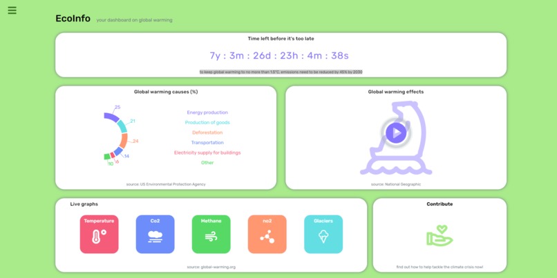
Front Page of the Website
Inspiration
I am an data science student and wanted to try my visualisation skills to contribute something which is a concerning issue for the people
What it does
It is a dashboard on global warming which count downs the time (which times that if we dont keep global warming to no more than 1.5°C, emissions doesnt reduced by 45% by 2030 that life on the earth will gets difficult and I am also deduced the other required informations and how we can contribute to presearve the environment.
How we built it
I built it using Reactjs
Challenges we ran into
Nothing much
Accomplishments that we're proud of
Data visualisation

Log in or sign up for Devpost to join the conversation.