-
-
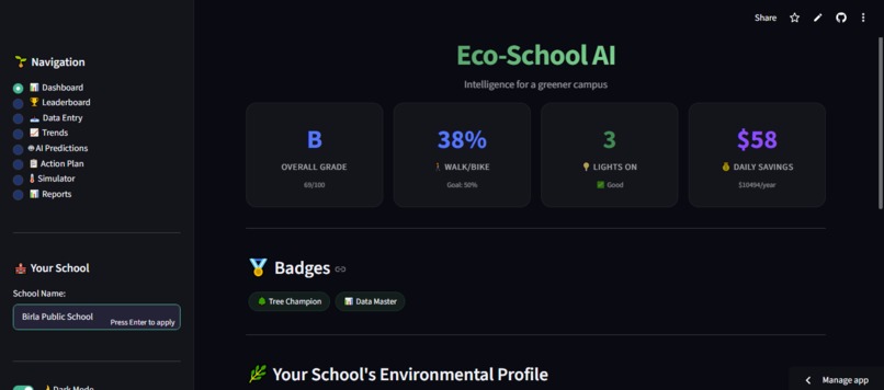
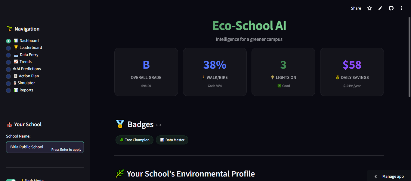
Dashboard
-
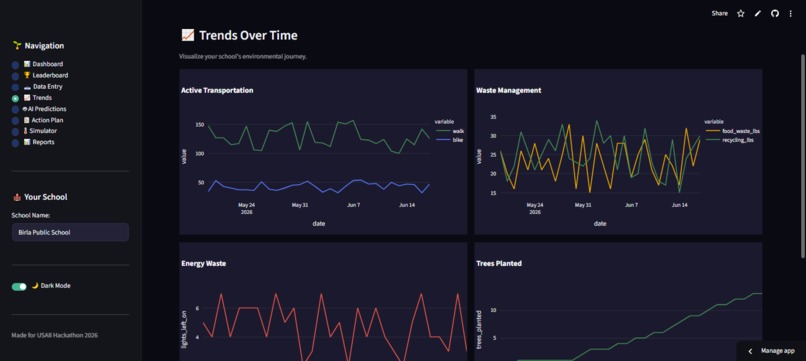
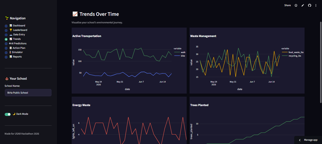
Graphs made using demo data
-
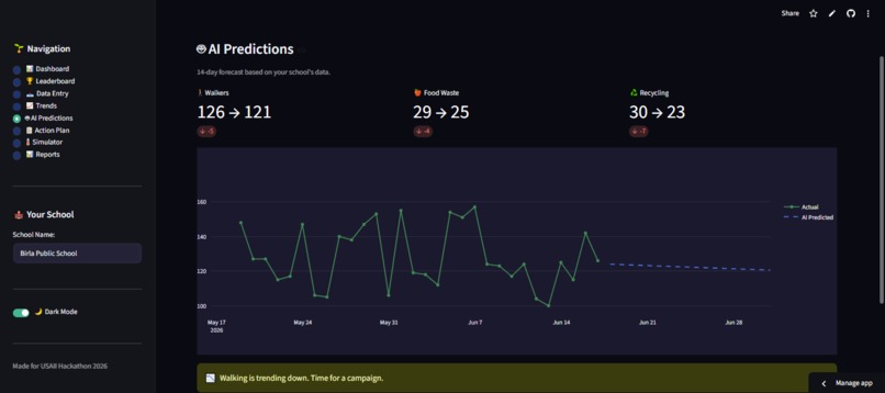
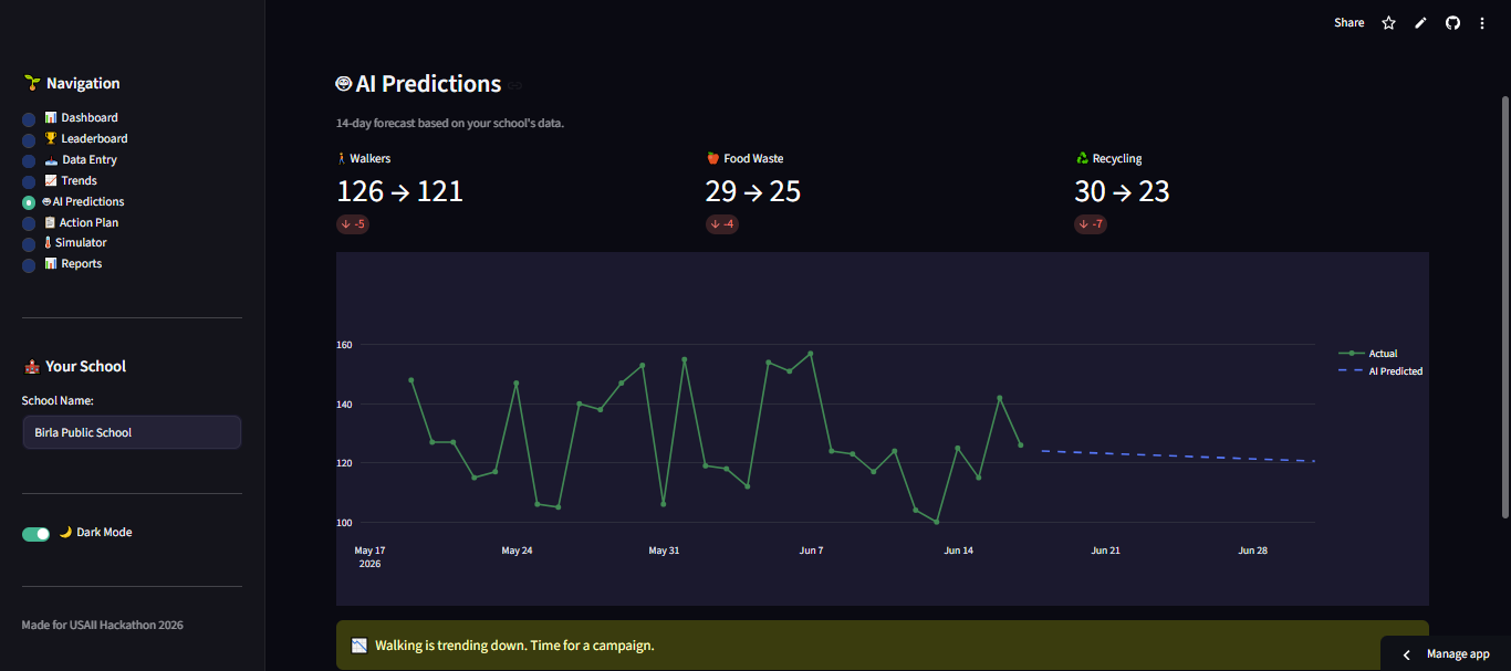
Prediction of flow of data using maths in AI
Inspiration
Every day, schools around the world waste energy, food, and resources — not because they don't care, but because they don't see the impact. Teachers are overwhelmed. Students want to help but don't know where to start. Environmental data is scattered across spreadsheets, bills, and observations. Invisible and unusable.
We asked ourselves: What if schools could see their environmental impact the way they see their grades? What if AI could turn messy data into clear insights, predictions, and actions?
That's how Eco-School AI was born. To make sustainability visible, measurable, and actionable for every school.
What it does
Eco-School AI is an AI-powered environmental dashboard that helps schools track, predict, and reduce their environmental impact.
Key Features
- Live Dashboard – Real-time metrics with an overall grade (A-F)
- AI Predictions – Uses Linear Regression to forecast trends 14 days ahead
- Anomaly Detection – Automatically flags unusual patterns (spikes in food waste, drop in walkers)
- Personalized Action Plan – Prioritized recommendations based on your school's data
- Multi-School Leaderboard – Compare your school against others in the district
- Cost Savings Calculator – Shows dollar impact of actions taken
- Badges and Gamification – Rewards for milestones (Tree Champion, Waste Warrior, etc.)
- Data Entry – Simple daily logging for walkers, bikers, energy, waste, and recycling
- Trend Visualization – See your school's environmental journey over time
- Dark Mode – Full light/dark theme toggle
The AI Formula
The overall environmental grade is calculated using:
$$ \text{Grade} = (\text{Walk/Bike \%} \times 0.3) + (\text{Waste Diversion \%} \times 0.2) + (\text{Energy Score} \times 0.3) + (\text{Trees Planted} \times 2) $$
Where:
- Energy Score = ( \max(0, 100 - \text{Lights Left On} \times 10) )
- Waste Diversion = ( \frac{\text{Recycling lbs}}{\text{Food Waste lbs} + \text{Recycling lbs}} \times 100 )
How we built it
Technology Stack
- Frontend and Backend: Streamlit (Python)
- AI and Machine Learning: scikit-learn – Linear Regression
- Data Visualization: Plotly and Plotly Express
- Data Storage: CSV files with JSON for leaderboard data
- UI/UX: Custom CSS with dark/light mode support
AI Implementation
from sklearn.linear_model import LinearRegression
import numpy as np

def predict_trends(df, days=14):
    df_sorted = df.sort_values('date')
    days_num = np.array(range(len(df_sorted))).reshape(-1, 1)
    model = LinearRegression()
    model.fit(days_num, df_sorted['walk'].values)
    future = model.predict(
        np.array(range(len(df_sorted), len(df_sorted) + days)).reshape(-1, 1)
    )
    return future
### Anomaly Detection

We used statistical methods to detect anomalies:

$$ \text{Anomaly} = |\text{Value} - \text{Mean}| > 2 \times \text{Standard Deviation} $$

If a value falls outside \( \pm 2\sigma \), the AI flags it as an anomaly and alerts the user.

### Recommendation Engine

The AI generates personalized action plans using rule-based logic:

- If **lights_left_on > 3** → *"Assign Energy Monitors in each classroom"*
- If **walk_pct < 40** → *"Launch a Walk & Roll Wednesday program"*
- If **food_waste_lbs > waste_avg** → *"Start a Share Table program"*
- If **waste_pct < 60** → *"Add more recycling bins in hallways"*

### Cost Savings Logic

We calculated real-world savings using conservative estimates:

- **Energy:** \( \text{Savings} = \text{Lights Left On} \times \$10 \text{ per month} \)
- **Waste:** \( \text{Savings} = \text{Food Waste lbs} \times \$0.50 \)
- **Transport:** \( \text{Savings} = \text{Car Dropoffs} \times \$0.20 \)


## Challenges we ran into

1. **Data Formatting** – Different schools track data differently. We solved this by creating a standardized data entry form with clear labels and auto-calculation.

2. **AI Accuracy** – With limited data, Linear Regression predictions can be noisy. We added trend indicators (up/down) and confidence messaging to help users interpret results.

3. **UI Consistency** – Getting dark mode to work properly across all elements took multiple iterations. We used conditional CSS with session state.

4. **Date Sorting** – The trends graph initially plotted dates in wrong order. We fixed this by sorting the dataframe by date before plotting.

5. **Sidebar Visibility** – The default sidebar toggle was invisible in light mode. We added custom CSS to make it visible.

6. **Cost Savings Logic** – Calculating real-world savings required research. We used conservative estimates: $10/classroom/month for lights, $0.50/lb for food waste, $0.20 per car trip.

7. **Gamification Balance** – We wanted badges to feel earned, not trivial. Thresholds: 5 trees for Tree Champion, 30 days of data for Data Master.


## Accomplishments that we're proud of

- **15+ Features** – All working in a single, cohesive dashboard
- **Real AI** – Not just a buzzword – we built actual machine learning predictions
- **User-Friendly Design** – Clean, professional, and intuitive for non-technical users
- **Actionable Insights** – Not just data, but clear next steps
- **Dark Mode** – Full theme support for comfortable viewing
- **Multi-School Support** – Leaderboard and district comparison
- **Cost Savings** – Showed dollar impact, not just environmental impact
- **Positive Reinforcement** – Badges and encouragement keep users engaged
- **Mobile-Responsive** – Works on phones, tablets, and desktops
- **Zero Manual Data Collection** – AI does the heavy lifting


## What we learned

1. **AI is only as good as the data** – We learned to set realistic expectations with limited data and use confidence indicators.

2. **UI matters** – A beautiful dashboard makes data more engaging and actionable.

3. **Simplicity wins** – Users don't want complex models; they want clear answers: *"Is my school doing well? What should I do next?"*

4. **Gamification drives engagement** – Badges and leaderboards motivate users to log data consistently.

5. **Real impact > abstract metrics** – Connecting actions to dollars saved and CO2 reduced makes sustainability feel tangible.

6. **Iterate quickly** – We built, tested, and refined features in rapid cycles, which helped us catch bugs early.

7. **Streamlit is powerful** – With minimal code, we built a production-ready web app that would normally take weeks of frontend work.


## What's next for Eco-School AI

- **Real-Time Data Integration** – Connect to IoT sensors (smart meters, smart plugs) for automatic data collection
- **Mobile App** – Build a companion app for on-the-go data entry and notifications
- **Advanced AI** – Implement Recurrent Neural Networks (RNNs) for more accurate time-series predictions
- **Community Sharing** – Let schools share their success stories and best practices
- **District Dashboard** – District-wide view for administrators to track all schools at once
- **Smart Alerts** – Push notifications when anomalies are detected
- **Seasonal Challenges** – "Plant 50 trees this spring" campaigns with special rewards
- **Expansion** – Adapt the platform for other cities and school districts beyond NYC
- **API Access** – Allow developers to build on top of the platform
- **Student Ambassadors** – Gamify the platform further with student-led sustainability challenges
Built With
- claude
- deepseek
- github
- streamlit
- visual-basic


Log in or sign up for Devpost to join the conversation.