-
-
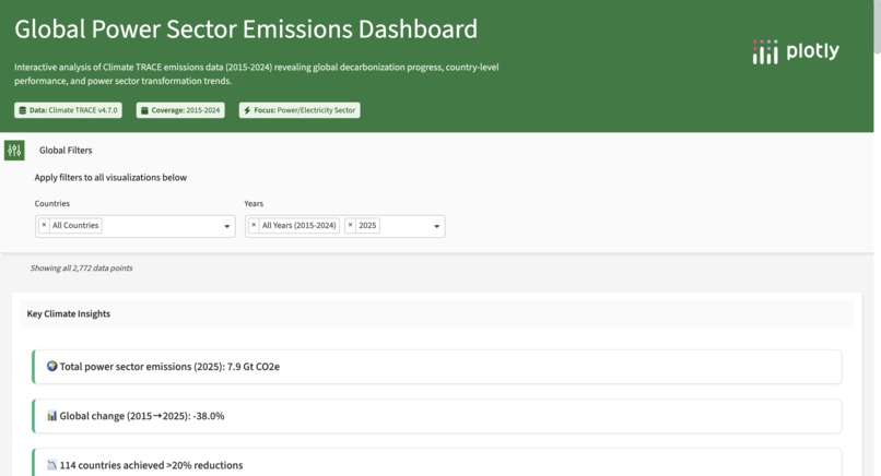
Image of the initial look of the ECO+ dashboard
ECO+: Turning Climate Anxiety into Data-Driven Hope!
Inspiration
The idea for ECO+ came from a mix of frustration, fear, and hope. As someone who spends a lot of time online, it’s hard not to feel overwhelmed by the endless stream of climate doom, headlines that make it seem like our world is already past saving. It started to feel paralyzing, like the future was something to dread instead of build toward.
So I decided to do something about it.
I wanted to see proof that change is real, that people, policies, and technology are actually making a difference. That’s why I built ECO+, a climate progress dashboard designed to shift the narrative from doom to capability. It’s a data-driven reminder that there’s still reason to believe in progress, and that small, measurable wins matter.
What it does
ECO+ turns massive global emissions data into a clear, uplifting story of climate action. Using verified data from Climate TRACE v4.7.0 involving the power sector, it highlights countries and sectors that are genuinely cutting emissions and moving toward sustainability.
Key features:
- Narrative Reframing: A design philosophy built to fight “doom-scrolling” with data-scrolling for hope. Every visualization centers on progress and possibility!
- Performance Tracking: Users can explore emissions by region (Global, Country, City), sector (Power, Transport, Buildings), and year (2015–2024 trends) and some recent 2025 data.
- Impact Translation: Numbers are turned into tangible stories, like “emission reductions equal to removing millions of cars from the road.”
- Dynamic Visuals: Seven interactive charts, including an Emissions Evolution Animated Bubble Chart, trace how leadership and accountability shift over time.
How I built it
I built ECO+ entirely on my own including every prompt, visualization, and piece of research.
Data Preparation & Metric Calculation: I sourced raw emissions data from Climate TRACE and performed critical metric calculations outside of the visual interface. This involved calculating the Year-over-Year Change, Ranking Shifts, and core Impact Equivalents (cars, trees) before uploading the cleaned, metric-ready CSVs for use in the app.
AI-Assisted Visualization: With Plotly Studio’s AI, I generated and refined seven complex charts through iterative prompt engineering, maximizing precision while staying within time and token limits.
Context Cards: To bridge the “why” behind numbers, I researched real-world causes (like China’s solar expansion or U.S. wind growth) and embedded them into the dashboard for deeper meaning.
Challenges I faced
- Balancing realism with hope: Presenting climate data honestly while keeping it hopeful was emotionally and technically hard. I had to rethink how to measure “success,” focusing on relative improvement rather than perfection.
- Solo development: As the only builder, managing everything from design to data cleaning was intense. There were long nights where it felt like the project might break before it worked. But seeing the dashboard come alive made it worth it!
- AI tool constraints: Plotly Studio’s AI model had strict limits, so I learned to iterate carefully, refining each visualization instead of endlessly regenerating them.
Accomplishments I’m proud of
- Solo execution: Building this entire project alone pushed me far beyond what I thought I could handle. It taught me that I can turn anxiety into something meaningful.
- Purposeful design: ECO+ isn’t just another dashboard, it’s a space to breathe, to remember that progress is happening, and that data can be both informative and emotionally grounding.
- Hope through data: I’m proud that ECO+ challenges despair with proof of possibility! We all desperately need this as a reminder that our generation’s tech can be a tool for healing, not just awareness.
What I learned
Data alone doesn’t change how people feel, stories do. The most meaningful insight wasn’t just about emissions or rankings, but how framing shapes emotional impact. When progress is visualized clearly, it inspires curiosity, confidence, and action.
This project also taught me resilience, how to balance logic with hope, and how to keep building even when the world feels heavy.
What’s next for ECO+
- Live API integration: Replace static CSVs with Climate TRACE’s live API for real-time updates.
- Per Capita Comparisons: Integrate population data for fairer global comparisons.
- Automated storytelling: Connect verified news APIs to explain why reductions happened turning data into dynamic, living climate stories.


Log in or sign up for Devpost to join the conversation.