-
-

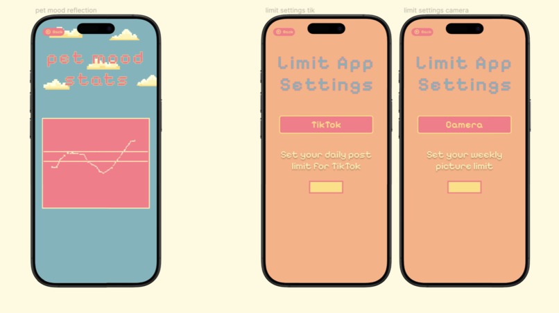
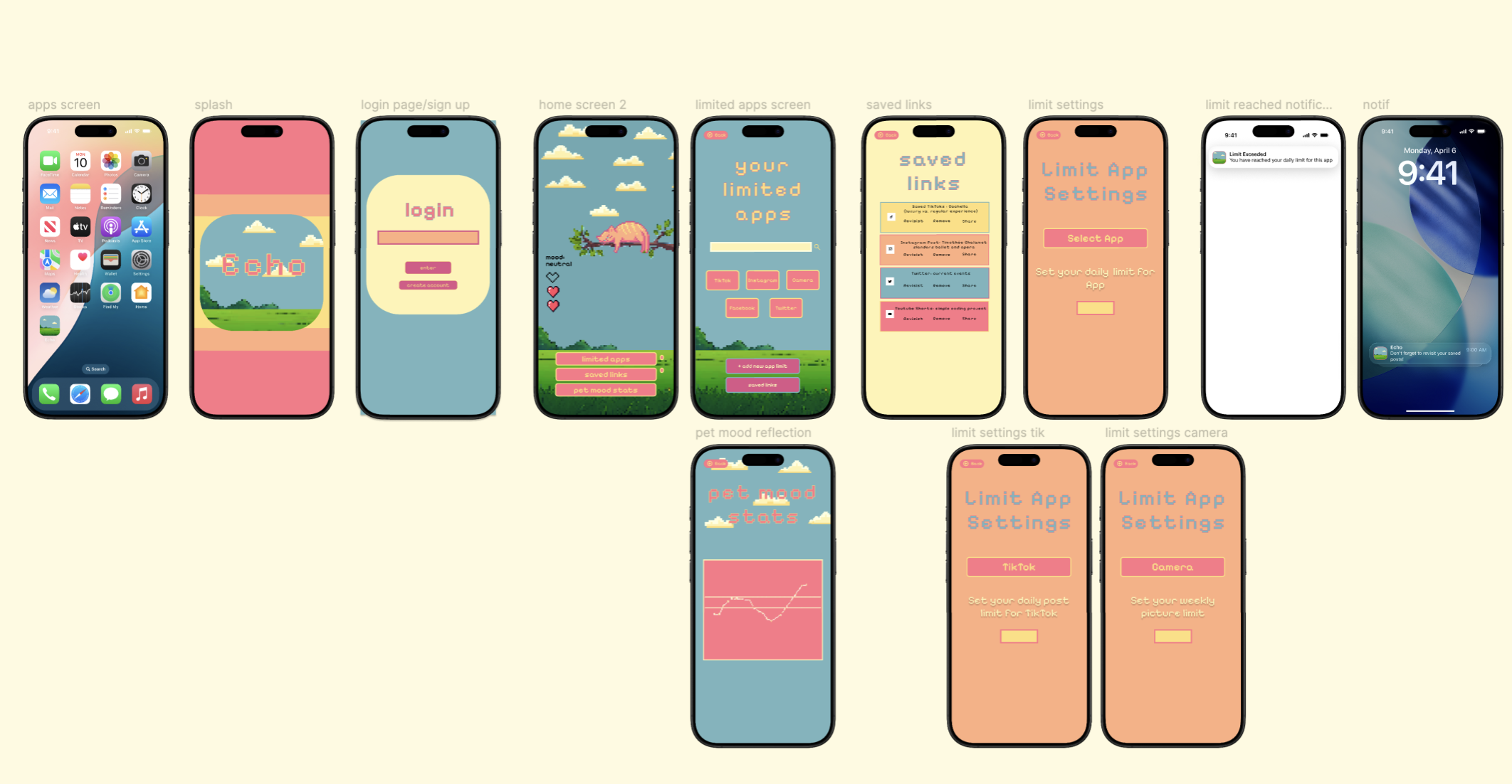
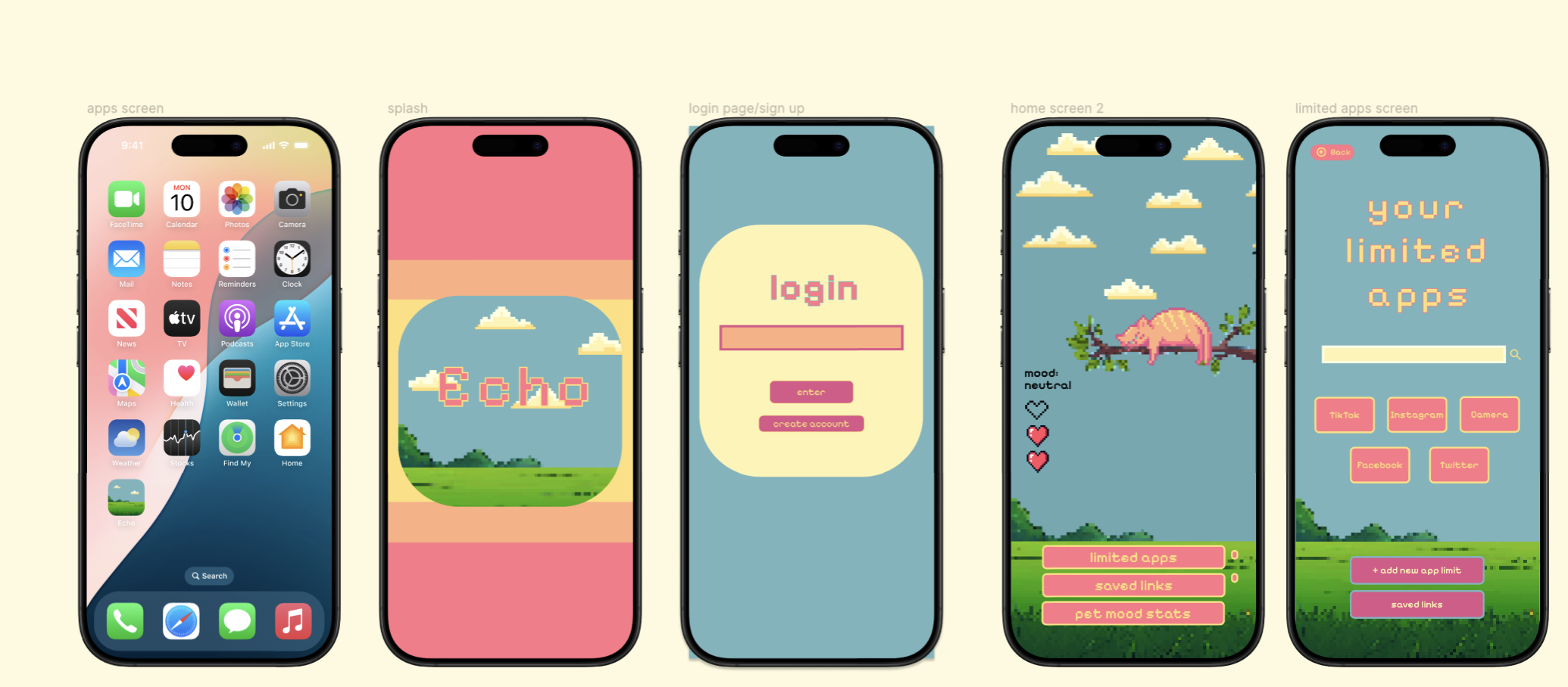
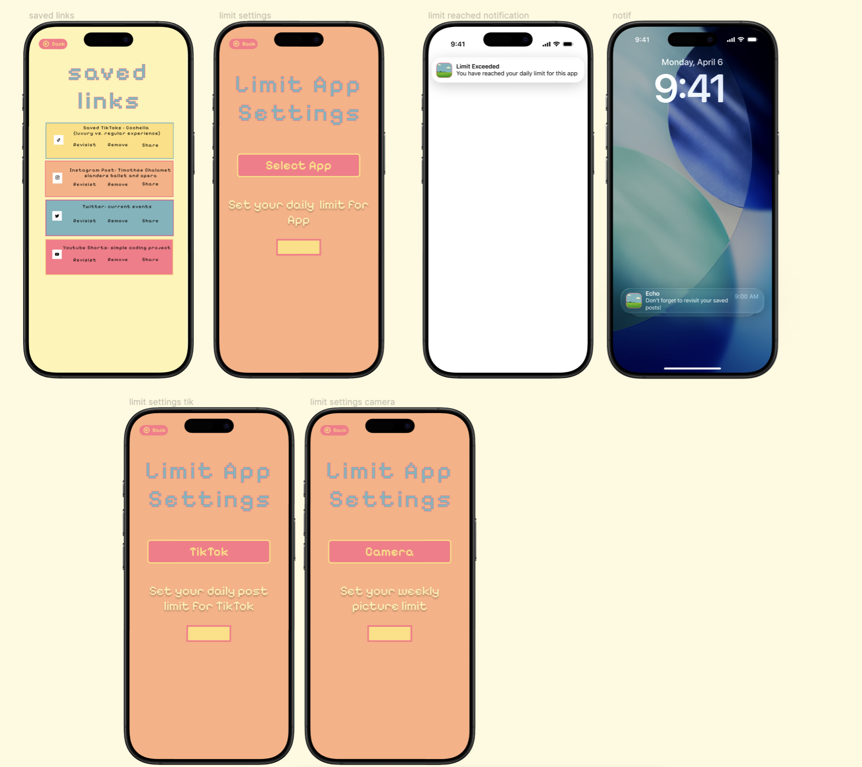
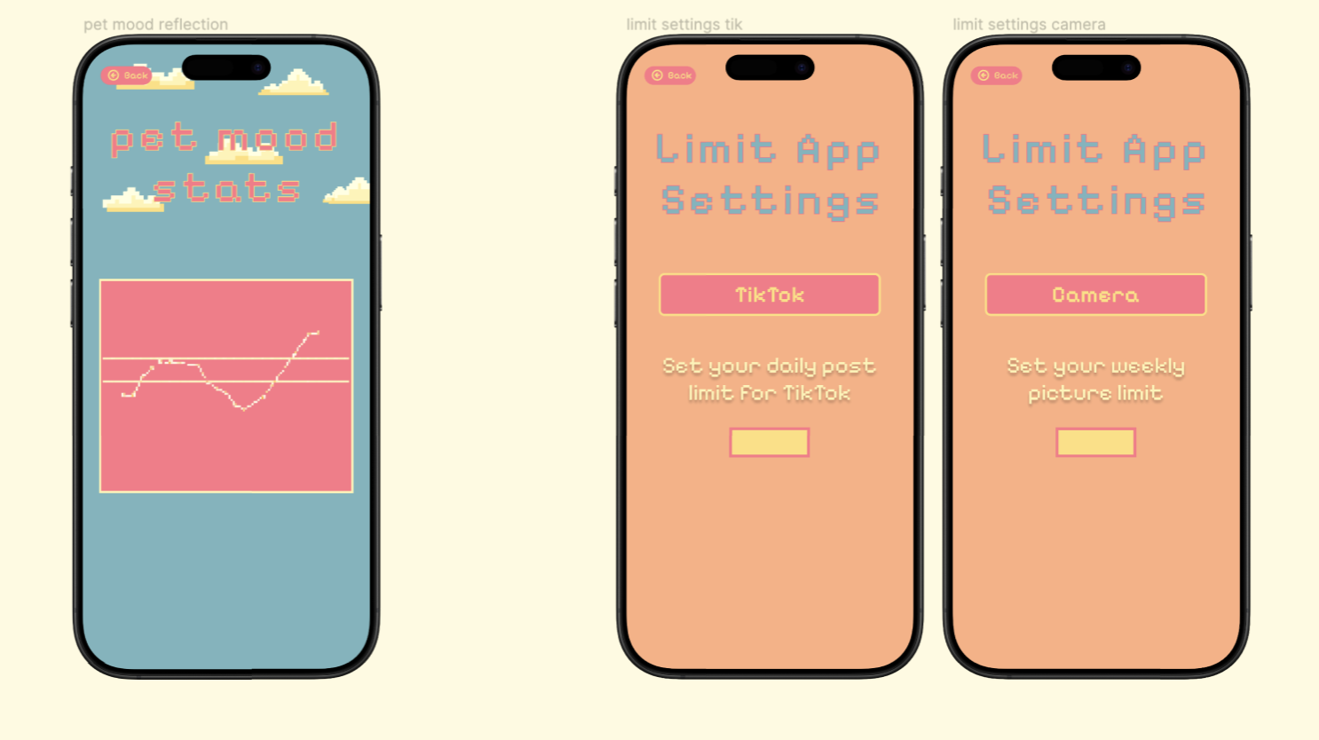
Overview of screens
-

-

-
Inspiration
We were inspired by recent posts and research on attention span, memory retention, and how excessive social media use may negatively impact cognitive health. As Gen Z users, we also wanted the experience to feel engaging and cute, so we chose a pixel-style, playful aesthetic. Our goal was to find a better alternative to passive scrolling and redesign how users interact with content in a more intentional way.
What it does
Echo encourages users to slow down, take a breath, and reflect on the content they consume instead of passively scrolling. While most apps focus on time limits, Echo introduces a post based limit, allowing users to control how much content they engage with rather than how long they spend. For example, instead of scrolling endlessly for 20 minutes and seeing dozens of posts, users are shown a limited number of posts and encouraged to focus on what actually resonates with them. This shifts the experience from passive consumption to intentional, mindful interaction.
How we built it
We designed Echo in Figma, focusing on core user flows, limited feed interaction, saving posts, reflection moments, and a companion system that responds to user behavior. We prioritized simplicity and clarity to ensure the concept remained understandable and focused.
Challenges we ran into
One major challenge as our mentor gave us feedback was uncertainty around whether limiting posts guarantees users will encounter meaningful content worth saving or reflecting on. We also discussed the counterargument that social media is not only for deep reflection sometimes it is meant for light entertainment and casual browsing so it’s the end if the user doesnt get a meaningful set of posts everyday. Another challenge was scope. We initially had many ideas and screens, but had to narrow down and prioritize a single clear user flow to avoid overcomplicating the product.
Accomplishments that we're proud of
We are proud that, as a team with mostly beginner experience in UI/UX, two members learned Figma during the project and were still able to design a cohesive and thoughtful experience. We also developed a strong concept and visual direction that aligns with our theme while remaining accessible and engaging.
What we learned
We learned to focus on defining the core problem before designing solutions, rather than assuming user behavior. We also learned the importance of simplifying ideas and prioritizing a single clear user flow instead of trying to include too many features at once.
What's next for Echo
Next, we aim to expand Echo beyond social media by integrating other productivity and learning platforms such as GitHub and Canvas. This would allow users to reflect not only on consumption habits but also on productivity and creative output. We also plan to further develop visual elements, personalization, and companion interactions to make the experience more immersive and meaningful over time.
Built With
- figma

Log in or sign up for Devpost to join the conversation.