-
-
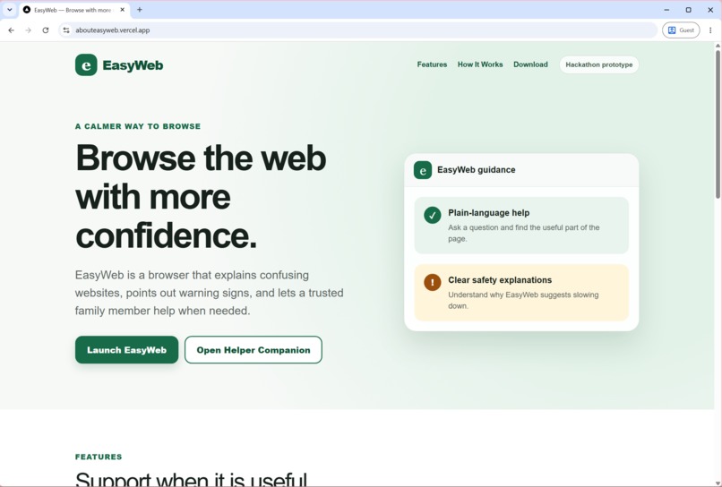
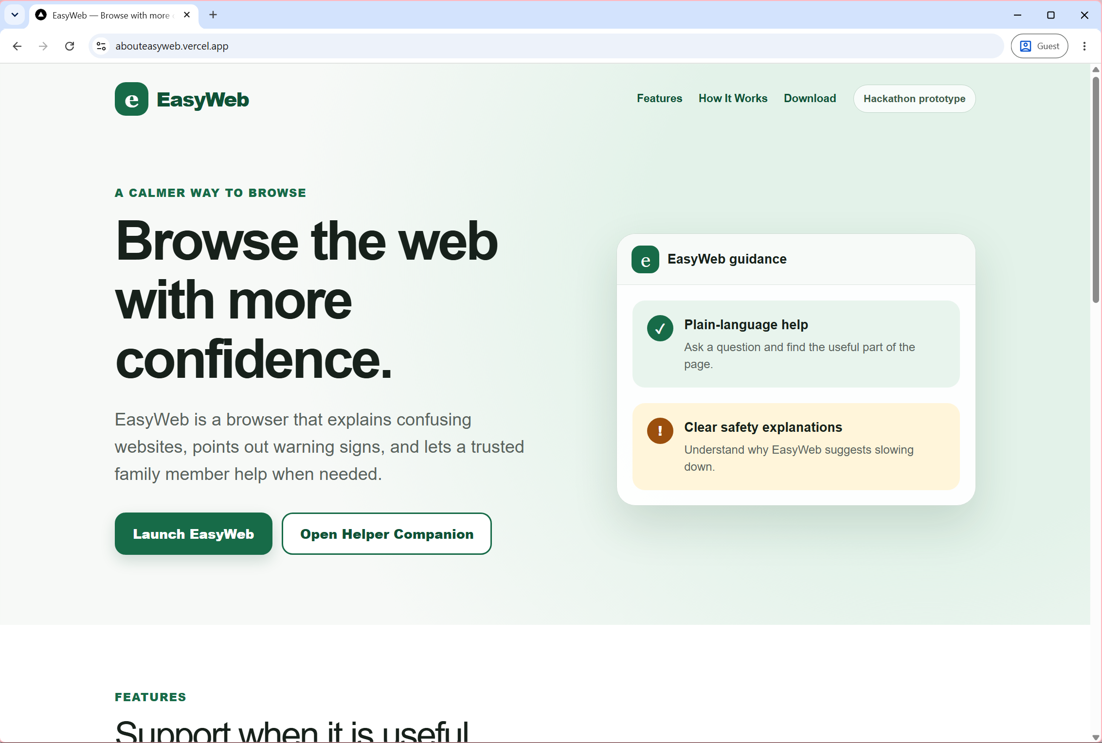
Website Landing Page
-
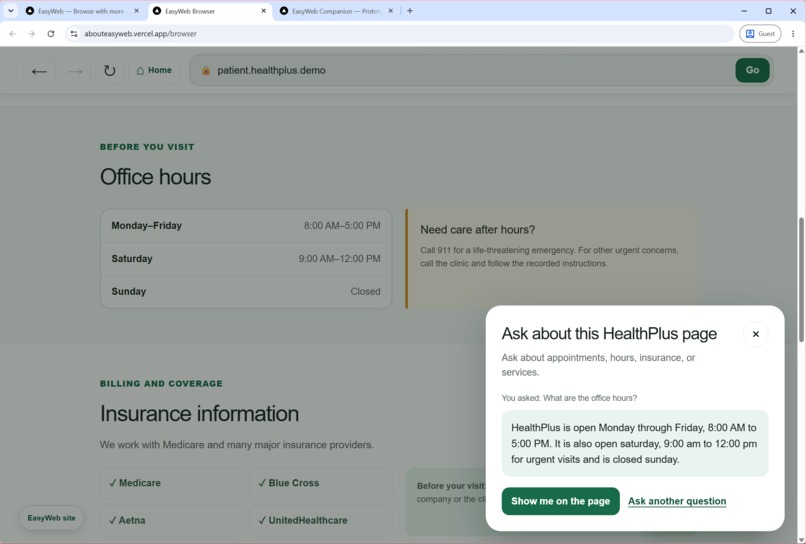
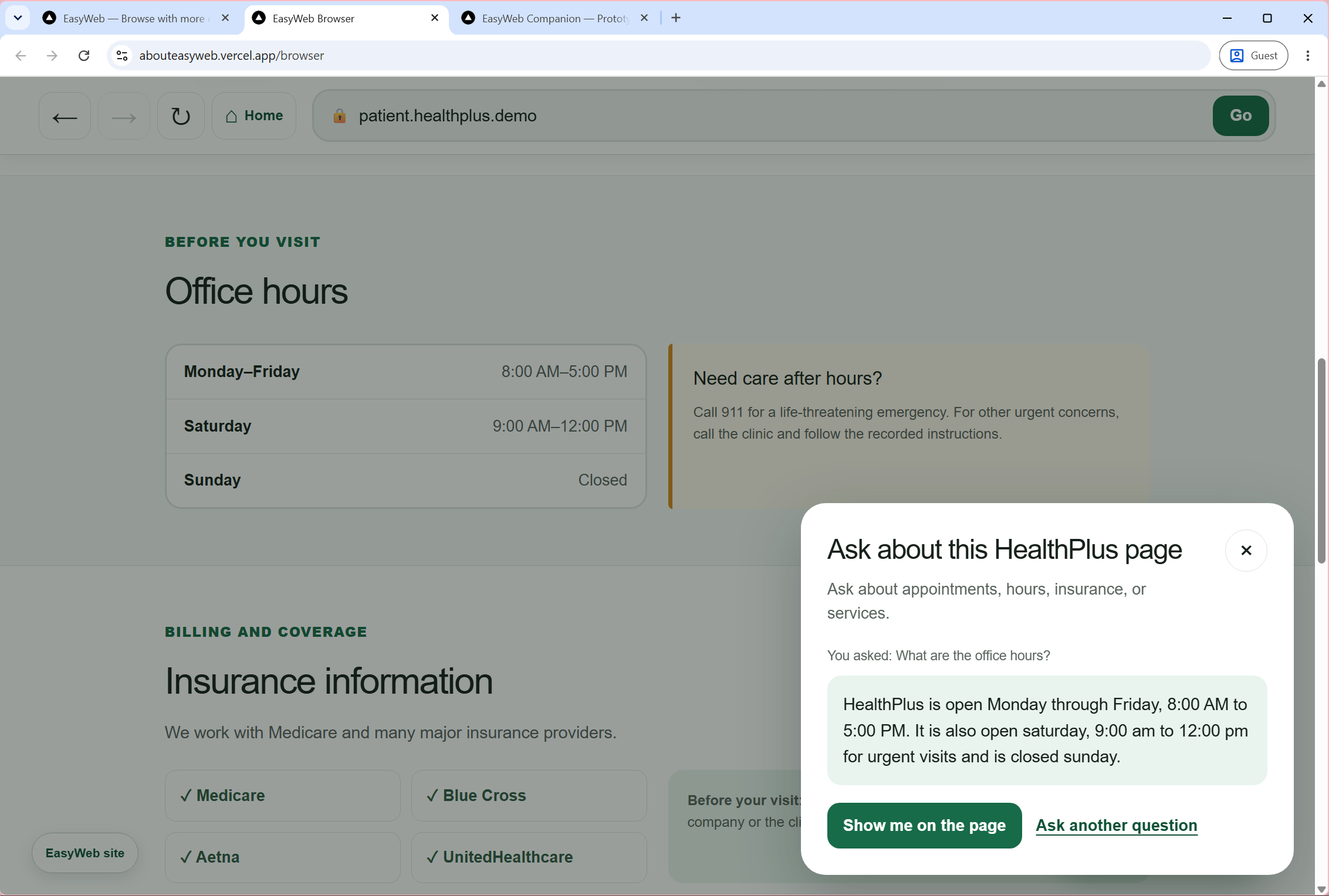
EasyWeb's browser assistant can show info on page
-
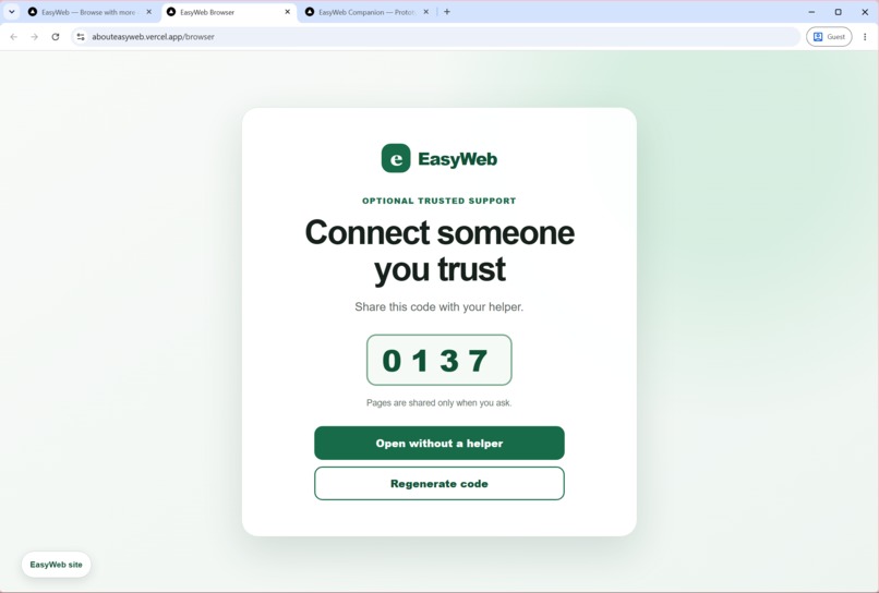
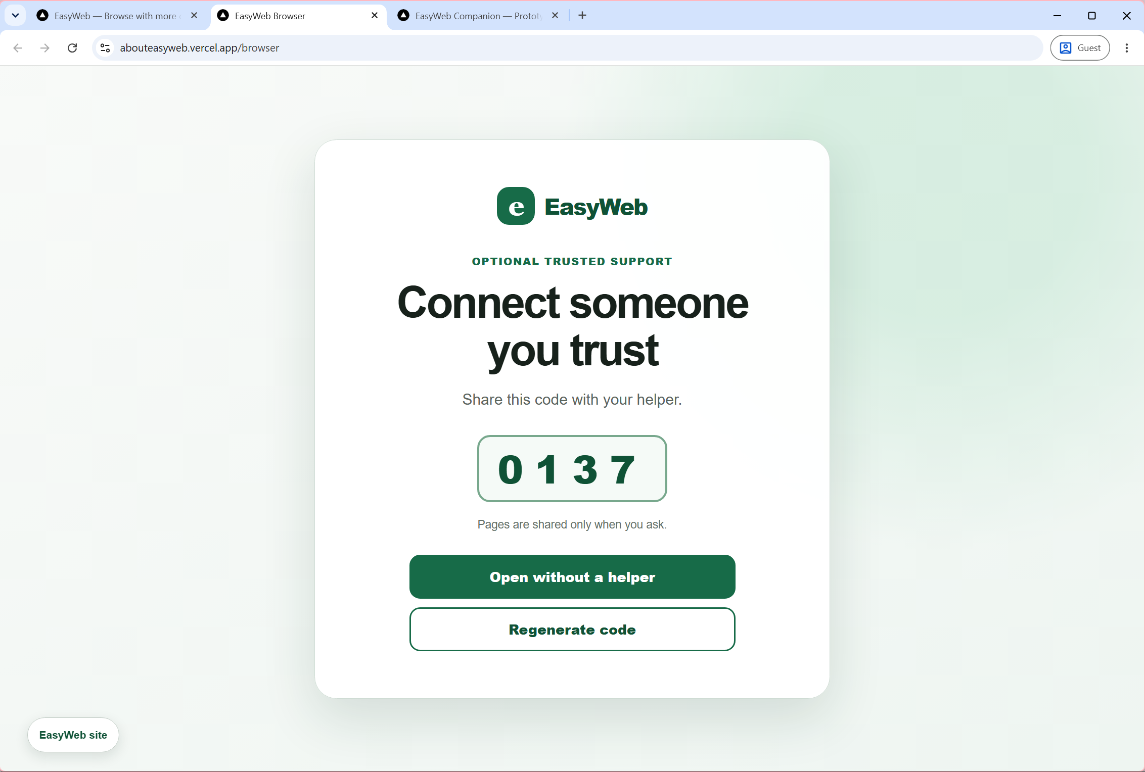
Browser User Connect Page
-
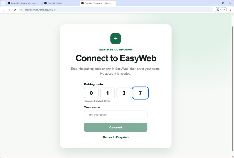
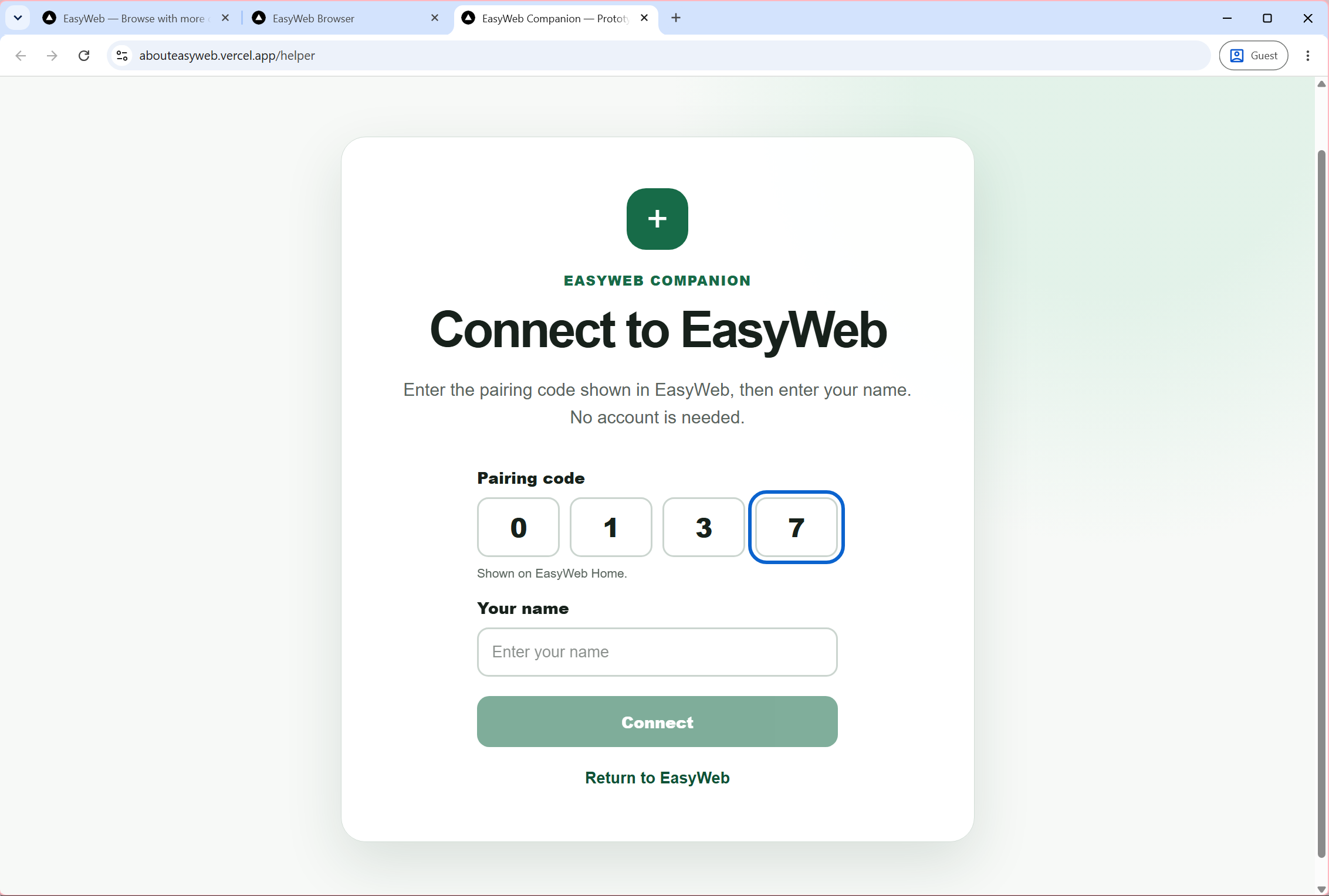
Helper Connect Page
-
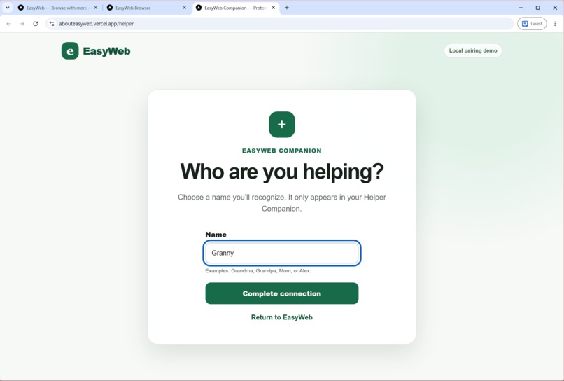
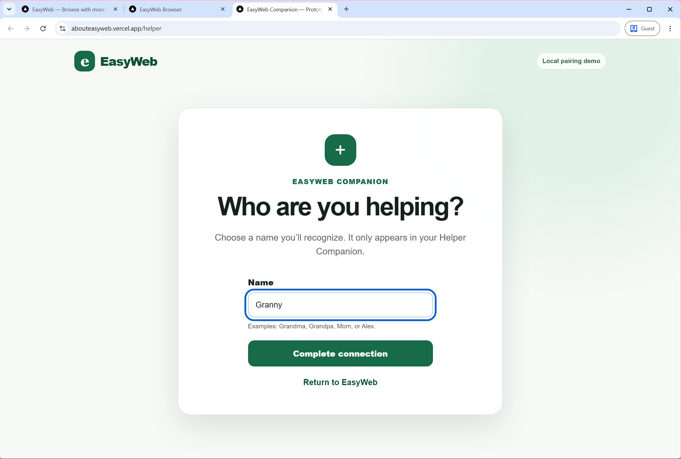
Custom browser user's name
-
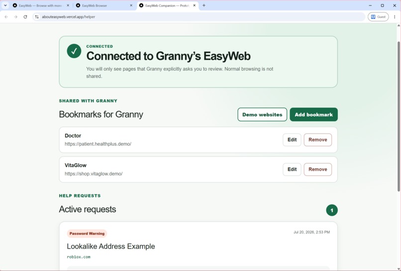
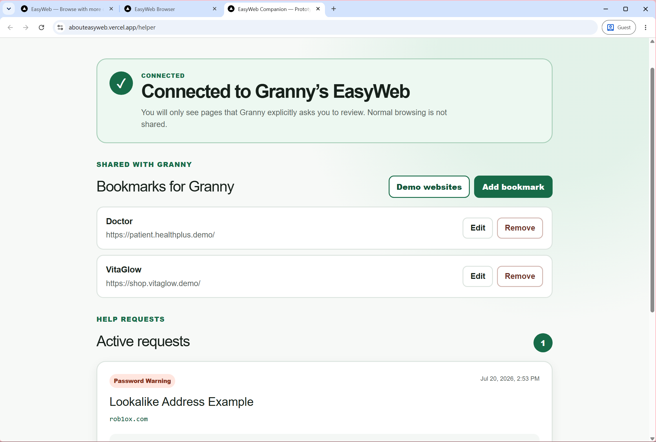
Helper's Page
-
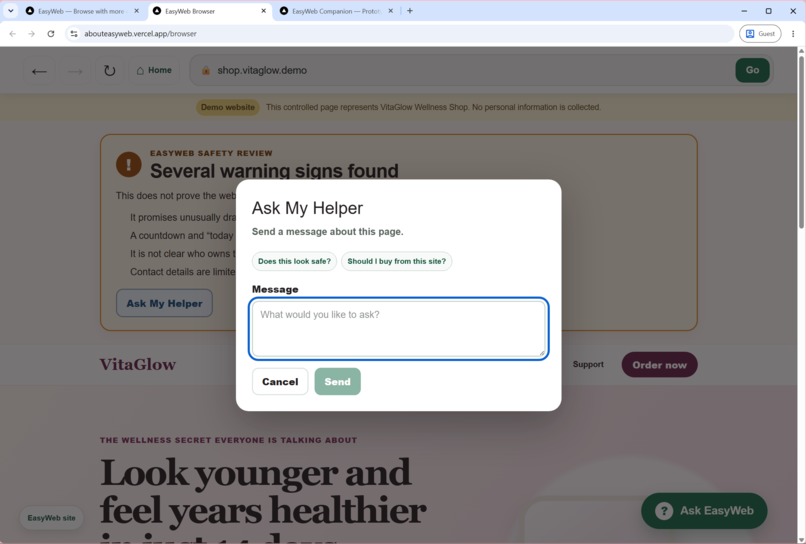
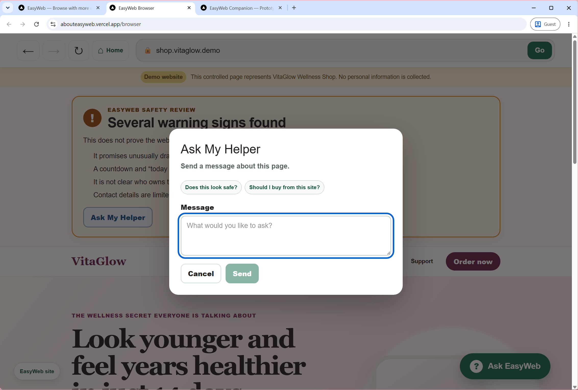
Browser User Request Help
-
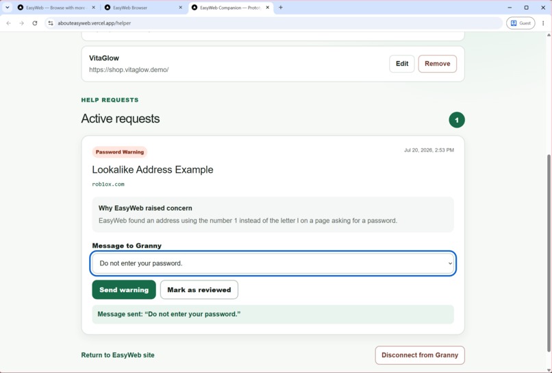
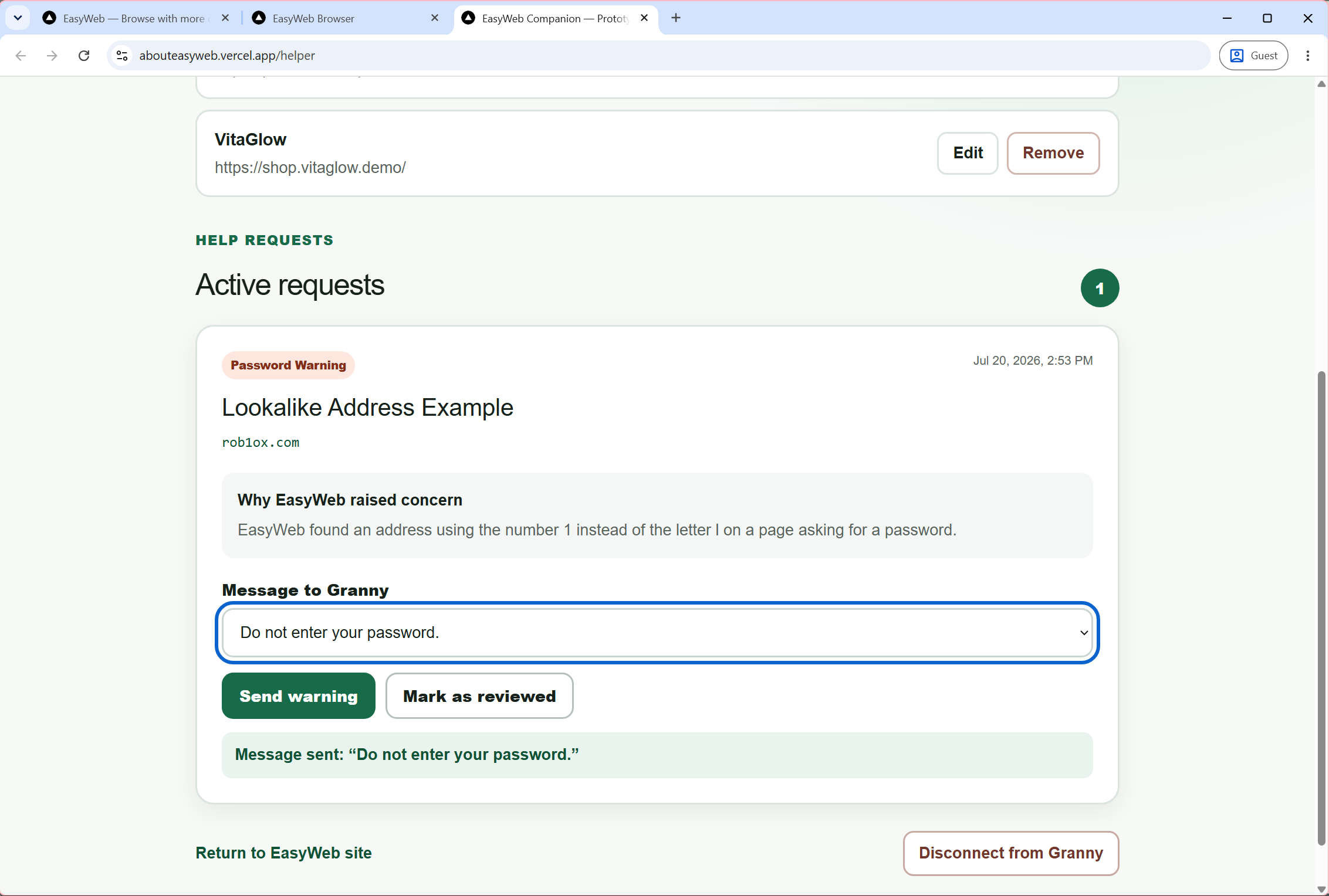
Helper Help Requests
Inspiration
EasyWeb started with my own family.
My grandma is in her 90s and rarely uses her iPhone because technology feels overwhelming to her. She’s afraid of pressing the wrong button or getting stuck somewhere she doesn’t understand, so she often avoids the internet altogether.
As I watched other senior family members use the web, I realized they struggled in different ways. Some worry about making a mistake and ask for reassurance before tapping even the smallest pop-up or permission prompt. Others confidently click through unfamiliar websites, only to end up on convincing phishing pages or scam stores without realizing anything is wrong.
The internet has become more complicated over the years. Modern browsers are filled with settings, notifications, menus, and many buttons that people don’t need. Websites are cluttered with pop-ups, advertisements, sponsored links, and confusing layouts, making it hard to know what information to trust or what action to take next.
Watching my family face these challenges made me realize the problem isn’t a lack of intelligence or willingness to learn. The internet has become too complicated for many people, and today’s browsers offer little help when users feel uncertain.
I wanted to build something that could help not only my own family, but anyone who feels overwhelmed, intimidated, or unsure while browsing the web. Instead of expecting people to understand every website, EasyWeb is designed to help the internet make more sense to them.
How I Built It
EasyWeb was built as a full-stack Next.js application using React and TypeScript. The project consists of two connected experiences:
- EasyWeb Browser, where users browse the web with additional guidance and safety features.
- EasyWeb Companion, which allows a trusted family member to manage bookmarks and respond when help is requested.
The browser includes a simplified interface, contextual guidance through Ask EasyWeb, page-specific explanations, phishing detection for lookalike websites, and a “show me on the page” feature that highlights relevant information directly on supported websites.
To demonstrate these features, I created several realistic demo websites, including a healthcare portal, a fake online shopping website, and a phishing login page. Together they showcase how EasyWeb helps users understand websites, recognize possible scams, and confidently decide what to do next.
Throughout development, I used Codex to accelerate implementation, refactor components, polish the user experience, and iterate on features while making the architectural and product decisions myself.
Challenges
One of the biggest technical challenges was supporting real websites.
Modern websites often block themselves from being embedded inside another browser experience due to security restrictions, making it impractical to demonstrate live website understanding within the scope of a hackathon.
Instead of spending the project fighting browser limitations, I focused on creating realistic demonstration websites that allowed me to reliably showcase the browsing experience, contextual explanations, safety warnings, and helper interactions.
Another challenge was balancing simplicity and usefulness. When adding new features, I had to ask myself if it would help users browse more confidently or add confusion.
What I learned
This project taught me that accessibility is about more than physical limitations. Many people feel overwhelmed by today’s websites not because they aren’t capable, but because the internet has become increasingly complex. I learned the importance of designing around people’s confidence rather than assuming they need more technical knowledge. Sometimes the most helpful technology isn’t one that does everything for you; it’s one that helps you understand what’s in front of you before you click.
I also started noticing how many browser interactions quietly assume experience. Small things that seem obvious to frequent internet users, like knowing you can press Enter to search, recognizing unfamiliar icons, or understanding what a button does, aren’t always obvious to everyone. I remember my mom asking what the small handle in the corner of a text box was for because she had never seen it before. Moments like that reminded me that people aren’t struggling because they’re incapable; they’re struggling because the web often assumes knowledge they were never taught.
That experience influenced many of EasyWeb’s design decisions. Rather than relying on icons alone, I tried to make actions explicit with clear labels like “Go,” simple navigation, and plain-language explanations. My goal wasn’t to simplify the internet by removing functionality; it was to make it feel approachable without making people feel embarrassed for asking questions.
More than anything, this project reminded me that good technology shouldn’t make people feel left behind. It should make them feel capable.
Built With
- codex
- git
- next.js
- openai
- react
- tailwind
- typescript


Log in or sign up for Devpost to join the conversation.