-
-

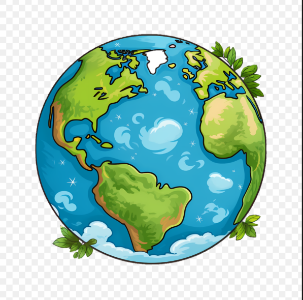
EarthPulse
About EarthPulse Where the inspiration came from Climate change and global warming keep accelerating, but day to day it is easy not to feel how fast the planet is shifting. I wanted a place where you see the real effects: not a vague headline, but what was before and what came after, in the same spot. That honesty is the hook. From there, the app nudges you toward one small action you can repeat, because small choices, sustained, still matter over the long run.
What it does EarthPulse lets you explore many real locations where the Earth has changed over time, through natural processes and human pressure, using before and after satellite style imagery and supporting detail so the story is concrete, not imaginary. Each place comes with context: what happened, why it matters, and one practical thing you can start today to reduce how often we replay the same kind of climate and environmental harm.
How we built it Clients: web browser and mobile web hit a Vercel hosted app; GitHub is the source of truth for the repo and deploy integration.
Application: Next.js 16, React 19, TypeScript, Tailwind v4.
3D and motion: Three.js, globe.gl for the interactive globe, Framer Motion for UI motion.
Serverless API routes (Next.js route handlers, secrets from Vercel env):
GET /api/analyze for stress reports, weather, optional AQI GET /api/satellite for map stills or bbox style satellite assets POST /api/dead-zone-story for AI narratives (IBM watsonx, then Gemini when configured) POST /api/dead-zone-reading for reading links POST /api/plan for the climate plan style panel POST /api/place-research for place research briefs Data and AI (outbound HTTPS): curated catalogue shipped in app (src/lib/deadZones*.ts), plus Open Meteo, OpenWeather (optional AQI), OSM or Nominatim geocoding, and model providers (IBM watsonx.ai, Google Gemini, OpenAI) for narrative or research helpers.
Algorithm in simple terms:
User selects a pinned place on the globe. The app loads structured facts and imagery pairs for a before window and an after window. Server routes fetch or assemble weather, air, and geospatial context where keys exist. Narrative routes call IBM watsonx (and fall forward to Gemini when wired) to turn evidence into readable copy, not invented damage. The client shows the before and after control, reading links, plan style panel, and one small action you can adopt. System diagram
EarthPulse system diagram Source file in repo: images/earthpulsesystemdiagram.png
Challenges we hit 3D rendering was the steepest climb because it was my first serious pass at globe scale visualization, so camera moves, performance, and keeping the UI readable took iteration. Aggregating and normalizing a large amount of geospatial and narrative data also took tweaking: mismatched dates, messy sources, and keeping the experience smooth without lying about uncertainty.
What I am proud of I built EarthPulse solo, started late, and still shipped something that feels impactful and fun to spin and explore. Making heavy topics approachable without sanding away the truth was the goal, and seeing people actually use the globe and sliders felt like the win.
What I learned Visibility changes compassion. When before and after is tied to a named place, the brain holds the story longer than another chart in a feed.
Where I would take it next More data (more pins, richer time ranges, clearer sourcing), smoother performance and transitions, and a stronger 3D globe experience so the “orbit first” moment feels even more inevitable.


Log in or sign up for Devpost to join the conversation.