-
-
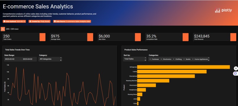
Gradent colored Header, KPI Cards, Line Chart and Bar Chart
-
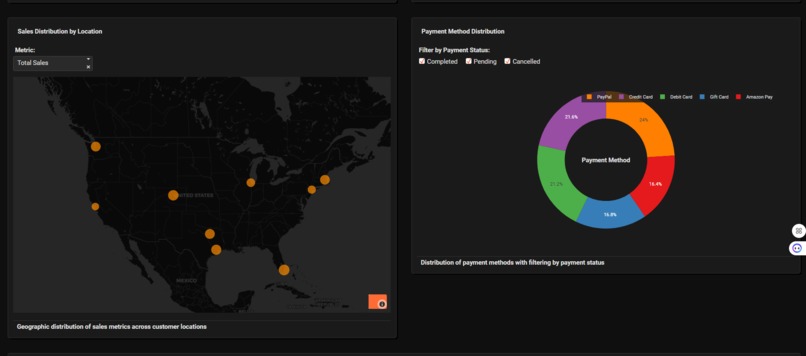
Bubble Map and Donut Chart
-
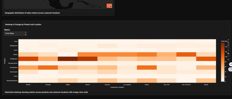
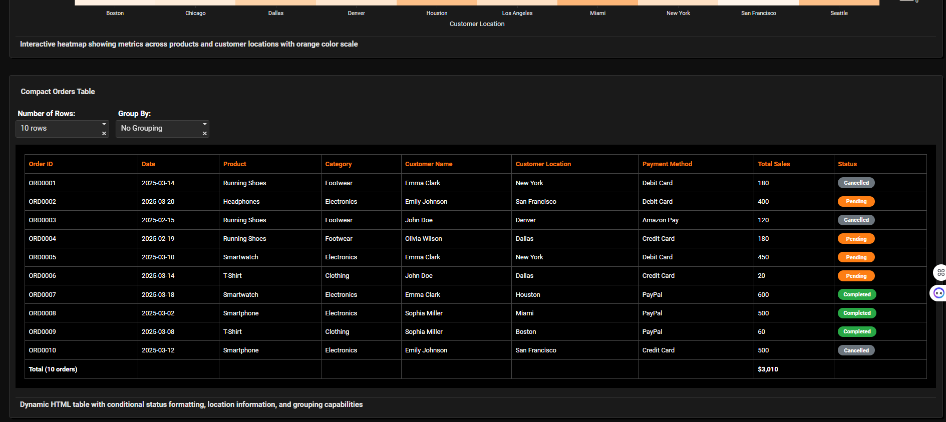
Heatmap
-
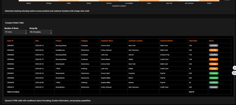
HTML table with conditional colored pills


Inspiration
The wave of digital transformation has made data-driven decision-making essential, especially in e-commerce. I was inspired to create an intuitive and visually rich analytics dashboard that empowers users to transform unprocessed data into actionable insights—helping them identify trends, optimize strategies, and ultimately boost their revenue.
What it Does
My E-commerce Sales Analytics dashboard provides a comprehensive overview of an online store’s sales performance. It:
- Visualizes total orders, revenue, and average sales through summary cards.
- Tracks sales trends over time with interactive filtering by date and category.
- Compares product performance across multiple categories.
- Map the geographic distribution of sales.
- Breaks down payment methods and completion rates.
- Offers a dynamic, filterable orders table with real-time status highlighting.
How I Built It
- Utilized Plotly Dash for the dashboard interface, taking advantage of its interactive charting capacities.
- Designed:
- Line and bar charts for sales analytics.
- Scatter map for regional breakdowns.
- Donut chart for payment pattern visualization.
- Heatmap by Location and Product
- Dynamic HTML table with color-coded statuses.
- Implemented user-friendly filters for timeframe, product category, payment status, and more.
- Designed:
I removed the data table, I added a new HTML table and I used this additional prompts:
- Theme: "Orange color shades, hero is in black backround with gradient black, blue and orange"
- Layout: "Add the chart heatmap_in_orange_by_product 100% width Compact Orders Table (100%)"
- Map: "Sales distribution as a scattter map, in dark mode with dropdown to toggle between total sales and order count metrics in orange and red, show the names of the locations above the scatter"
- Donut Chart: "Payment method distribution as a donut chart with checklist to filter by payment status with 5 different colors from right descend colors with bigger hole, in the center will be a text as Payment Method"
- Heatmap: "make a Heatmap in orange by Product and Location"
- Compact Orders Table: "Add compact HTML table dinamycally with conditional formatting as pill for the status column in orange, red and grey and similar colors I want it only in black background I need plus Location column Allow pivoting by grouping and show paying methods Show headers with orange colors Show labels on filter with white colours Filter for the row numbers dinamically"
- UI/UX
- Focused on a dark theme to reduce eye strain and highlight color-coded data.
- Ensured component responsiveness and consistent visual hierarchy.
Challenges I Ran Into
- Data Consistency: E-commerce data came with varying formats, missing values, and status inconsistencies. I needed robust preprocessing scripts to clean and standardize it.
- Performance Bottlenecks: Rendering large datasets with complex interactivity caused lag. We integrated caching and reduced payload sizes to enhance performance.
- Balancing Simplicity & Detail: I wanted a dashboard that is easy to navigate but also provides deep dives when needed. Tuning chart types, filters, and groupings was an iterative process.
- Conditional Formatting: Highlighting status (“Completed”, “Pending”, “Cancelled”) effectively in a table without cluttering took careful UI decisions.
Accomplishments That I am Proud Of
- Unified Analytics Platform: I created a one-stop solution for multiple sales metrics, giving business users clarity at a glance.
- Seamless Interactivity: Users can filter and analyze the data instantly, gaining new insights in real time.
- Visual Storytelling: The dashboard tells a “story” of the business—revealing trends, hot products, and payment preferences effortlessly.
- User-Centric Design: Positive feedback on the interface flow and visual appeal reinforces our design approach.
What I Learned
- Importance of Clean Data: Accurate insights start with thorough data preprocessing.
- Effective Visualization: Picking the right charts—bar for comparison, donut for composition, map for distribution—makes a huge difference in understanding.
What’s Next for E-commerce Sales Analytics
- Predictive Analytics: Integrate machine learning models for sales forecasting and personalized recommendations.
- Customer Segmentation: Add modules for deeper demographic and behavioral analysis.
- Integration: Enable connections to real-time data sources (APIs), supporting live analytics.
- Export & Reporting: Allow users to generate custom PDF or Excel reports directly from the dashboard.
- Enhanced Collaboration: Implement multi-user sharing and commenting features.
Built With
- plotlycloud
- plotlystudio

Log in or sign up for Devpost to join the conversation.