Inspiration
Every flashcard app has the same leak: the answer is one tap away, so you peek. And re-reading feels like studying. In Roediger & Karpicke (2006), students who read a passage once and then tried to recall it three times remembered 61% a week later. Students who read it four times remembered 40%, and they predicted they'd do better. Feeling ready isn't remembering. Recalling is.
A paper index card solves this by accident: you have to answer before you flip it. iPhone Duo is the first phone that folds like one. So the hinge became the flashcard.
What it does
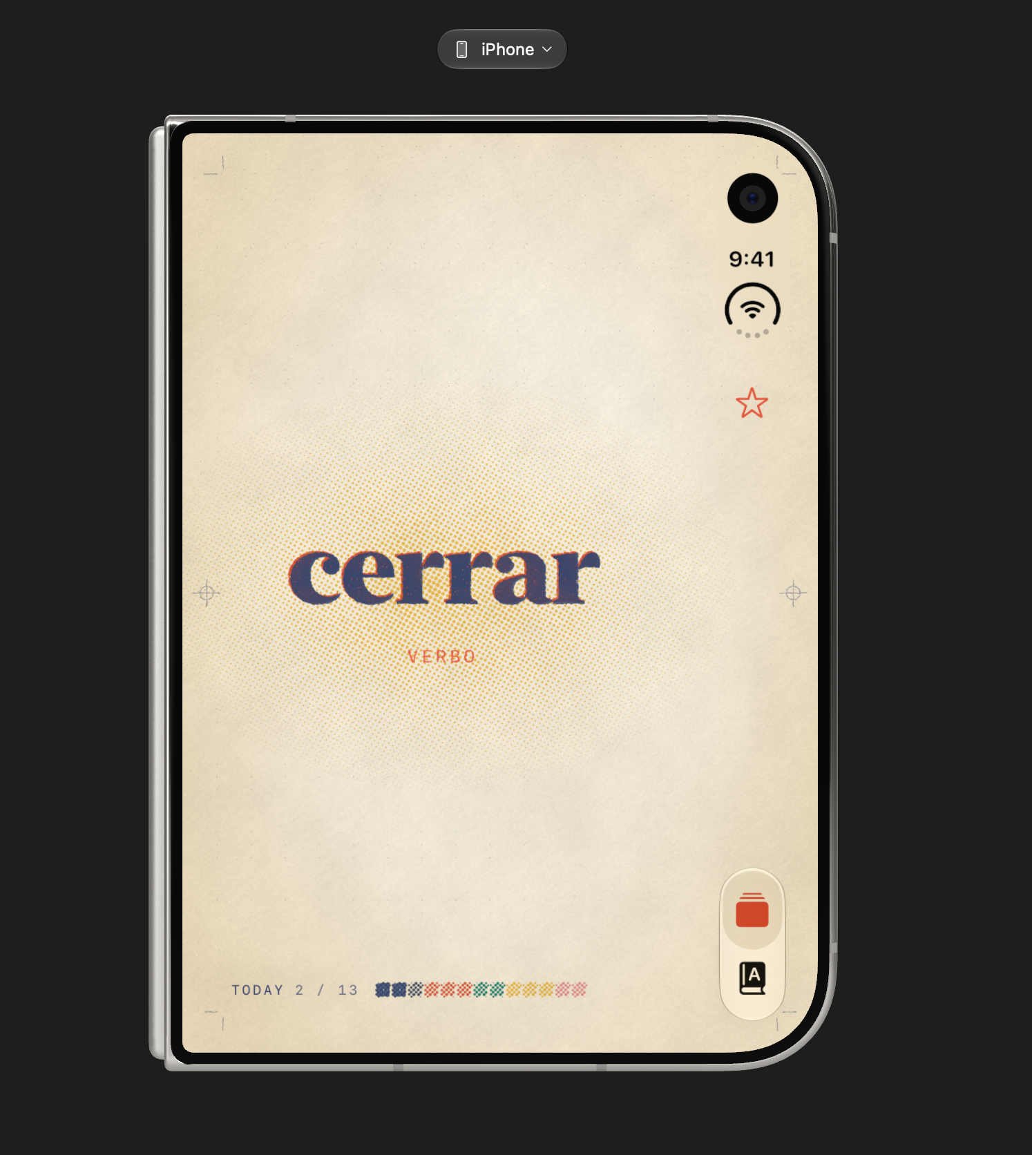
duo-lingo puts the question on the cover display and the answer inside the fold.
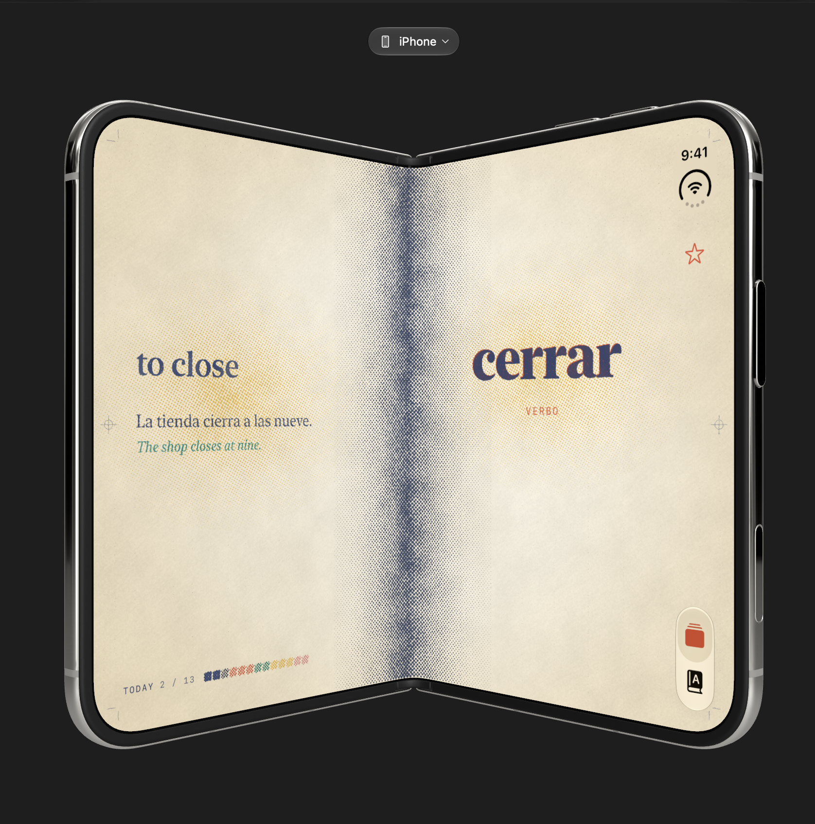
- Fold, recall, unfold. Closed, the cover shows one word or concept. Say the answer out loud, then open the phone. As the hinge opens, the answer develops on the left page like ink coming up on a print, a warm lamp of halftone comes on behind it, and the crease deepens with the fold.
- Fold it shut to move on. The card deals off the stack and today's color bar prints a swatch for it.
- Miss one? Star it. It comes back three cards later, until you clear the star.
- Decks: Spanish and Japanese, plus 61 college cards across Biology, Chemistry, Physics, Calculus and Linear Algebra. For example, the chain rule, \( \frac{d}{dx}\sin(x^2) = 2x\cos(x^2) \), or the Krebs cycle's 3 NADH, 1 FADH₂, 1 GTP.
- Make a deck from any link. Paste a URL: a lecture page, a Wikipedia article, a chapter. The app reads the page and OpenAI writes a deck of flashcards sized for the cover display. Then fold and study them.
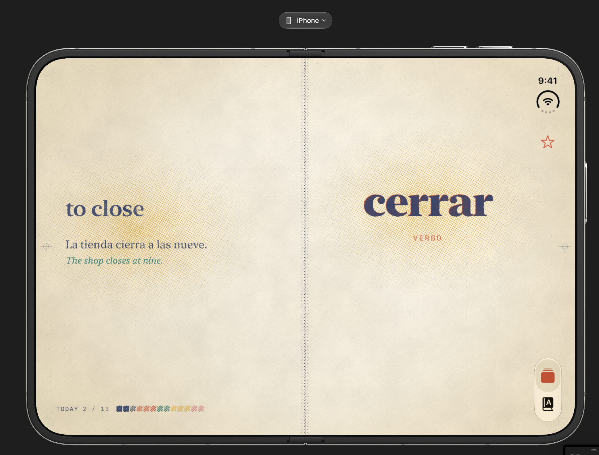
- Unfolded, it's a book. The inner display shows your decks beside their cards in a split view that stays clear of the fold, and a tap turns the page when the phone is lying open on a table.
How I built it
- SwiftUI on the iOS 27 SDK, generated with XcodeGen, built solo in about four hours in Bitrig with its built-in Claude Code harness.
- Hinge:
onHingeChangewithDeviceHingeContext(closed / partially open / fully open, plus the angle) drives the whole study loop. Opening reveals; closing deals the card away. The angle drives how far the answer's ink has developed. - Two displays, one app: compact width means the cover display, which shows only the card stack. Regular width means the inner display: a two-page spread with the word on the right and the answer on the left.
- The fold:
reservedRegions(kind: .division)finds the hinge, so no text ever sits in the crease, and the two pages bind into a book around it. - The riso look: four Metal shaders in
Riso.metalvia SwiftUI's shader effects:risoPaper: uncoated stock, with cloudy formation, fiber tooth and warm falloff at the edges.risoHalftone: each ink screened at its own angle, with dots that swell unevenly like a drum laying down ink.risoInk: solids that print blotchy and flecked, with the paper glowing through.risoRoughen: type edges that sit in the paper.
Set in New York, with a three-plate halftone paper crane printed a hair out of register.
- AI decks: the app fetches the page with URLSession and strips it to text. OpenAI's Responses API, with a strict JSON schema, returns cards in the app's own format: term, note, meaning, example and elaboration.
Challenges I ran into
- Unfolding showed the crane instead of the answer. The cause was my own screenshot tooling. It launched the app with a debug
-hingeAnglepose, which pinned the fold state, so real unfolds were ignored. I recorded the hinge events to a log, replayed them through the study session in a test binary, and changed the pose to unpin on the first real hinge movement. The old code never revealed; the new code does. - You can't automate a hinge. The simulator has no scripted fold control. A Bitrig engineer confirmed that clicking the fold controls (computer use) is the only way. So every fold-logic change was verified by replaying recorded hinge data.
- Making print look printed. My first pass was flat fills and uniform dots, which is what "riso filter" usually means, and it looked like slop. The fix was modeling the press: per-plate screen angles, uneven ink uptake, misregistration and real paper tone.
- Long STEM terms on a small cover. "Krebs cycle" fits; a whole theorem doesn't. Science and math cards wrap to two lines, drop the note to its own line, and pin symbols like
=,≥and⇌with non-breaking spaces so an equation never breaks mid-sign.
Accomplishments that I'm proud of
- The hinge is the interaction. There's no reveal button to cheat with while the phone is closed.
- The answer developing in ink as the phone opens: the angle matters, not just open or closed.
- A print aesthetic built from shaders, not a texture overlay.
- 61 fact-checked college STEM cards and an AI deck from any link, all in a solo four-hour build.
What I learned
- The best new-hardware apps make the hardware the metaphor. A fold is a flashcard.
- The research on retrieval practice is strong, and people consistently misjudge it. The app has to force the good habit, because learners won't choose it.
- Debug affordances can masquerade as product bugs. Log real input and replay it before trusting a fix.
- Taste is in the details: screen angles, ink density and paper tone.
What's next for duo-lingo
- Spaced repetition across days, not just within a session.
- Spoken answers: say it out loud before unfolding, and let on-device speech check it.
- Share decks, so a class or study group studies from one link.
- Photo to deck: snap a textbook page or whiteboard.

Log in or sign up for Devpost to join the conversation.