-
-
Drug Analysis Simplified explanation data app

Inspiration
The beauty and complexity of molecular interactions in drug discovery have always fascinated us. Each molecule tells a story—how its structure influences a protein, how subtle changes can determine whether a compound is active or inactive. Yet, making sense of these massive datasets can feel overwhelming.
We were inspired to bring clarity to complexity. By combining AI and interactive visualization, we aimed to create a tool that doesn’t just analyze data—it lets researchers see the invisible threads connecting molecular features to biological outcomes. This project is our attempt to make drug discovery exploration intuitive, engaging, and insightful.
What it does
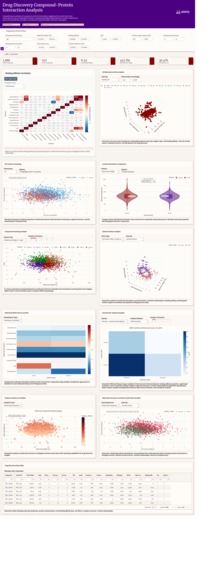
This dashboard transforms the Drug Discovery Virtual Screening Dataset from Kaggle into a living, interactive visualization of molecular interactions.
Key capabilities include:
- Correlation Heatmaps that reveal hidden relationships between molecular and protein descriptors.
- 3D Scatter Plots of molecular weight, LogP, and binding affinity to understand how properties influence activity.
- PCA Feature Clustering to uncover structure–activity relationships at a glance.
- K‑means Clustering to reveal molecular pattern groupings.
- Violin and Distribution Plots to compare active versus inactive compounds.
- Interactive Filtering for dynamic exploration of compound and protein properties.
In essence, this app bridges data and biology, giving users a visual and intuitive way to connect molecular descriptors—like hydrophobicity, hydrogen bonding, and polar surface area—to binding affinity and activity status.
How we built it
- Framework: We leveraged Dash Design Kit (DDK) and Plotly, which are phenomenal for interactive visualization. Plotly allows us to create dynamic, high-quality charts effortlessly, rendering 3D scatter plots, violin plots, and heatmaps that make subtle molecular patterns visible immediately.
- Programming: Built in Python, using NumPy and pandas for efficient numerical and statistical computations.
- AI / Analysis: Implemented PCA and K‑means clustering manually, giving us full control over dimensionality reduction and unsupervised grouping.
- UI / UX: Designed a clean, responsive interface with modular cards, intuitive controls, and robust error handling. Plotly’s flexibility enabled us to combine scientific rigor with visually elegant storytelling.
- Dataset: Utilized the Drug Discovery Virtual Screening Dataset (Community Data License), containing rich compound–protein interaction features such as:
$$\textbf{Molecular & Physicochemical Properties:}$$ $$\text{compound_id, molecular_weight, logP, compound_clogP, mw_ratio}$$
$$\textbf{Hydrogen Bonding & Structural Flexibility:}$$ $$\text{h_bond_donors, h_bond_acceptors, rotatable_bonds, polar_surface_area}$$
$$\textbf{Protein-Level Descriptors:}$$ $$\text{protein_id, protein_length, protein_pI, hydrophobicity, binding_site_size}$$
$$\textbf{Interaction & Activity Metrics:}$$ $$\text{logP_pI_interaction, binding_affinity, active}$$
Challenges we ran into
- Harmonizing molecular and protein features with vastly different scales.
- Building PCA and K‑means from scratch while keeping performance high for large datasets.
- Maintaining stability and usability when users applied extreme filters or incomplete data.
- Designing layouts that are both scientifically informative and visually appealing across multiple modules.
Accomplishments that we're proud of
- Created a unified dashboard connecting diverse analytical modules seamlessly.
- Achieved smooth interactivity even with complex datasets.
- Successfully implemented manual PCA transformation and clustering from scratch using NumPy.
- Delivered a polished, intuitive interface that makes scientific exploration enjoyable and engaging.
What we learned
- Visual analytics can turn overwhelming biochemical data into clear, actionable insights.
- Data preprocessing is as critical as algorithm choice for interpretability and accuracy.
- Dash’s modular design enables scalable, maintainable solutions for complex scientific applications.
- Good visualization reveals hidden patterns faster than numbers alone.
What's next for Drug Discovery Compound-Protein Interaction Analysis
- Integrate machine learning models to predict compound activity from molecular descriptors.
- Add automated feature importance scoring and explainable AI (XAI) components.
- Enhance 3D molecular visualization with rotational rendering of interactions.
- Expand compatibility with multiple public bioassay datasets for broader insights.
- Deploy the dashboard as a fully interactive web app, empowering researchers worldwide to explore drug discovery like never before.
Built With
- api
- cloud
- flask
- javascript
- plotly
- python
- react


Log in or sign up for Devpost to join the conversation.