Inspiration
We have always been passionate about data science. The way people marvel at a sculpture or painting or a really melodic tune, that's exactly how we feel about well-displayed data. We believe that knowledge is power, and that data science gives us knowledge.
What it does
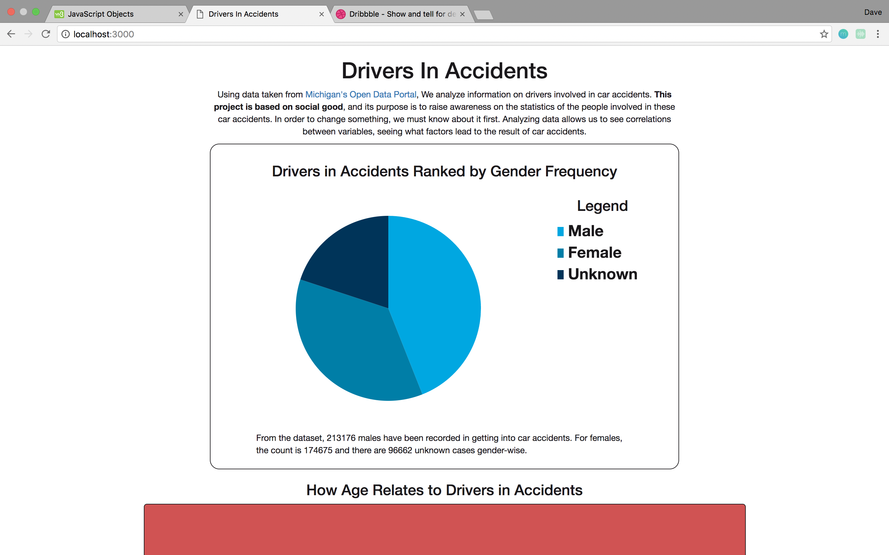
Displays data about people involved in car accidents.
How I built it
We built it with d3.js, along with a lot of pain and suffering...
Challenges I ran into
The dataset provided had a lot of options for us to work with, and D3.js is a really awesome library for data science. But, we needed to pick a scope, and we were just beginners and D3 has a steep learning curve. We tried a lot of different data visualization methods such as bar charts, making our UI/UX really fancy, and even implementing maps. However, we were chopped on time.
Accomplishments that I'm proud of
Getting a pie chart with a legend to work. Learning how to use D3. Being able to make it to this hackathon. It was a tiring 6-hour drive from Hamilton. It was exhausting. But we wanted to make the most of this event, so we sucked it up and used all of our energy to do so. Also, school is actually really busy... but we're proud that we made it through to get here.
What I learned
D3.js. Teamwork.
What's next for DriversInAccidents
We hope to have cleaner visuals and more variety with our charts, such as bar charts and scatter plots, and visuals that implement maps. We want to add animations and transitions. We also plan to really clean up the code and make it more elegant, readable, and robust. More efficient.


Log in or sign up for Devpost to join the conversation.