-
-
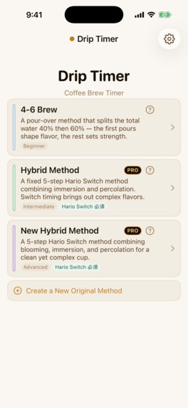
Three brewing methods, plus your own
-
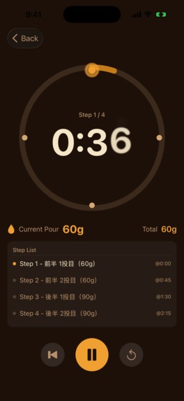
Follow the gauge — how much, and exactly when
-
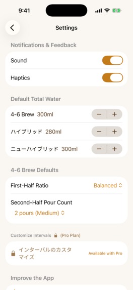
Defaults, sound and haptics
-


Inspiration
Pour-over coffee has a dirty secret: it is mostly arithmetic. The methods that make a genuinely better cup ask you to split your total water into percentages, pour specific amounts at specific seconds, and adjust the split depending on whether you want the cup sweeter or brighter. People do this math on notes apps, on paper, or badly in their heads - while a kettle is running.
We wanted the math gone. Enter one number - your total water - and have every pour computed, timed and announced, so the only thing left to do with your hands is pour.
What it does
Drip Timer Cup of Joe is a step-by-step pour-over brewing timer.
- Enter the total, get the steps. Total water (150-900 ml) and coffee dose (10-60 g) are linked at a 1:15 ratio - change one and the other follows. The app computes how much to pour at each step and exactly when.
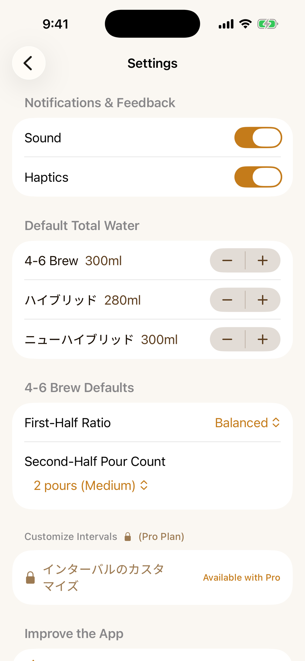
- Three named methods. 4-6 Brew (free) splits the water 40/60 and lets you tune flavor (sweet / balanced / bright) and strength. The Hybrid and New Hybrid methods (Pro) alternate immersion and percolation across fixed five-step recipes.
- Your own methods (Pro). Build recipes step by step - water percentage, wait time, a note per pour - and save as many as you want.
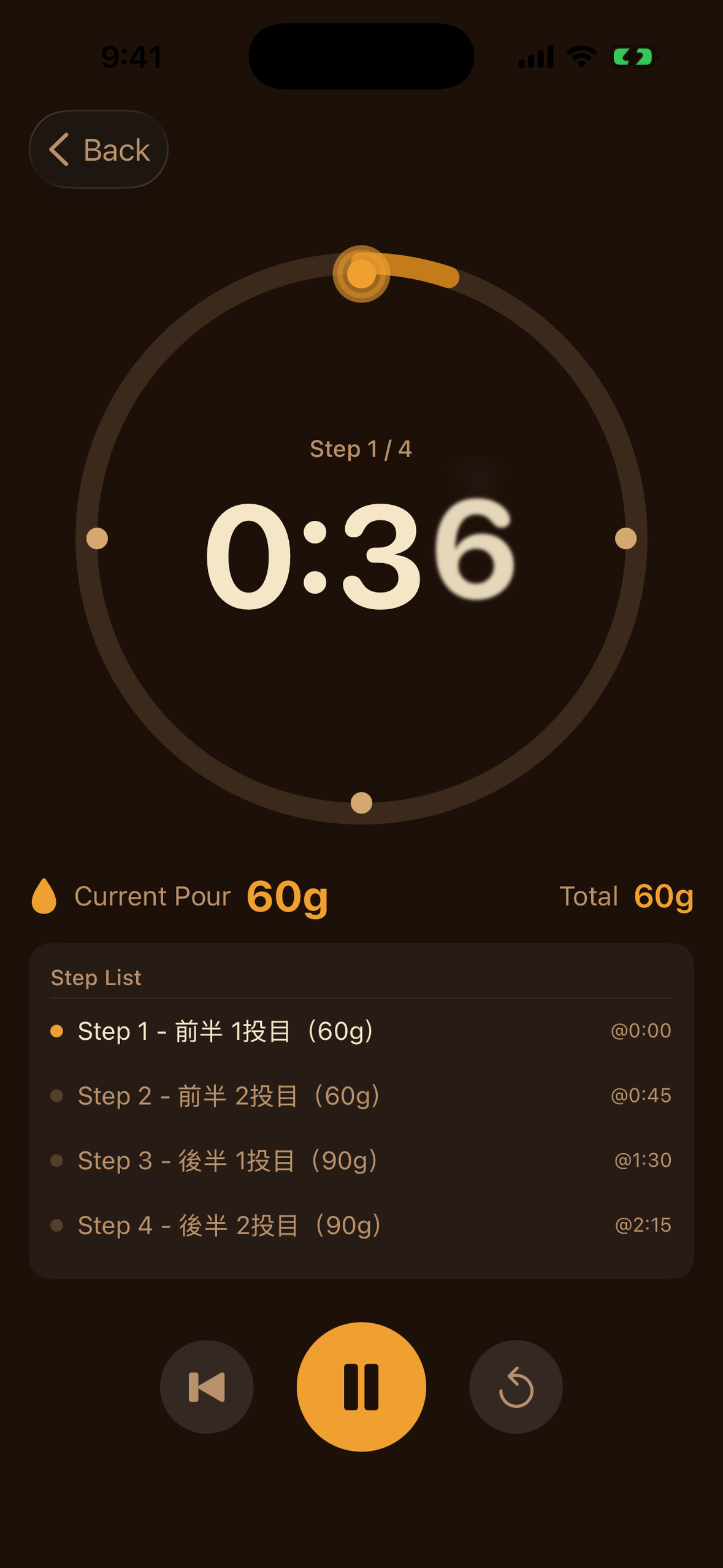
- A timer built for wet hands. A circular gauge with the step points on the arc, a live "pour now" amount and running total, haptic and audio cues at every step change, background operation with notifications, and a screen that stays awake through the brew.
- Offline by design. Every calculation runs on the device. No account, no connection, no sync - settings and original methods never leave the phone.
Pro is a subscription (JPY 480 per month / 2,980 per year on the Japanese storefront), with a single entitlement unlocking everything.
How we built it
Swift and SwiftUI throughout, with the recipe engine as plain value types - a method is data (steps, percentages, timings), and the three built-in methods and user-created ones flow through the same pipeline.
- RevenueCat with StoreKit 2 for the two subscription products, one group, one entitlement (pro_access)
- UserNotifications for step alerts while the app is in the background
- Haptics and audio cues on every step transition, so the timer works eyes-free
- PostHog for product analytics
- A design-token system ("Drip Amber") with contrast-measured colors for the gauge and step points
Challenges we ran into
An iPad bug that only an iPad could show us. After launch, our paywall's terms-of-use and privacy-policy links were reported unresponsive on iPad. The links were fine - the presentation was not. On iPad, a plain SwiftUI sheet defaults to a centered form-sheet card, our paywall's lower content sat outside its visible area, and swipes near the card's edge were swallowed by the dimming view behind it, which read every touch as "dismiss." On iPhone the same sheet fills the screen and nothing is wrong. We reproduced it with an accessibility-level hit test that showed exactly which view was eating the taps, fixed the presentation sizing, and shipped the correction as our first update.
Killing a price tier mid-development. The original monetization had three tiers with a one-time purchase in the middle. We collapsed it to free-plus-subscription while the app was already built, which meant re-mapping every feature gate, deleting the purchase flow for the middle tier, and re-testing the boundary between free and Pro. Painful, but the two-tier result is dramatically easier to reason about - and easier to explain to a user in one sentence.
Accomplishments that we're proud of
The free plan is a complete tool, not a teaser - the entire 4-6 Brew method with flavor and strength adjustment, usable every day, forever, offline. We are proud that the paywall sits on a boundary that respects how people actually brew, and that the timer screen answers exactly one question at a glance, with every color on it verified by contrast measurement rather than by eye.
What we learned
Test on the device class you do not personally use. The paywall bug shipped because every sheet looks right on an iPhone, and the iPad's default presentation quietly changes the geometry - and therefore what is tappable. A hit test that names the view actually receiving each touch turned a vague "links don't work" report into a one-line fix.
What's next for Drip Timer Cup of Joe
Refining the iPad layout beyond the fix - treating the larger screen as its own surface rather than a scaled phone - and continuing to grow the original-method editor that Pro users build their own recipes with.

Log in or sign up for Devpost to join the conversation.