Dream to Doing — Case Study
I chose Gabby Beckford’s brief because her problem resonated deeply: ambitious women have big dreams but often get stuck in the gap between inspiration and action.
Gabby specifically asked for a way to combine mindset with micro-actions and mentioned gamification and confetti. A standard to-do list app immediately felt wrong—too boring and too stressful. To truly help users “Go from dreaming to doing,” friction had to be reduced to zero.
My core insight was to combine the addictive, effortless UI of a dating app (swiping) with the effectiveness of a habit tracker.
Goal: make self-improvement feel as satisfying as clearing your inbox.
What It Does
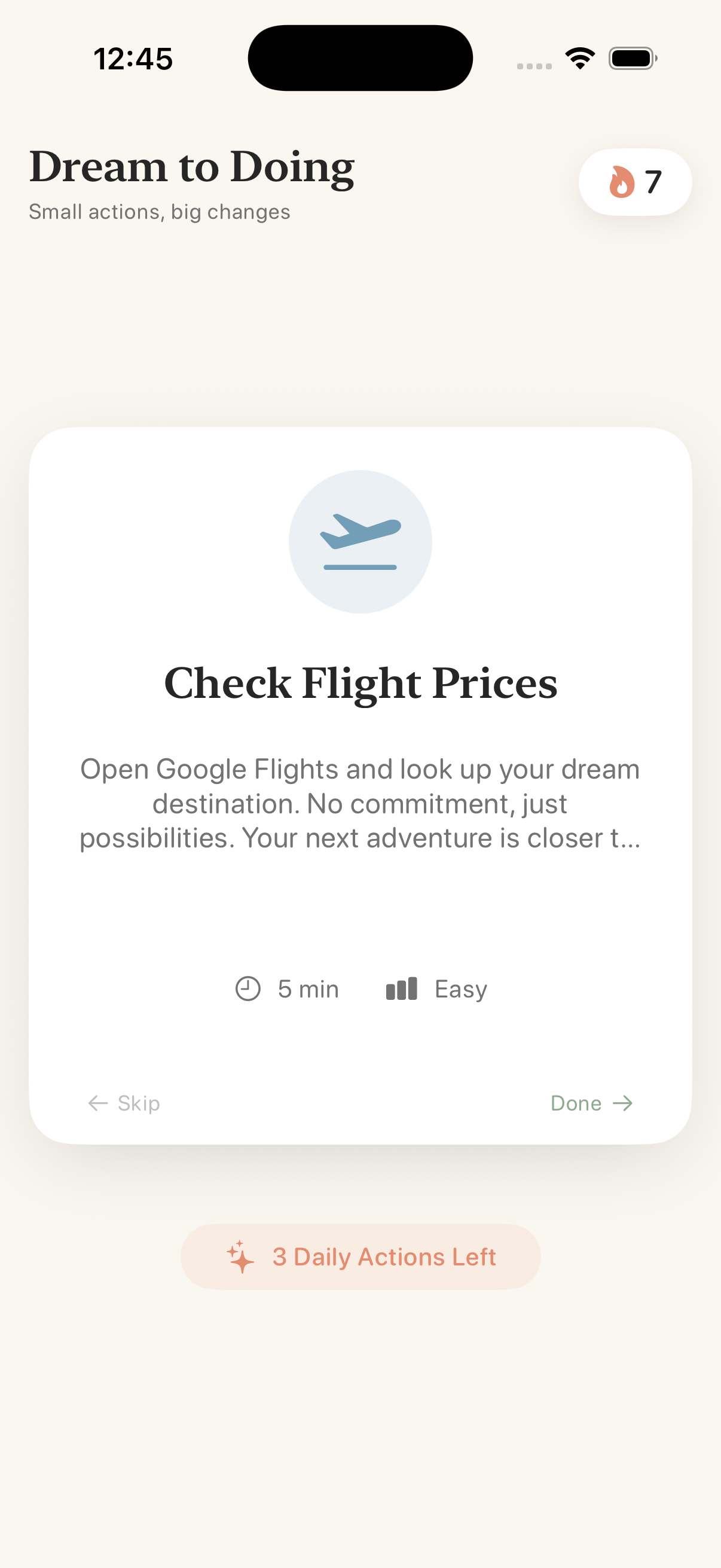
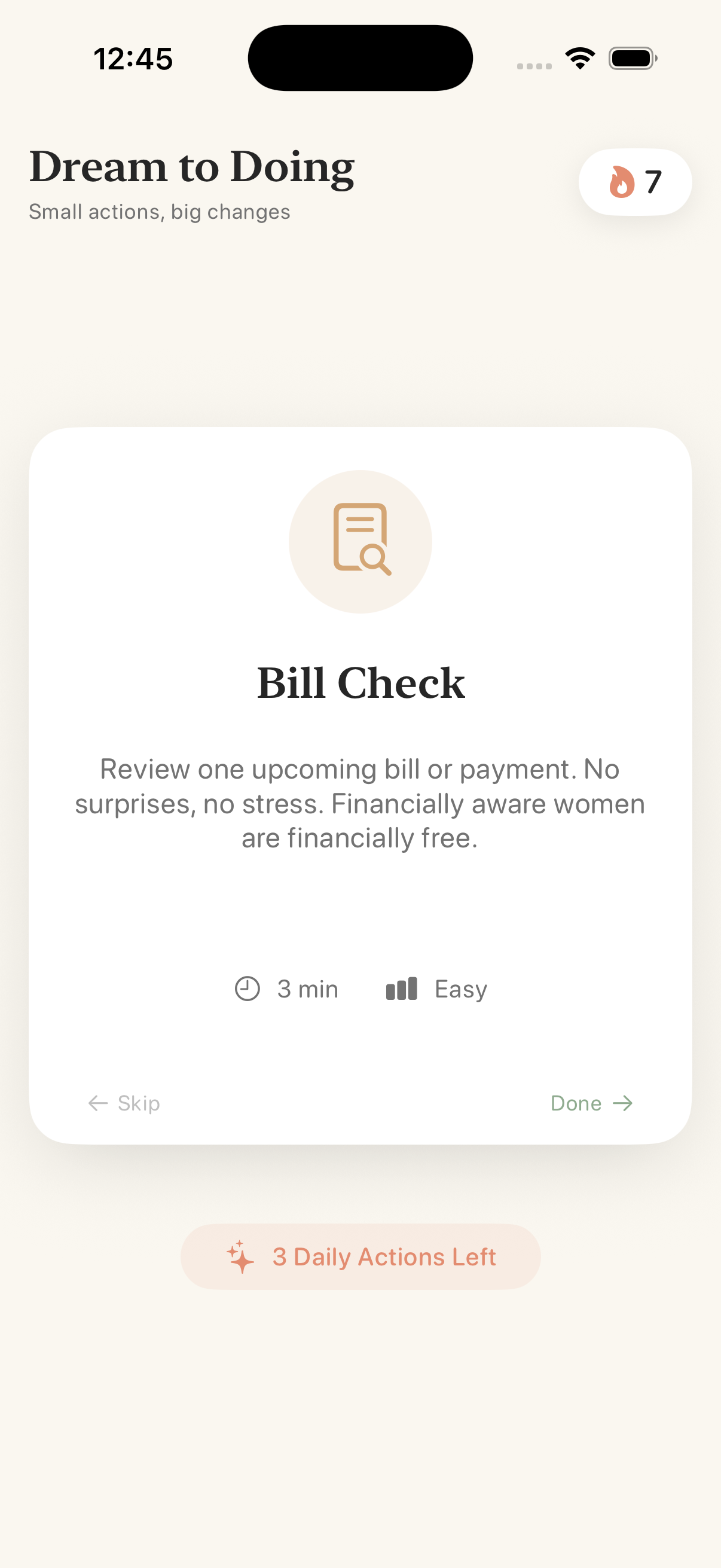
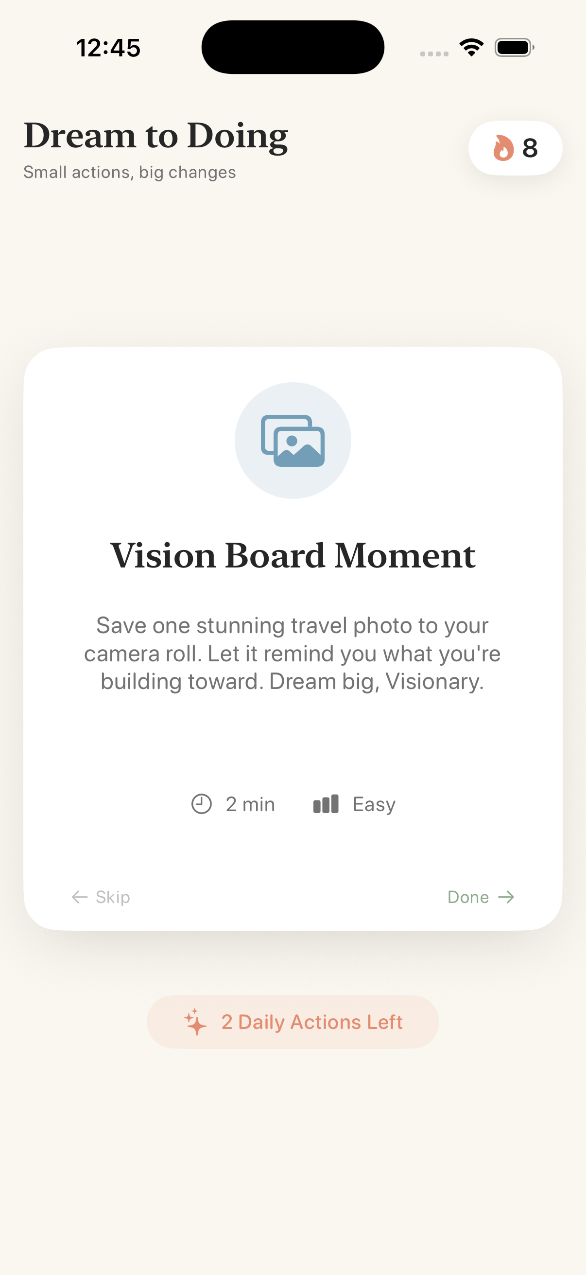
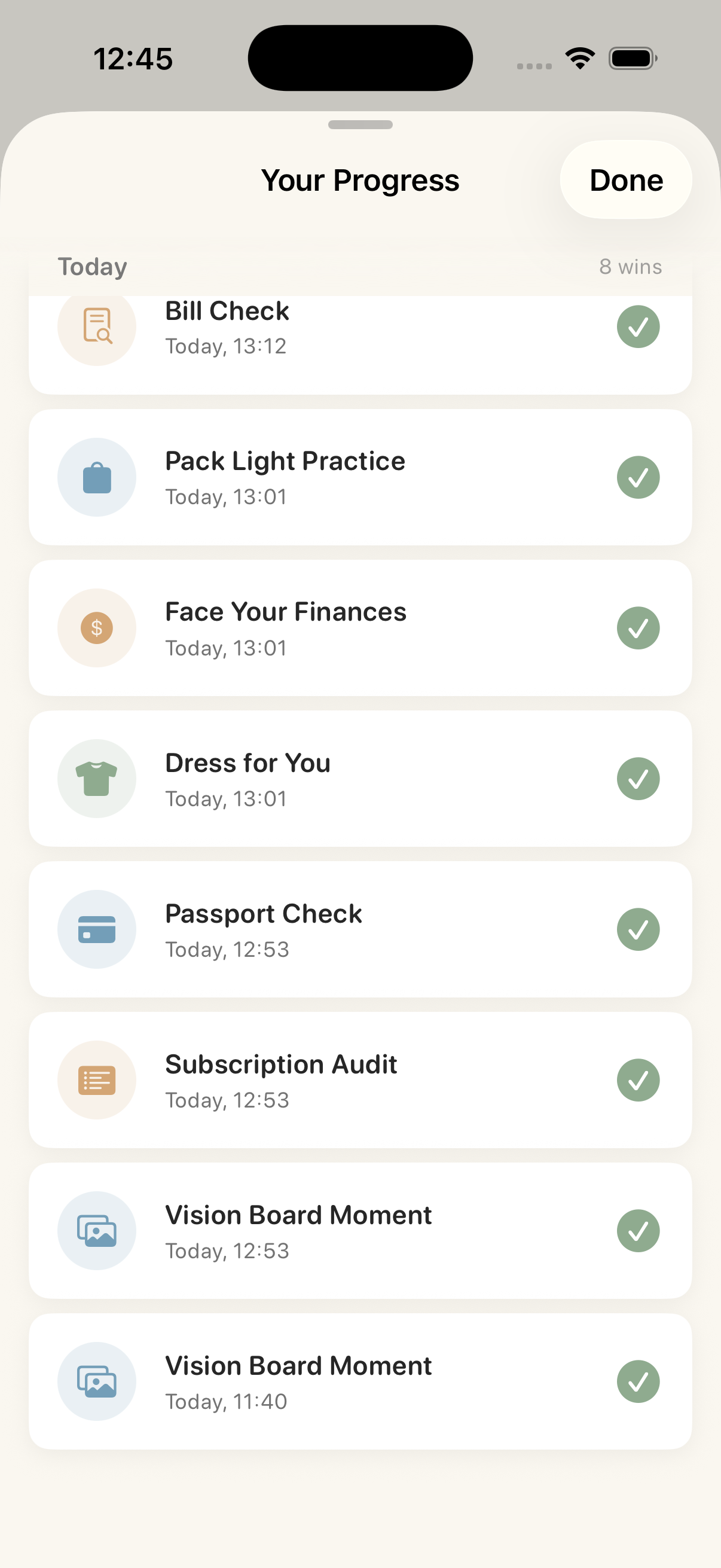
Dream to Doing is a gamified action deck for ambitious women.
Instead of an overwhelming task list, users are presented with a focused stack of Micro-Actions.
Swipe Right — “Do”
Completing a task triggers haptic feedback, a confetti explosion, and builds your daily streak.Swipe Left — “Skip”
If a task doesn’t fit today, swipe it away. No guilt.The Daily Drop
Free users receive 3 curated cards per day.Premium Access
Once the free cards are used, users hit a Paywall Trap. Through RevenueCat, they can subscribe to unlock:- The full deck (Travel, Career, & Mindset)
- Unlimited swipes
How I Built It
Platform
Built 100% in native SwiftUI, targeting iOS 17+.Architecture
Clean MVVM architecture using the new@Observablemacro for state management.Local-First
A serverless approach ensured a fast, privacy-focused MVP:- Content loaded from a local JSON store
- User progress persisted with
AppStorage
- Content loaded from a local JSON store
UI / UX
Heavy focus on the Clean Girl Aesthetic—cream, terracotta, and sage tones—to align with Gabby’s personal brand.- Confetti effects built with Canvas
- Custom spring animations for realistic, weighty card-stack physics
Monetization
Integrated the RevenueCat SDK to manage the freemium model.
The app checks subscription status in real time to lock or unlock specific Premium cards within the deck.
Challenges I Faced
Balancing simplicity with value
Choosing not to build a complex backend was a difficult technical decision, but it allowed full focus on user experience and polish.Swipe physics
The cards needed to feel heavy and substantial—not like floating views. Achieving this required extensive fine-tuning of:- Drag gestures
- Rotation angles
- Spring damping and inertia
- Drag gestures
Accomplishments I’m Proud Of
The “Feel”
The app doesn’t feel like a hackathon prototype—it feels like a shipped product.
Haptics and animations make it genuinely enjoyable to use.Audience Fit
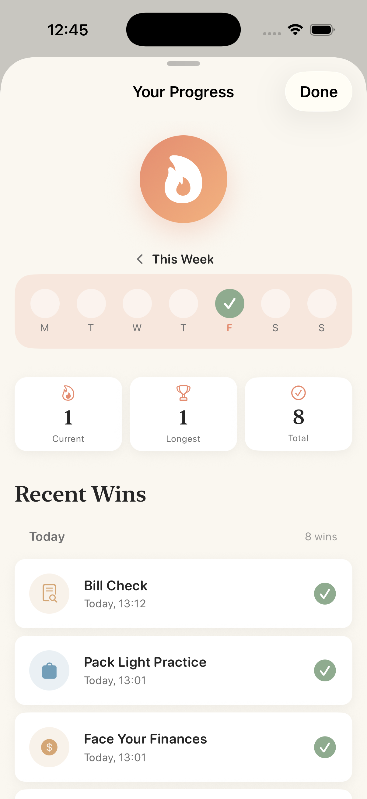
Gabby’s request for wins tracking and confetti was successfully translated into a cohesive, motivating understand feature set.RevenueCat Integration
The paywall feels like a natural part of the flow—the “End of Day” cliffhanger—rather than an intrusive popup.
What I Learned
Friction is the enemy of action. By removing navigation tabs and complex forms, users are far more likely to engage.
I also deepened my understanding of RevenueCat Paywalls. Setting up a robust subscription model without custom server-side validation was surprisingly straightforward and effective.

Log in or sign up for Devpost to join the conversation.