


Inspiration
Curious about the inner workings of equity markets and their intersection with technology, our team decided to build a hack targeting traders and financial exchanges. Exchange data is often volatile and unpredictable, making it hard to derive meaningful insight without the proper processing.
What it does
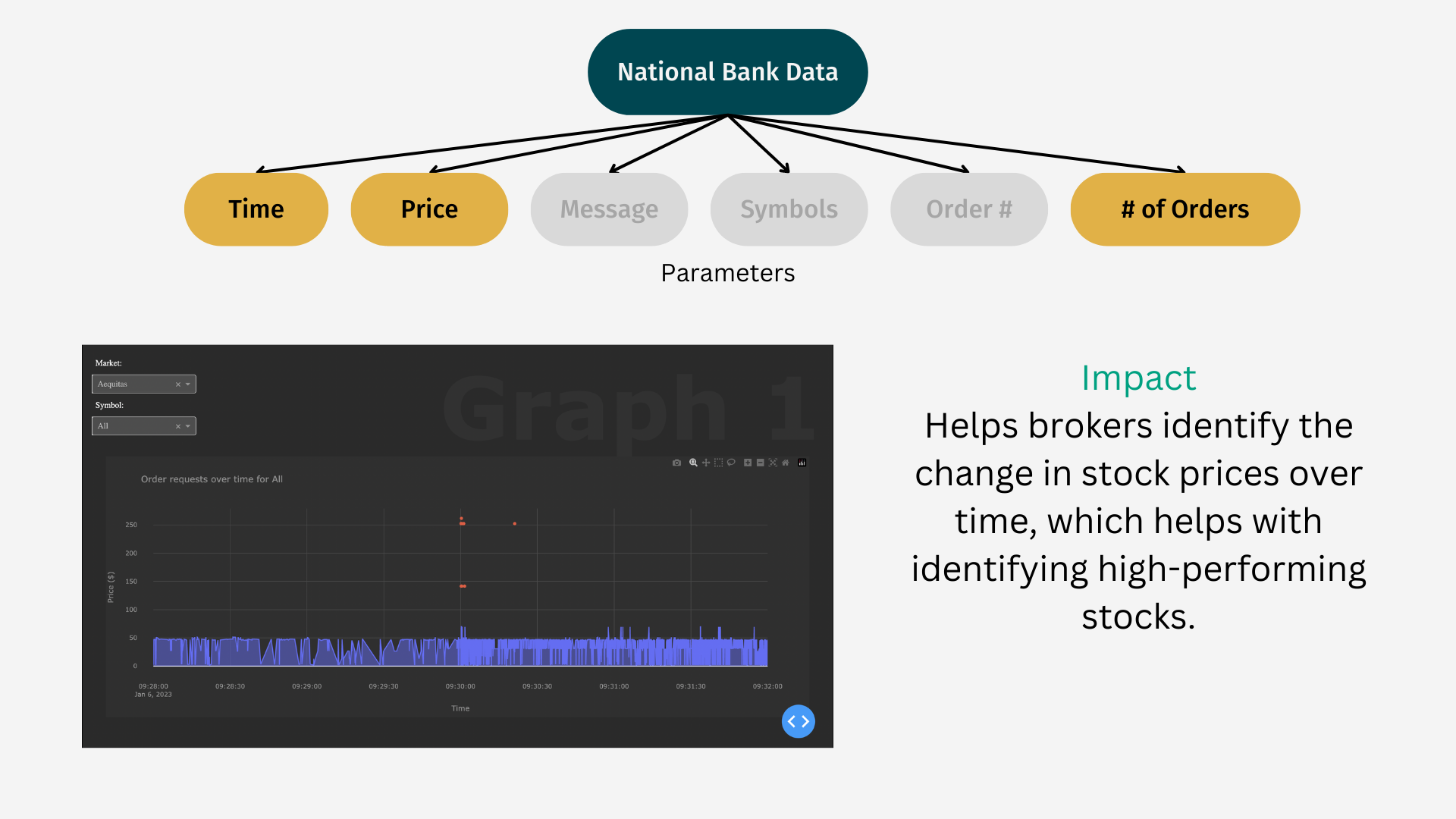
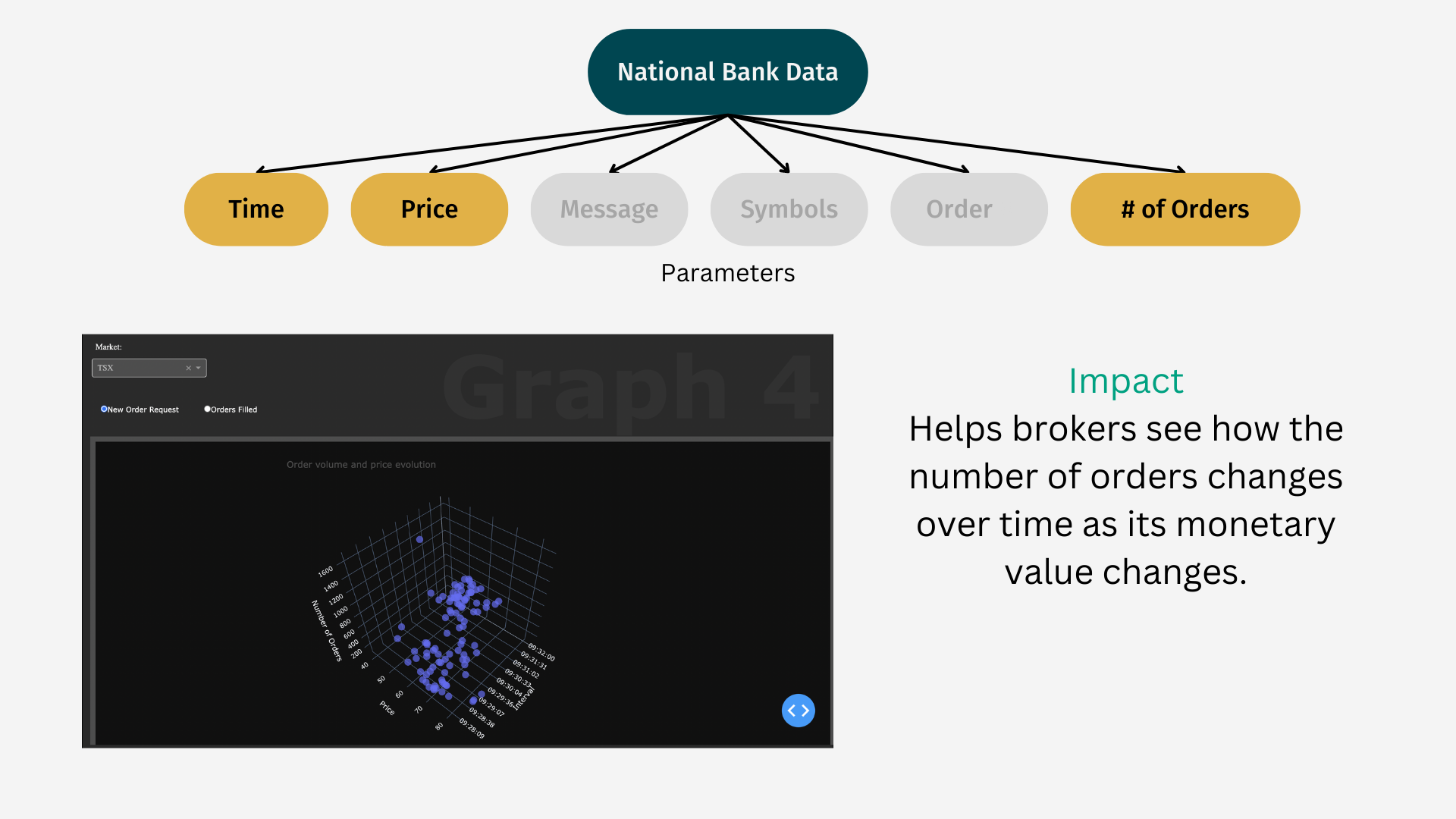
With Dot Deck, our team provides partners with a one-in-all dashboard, equipping the user with the ability to visualize critical underlying trends along with anomaly detection, while empowering the user with the ability to customize which data to show and how it is displayed.
How we built it
- To build, scale, and deploy our dashboard, we used Plotly Dash and Python
- Graphs and data were generated using Pandas from JSON source data
- HTML/CSS was used to enhance the user experience by making the interface more user-friendly
Challenges we ran into
- Understanding the data/parameters well enough to extract impactful insights for the partners
- Learning how to use the Plotly Dash API
- Performing statistical analysis to identify outliers and anomalies
- Unifying the dashboard to contain each of the relevant graphs in a logical manner
- Writing efficient data processing algorithms to minimize run and display time
Accomplishments that we're proud of
- We all learned something new in the span of 24 hours
- We pushed ourselves to learn new technologies
- We dealt with real data, something that we don't interact with every day
- We performed anomaly detection using statistical analyses including standard deviation calculations and Tukey's fences
- We are really proud of what we created and learned together, we think that it came together quite well


Log in or sign up for Devpost to join the conversation.