-
-
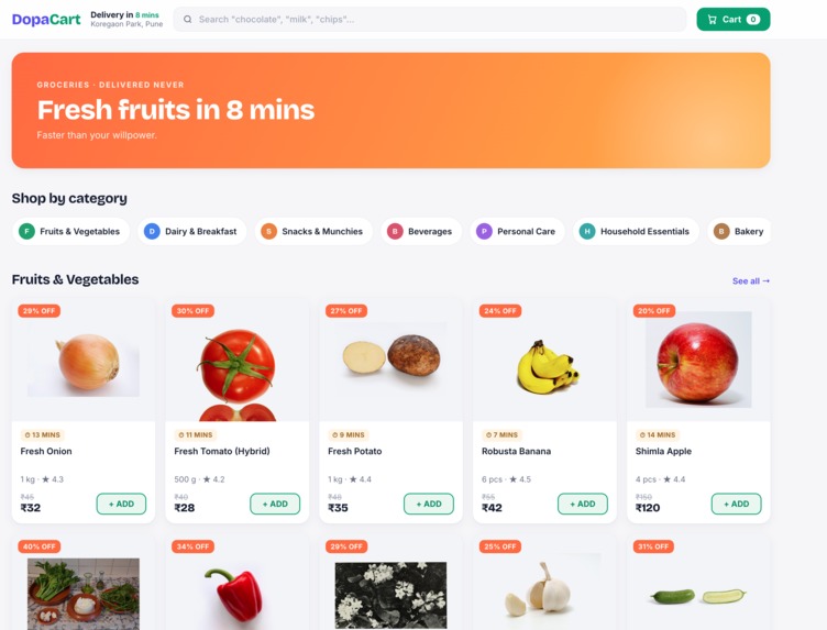
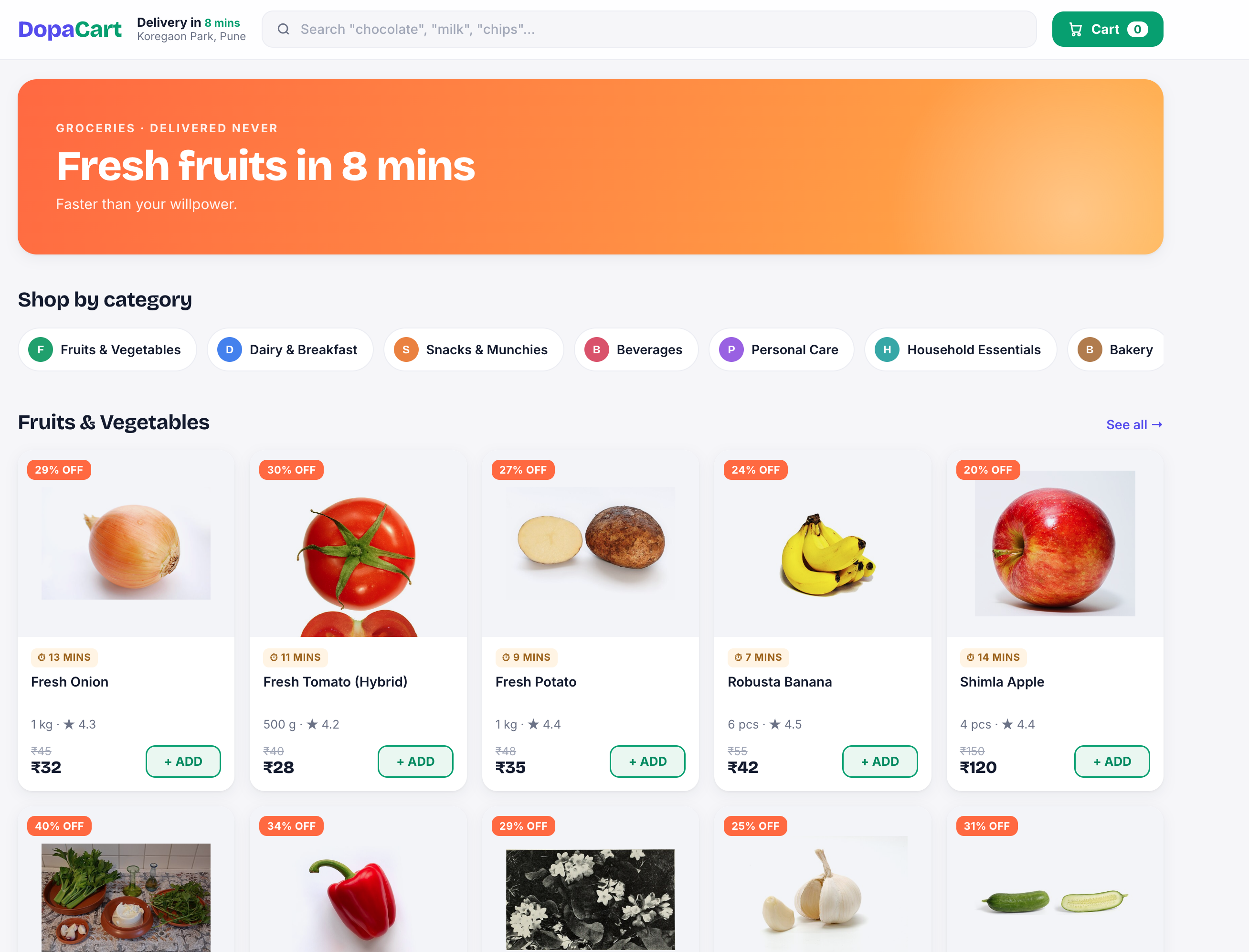
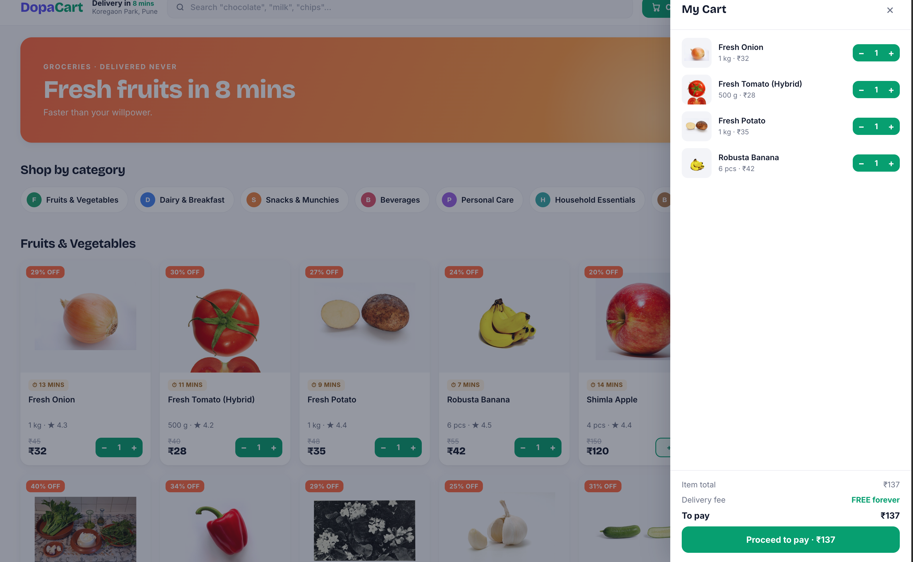
Homepage — Fresh Fruits & Vegetables "Real products, real prices, real photos. The only fake part here is the delivery."
-
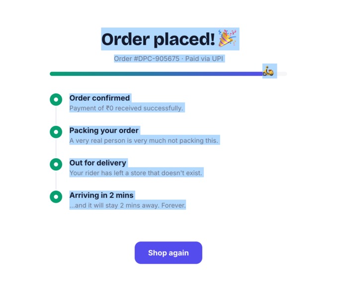
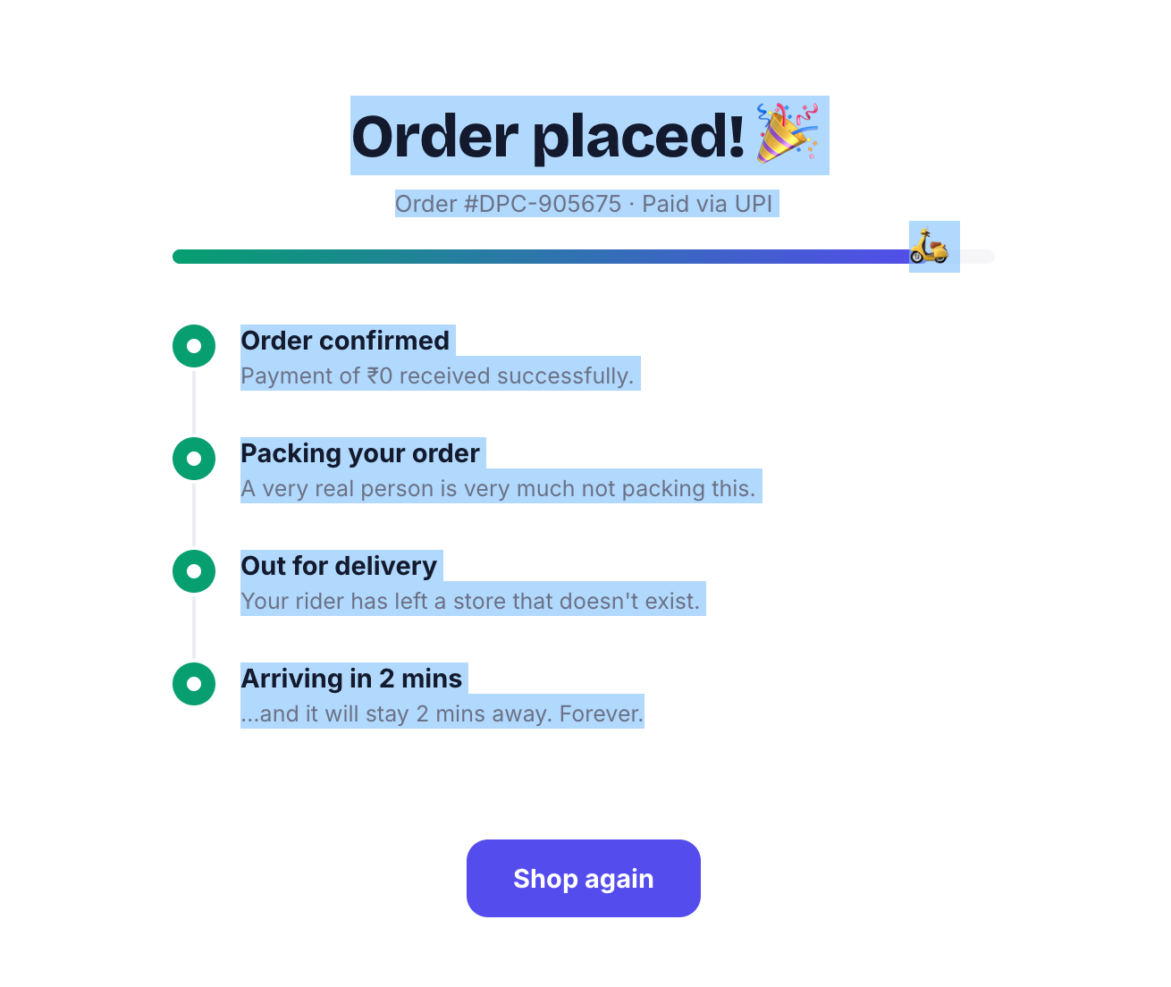
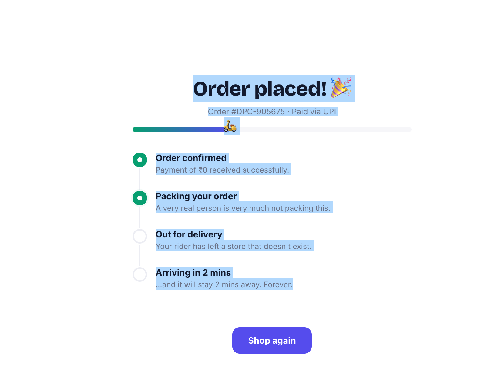
Order Tracking — Animated scooter + delivery steps "Arriving in 2 mins... and it'll stay 2 mins away. Forever. That's the whole point.
-
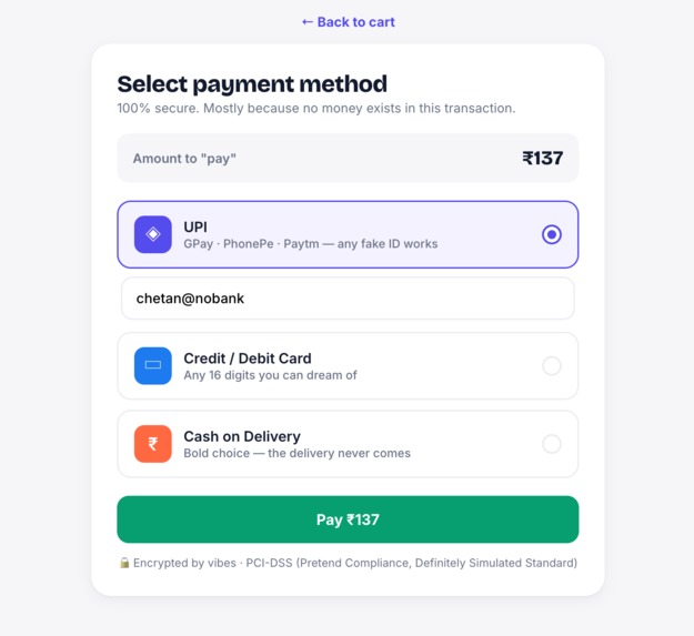
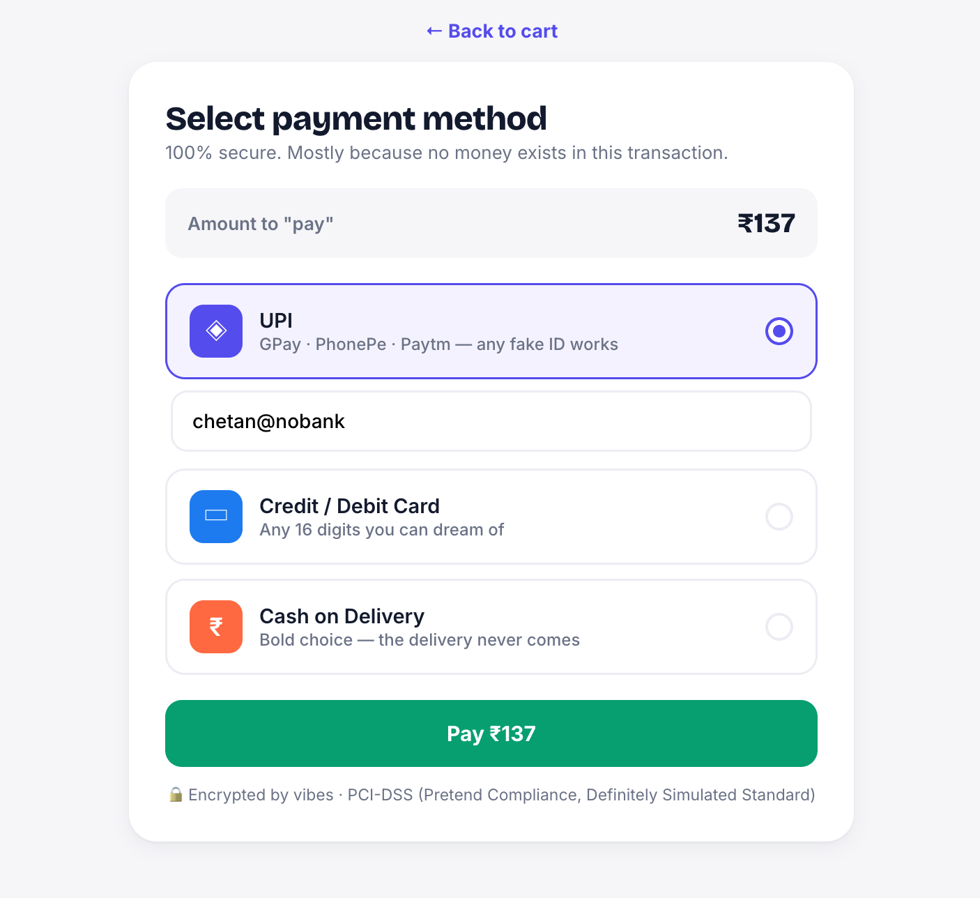
Payment Screen — UPI/Card/COD selection "100% secure checkout. Mostly because no money exists in this transaction 'chetan@nobank' works fine
-
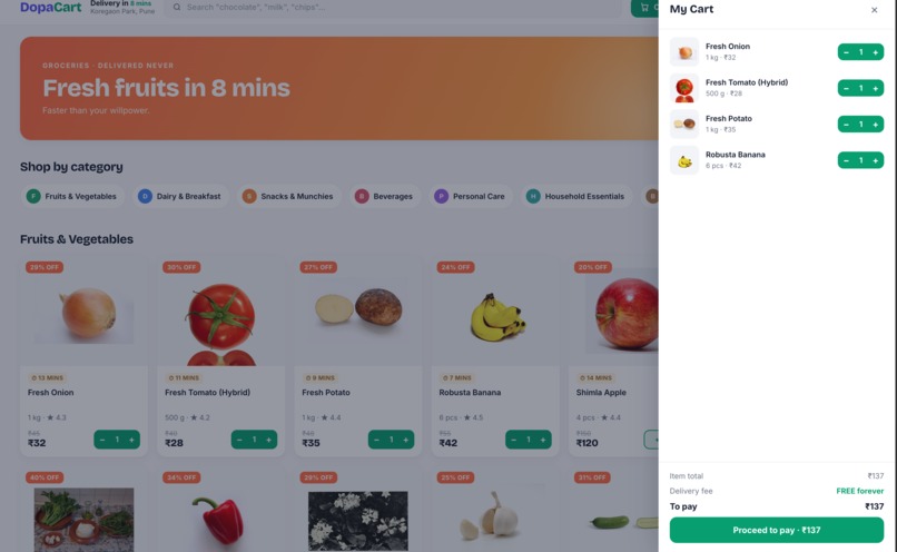
Cart Drawer Items with live price calculation ₹137 worth of groceries, ₹0 worth of guilt. Free delivery forever
-
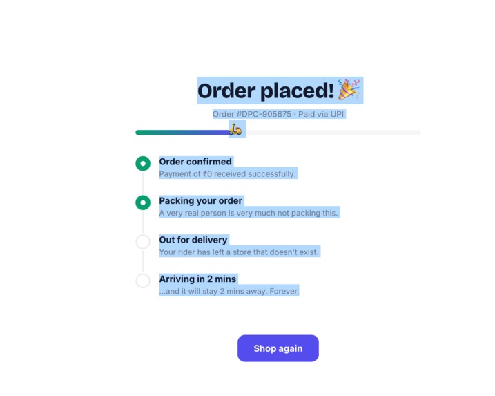
Order confirmed! A very real person is very much not packing this right now.
Inspiration
In mid-2026, a strange trend went viral in South Korea: "dopamine sites" — fake shopping and food delivery apps that let people browse products, fill a cart, place an order, and even track a fake delivery rider, but nothing is ever actually delivered or charged. Apps like FoodNeverComes were built by developers who noticed they kept compulsively opening and closing real delivery apps late at night without ever ordering. The sites gave them the emotional "hit" of shopping without the cost.
That idea stuck with me. As a developer in India who's watched quick-commerce apps like Zepto and Blinkit become part of daily life — and seen how their 10-minute-delivery, dopamine-driven UX keeps people scrolling and adding to cart — I wanted to ask: what if we built a version of that experience purely for the ritual, with zero real-world cost? Not to encourage overconsumption, but as a genuinely useful tool for people managing impulse-buying habits, stress, or shopping addiction.
That's how DropKart was born — a quick-commerce shopping simulator for Indian users, with real products, real prices, and a fully animated experience, but no real orders, no real payments, and no real deliveries, ever.
What I Learned
Building this taught me that what makes an app feel "addictive" has almost nothing to do with the product catalog and everything to do with anticipation design — the Fogg Behavior Model (motivation + ability + trigger), variable rewards, and sensory feedback loops. I dug into UX psychology research on dopamine-driven design and realized the emotional payoff in apps like Zepto comes from small things: the cart bounce animation, the "8 mins" delivery badge, the confetti on checkout — not the actual product arriving.
I also learned a lot about AI-assisted, spec-driven development. Instead of prompting an AI tool screen-by-screen with vague instructions, writing a detailed projct.md (covering tech stack, data model, architecture) and a DESIGN.md (covering every screen's exact animations and micro-interactions) upfront made the AI-generated code dramatically more consistent and production-ready.
How I Built It
- Research phase — Studied the dopamine sites trend, quick-commerce UX patterns (Zepto vs. Blinkit), and habit-loop psychology to ground the design in real behavioral principles rather than just copying an app's look.
- Data layer — Sourced 100+ real Indian grocery/retail products (real names, real INR prices, real quantities) via the Open Food Facts API and manual curation, structured into a clean JSON schema with fields for price, MRP, category, delivery time, and image URL.
- Spec files — Wrote a
projct.mddefining the project overview, tech stack (Next.js, TypeScript, Tailwind, Framer Motion, Zustand), architecture, and non-negotiable rules (no real payment gateway, no real address storage). Paired it with aDESIGN.mddetailing screen-by-screen animations — cart fly-to-cart micro-interactions, skeleton shimmer loaders, confetti on order success, and an animated delivery-bike icon on the fake tracking screen. - Build phase — Used Codex to generate the app screen-by-screen (home, category listing, product detail, cart, checkout, order tracking), feeding it one spec section at a time for tighter control over output quality.
- Polish phase — Replaced early emoji/icon placeholders with real sourced product photography, added hover states, shadows, and loading transitions to bring the UI up to the visual bar of Zepto/Blinkit.
- Deployment — Shipped the web version on Vercel at dropkart1.vercel.app, with a mobile app version planned next.
Challenges I Faced
- Sourcing real product data at scale: Finding 100+ real Indian product names, prices, and images without scraping live competitor apps (which raises ToS and legal concerns) meant relying on open datasets like Open Food Facts and manual curation — slower, but safer and more sustainable.
- Balancing "addictive" with "ethical": The whole point of DropKart is to help people, not create a new addiction. I had to consciously build in guardrails — a visible "why this exists" disclosure, no dark patterns, no fake urgency that traps users — while still making the UI genuinely satisfying to use.
- Making fake feel real: Getting the checkout-to-tracking flow to feel emotionally convincing (not just functionally complete) took multiple iterations on animation timing — too fast felt cheap, too slow lost the dopamine payoff.
- Prompt-to-code consistency: Early attempts at giving Codex vague, one-line prompts produced inconsistent UI across screens. Writing detailed spec files (projct.md + DESIGN.md) before generating any code solved this almost entirely.
Built With
- css3
- figma
- framer-motion
- gamification
- git
- github
- html5
- javascript
- json
- nextjs
- node.js
- open-food-facts-api
- openai-codex
- pwa
- react
- responsive-design
- rest-api
- tailwindcss
- typescript
- ux-research
- vercel
- web-app
- zustand

Log in or sign up for Devpost to join the conversation.