-
-
The logo
-
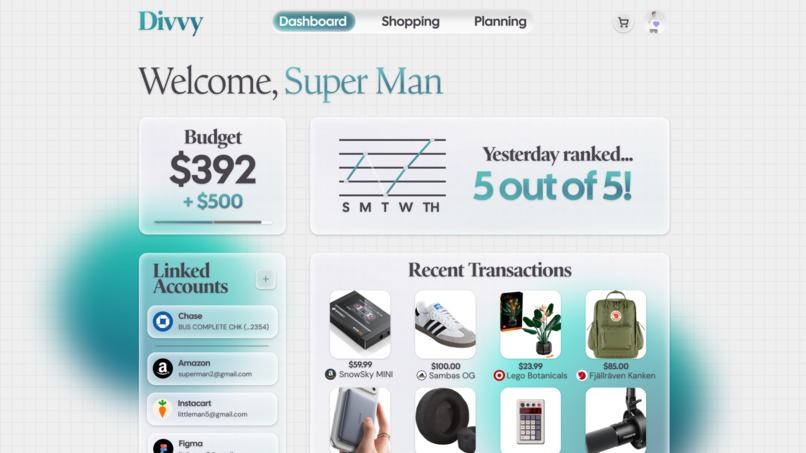
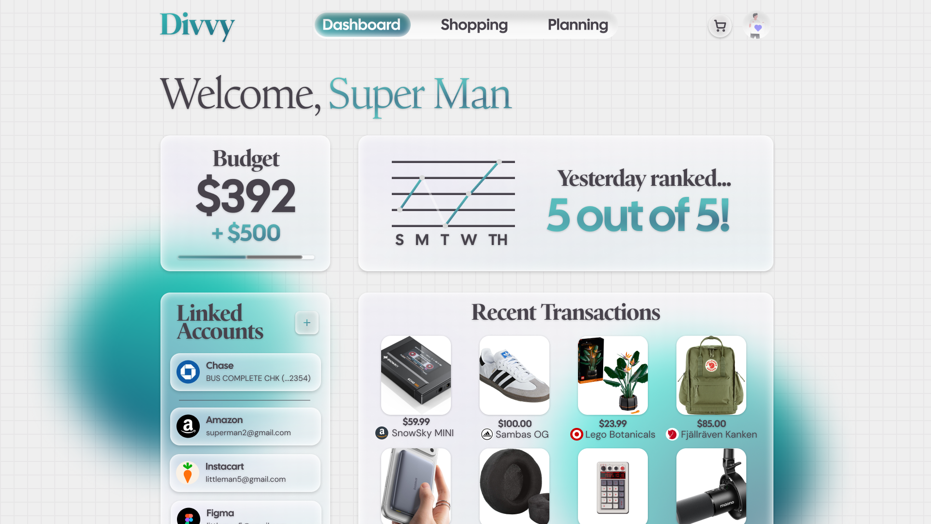
The Dashboard
Problem Statement
This project was inspired by a large rise of paycheck-by-paycheck workers struggling to get by in the economy, while at the same time, companies like Klarna falsely advertise pricing and abuse customers. The goal of Divvy is to provide a more logical way to manage finances, while still lending out only what we think the user can afford with their next payday.
This ties into the theme of "Designing for the In-Between" as our core focus is those on the fringes who are barely making it by. It's less of a single isolated experience of migrating, such as between high school and college, and more so designed for the repetitive experience life can give you, where you can never quite catch up yet can't slow down at the same time.
What it does
Divvy is a multi-purpose budgeting app. We want the users to save money, while providing a service to lend out small payments for the essentials. You can import bank accounts and get budgets set for you. There is also a shopping portal, allowing you to browse and use your credit from Divvy to purchase products. It all currently uses mock data, not real banking info or active API queries, but it is a real website.
How we built it
We built this in both Figma for the concepts/planning, and SvelteKit for the website. We used the GSAP animation library to build out the dynamic animations of the app. We've developed a Svelte component library we call "Mizu UI", which is also in Figma, so we made use and expanded upon this for the UI designs. AI was only used to assist in the development of the website's mock data functionality and and some animation work + dialogs.
Challenges we ran into
We ran into some major challenges with data-overloading. There is a lot that goes into fintech and budget management, so our goal was to abstract away whats unnecessary. Building out prototypes with data was also very difficult to get right.
Accomplishments that we're proud of
We bootstrapped a full functioning website in 24 hours! We quickly created a Hi-Fi mockup as well.
What we learned
We learned lots about research into user behavior and finding out what's actually important to display in an app. Lots of features and the way we organized things seemed somewhat alien to some of our test subjects, leading to a "Simple" view of the planner, and some other arrangements.
Figma Design Link: https://www.figma.com/design/6W3nfntqVTwYBRIdHS82mx/Main-Div?node-id=0-1&t=MG4hDpIqIBkJtnax-1
YouTube Link: https://youtu.be/3oPkRLxqM9s
Built With
- figma
- gsap
- svelte


Log in or sign up for Devpost to join the conversation.