-
Displacements Over Time (2008-2021)

Inspiration
Climate change will displace people. We need to help everyone, and understanding the problem is the first step.
What it does
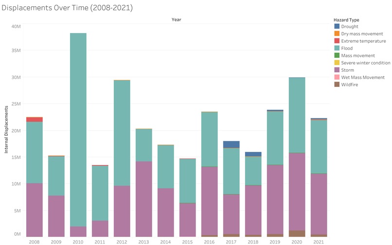
Our site displays interactive graphs that teaches users about the number of people that were forced to move because of natural disasters throughout the world. Through our visualizations, we hope to inspire people to take action against climate change.
How we built it
We gathered reliable data spanning more than 10 years from the Internal Displacement Monitoring Centre (IDMC). This reports how many people had to move because of a natural disaster (data). Then we created multiple plots using tableau's wide selection of graphs, where we filtered the data by disasters that can be affected by climate change. We coupled this dataset with another dataset of the population of each country over time, provided by Our World in Data. We show the percentage of people that were displaced in 2021 due to a natural disaster in each country.
Challenges we ran into
- Finding appropriate data for our visualizations
- Cleaning up the data
- Combining two datasets to find the percentage of people displaced per event
- Choosing the most impactful visualizations
What we learned
I learned about a lot about natural disasters that have happened in the last 15 years, like the 2010 Pakistan floods. Through this project, I also have learned about the power of data visualization.
What's next for DND
The first phase was about visualizing the past. Naturally, the next step is to visualize the future. How will people move around the Earth as the effects of climate change get stronger? Where are the safest places to build shelters?

Log in or sign up for Devpost to join the conversation.