-
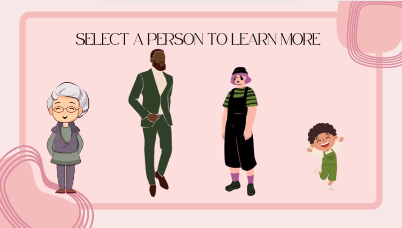
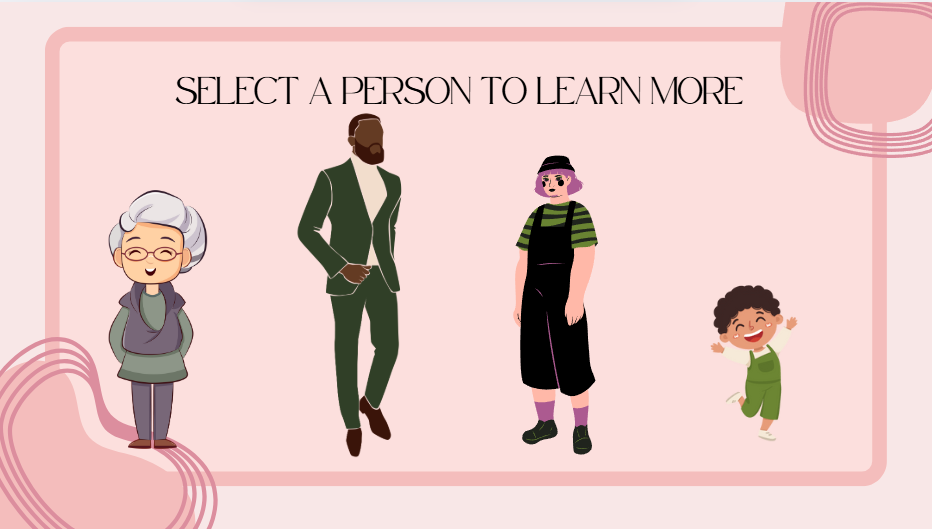
User chooses who to learn more about
-
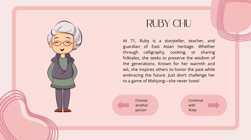
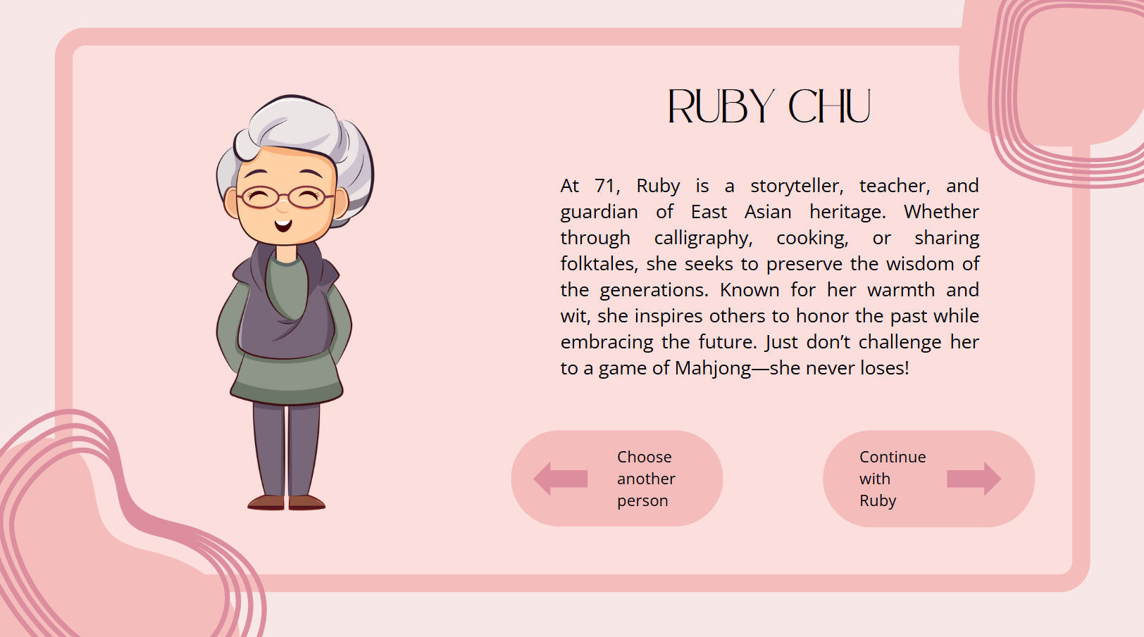
Ruby
-
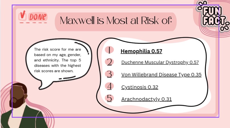
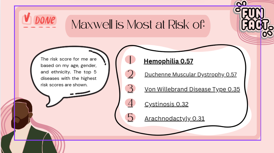
Maxwell
-
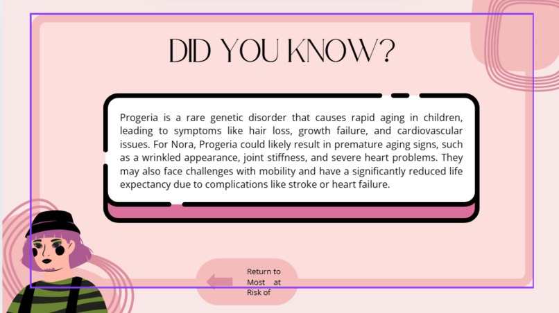
Nova
-
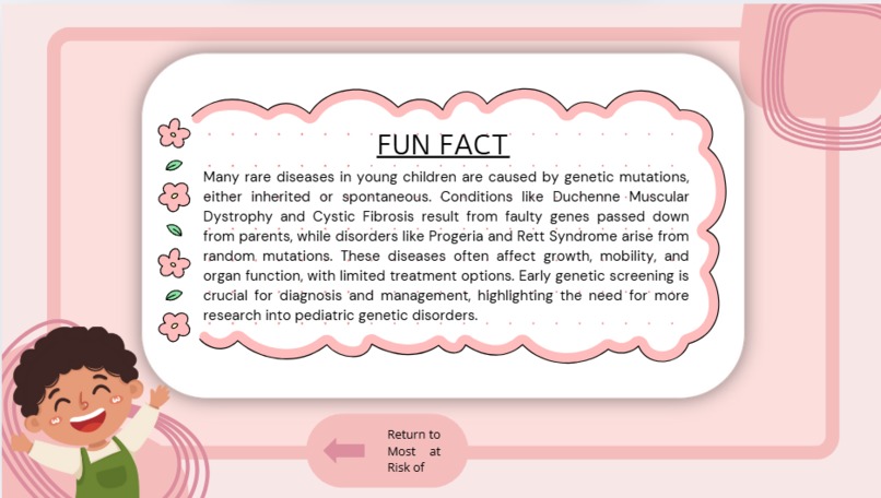
Luca

Inspiration
Our inspiration came from Invisible Women: Data Bias in a World Designed for Men by Caroline Criado Perez, which exposes the systemic exclusion of women and gender minorities from data collection and analysis. This lack of representation has serious consequences, particularly in healthcare, where medical research, drug trials, and disease data often prioritize male subjects. We wanted to build a project that not only highlights these disparities but also makes them personal and interactive, helping users understand how these biases affect real people.
What it does
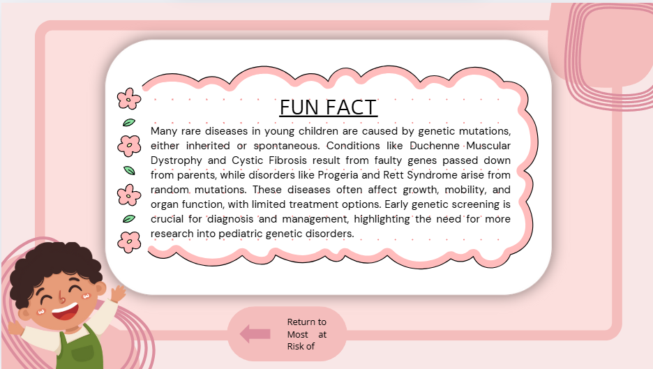
HealthScope is an interactive experience that allows users to walk through the lives of four different characters and explore what rare diseases could affect them based on their age, gender, and ethnicity. Our goal is to show how medical data bias can impact different groups, particularly those who are underrepresented in traditional datasets. By combining data analysis with storytelling, we help users engage with these issues in a more meaningful way. The experience is designed within Canva, making it visually accessible and easy to navigate.
How we built it
We started by searching for real-world datasets that included gender, age, and ethnicity-specific disease prevalence. However, we quickly realized that many publicly available datasets lacked the depth and inclusivity we needed. To address this, we used Gemini AI to generate a synthetic dataset, ensuring better representation of marginalized groups.
Using Python, Pandas, and UMAP, we processed and visualized this data, analyzing how different diseases impact different demographics. We then integrated our findings into a Canva-based user interface, where users can explore the data through four fictional characters, each with their own unique attributes. This blend of data science and storytelling helps bridge the gap between raw statistics and real-world impact.
Challenges we ran into
One of our biggest challenges was finding an inclusive dataset that reflected the experiences of women and gender minorities. The majority of existing medical datasets skew heavily towards male-centric data, making it difficult to analyze disease prevalence accurately across all demographics. To overcome this, we generated synthetic data with Gemini AI, ensuring that our dataset included a diverse range of individuals.
Another challenge was designing an experience that balanced technical accuracy with accessibility. We wanted to present complex medical data in a way that was easy to understand and engaging for a general audience. Using Canva as our primary interface allowed us to create an interactive and visually appealing experience, but integrating detailed data into a user-friendly format required careful planning and iteration.
Accomplishments that we're proud of
We’re proud of creating a tool that not only analyzes data but also tells a story. By combining data visualization with an interactive narrative, we’ve made an often-overlooked issue more engaging and accessible. We also successfully navigated the challenge of generating a dataset that reflects a more diverse population, filling a gap in existing medical research.
Additionally, we learned how to leverage Canva for interactive storytelling, making complex data approachable for a wider audience. The fusion of data science, AI, and user-friendly design is something we’re particularly excited about.
What we learned
This project deepened our understanding of the biases that exist in medical research and healthcare data. We learned how difficult it is to find datasets that accurately represent diverse populations, reinforcing the importance of advocating for better data collection practices.
From a technical standpoint, we improved our skills in data analysis, AI-generated datasets, and data visualization techniques using UMAP. We also gained experience in designing interactive experiences with Canva, which provided valuable insights into making educational content more engaging.
What's next for Health Scope
There’s a lot of potential for Disease Lens to expand beyond this initial prototype. Some of our next steps include:
- Expanding the dataset: While our current dataset provides valuable insights, we’d like to refine it further, incorporating more real-world data where possible and improving AI-generated data for even better accuracy.
- Adding more characters and conditions: Right now, users can explore four different characters, but we’d love to add more perspectives, including individuals with disabilities and other underrepresented groups.
- Enhancing the user experience: We want to make the Canva interface even more interactive, possibly integrating clickable elements where users can see more in-depth information about specific diseases.
- Advocacy and education: This project has the potential to be used as an educational tool. We’d love to collaborate with educators, healthcare professionals, and advocacy groups to spread awareness about medical data bias.
- Further AI integration: We’re exploring ways to refine our AI-generated dataset to ensure it aligns as closely as possible with real-world epidemiological trends.


Log in or sign up for Devpost to join the conversation.