Inspiration
Living in Florida means hurricanes, flooding, and coastal hazards are never abstract—they’re seasonal reality. We wanted something that felt actionable, not just another dashboard: a place where someone could dial in wind, rain, and where they live, get a clear risk readout, and see live signals from agencies people already trust (USGS, NOAA). The spark was simple—turn scattered data and gut feelings into a single, explainable story about risk before decisions have to be made.
What it does
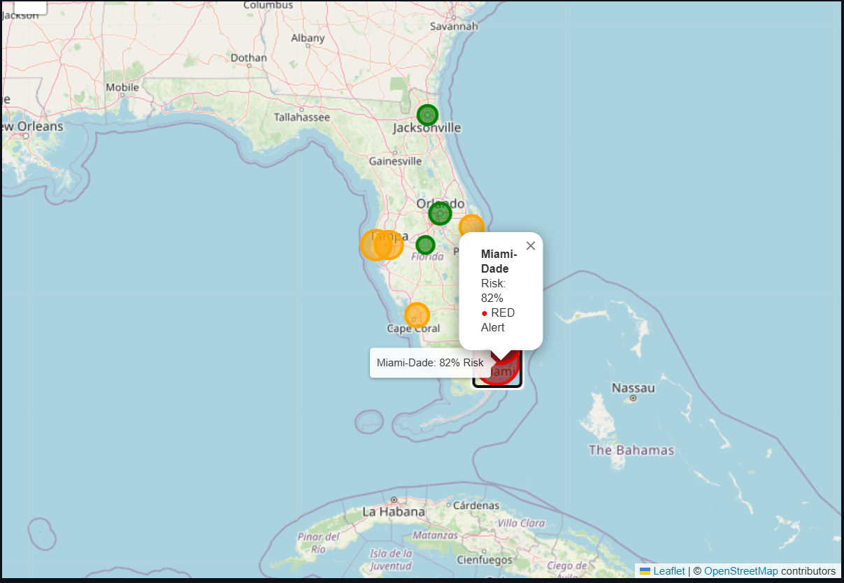
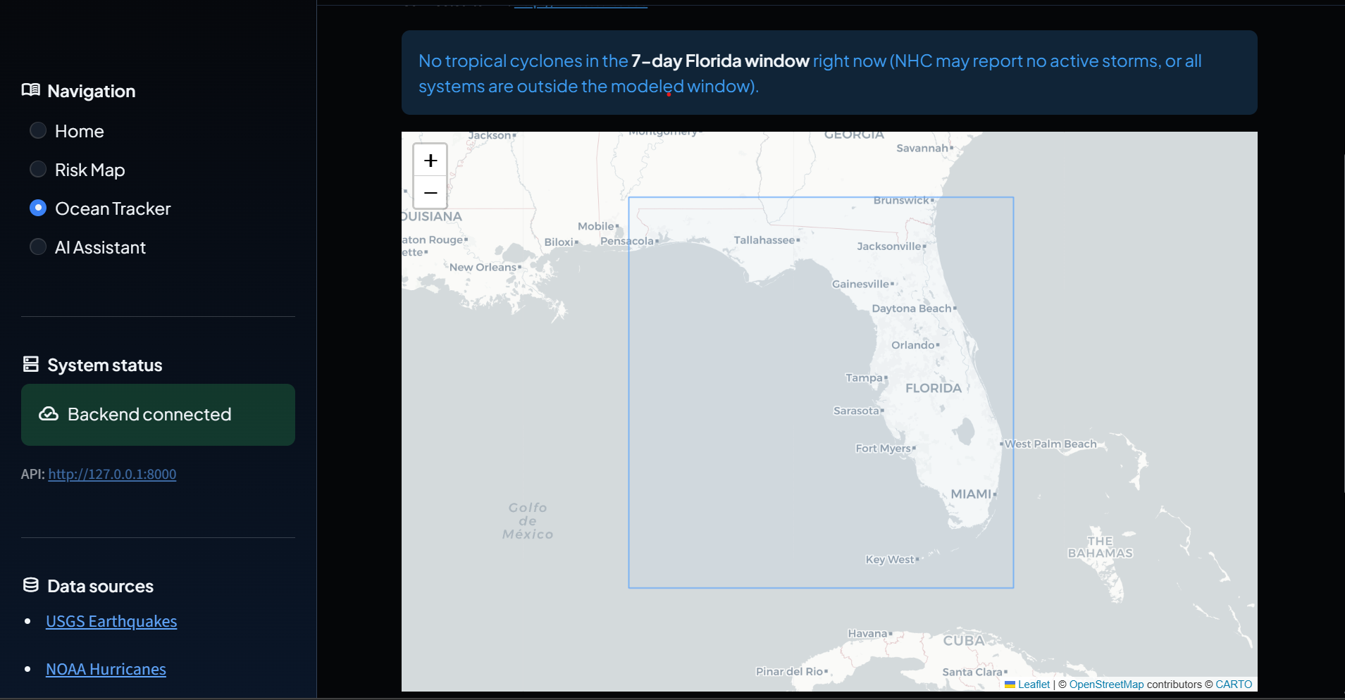
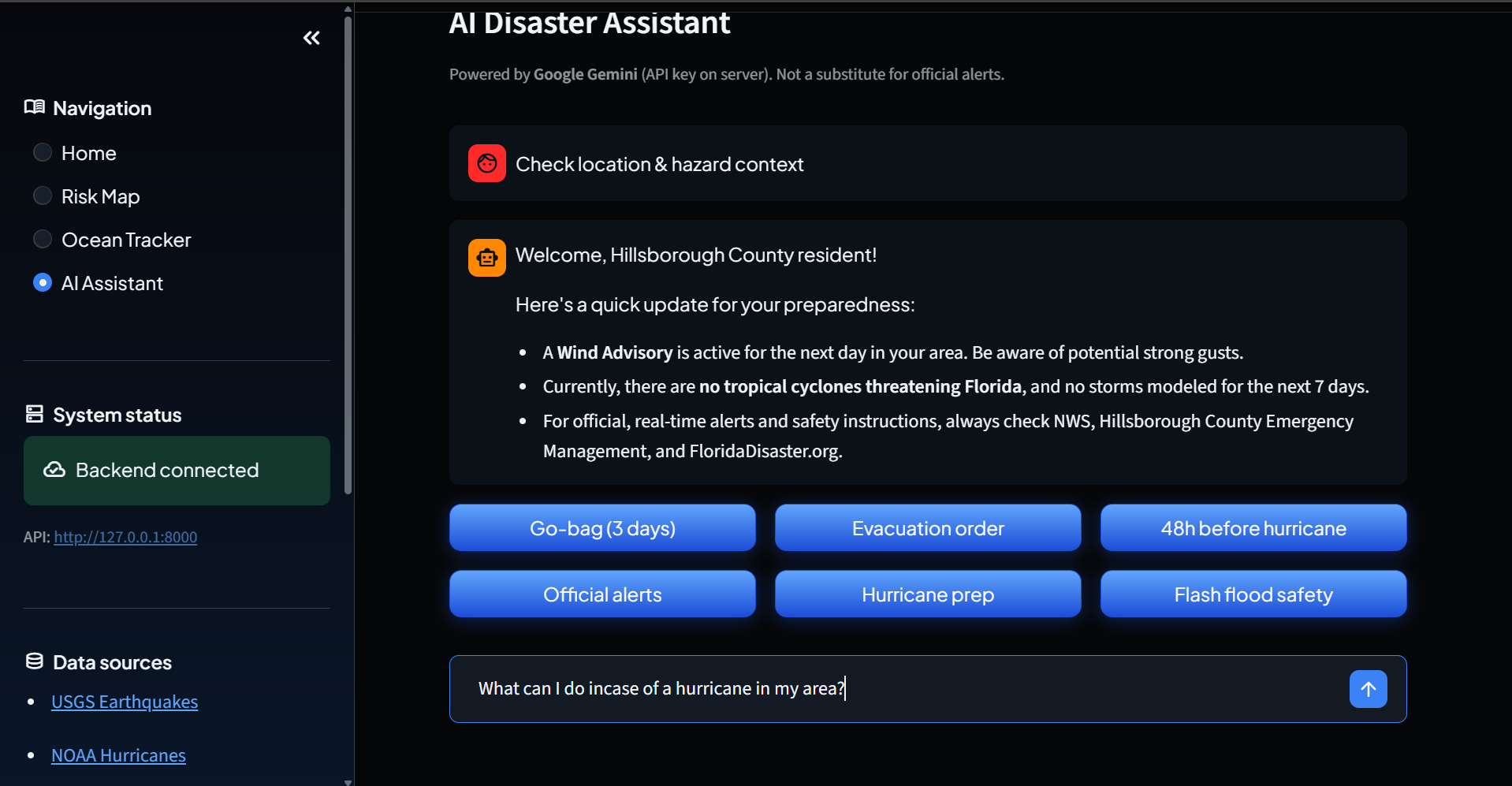
Live feeds — The API pulls USGS earthquake events near the peninsula (GeoJSON over httpx) and NOAA / NHC hurricane activity from their public JSON feed, so the UI can sit next to real institutional data, not only our model. Streamlit front end — A multi-page app (home, map, assistant-style flows) talks to FastAPI over HTTP, with styling and quick metrics so a demo reads clearly to judges and non-experts alike. Under the hood, the model uses wind speed, rainfall, and an encoded population-density band—the same feature contract from training through inference.
How we built it
Backend: FastAPI with Pydantic request/response models, CORS for the browser app, and routers for /api/prediction and /api/disasters. Async httpx clients call USGS and NOAA without blocking the event loop. Frontend: Streamlit for rapid UI, requests to the API, sliders and selectboxes for the risk form, and environment-driven API_URL (defaults to localhost:8000). Stack glue: Python 3, NumPy / pandas for feature tables, python-dotenv-friendly config patterns, and a clear path: train → pickle → FastAPI → Streamlit.
Challenges we ran into
Data vs. demo: A hackathon timeline meant we couldn’t fully curate historical Florida hazard datasets, so we used labeled synthetic data that encodes realistic relationships (wind and rain drive risk; density modulates impact). The challenge was keeping the pipeline honest—same features in train.py, predict.py, and app/models.py. Live APIs: USGS and NOAA are great when they’re up, but timeouts, empty responses, and rate quirks happen. We had to fail gracefully (empty lists, safe defaults) so a flaky network doesn’t tank the whole demo.
Accomplishments that we're proud of
A Streamlit experience that communicates risk levels visually and pairs scores with actionable copy, not just a number. Mastered using APIs to fetch information and convered that information into relevant data for users of our web application.
What we learned
Feature contracts matter more than model buzzwords—encoding population as Low/Medium/High and keeping it identical in training and inference avoided subtle bugs. Async HTTP in FastAPI is worth the extra structure when you’re calling multiple federal endpoints during a single user session. Demo apps live or die on degradation behavior—fallback scoring and empty API handling turned out as important as the happy path.
What's next
Replace API data with real or semi-synthetic Florida hazard + weather + census features, and add proper validation (spatial or temporal holdouts). Expand geography and labels: more counties, evacuation zones, and optional user-reported conditions with guardrails. Assistant depth: richer chat / RAG over official guidance (NWS, Ready.gov) so recommendations stay source-grounded.


