-
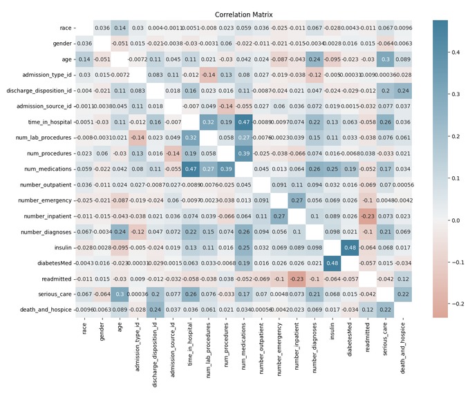
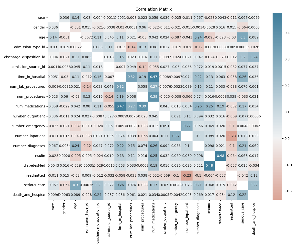
Correlation matrix
Inspiration
As women, people of color, and international students under-represented in math and physics, we have worked to try to close the gap in our own fields and departments. We have felt the effects of bias in our experience as researchers and are sensitive to these issues. Given this sensitivity, we wanted to use our time in the hackathon to find ways to show bias in a given dataset. We chose the healthcare dataset detailing care received for diabetes patients as we thought it had the type of datapoints we wanted to be able to show bias.
What it does
It produces a correlation matrix between the variables of the dataset.
It also produces graphics that express that men die more than women from diabetes; and that Hispanic people die less than people of other races/ethnicities. The following age groups die more: 0-10 and 20-30.
It also produces graphics that express that women receive more serious interventional care than men; and that white people receive more serious interventional care than people of other races/ethnicities. There is an exponential growth with respect to age and those who receive serious interventional care.
Finally, it shows how it’s important to confront one’s own bias as a researcher and to not to be too hasty about making conclusions you think you find in a dataset.
How we built it
We used Python to process the data, and performing rigorous preprocessing and preliminary data analysis to understand our dataset’s diverse features. We then applied Logistic Regression and Random Forest models to our cleaned dataset. We chose Logistic Regression for its proficiency in binary classification problems, offering clear probabilistic results, and employed Random Forest for its ability to handle unbalanced datasets and provide importance scores for each feature.
Challenges we ran into
We thought finding bias would be easy and straightforward, and it was not. We used tools that showed one result and had to edit our data to make it show another one more reflective of the dataset. We had to think about what type of data our tools needed to run well in order to get good information out of our data. We changed categorical data to numerical data. We thought about which type of performance measurement of our tools made sense. At one point, late last night, we were very frustrated as we had not achieved our goal of finding bias in our dataset with response to gender nor race. We thought more deeply about how we were defining “bad outcomes” to overcome this challenge.
Accomplishments that we're proud of
We are proud that we persevered through our challenges and came up what we hope is a compelling story to tell about both our dataset and our hacking process.
What we learned
So much! We have different levels of coding experience, so we learned different things. We learned more about different fundamental data science tools including data cleaning, data wrangling, redefining columns, and generating correlation matrices. We also learned about building machine learning classifiers using random forest and logistic regression and analyzing how they work with shap. All of these experiences reminded us of what one of our favorite professors tells us repeatedly: most data challenges need only fundamental statistics tools. Be careful when using more advanced ones.
What's next for Diabetes Dataset
We really want to know where this dataset is from. The insights we found from our dataset contradict national morbidity and mortality trends with respect to race and gender. Is there something special about the local population from which this dataset comes from to account for this contradiction? Or is the contradiction due to how the data is gathered, or to how we measured “bad outcomes.” We need to know more about our dataset to feel confident about the insights we see from it.
Built With
- correlation-matrix
- data-cleaning
- data-wrangling
- jupyter-notebook
- logistic-regression
- pandas
- random-forrest
- scikit-learn
- shap

Log in or sign up for Devpost to join the conversation.