-
-
Solution & Key User Flow 1
-
Solution & Key User Flow 2
-
Solution & Key User Flow 3
-
Solution & Key User Flow 4
-
Solution & Key User Flow 5
-
Solution & Key User Flow 6
-
Solution & Key User Flow 7
-
Solution & Key User Flow 8
-
Solution & Key User Flow 9
-
Solution & Key User Flow 10
-
Design Process1
-
Design Process2
-
Design Process3
-
Design Process4
Inspiration
What if the best part of getting somewhere happened along the way?
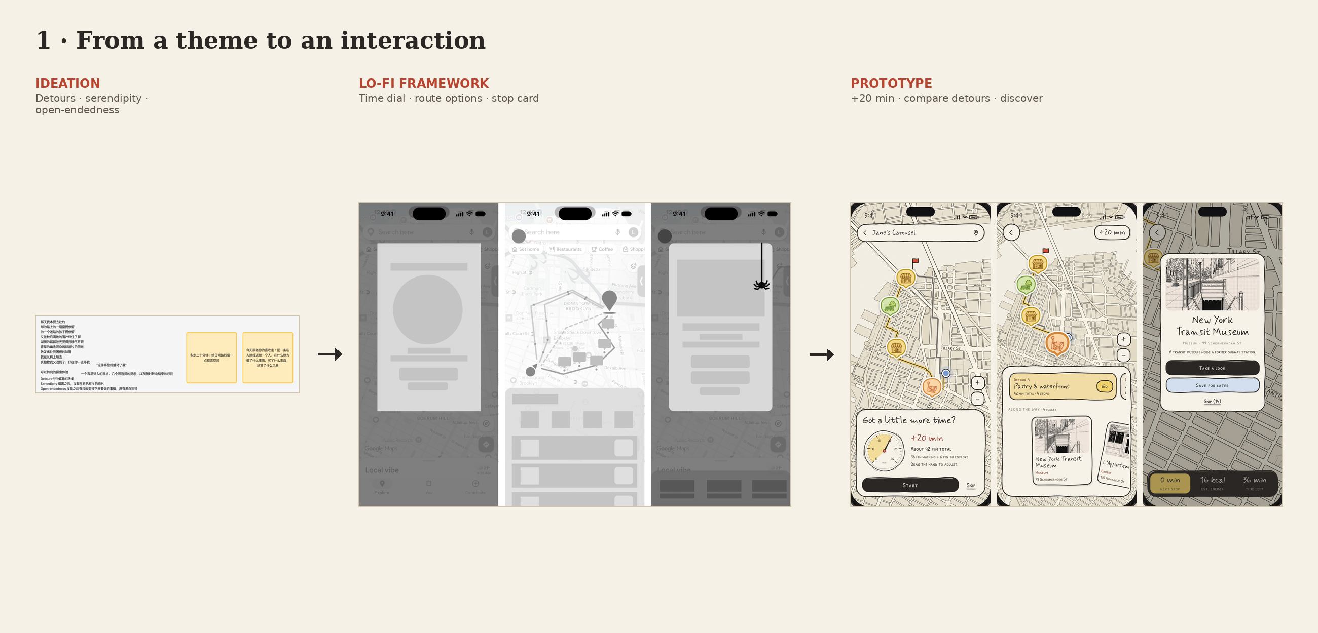
We started with detours, serendipity, and open-endedness: the possibility that an unexpected turn could become the most memorable part of an ordinary day. On familiar routes, it is easy to stop noticing what surrounds us. We follow directions, watch the arrival time, and walk past places we might have loved.
That led us to a simple invitation: walk a little longer, on purpose.
What it does
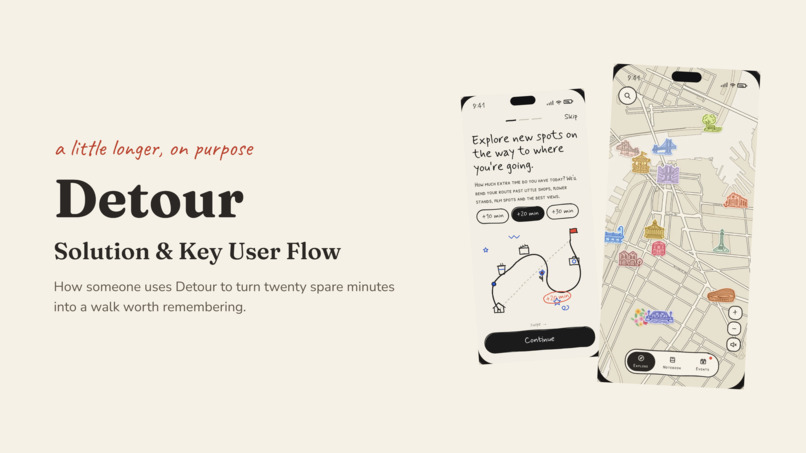
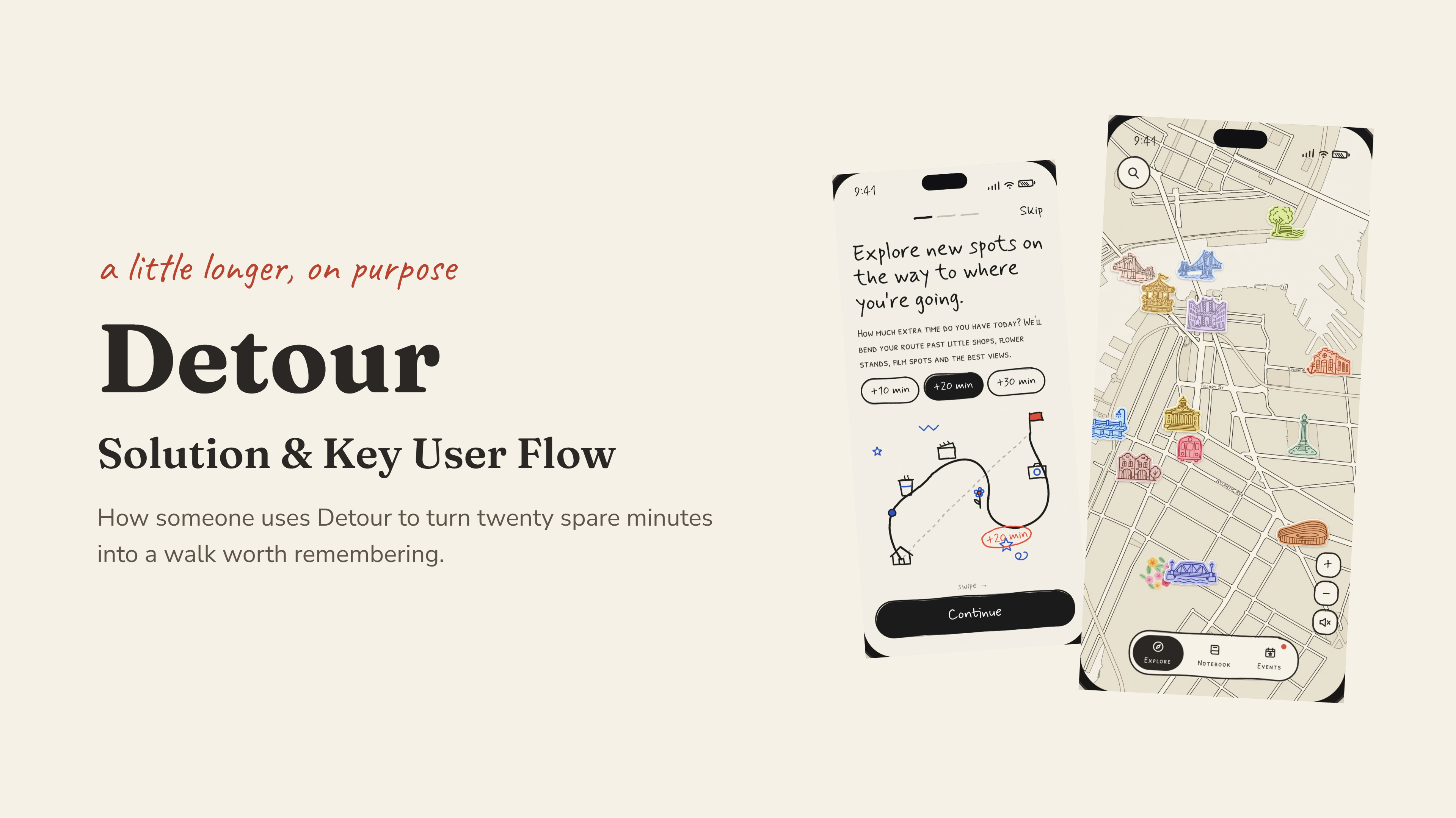
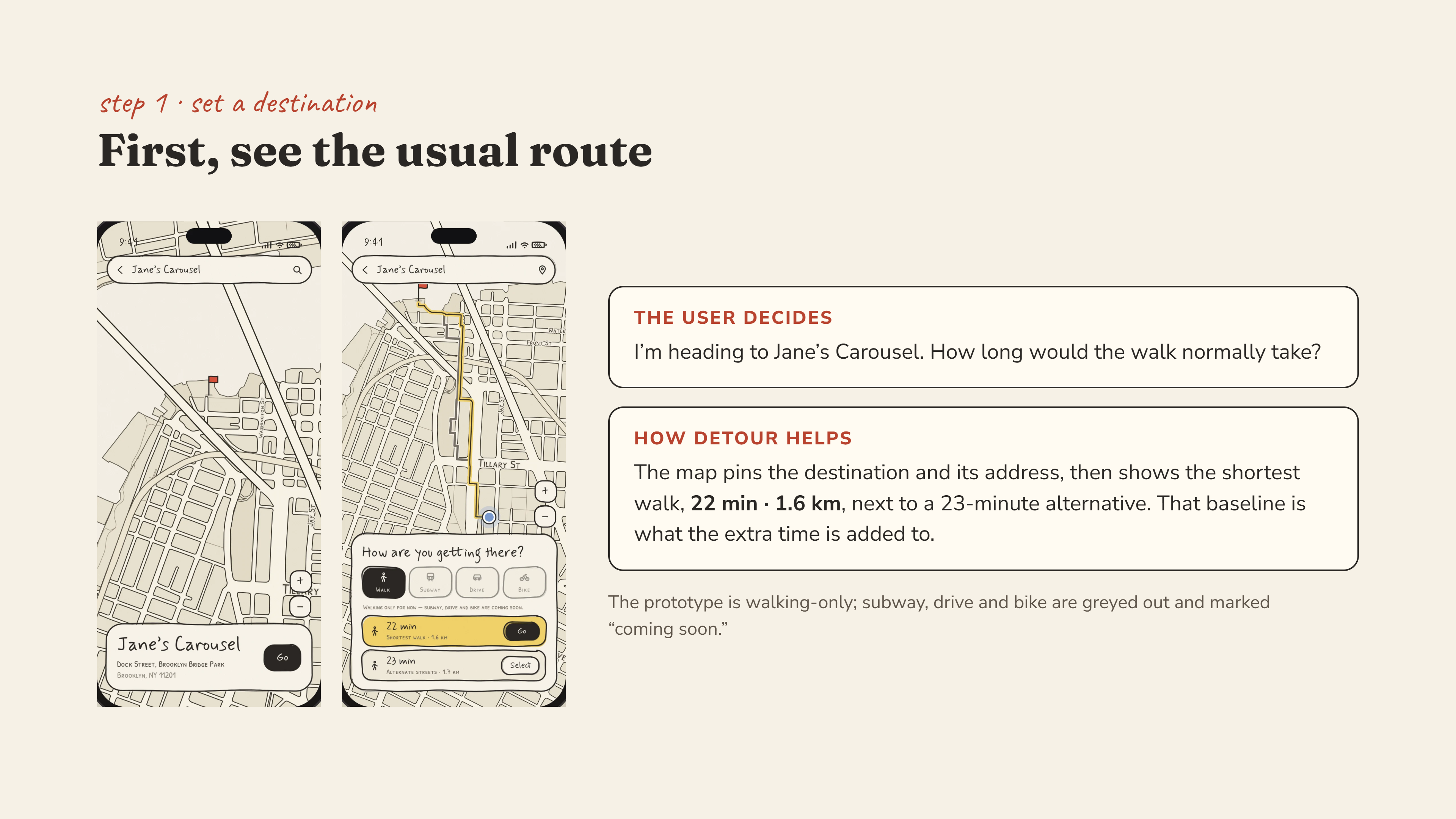
Detour is a walking exploration app that makes room for small discoveries between where you are and where you need to go.
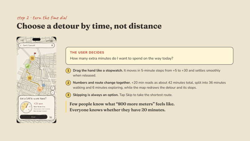
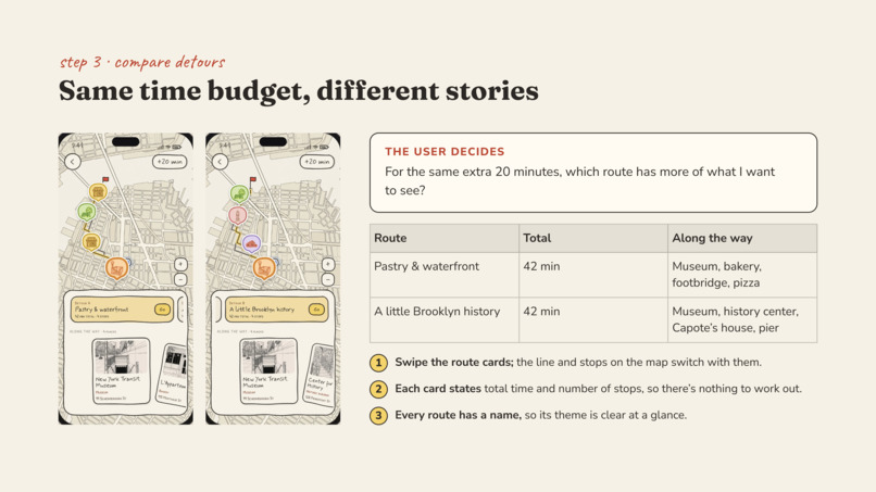
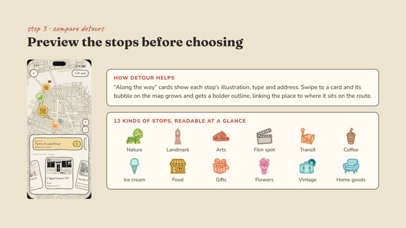
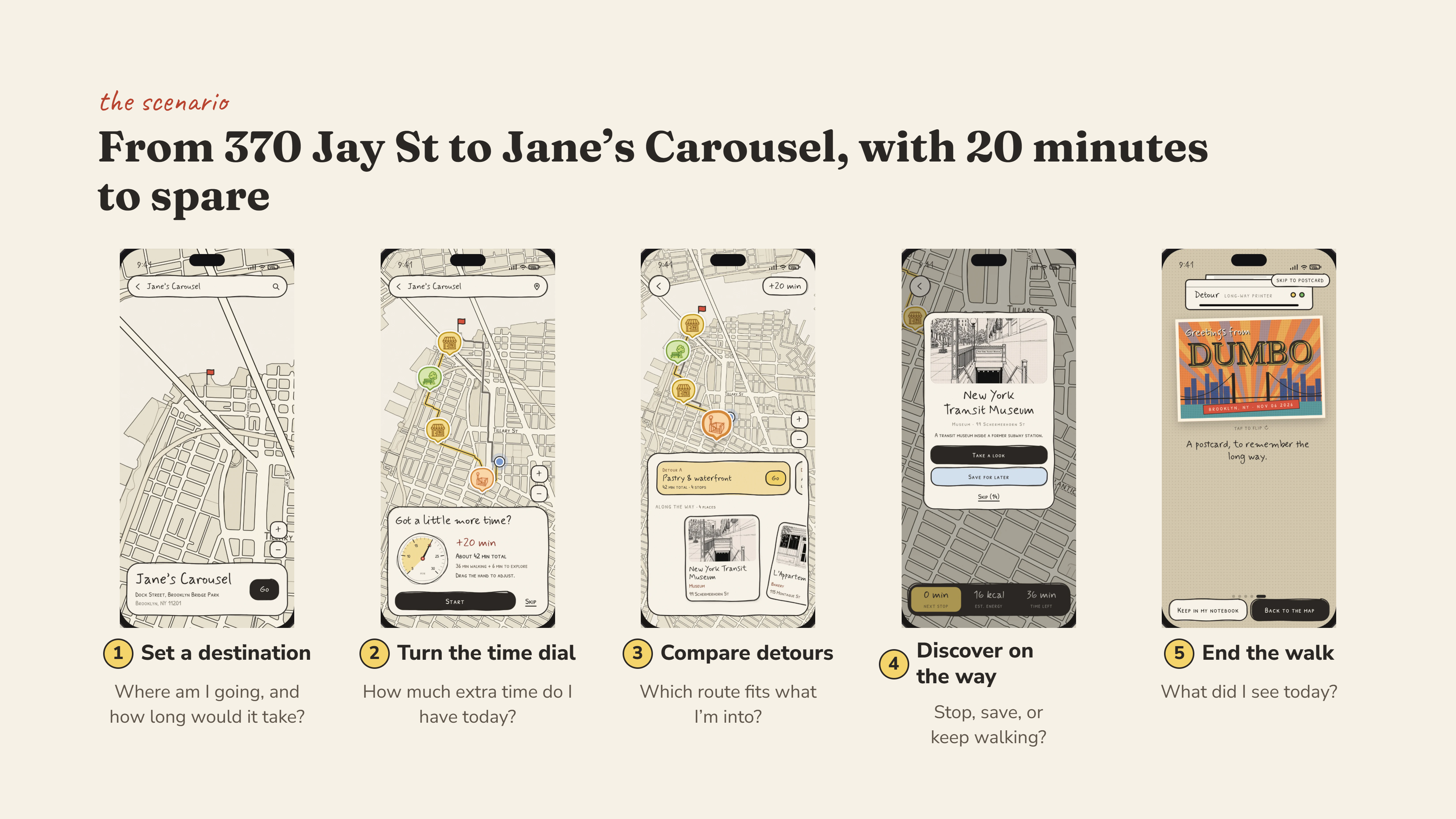
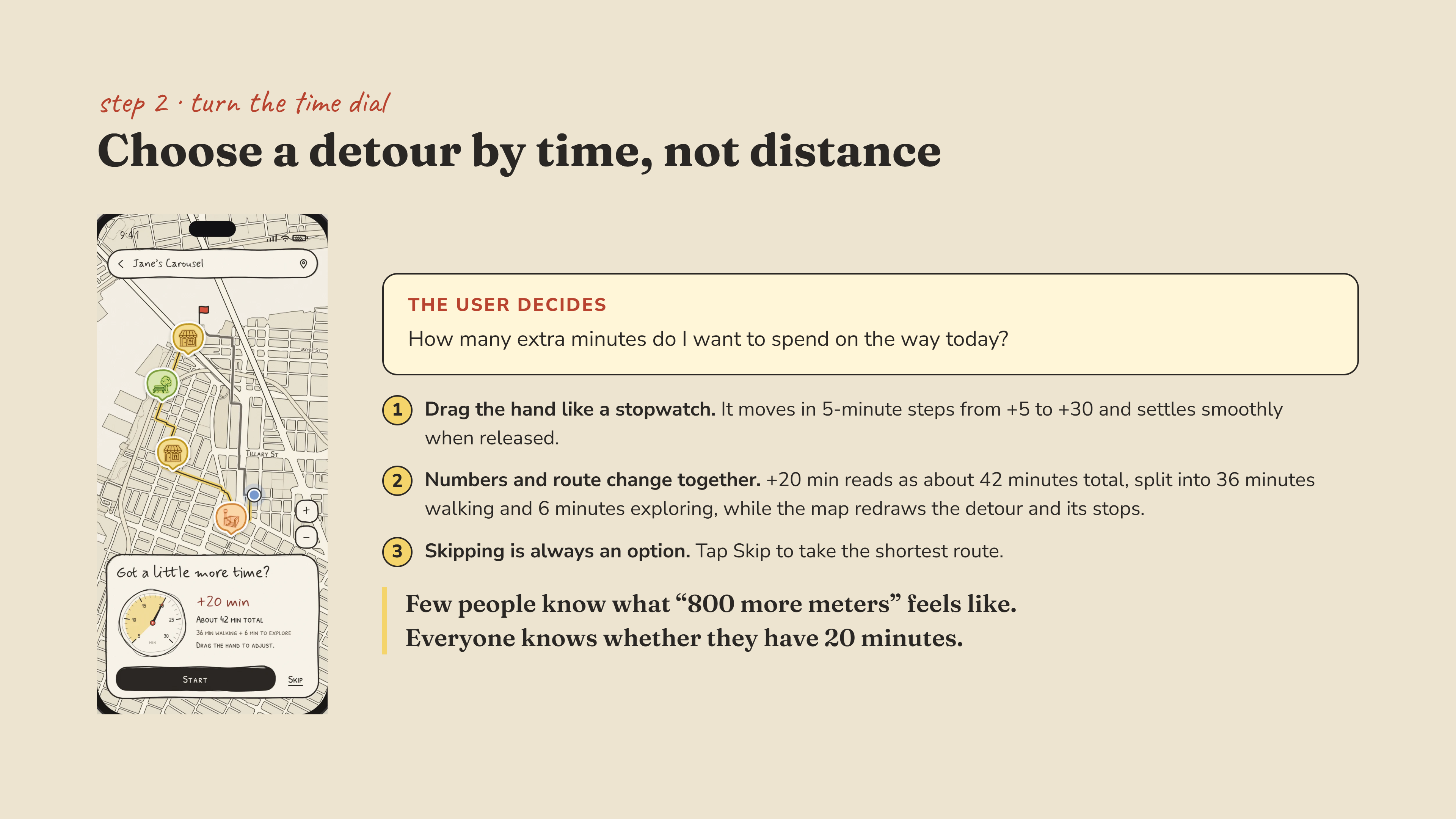
Instead of starting with a list of attractions, Detour asks: How many extra minutes do you have? Users choose between +5 and +30 minutes and explore a route with places that might catch their interest, from a flower shop or bookstore to a waterfront view.
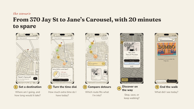
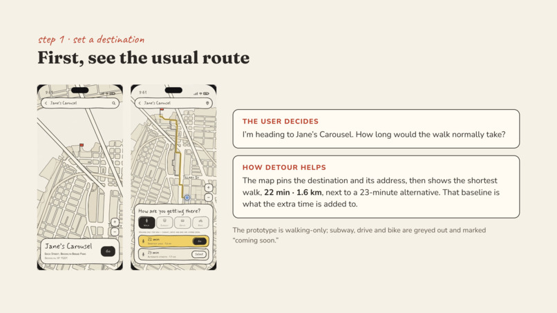
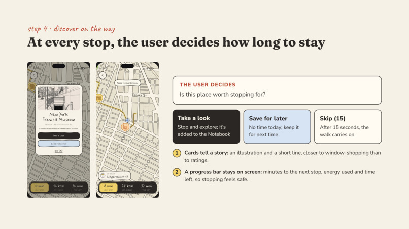
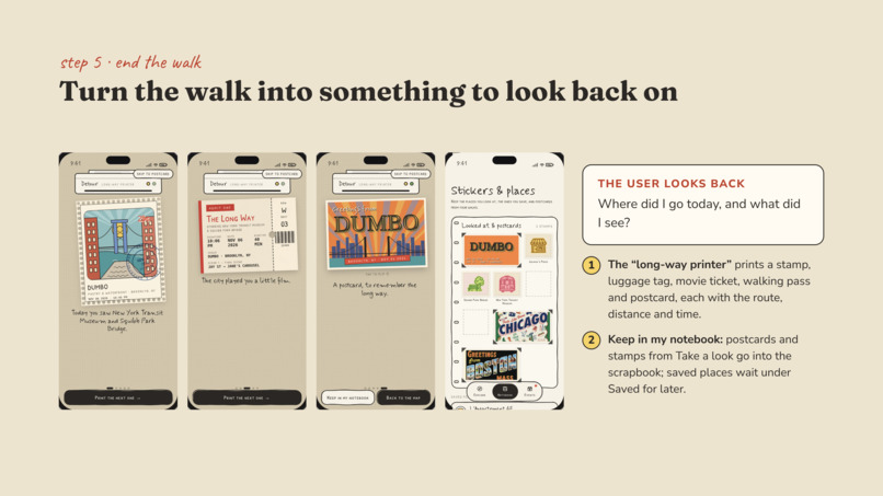
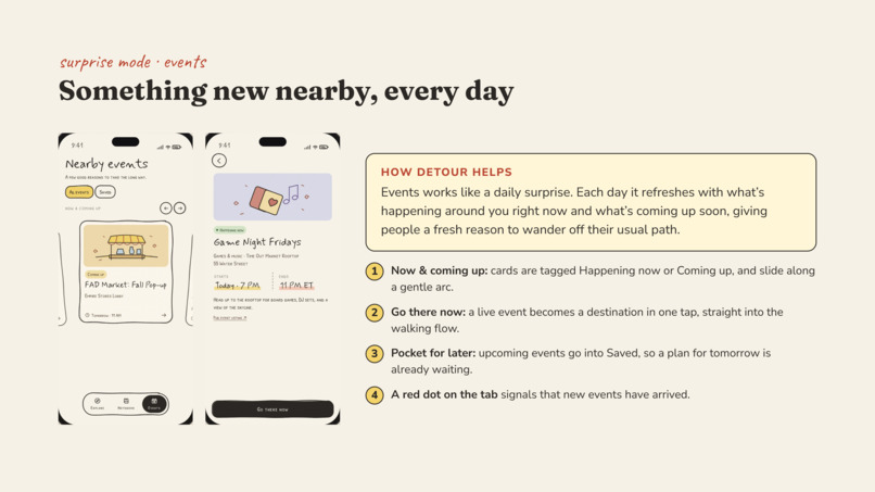
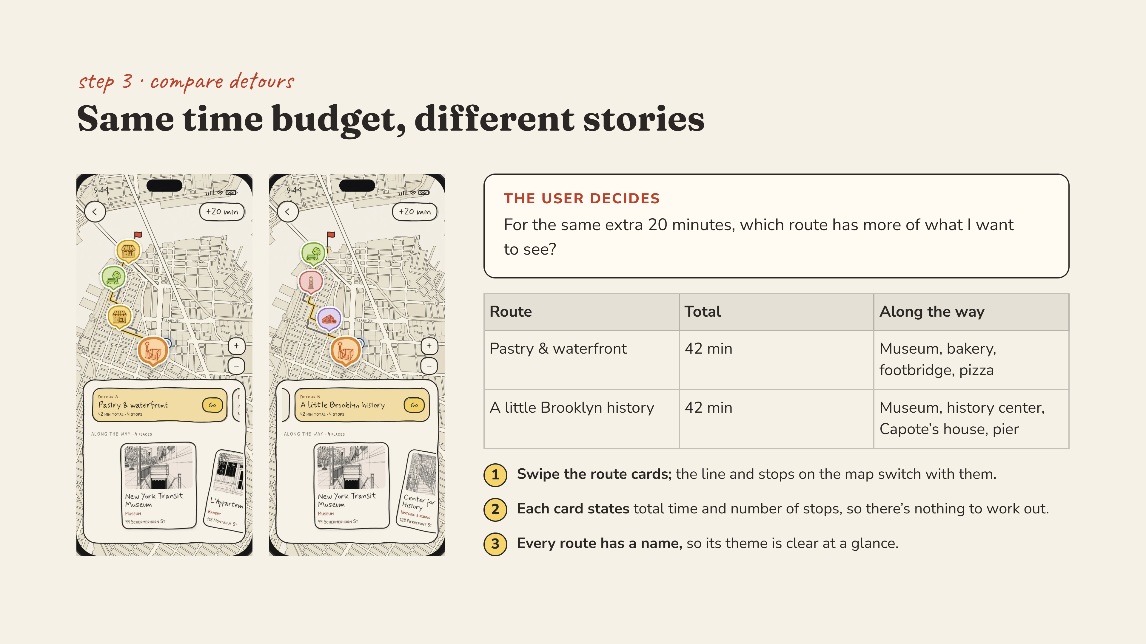
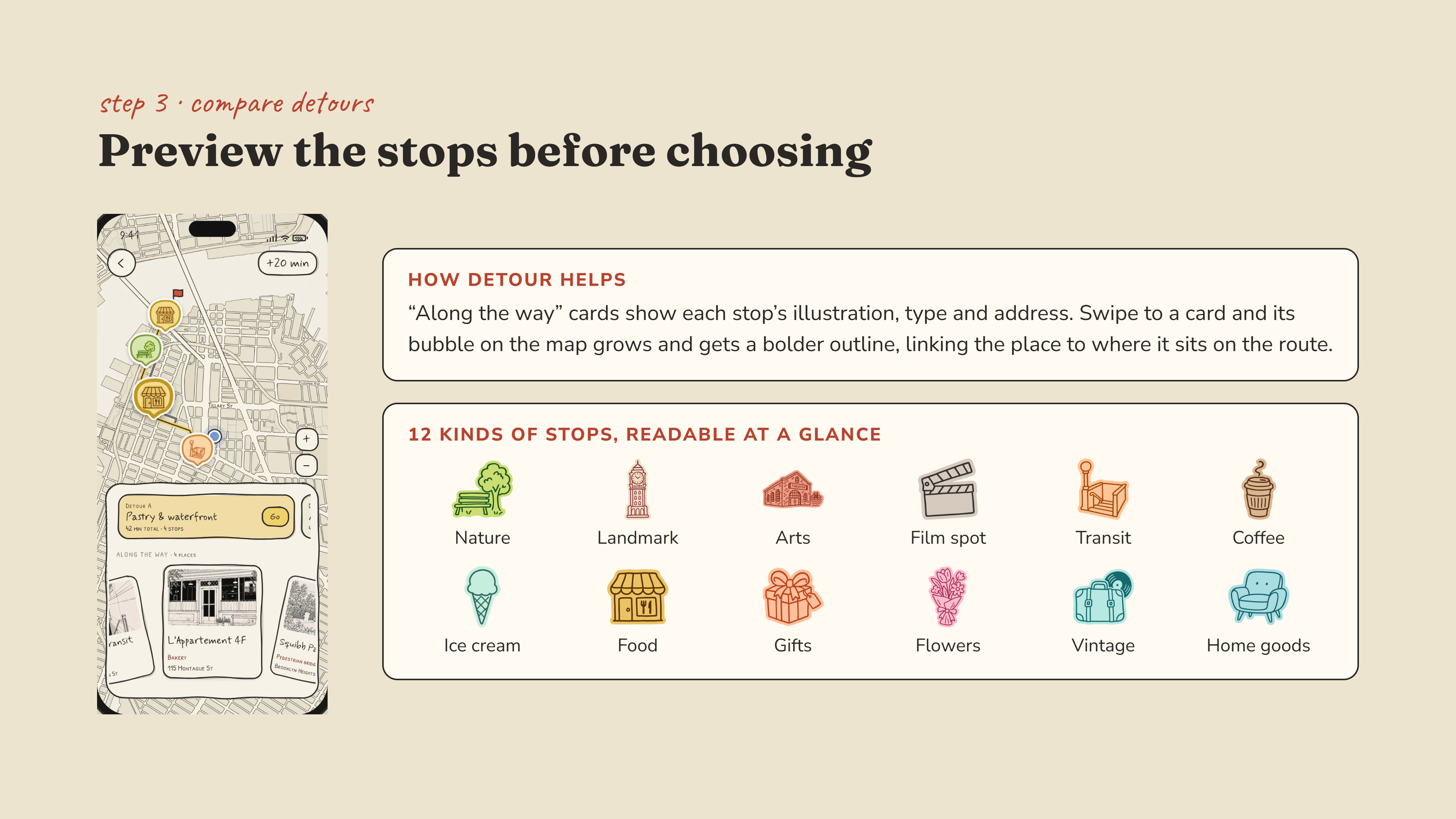
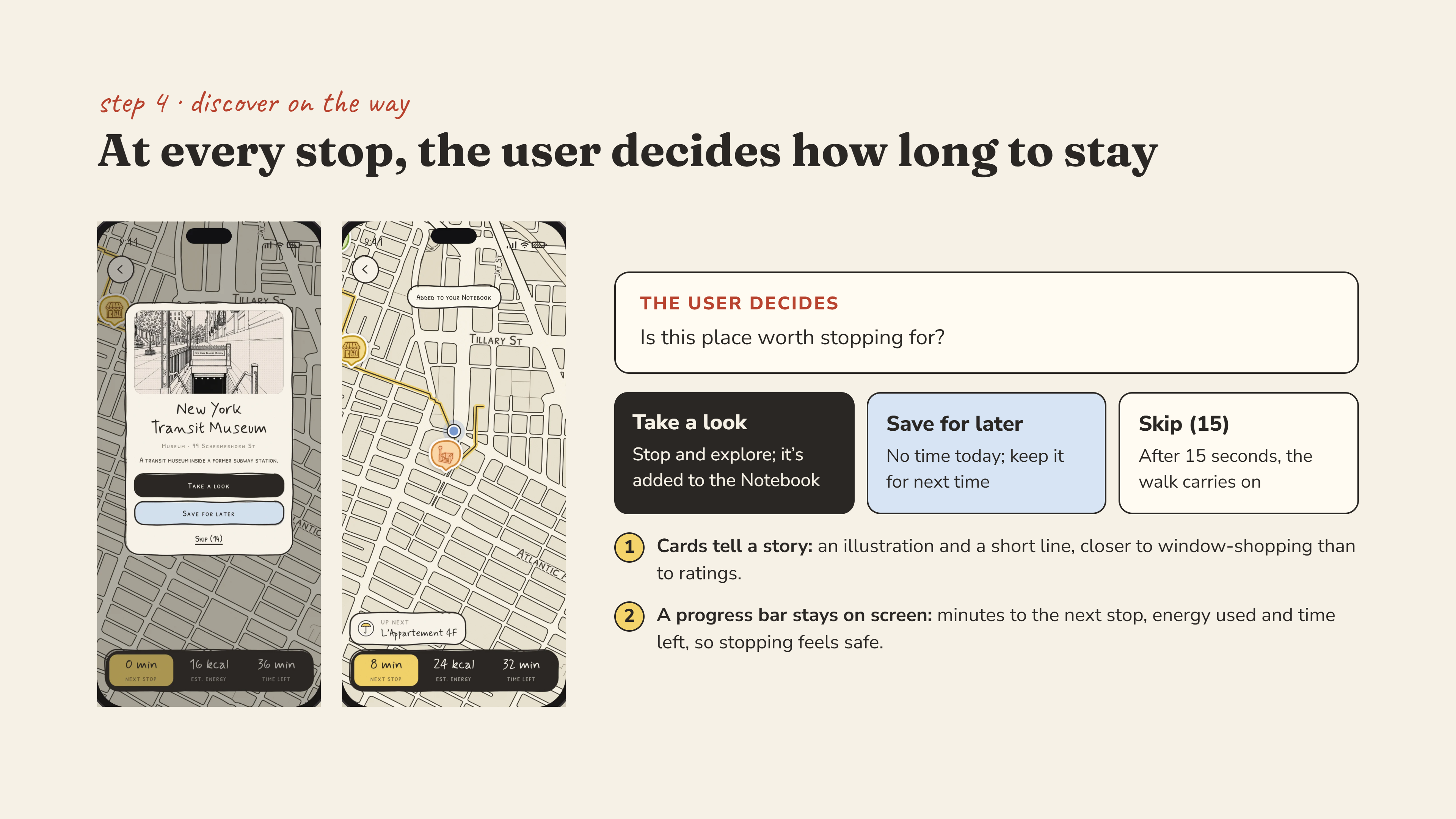
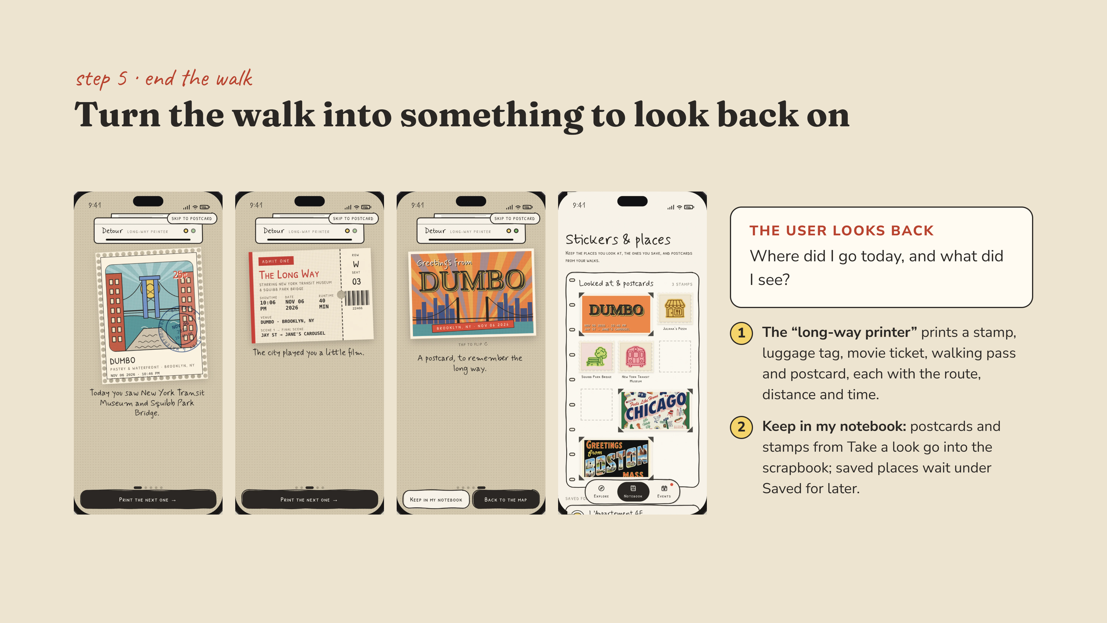
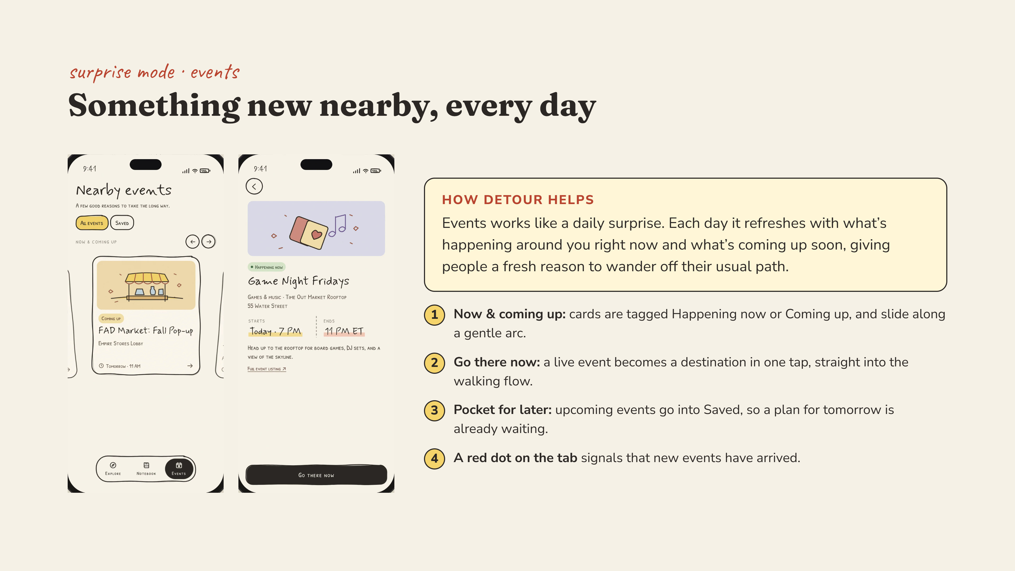
Our clickable prototype follows a journey from 370 Jay Street to Jane’s Carousel in Brooklyn. Users can select interests, adjust their extra time, explore suggested routes, and open cards about places along the way. At the end, a playful ticket-and-postcard experience turns the walk into a small keepsake.
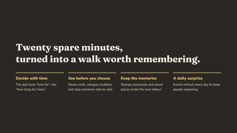
Detour makes exploration feel possible within an everyday trip, even when there is only a little time to spare.
How we built it
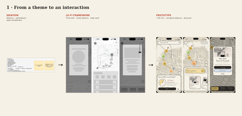
We developed the concept through brainstorming, early flow sketches, and iterations in Figma, then built the interactive web prototype with HTML, CSS, and JavaScript.
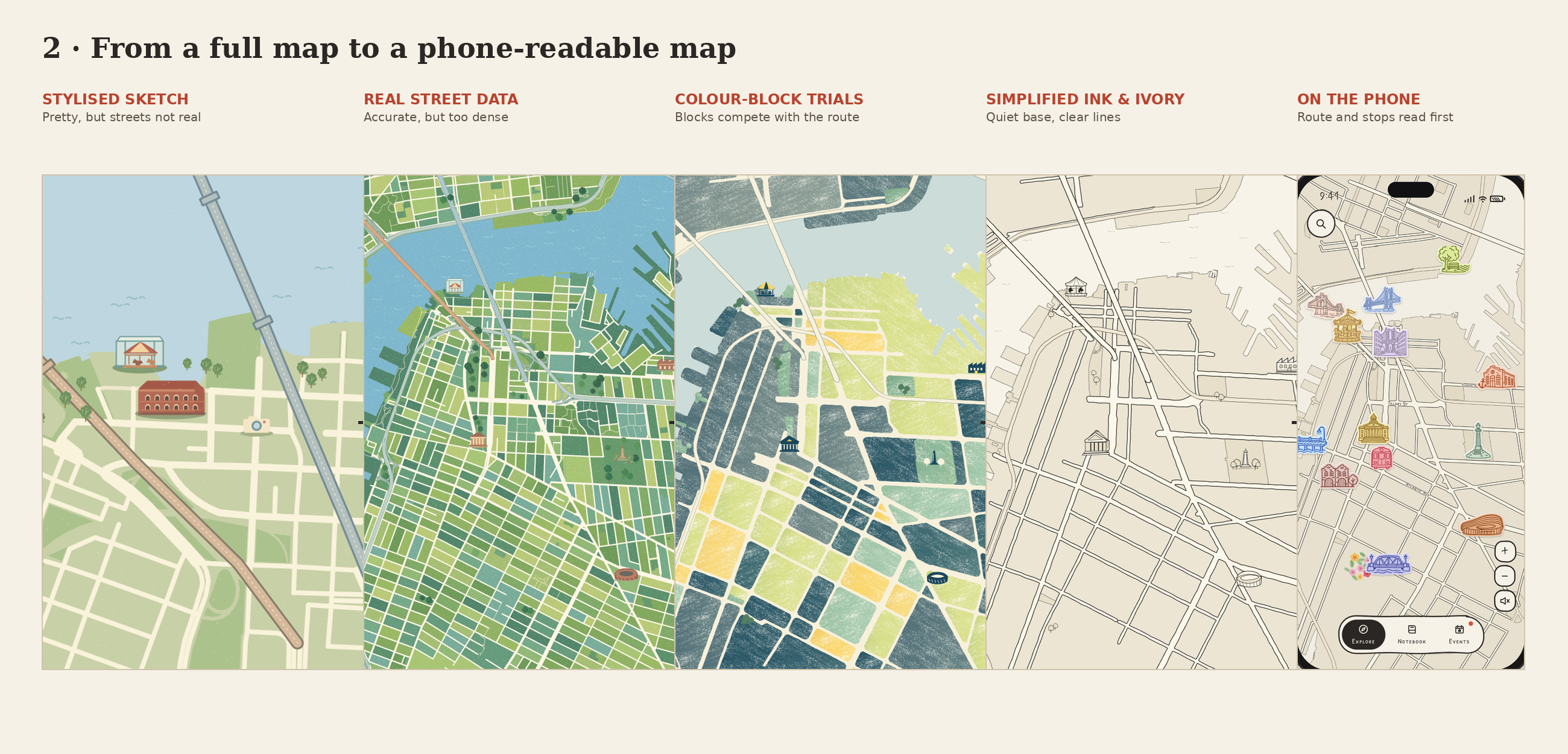
We researched real places around Downtown Brooklyn and DUMBO to give the demonstration a specific local setting. The prototype combines illustrated maps, place cards, route choices, and animated transitions in a browser-based experience.
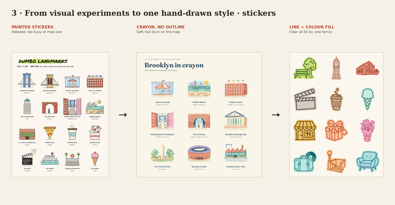
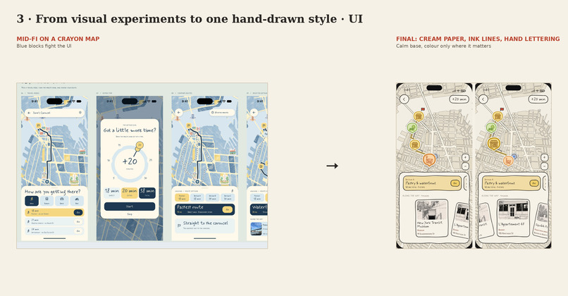
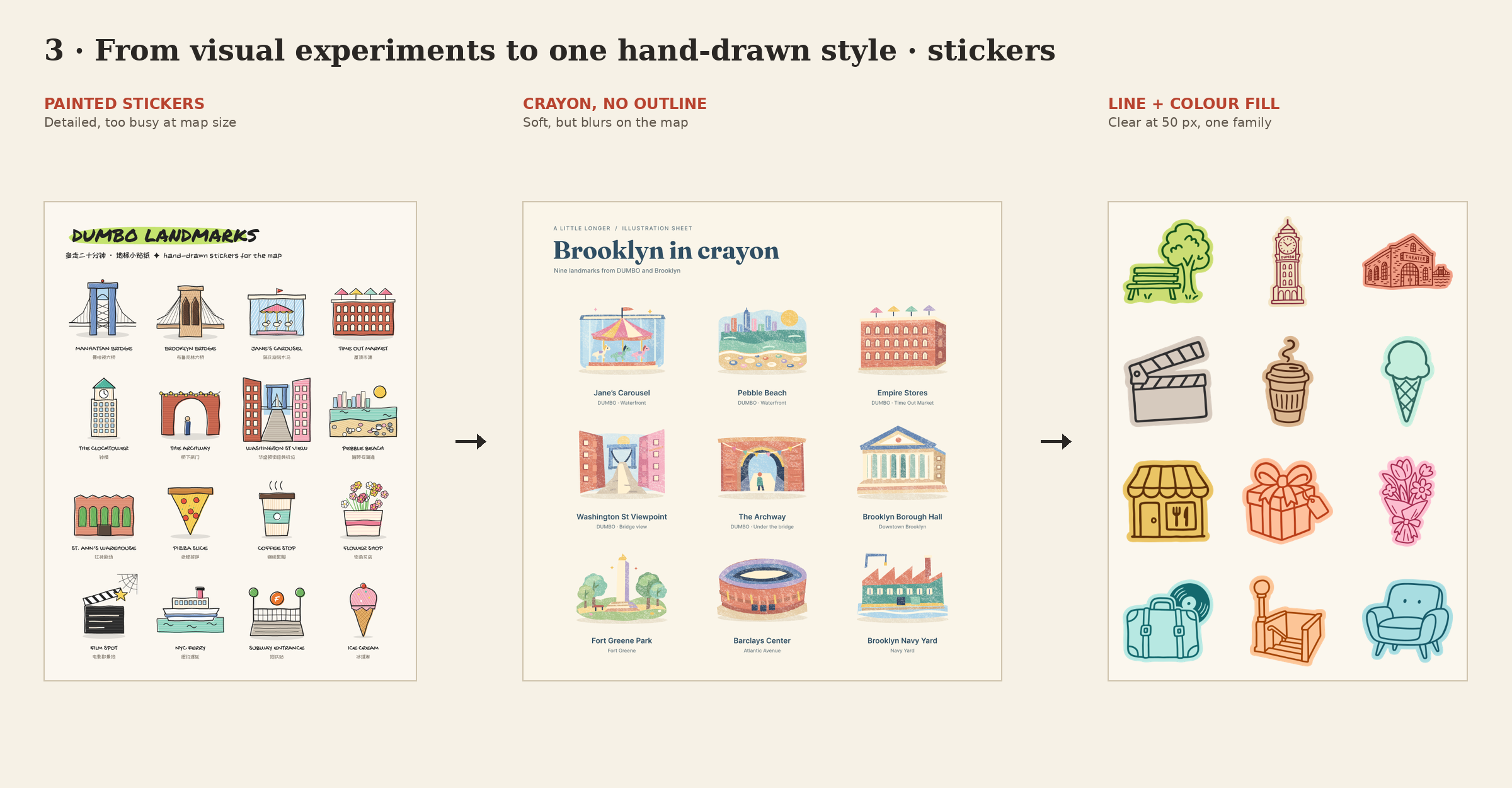
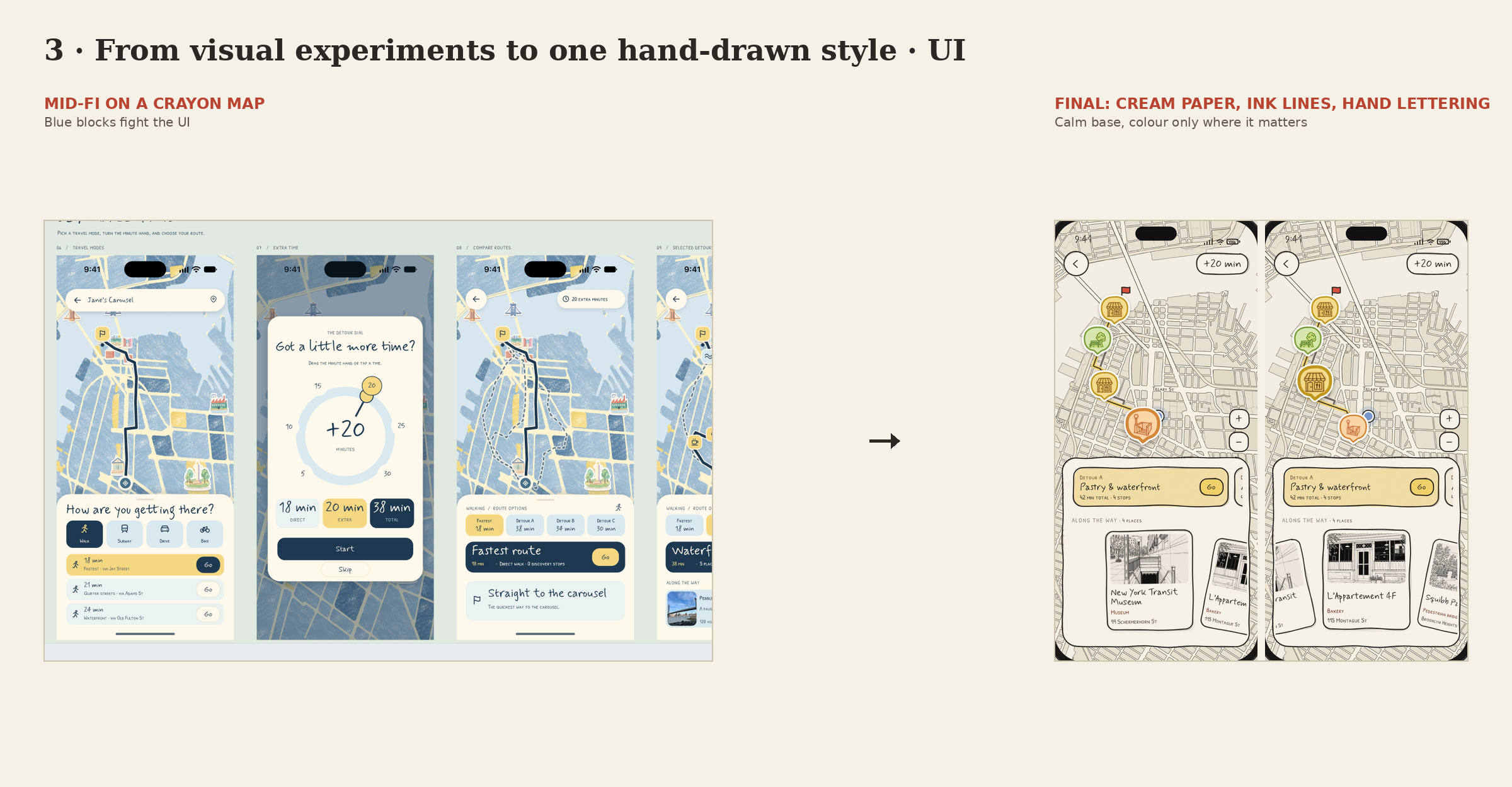
Its visual language uses hand-drawn outlines, warm paper textures, and playful typography. We wanted the interface to feel like a personal travel notebook, carrying the same curiosity that the app encourages outdoors.
The current version demonstrates the intended experience with predefined routes and interactions. It does not yet generate live routes or provide real-time navigation.
Challenges we ran into
Our first challenge was turning an abstract feeling into a useful interaction. “Notice the in-between” expressed our intention, but it did not tell users what to do. Letting people choose their extra minutes gave that idea a clear starting point.
Another challenge was balancing discovery with direction. Users need enough information to feel comfortable taking a detour, while still leaving room for surprise.
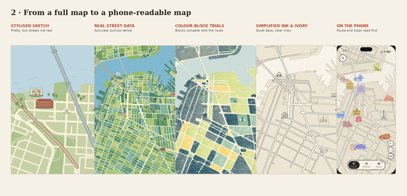
We also worked to make the illustrated map readable on a small screen. Across iterations, we adjusted its proportions, visual hierarchy, and relationship with the place cards so the hand-drawn style could support the experience.
What we learned
We learned that a poetic idea becomes stronger when it offers a concrete choice.
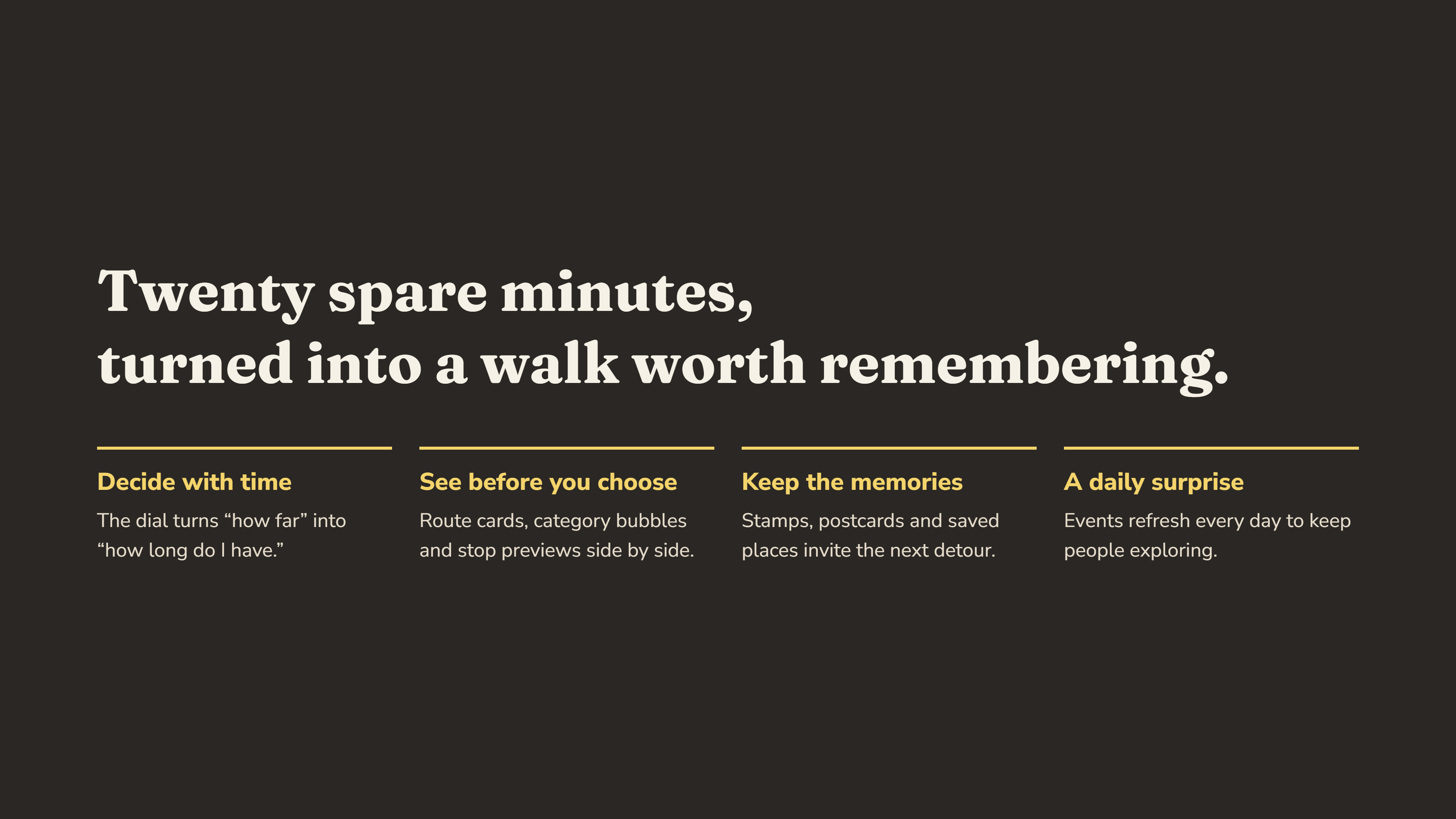
Choosing a small amount of extra time gives exploration a manageable boundary. Someone may not have an afternoon to wander, but they might have ten minutes to try a different street.
We also learned that visual design shapes the invitation. The map, language, and keepsake all help frame an ordinary walk as something worth paying attention to.
What's next
We would like to connect Detour to live walking directions and place information, test it with people on their everyday routes, and refine how suggested detours fit their available time.
We also want to explore how saved postcards could become a personal collection of small discoveries—a record of the places someone found by leaving a little room along the way.
Built With
- base44
- claude
- figma


