-
-

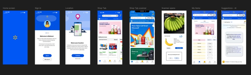
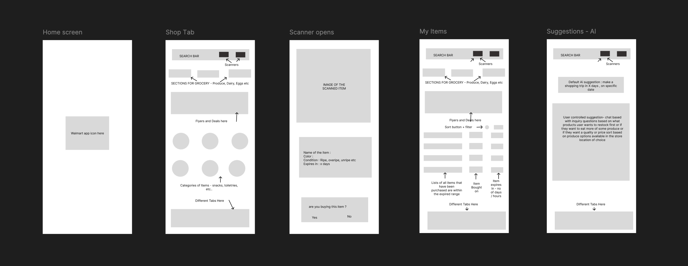
Wireframes for the freshness scanner app
-
Prototype

Freshness Scanner – Product Documentation
Overview
Freshness Scanner is a mobile feature designed for the Walmart app that helps users assess produce freshness using their phone camera. The idea emerged from a simple but overlooked gap in everyday shopping: most people rely heavily on color to judge ripeness, but that assumption breaks down for millions of users. This feature uses visual analysis beyond colorsuch as texture and surface cuesto give users a clearer, more reliable understanding of produce quality in real time. Built as part of a two week hackathon, the focus was on creating an accessible, intuitive experience that fits naturally into existing shopping behavior rather than introducing a separate workflow.
Problem Statement
Grocery shopping is a highly visual experience, and for colorblind users, it presents a consistent accessibility barrier. People with red-green colorblindness in particular struggle to determine whether produce is ripe, underripe, or spoiled because the primary signal color is unreliable for them. This often leads to poor purchasing decisions, wasted food, and, in some cases, anxiety around food safety. Over time, this can reduce confidence and independence, with some users choosing to avoid shopping alone altogether or relying on others for assistance.
This challenge extends beyond colorblindness. As vision declines with age or in low-light environments, even users without diagnosed conditions can struggle with the same uncertainty. What seems like a trivial decision picking the right banana or avocado becomes a repeated point of friction. The core problem is not just incorrect selection, but the loss of confidence and control in making everyday decisions independently.
Clarifying Questions
To better understand the scope of the problem, I explored a few key questions early on. Approximately 3.7% of Americans are colorblind, which translates to around 12 million people, with a significantly higher prevalence among men. Of this group, about one-third report specific difficulty with food-related decisions, particularly in grocery environments. The issue is most pronounced with commonly purchased produce like bananas, apples, tomatoes, and avocados, where subtle color differences indicate ripeness.
From a feasibility perspective, the solution needed to work with tools users already have-namely, smartphones and integrate into an app they already use frequently. It was also important to ensure the feature felt empowering rather than assistive in a limiting way, which led to positioning it as a smart shopping tool that benefits a wide range of users, not just those with color vision deficiencies.
Research
Research reinforced that this is both a widespread and under-addressed issue. Studies show that up to 90% of individuals with red-green colorblindness experience difficulty when making food-related judgments based on color. This is not limited to edge cases but affects routine decisions. In addition to quantitative findings, anecdotal insights highlighted the emotional impact users expressed hesitation and even fear around selecting food for their families due to uncertainty about freshness.
To better understand how this friction shows up in real life, I mapped the problem across a set of representative users.
Josh, a college freshman with red green colorblindness, is learning to manage daily responsibilities on his own. Grocery shopping, which should be routine, often becomes uncomfortable. He struggles to distinguish whether bananas are ripe or already turning, and in one instance ended up buying bananas that were already overripe and unusable the next day. Situations like this make him feel self conscious and dependent on others, especially in a new environment where he is trying to build independence.
Dave, a 60 year old retiree with astigmatism and declining vision, faces a similar but more gradual challenge. Subtle visual cues on produce are difficult to interpret, particularly under inconsistent store lighting. He frequently relies on store employees to help him choose fruits and vegetables, which, while helpful, reduces his sense of autonomy over time and makes routine errands feel more effortful.
Gina, a 25 year old working in finance, experiences the problem through the lens of time and efficiency. Her schedule leaves little room for uncertainty, yet assessing produce quality often slows her down. Even when she uses personal shoppers, the items selected don’t always meet her expectations, creating a disconnect between convenience and control. What should be a quick task becomes another point of friction in an already busy day.
Georgina, a 35 year old single mother, navigates this challenge at a systems level. Balancing work and household responsibilities, she often has to guide her young child over video calls to pick out groceries. Explaining how to choose the right produce remotely is both time consuming and unreliable, adding to her cognitive load. On top of that, keeping track of what’s expiring at home makes meal planning more complex than it needs to be.
Across all of these users, the issue is not just about identifying freshness, but about the broader impact on confidence, independence, time, and mental effort.
Insights
A few key insights shaped the direction of the solution. Color is treated as the default indicator of freshness in most retail environments, making it inherently exclusionary for a significant group of users. At the same time, users are not looking to learn or memorize rules about produce-they need immediate, contextual guidance at the moment of decision making.
Another important realization was that accessibility challenges often overlap with efficiency challenges. For users like Josh and Dave, the issue is confidence and independence, while for users like Gina and Georgina, it is speed and cognitive load. In both cases, the underlying need is the same: a fast, reliable way to make decisions without second-guessing. This reinforced the importance of designing a solution that is not only accessible, but universally useful.
Constraints
The solution had to operate within both technical and experiential constraints. From a technical standpoint, the analysis needed to be fast enough to feel seamless, ideally within a couple of seconds, and rely only on the phone’s existing hardware. Given the hackathon timeline, the focus was on demonstrating feasibility and designing the experience rather than building a fully trained model.
From a user experience perspective, the interaction needed to be simple and intuitive, without requiring barcodes or precise positioning, and robust enough to function in inconsistent lighting conditions typical of grocery stores. Accessibility also required that results be easy to interpret at a glance, without relying on small text or subtle visual differences.
Target Consumers
The primary audience for this feature is colorblind users between the ages of 18 and 65 who regularly shop for groceries using their smartphones. However, the value extends well beyond this group. Users like Dave, who experience declining vision, benefit from clearer and more accessible outputs, while users like Gina and Georgina benefit from reduced time and effort in decision-making.
This broader applicability reinforces the positioning of Freshness Scanner as a universal tool rather than a niche accessibility feature. By solving for edge cases well, the experience improves for everyone.
Potential Solutions
Several approaches were considered before arriving at the final direction. Adjusting color palettes to make differences more visible was initially appealing due to its simplicity, but it still relied on users interpreting visual differences, which does not fully solve the problem. Barcode-based or database-driven solutions offered accuracy but introduced friction and did not work well for loose produce.
A more promising direction was to move away from color entirely and instead analyze non-color cues such as texture and surface patterns using machine learning. While more complex, this approach directly addresses the root of the problem and provides a more universally accessible solution. A hybrid approach was also considered, but given the scope and timeline, focusing on texture-based analysis provided the best balance of impact and feasibility.
Final Solution
Freshness Scanner allows users to point their phone camera at a piece of produce and receive an instant assessment of its condition. Instead of relying on color, the system evaluates visual patterns, surface texture, and other indicators to determine whether the item is unripe, ripe, or overripe. The result is presented in a clear and concise ****format that includes the produce name, its current state, and an estimate of how long it will remain fresh. To further support accessibility, the feature can optionally provide audio feedback.
The scanner is integrated directly into the Walmart app, accessible through the search bar and services section, making it a natural extension of existing user behavior. Beyond in-store use, it also supports at-home scenarios, allowing users to recheck items and receive reminders as they approach expiration.
For users like Josh, this means being able to shop independently without second-guessing decisions. For Dave, it restores a sense of autonomy in a task that had become increasingly difficult. For Gina, it reduces friction and saves time, while for Georgina, it simplifies coordination and reduces mental load across her daily routine.
Wireframes and Prototype
The design process began with mapping out a simple user journey across a small set of key screens. The entry point needed to feel native to the app, leading into a camera interface that clearly guides the user without overwhelming them. The results screen was designed to prioritize clarity, using large text and supporting icons rather than relying on color alone.
These decisions were directly informed by user needs. For someone like Dave, readability and clarity are critical, while for Gina, the ability to move quickly through the flow without friction is equally important. Additional flows, such as scanning multiple items or reviewing previously scanned produce, were included to reflect real shopping behavior, particularly for users managing multiple items or households.
These concepts were translated into a clickable prototype in Figma, with attention to maintaining visual consistency with Walmart’s design language while ensuring accessibility standards like touch target size, contrast, and typography were met.
Implementation
If developed further, the implementation would involve training a machine learning model on a diverse dataset of produce images across different stages of freshness. The goal would be to enable fast, reliable inference either directly on the device or through a lightweight backend service.
Additional integrations, such as linking scanned items to a user’s purchase history or enabling proactive notifications, could extend the feature into a broader food management tool. For users like Georgina, this could translate into smarter reminders and planning support, while for others, it would reinforce consistency and reliability in everyday use.
Testing
Testing during the hackathon focused on validating usability and clarity. Quick, informal sessions were used to observe whether users could understand and use the feature without explanation, and whether they could complete the core task-scanning and interpreting results-within a short time frame. Accessibility checks ensured that the interface remained usable under different visual conditions.
Looking ahead, more rigorous testing would include working directly with users who share characteristics with Josh and Dave to validate accessibility improvements, as well as testing with users like Gina and Georgina to ensure the experience holds up under time pressure and real-world complexity. Evaluating the accuracy of the model across different types of produce and refining how information is presented will be key to ensuring both trust and usability at scale.
Built With
- chatgpt
- figma


Log in or sign up for Devpost to join the conversation.