-
-
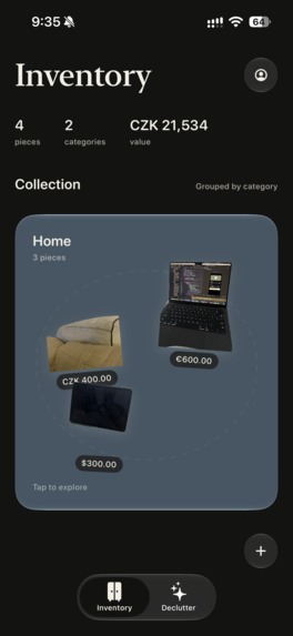
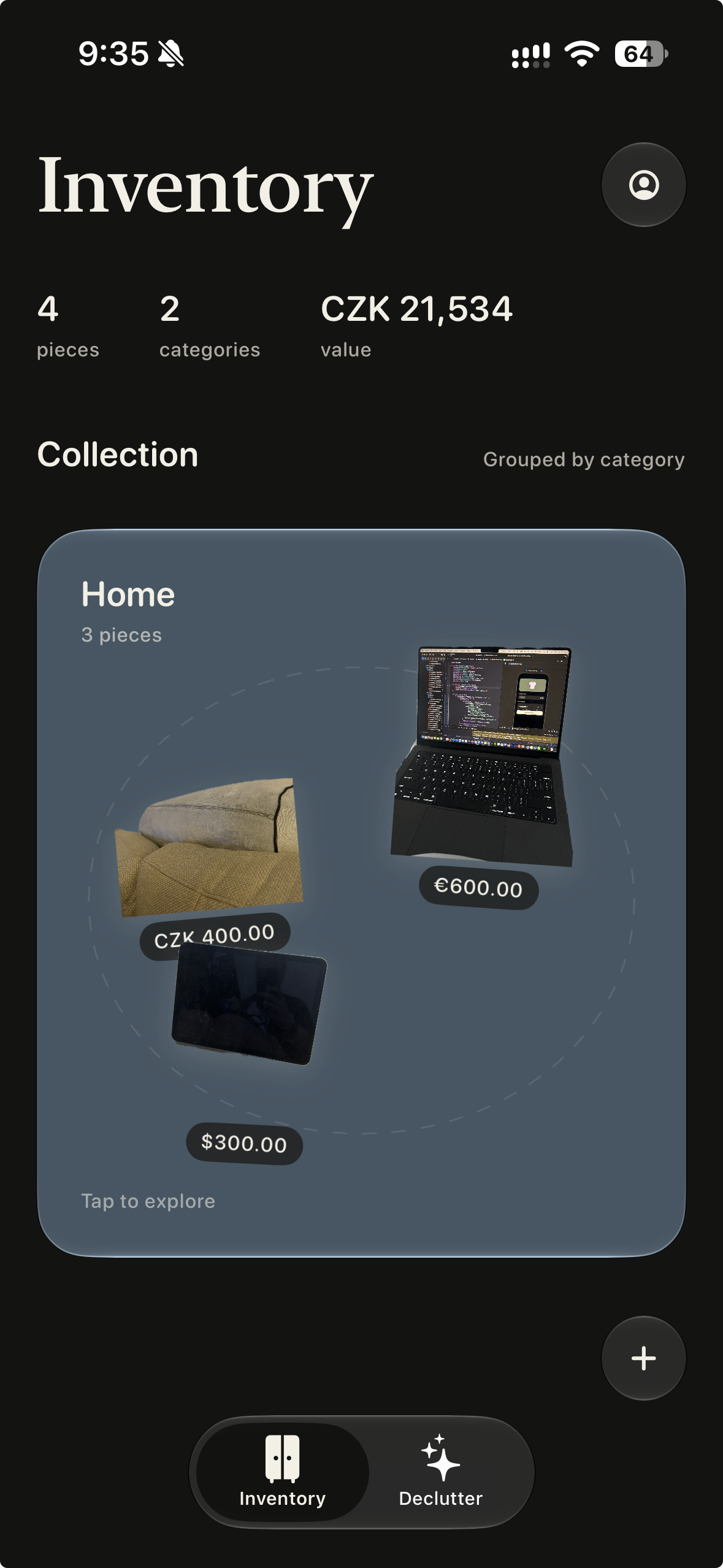
Home Screen
-
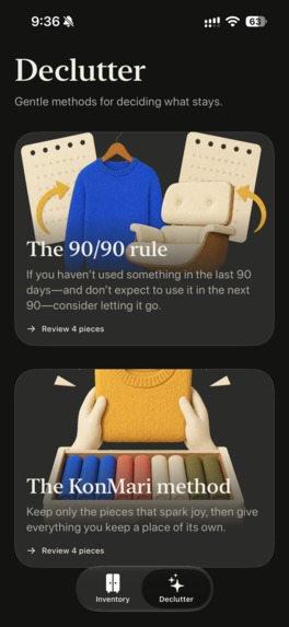
Declutter Menu
-
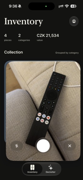
Camera pop out
-
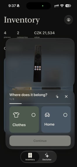
Add Flow
-
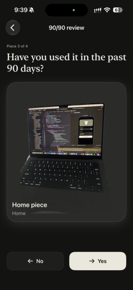
Decluttering Flow
-
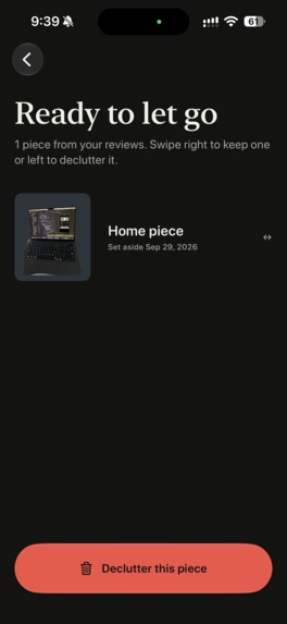
Let Go List
-
Inspiration
Decluttr started with a conversation between me (Michael) and Simona. We both complained that we had too much stuff and want to have an overview about it, together with a simple way of marking items to get rid of.
We spent a couple of hours brainstorming the concept: what the app could do, how it should feel, and how it could help other people facing the same challenge. After that conversation, we started implementing it, and we collaborated on developing the idea into a working app.
What it does
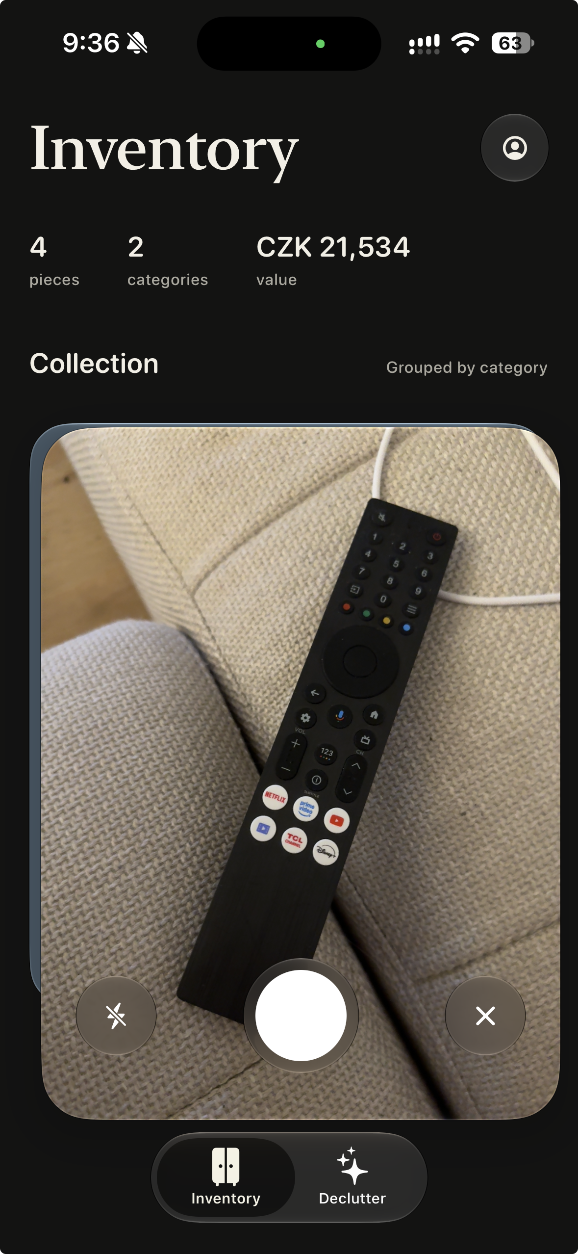
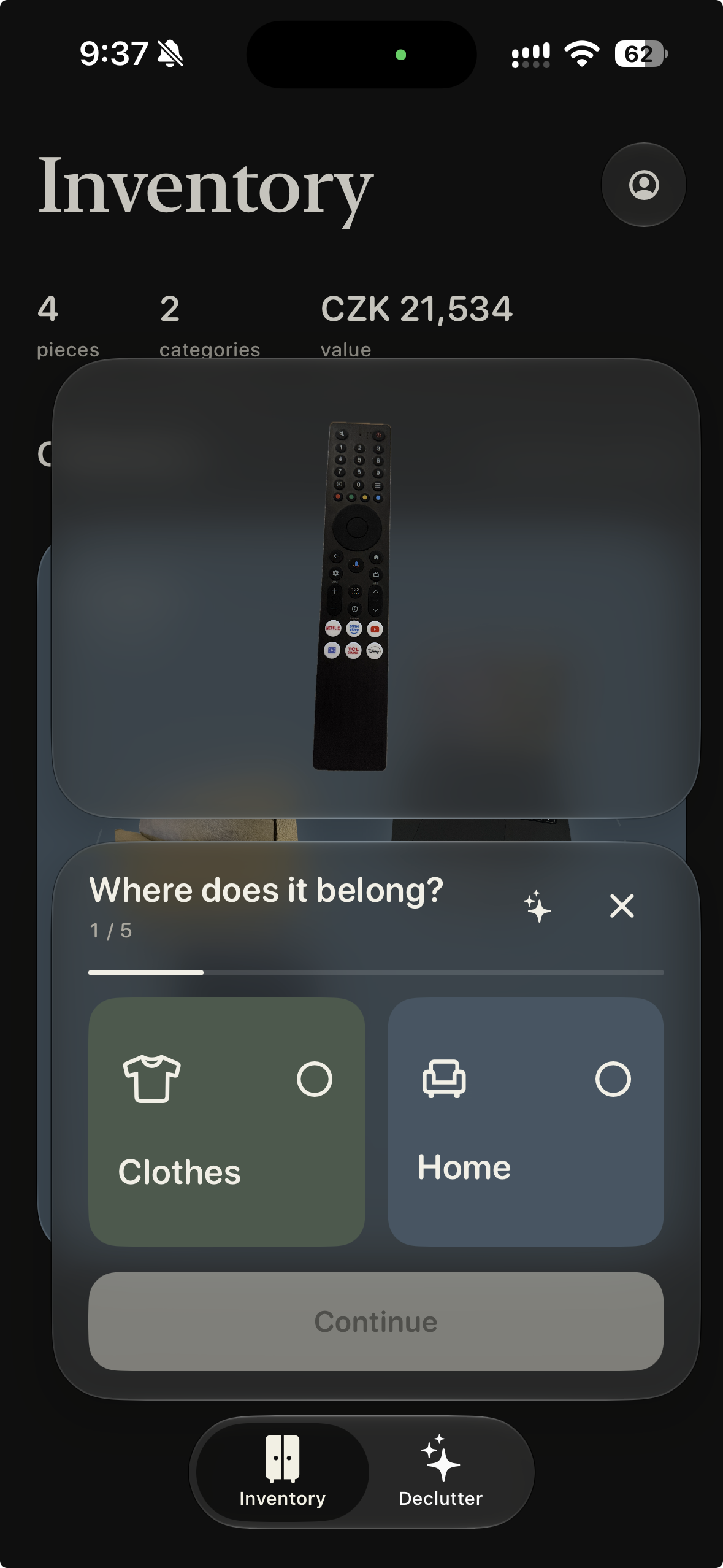
Decluttr turns photos of your belongings into a visual inventory, using on-device background removal to create clean cutouts. You can organize clothes and home items, record purchase details, and review what deserves a place in your life.
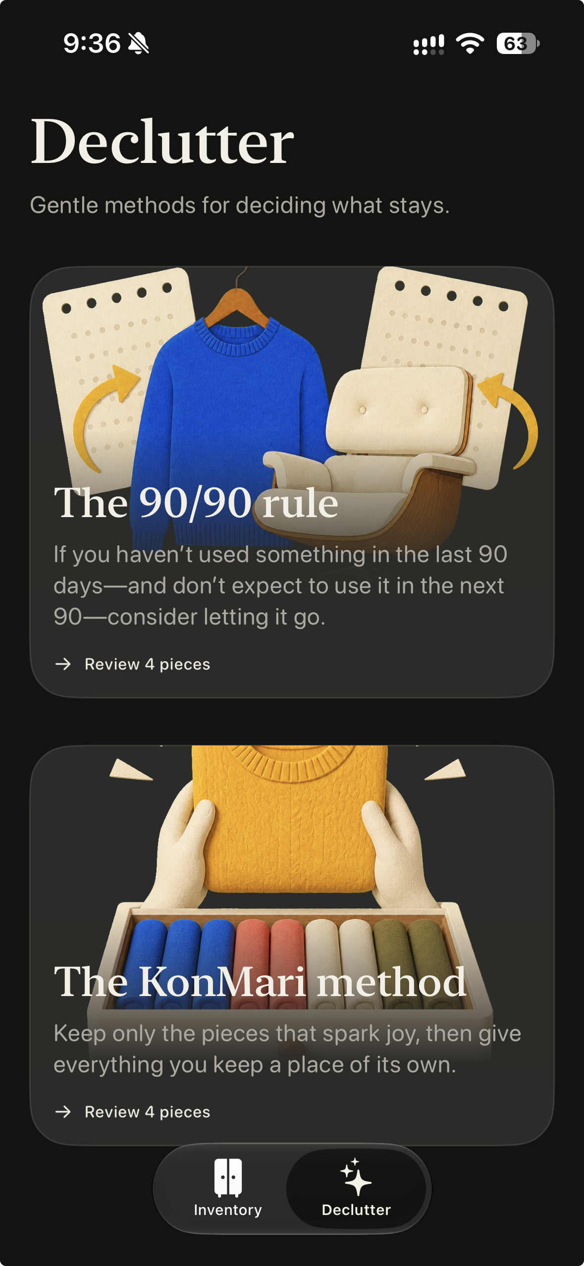
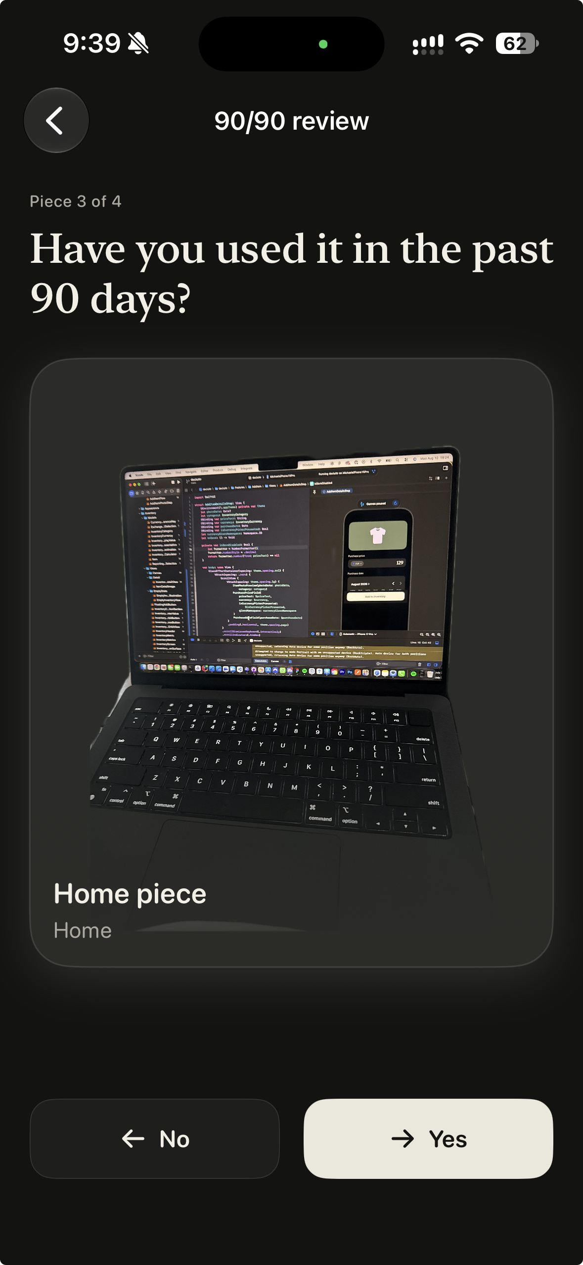
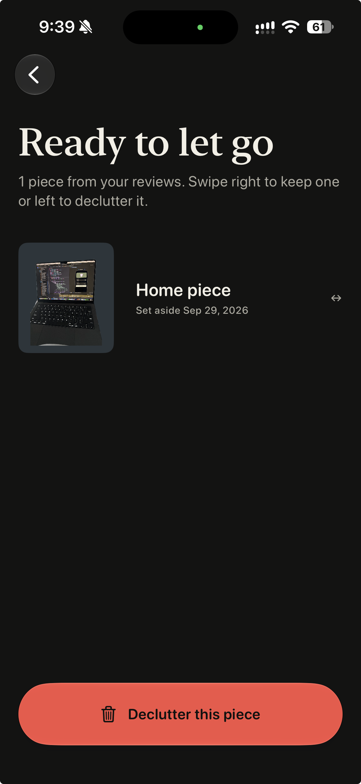
When it is time to declutter, guided reviews use the 90/90 rule or the KonMari approach to help you decide. Items you are ready to part with collect in a “Ready to let go” list.
How we built it
Simona and I built Decluttr together over roughly three weeks. My day to day job is iOS Development, and Simona's is Product Management. We both contributed to building the app, combining our perspectives on the product, its design, and how it should work.
The app uses SwiftUI for the interface, SwiftData for persistence, and Apple’s Vision framework for on-device cutout processing. Liquid Glass helps connect the controls and transitions throughout the experience.
Codex helped a lot during development, and we explored apps on Mobbin for design inspiration.
Challenges we ran into
The hardest part was the add-item flow. Adding belongings is something users need to do repeatedly, so making that process feel tedious would undermine the whole app.
We wanted it to feel pleasant and continuous. I spent particular effort on the camera popout and the Liquid Glass containers that split and transition between steps. Balancing those interactions with a clear, practical flow was the biggest design and implementation challenge.
Another challenge was App Review, which took two weeks. With the Shipaton deadline approaching, we weren’t sure whether the app would make it through in time. After roughly three weeks of building, that uncertainty made the wait especially stressful.
Accomplishments that we're proud of
The proudest moment for me was giving Decluttr to my mom to try. She isn’t very tech-savvy, but she had no trouble understanding the concept and using the app.
After spending so much time refining the experience, watching her use it comfortably was incredibly rewarding. It was a practical sign that the design made sense to someone encountering it for the first time.
We’re also proud of turning a brainstorming session into a working app by combining our different backgrounds and perspectives.
What we learned
This project reinforced how much the experience of a utility app depends on its most repeated action. Capturing an item and entering its details sounds straightforward, but making that sequence enjoyable requires care at every step.
It also reminded us of the value of starting with a real need and putting the result in someone else’s hands. Our initial brainstorming gave the project direction, and watching my mom use the app helped validate its usability.
The App Review experience also taught us to leave more room between finishing development and a submission deadline.
What's next for Decluttr
The next step is to learn from more people using Decluttr with their own belongings: where they hesitate, what feels useful, and what makes them return.
We want to use that feedback to refine the add and review flows while keeping the app focused on its original purpose: helping people understand what they own and feel ready to let things go.


Log in or sign up for Devpost to join the conversation.