-
-
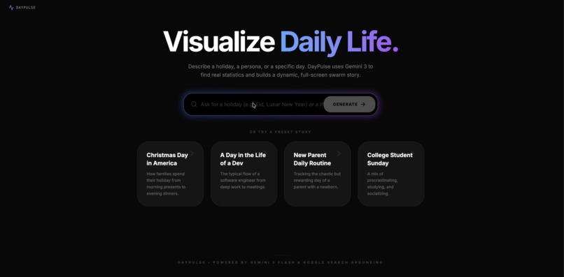
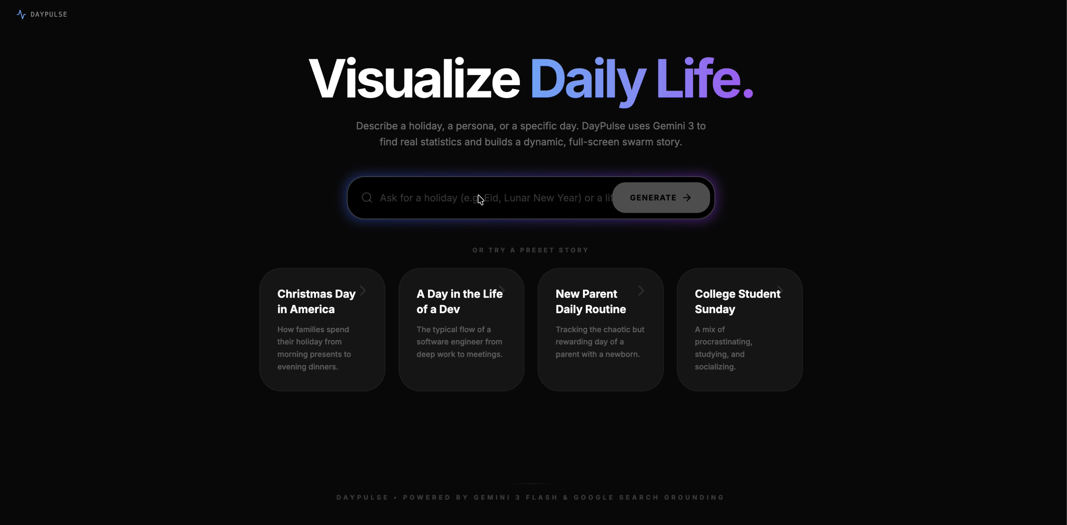
welcome screen
-
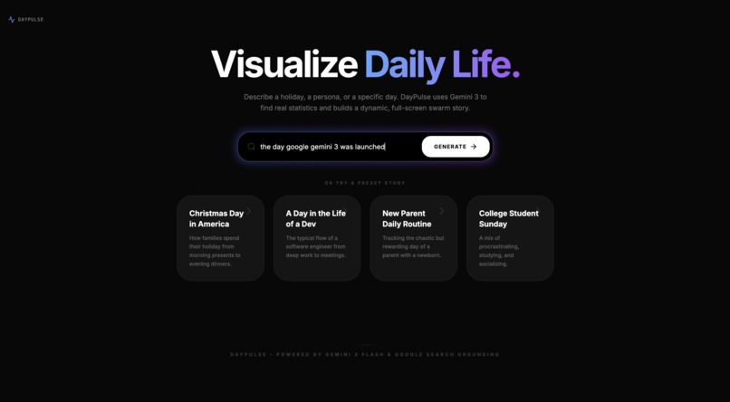
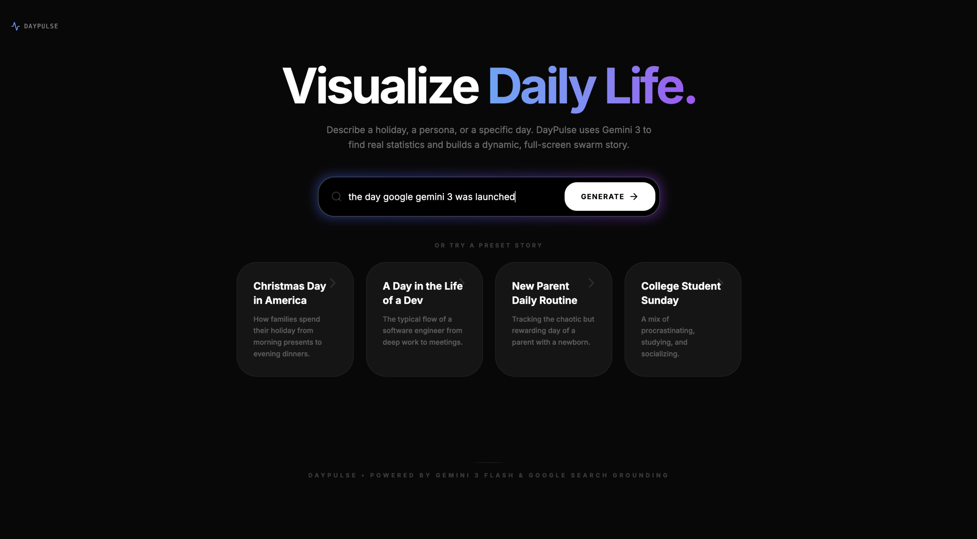
input query
-
Thinking with google gemini 3 and google grounding
-
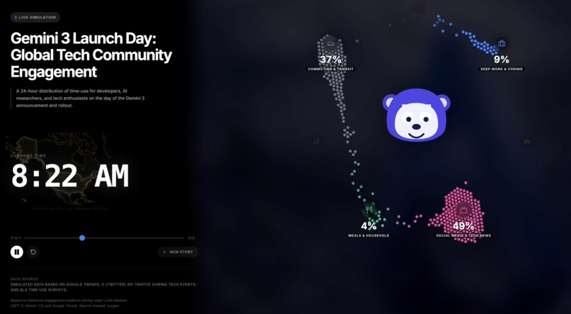
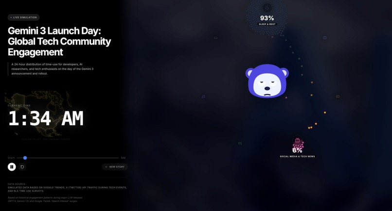
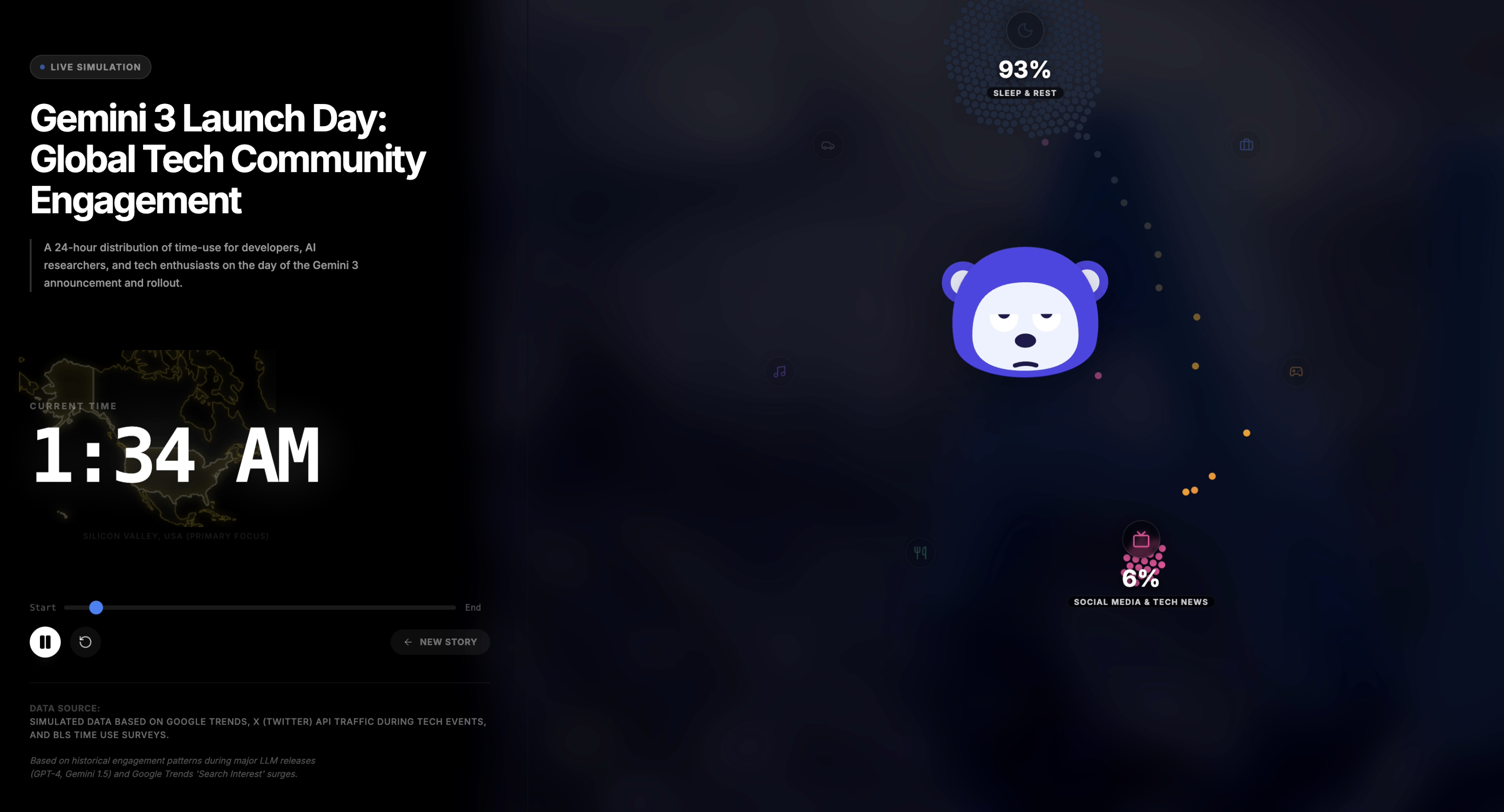
Visual representation with changing expressions of the character
-
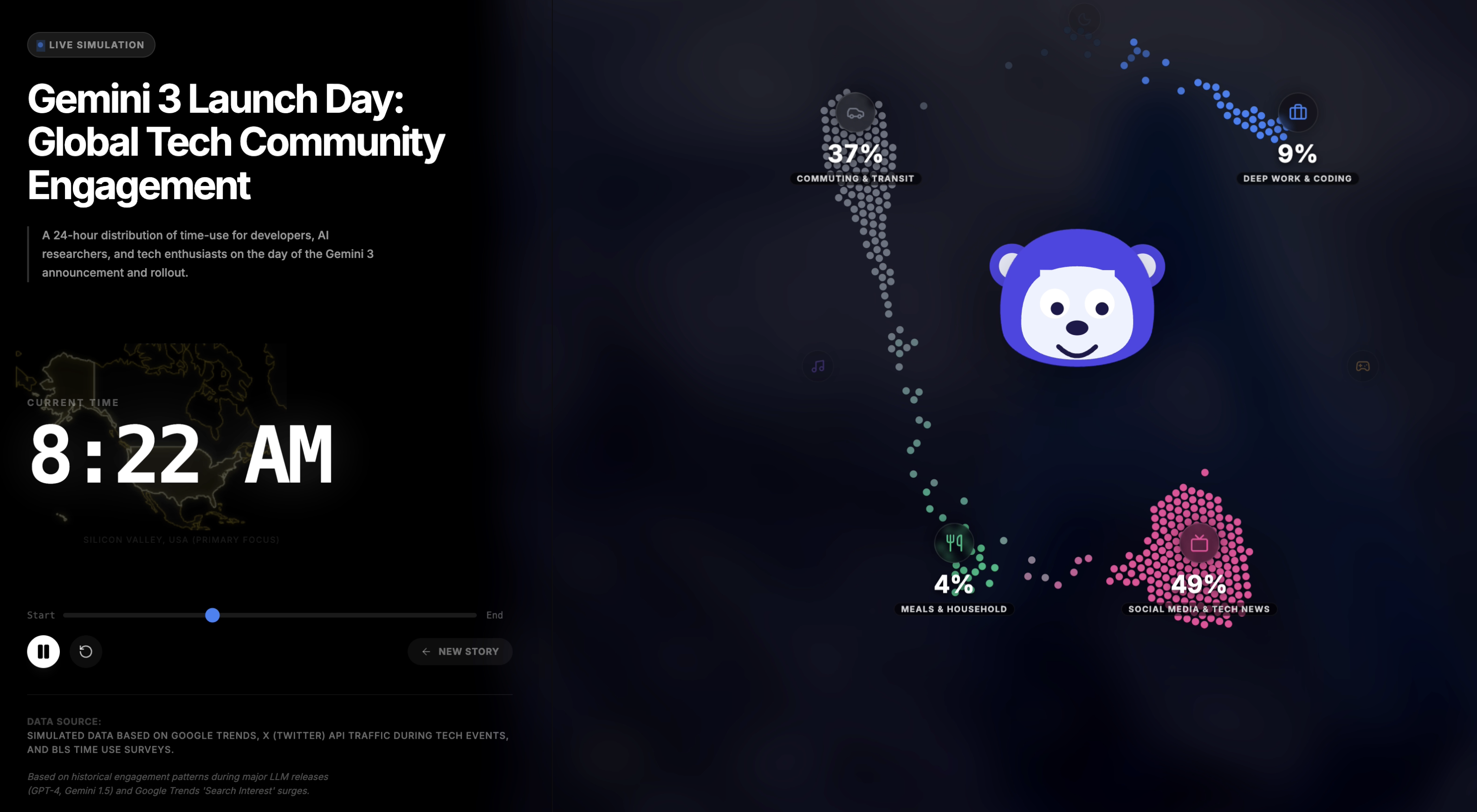
Visual representation with pulsating maps

Inspiration
We often see statistics about how humans spend their time: pie charts showing "8 hours sleeping" or bar graphs tracking "commute times." But these static charts fail to capture the rhythm of life. Time isn't a snapshot; it's a flow.
Inspired by the concept of "living data," we wanted to move beyond abstract numbers and create a visualization that feels like a heartbeat. We wondered: What does a day in the life of a firefighter actually look like in motion? How does the flow of a holiday like Lunar New Year differ from a regular Tuesday? We built DayPulse to turn cold statistics into a mesmerizing, physics-based story.
What it does
DayPulse is an AI-powered life visualizer that transforms abstract data into movement.
Prompt: The user inputs a persona (e.g., "A Software Engineer in Tokyo"), an event (e.g., "New Year celebrations"), or a demographic.
Research: The app leverages Gemini 3 Flash with Google Search Grounding to research real-world time-use surveys and cultural habits.
Simulation: It generates a 24-hour timeline of distribution data and renders it as a physics simulation.
Visuals: 400 individual particles (representing people) swarm between categories such as Sleeping, Working, and Eating, in real-time.
Context: A dynamic 3D globe or map centers on the relevant region while a live clock tracks the flow of the day.
How we built it
AI & Data: We used the Google GenAI SDK targeting
gemini-3-flash-preview. We utilized thegoogleSearchtool to ensure the data is grounded in reality, not just hallucinated. The model returns a strict JSON schema containing time-slices, category distributions, and geographic coordinates.Visualization: We used D3.js for the heavy lifting. We built the swarm on
d3-forceto handle collision and attraction physics, making the movement feel organic rather than linear.The Globe: The globe/map widget uses
d3-geoandtopojsonto render the location dynamically based on the AI's response.Frontend: We built the interface with React and Tailwind CSS for a clean, glassmorphic UI.
Logic: We implemented a custom interpolation engine to smooth out the data between the AI's provided time checkpoints, ensuring fluid animation ticks every 120ms.
Challenges we ran into
Data Integrity: LLMs excel at text, but asking for a 24-hour schedule where percentages strictly sum to 1.0 across 10 dynamic categories was difficult. We refined the system instructions significantly to ensure mathematical consistency in the JSON output.
Physics vs. Performance: Animating 400 SVG nodes with collision detection in a React environment can be heavy. We optimized the D3 tick loop to run outside of the standard React render cycle to maintain a smooth framerate.
Grounding Granularity: Sometimes the Search tool returned generic data. We tweaked our prompts to specifically ask for "time-use survey data" and "daily schedules" to get the granular detail needed for the animation.
Accomplishments that we're proud of
The "Living" Swarm: Watching the particles wake up and rush from "Sleep" to "Commute" and "Work" is genuinely hypnotic. It communicates the rhythm of a day better than words can.
Seamless Grounding: The app automatically extracts source URLs from the Gemini response metadata and lists them in the UI. It bridges the gap between AI creativity and factual reporting.
Atmosphere: We successfully combined the globe visualization, lighting effects, and particle physics into a cohesive, polished aesthetic.
What we learned
Gemini 3 Speed: The latency of Gemini 3 Flash is impressive. We were able to generate complex, grounded JSON structures in seconds, making the "on-demand" nature of the app possible.
Search Grounding is Powerful: Passing the
tools: [{ googleSearch: {} }]config requires very little code but adds immense value and trust to the application.React + D3: Mastering the balance between React's declarative state and D3's imperative DOM manipulation was a rewarding learning experience for the team.
What's next for DayPulse
Comparative Mode: We want to split the screen and visualize two scenarios at once (e.g., "Summer vs. Winter" or "US vs. Spain") to highlight cultural differences in daily rhythms.
Video Export: We plan to allow users to download their generated day as an MP4 to share on social media.
Zoom Capability: We want to let users click on a category (like "Work") to break it down further into sub-tasks (e.g., Meetings, Coding, Lunch).
Built With
- api
- d3.js
- gemini-3-flash-preview
- genai
- react
- sdk
- tailwind
- topojson
- typescript


Log in or sign up for Devpost to join the conversation.