-
-

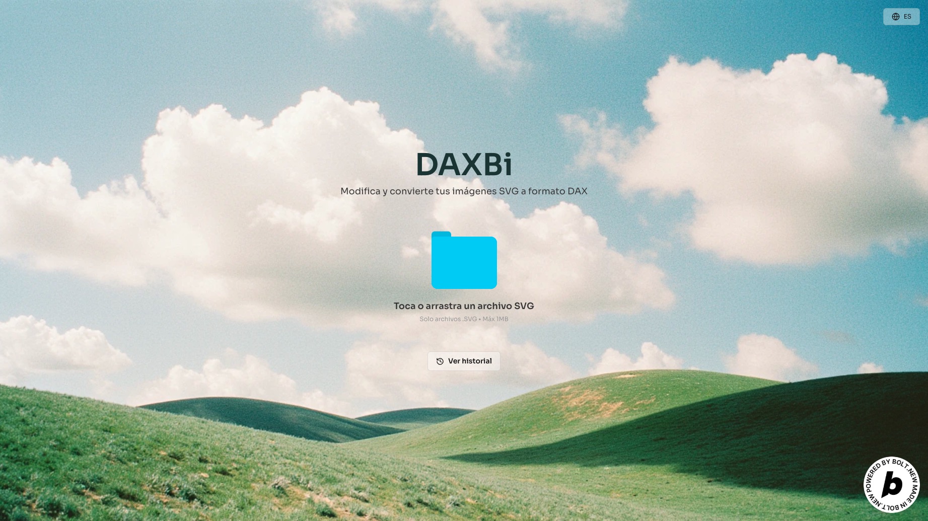
DAXbi - Home
Inspiration
Whenever I tried to customize visuals in Power BI, I kept running into the same problem: static images looked pixelated, and creating something unique required way too much manual work or coding. I thought—why not make it easier? Why not turn any SVG design into a clean, scalable, data-driven visual without touching a single line of SVG code? That’s how DAXBi started: to bridge the gap between design and dashboards, just drag, drop, copy and go.
What it does
DAXBi allows users to upload any SVG file and instantly convert it into DAX-compatible HTML code. The output can be copied and used directly inside Power BI by creating a custom measure and inserting it into an HTML viewer visual. It also keeps a history of previous conversions for easy reuse.
How we built it
We built DAXBi using a combination of modern tools focused on speed, design, and interactivity:
- Bolt for rapid prototyping and back-end logic.
- Figma to design the interface, preview experience, and overall UX flow.
- React Bits to handle animations and smooth transitions between states.
Challenges we ran into
One of the first things I noticed was that not all SVGs behave the same. Some were super clean, but others came with a bunch of layers, groups, and strange paths that made the conversion messy. I had to figure out how to simplify them without ruining the design.
Another big challenge was making sure the visuals stayed sharp and scalable in Power BI. I didn’t want users to deal with blurry images, so I focused on keeping everything in vector format using HTML inside DAX.
I also really wanted people to be able to change colors and resize the visuals based on their data—so I had to make the code dynamic and flexible. That took some experimenting and tweaking, but it paid off.
And of course, making the whole experience feel smooth—like instant previews, saving history, and having clean output—took some effort too. But the goal was always clear: make it super easy to go from SVG to Power BI without headaches.
Accomplishments that we're proud of
- I have created a tool that saves me time and headaches.
- It creates scalable, clean and fully customizable images.
- I managed to design a user interface that is simple, responsive and really easy to use.
- I learned how to marry the design tools with the data platforms in a way that feels seamless.
- And above all, try
What we learned
This project showed me that coding can be genuinely fun, especially when you're building tools for you. But I also learned that it's important to keep a balance—between building fast and building well, between adding features and keeping things simple.
One big takeaway was realizing how crucial prompt design is, especially when using AI-assisted or vibe coding tools. A good prompt can unlock creative solutions, speed up development, and even spark new ideas. It's no longer just about writing code—it's also about knowing how to ask the right questions and guide the tools you're working with.
What's next for DAXBi
I have a lot of ideas for where this could go next:
- Add support for exporting full Power BI themes, including fonts and color palettes.
- Let users connect their library icons files directly for live conversion.
- Create a community gallery where people can share their own SVG-based visuals.
- And maybe even build a Power BI add-in to bring DAXBi right into the desktop experience.
Built With
- bolt
- css3
- figma
- google-fonts
- html5
- react
- reactbits
- svgparser
- vite

Log in or sign up for Devpost to join the conversation.