Inspiration
We were inspired by the prize awarded by Warp and the efficiency of auto visualization.
What it does
DataWiz automatically profiles a given dataset, proposes visualization candidates, asks an LLM (Gemini) to pick and refine a visualization, applies safety guardrails (types, cardinality, faceting), and renders a clean Vega-Lite chart. You also get the full Vega-Lite spec and the intermediate JSON (profile + candidates) to inspect or reuse.
How we built it
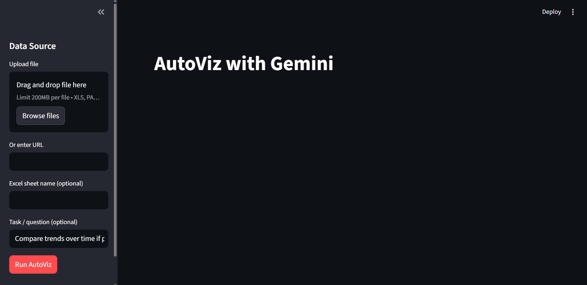
Frontend: Streamlit app with a minimalist upload→preview→explain flow.
Profiling: lightweight pandas summary (dtype, missing %, cardinality, temporal coercion hints).
Candidates: heuristic generator for line/bar/scatter/hist with basic aggregates.
LLM planning: Gemini turns the profile + candidates + user task into a single chart plan (encodings + Vega-Lite v5), using system_instruction and JSON output.
Guardrails: fix bad field references, cap category cardinality, correct mismatched types (e.g., non-datetime labeled “temporal”), and ensure histograms become bar + bin.
Rendering: Altair/Vega-Lite; we inject data as JSON-safe ISO values and let users download the spec and the raw profile/candidates JSON.
DX niceties: .env for keys, caching for file loads, clear errors when optional engines (e.g., openpyxl) are missing.
Challenges we ran into
LLM role/schema quirks: Gemini rejects system/assistant roles; we had to use system_instruction + user/model and enforce JSON MIME type.
Temporal mismatches: Numeric “time” columns mislabeled as temporal created blank charts—fixed by auto-downgrading to quantitative.
Excel sheets: Pandas returns a dict of DataFrames when no sheet is given—added a guard to default to the first sheet.
Engines & formats: Missing openpyxl / pyarrow surfaced at runtime; we added graceful errors and docs.
Cardinality explosions: High-cardinality categoricals wreck plots—implemented capping with user-visible notices.
Accomplishments that we're proud of
A fast path from plain English task → valid Vega-Lite chart that survives messy real-world data.
Clear explanations (“Why this chart?”) paired with downloadable JSON for transparency.
Guardrails that improve the LLM output without hiding what changed.
What we learned
Small, reliable heuristics (candidate generation + guardrails) drastically reduce LLM flakiness.
JSON hygiene matters: ISO timestamps and schema validation avoid so many headaches.
Users appreciate raw artifacts (profile/candidates/spec) as much as pretty charts—debuggability builds trust.
What's next for DataWiz
Multi-view dashboards: let Gemini propose a small set of coordinated charts.
Transform hints: suggest simple prepares (filter, aggregate, derive “week”/“month”) before plotting.
Natural-language tweaks: “color by region”, “bin by 5 minutes”, “log scale y” applied live.
Exporters: one-click to Observable/Altair/PowerPoint.
More file types: robust Parquet/Feather support with auto-install guidance.
Built With
- gemini
- pandas
- python
- streamlit
- visual-studio


Log in or sign up for Devpost to join the conversation.