-
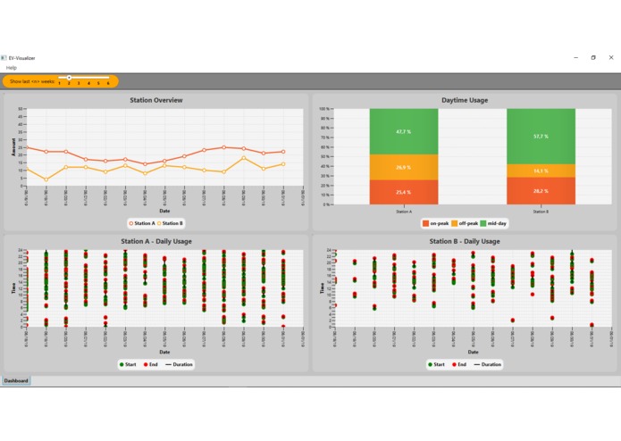
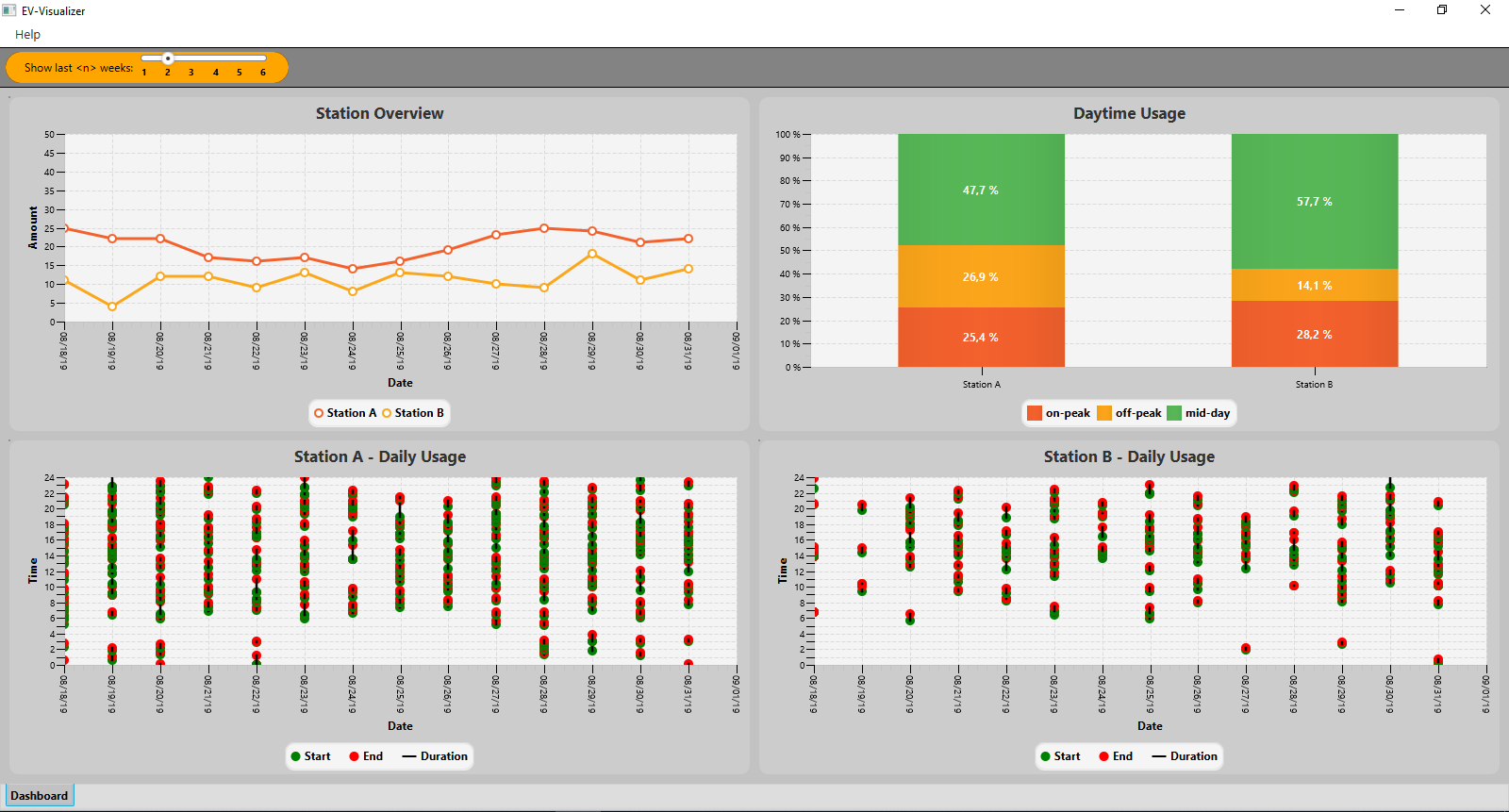
Dashboard view
-
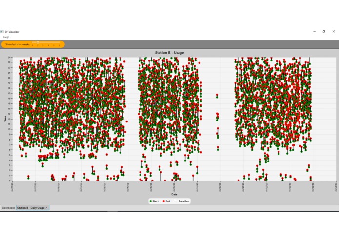
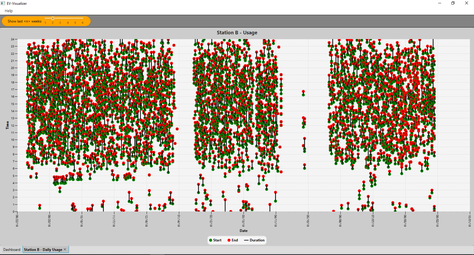
Full-Screen view
-
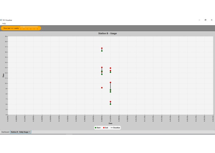
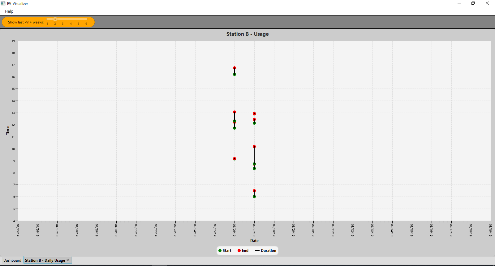
View after zoom
-
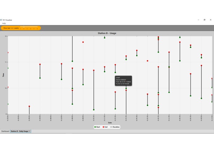
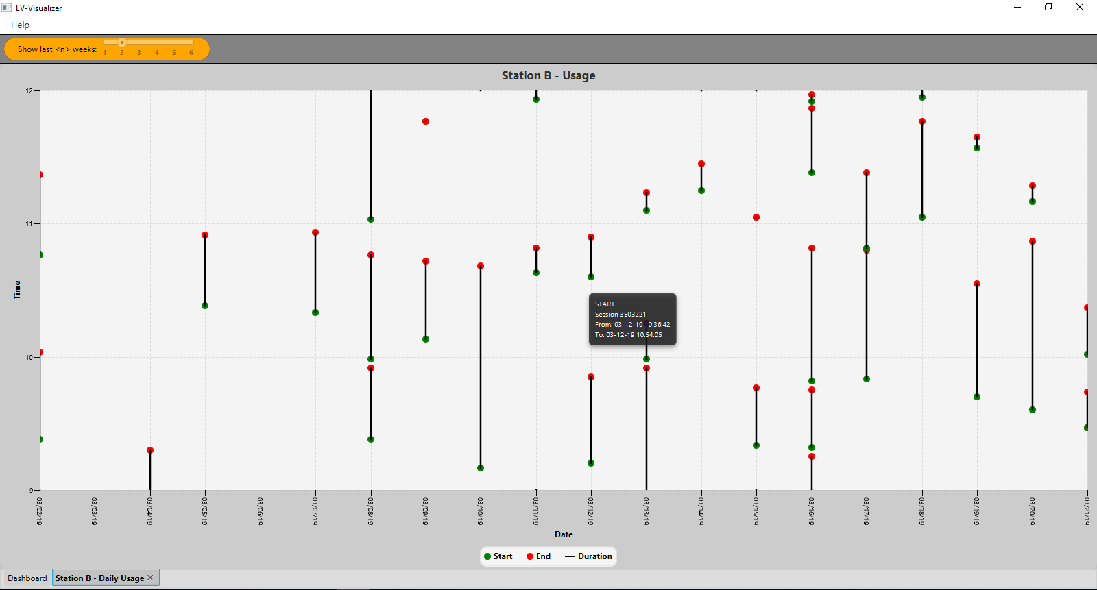
Additional tooltip-info for each charge-cycle
Inspiration
The fact that you can gain so much information from data just by visualizing it. If my solution is at least able to offer some interesting data-views, I would be happy.
What it does
EV-Visualizer is a Java desktop application that supports users to see the collected data from charging-stations in a visual way, so that they are able to detect errors and also to see how different stations relate to each other. For more details see README at https://github.com/HACC2019/data-up
How I built it
JavaFX
Accomplishments that I'm proud of
Functionality and design.
What's next for dataUp - EV-Visualizer
Modifying the bar-chart to provide different kind of data comparisons like KW/h etc. With real-time data the program could be designed much more efficient - especially regarding possible charge-station error notifications triggered by a background check after each data-import (every 15min?) I'm not a machine learning expert, but in my opinion it's not possible to gain enough valuable data from the charging stations (at the moment) to create a ML-algorithm to predict errors with a reliable score. That's why I assume that using real-time data for doing background checks to notify on warnings or errors would be more efficient. In addition to implement error checks, with the visualization it's also possible to gain strategical information out of the data. For example:
- If station B fails, is there an increased volume of charge cycles at another station?
- By looking at the chart, how does a station behave before weekends? Or Christmas time?
- Does a big amount of charge cycles per day at a single station prove that this station is doing well?
These questions can already be answered with the actual software version.

Log in or sign up for Devpost to join the conversation.