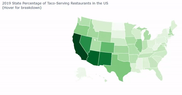
Goldman Sachs' problem presented to our team a need for a visual solution that could display multiple facets of data about thousand of taco and burrito-selling stores. Our plan was clear: We intended to:
- Clean up the data
- Acquire additional data via census.gov and factual.com with information for: a. Population of People per state b. Ratio of people to restaurants c. Ratio of taco and burrito-serving restaurants to all restaurants in a state
- Create a visual to help compare properties and correlations The largest challenges we faced were the difficulties in creating a county map in Python. We had wanted to use a county map for Python, which uses FIP codes, but we had great trouble getting them with the difficulties of lack of zip codes and odd province identifiers. If we had more time, we could have gathered more census data to see where the restaurants are in relation to income and households and have created a GUI to identify a taco or burrito restaurant to go to based on the persons personal preference by answering questions.
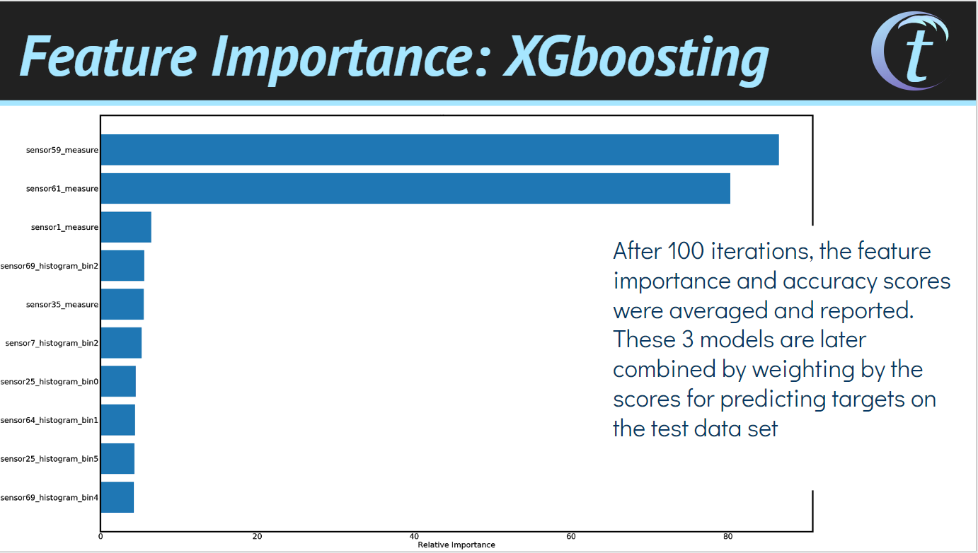
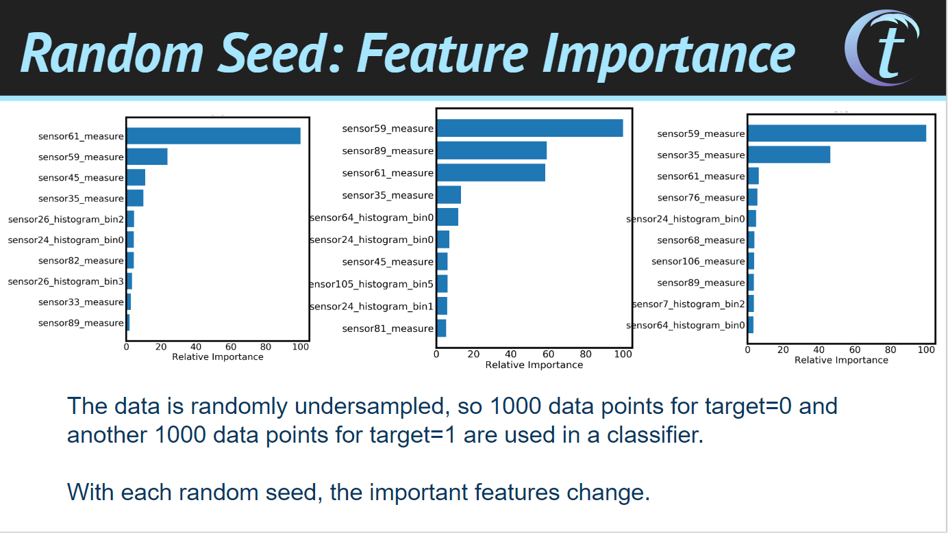
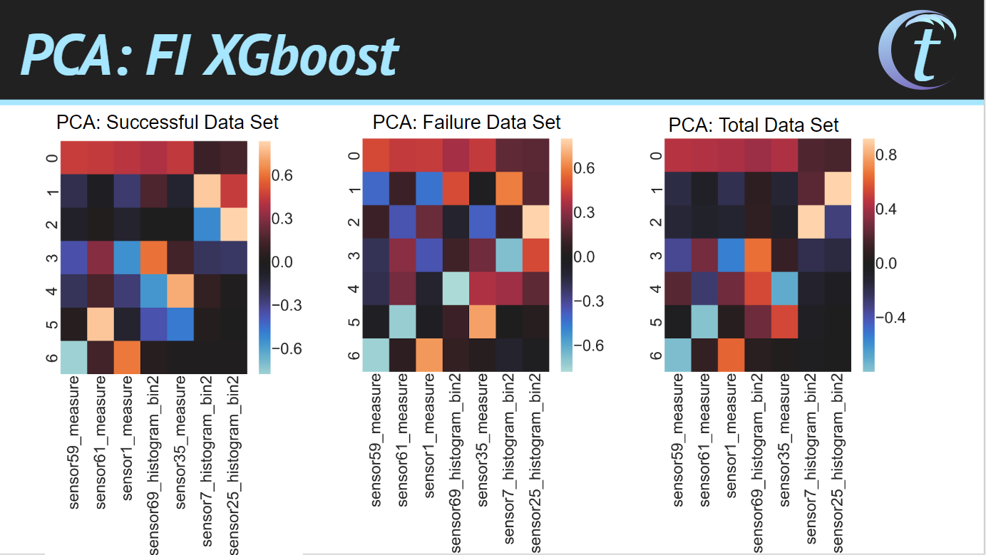
The ConocoPhillips design problem was to be solved with predictions from machine learning given a data set of sensors. Correlations were identified in the feature set using principal component analysis. The data sets were trained using tree-based classifiers and predicted with weighted model averages. By using random undersampling, the classifiers were fit and weight based on accuracy scores. Attached is a presentation of both projects.
Built With
- jupyter-notebook
- python


Log in or sign up for Devpost to join the conversation.