-
-
Overview
-
Screenshot of the website
Inspiration
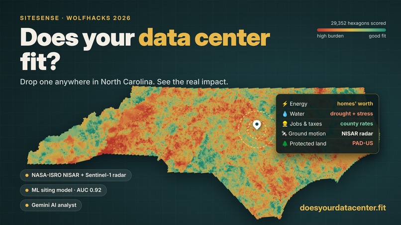
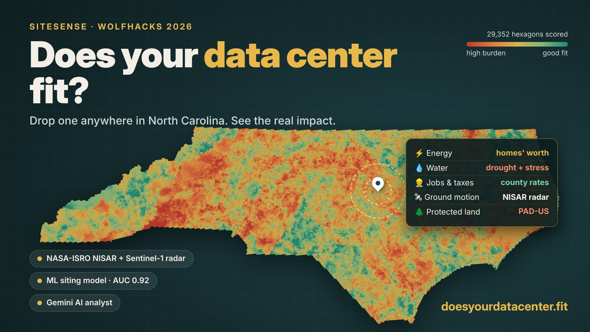
Data centers are rapidly expanding across North Carolina, but the public conversation often boils down to "jobs and tax revenue" versus "it will drink our water." We wanted to make the real tradeoffs easy to see for a specific place, using public data instead of press releases. SiteSense lets anyone explore what a hypothetical data center would mean for their community.
What it does
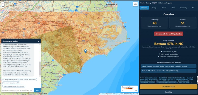
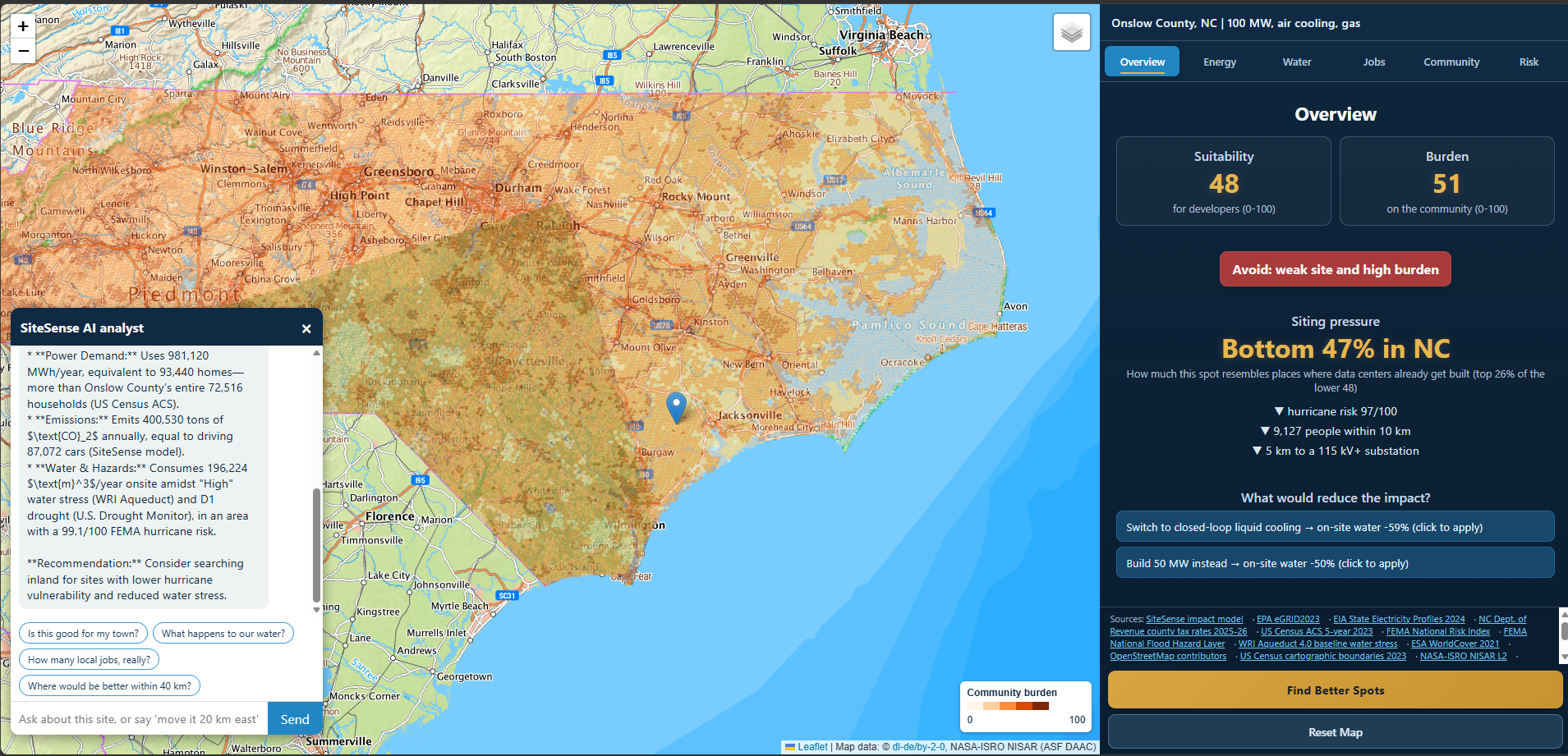
Drop a data center anywhere in North Carolina, choose its size, cooling, power source and workload, and SiteSense instantly builds a report:
- Energy: annual electricity in "homes' worth", grid carbon, nearest high-voltage substation, power bill
- Water: cooling water in "households' worth", WRI water stress, and this week's drought
- Jobs & taxes: construction and permanent jobs, county unemployment, property tax at the county's actual rate
- Community: people within 1/3/5 km, social vulnerability, nearby schools, existing data centers within 25 km
- Risk & ground: FEMA flood zone and hazard risk, ground motion from satellite radar (Sentinel-1 and NASA-ISRO NISAR), and protected land within 1 km
Every site gets a Suitability score (is it a good site for a developer?) and a Burden score (what does it cost the neighbors?), plus a machine-learning Siting Pressure score showing how much the spot resembles places where data centers already get built, with the top three reasons. Find Better Spots searches nearby for sites with higher suitability and lower burden, and never suggests a park or preserve. An AI analyst powered by Gemini answers questions like "what happens to our water?" using only numbers from the report, and can change the scenario on request: "move it 20 km east" or "make it 50 MW with liquid cooling."
How we built it
- Grid: a precomputed grid of 29,352 H3 hexagons covering North Carolina. Our ETL pipeline joins about 15 public datasets onto it: Census ACS, FEMA National Risk Index and flood maps, the US Drought Monitor, USGS PAD-US, WRI Aqueduct, ESA WorldCover, OpenStreetMap, EPA eGRID, EIA, NC Department of Revenue tax rates, OPERA DISP-S1 and NASA-ISRO NISAR.
- Siting Pressure model: XGBoost trained on GPU over 210,427 US hexagons, 539 of which contain a mapped data center. We validated it by holding out entire states: AUC 0.92, and the top 10% of hexagons capture 86% of data-center locations. TreeSHAP explains each site's score.
- Backend: FastAPI on Render, with live lookups for flood zone, drought and protected land.
- AI analyst: Gemini with server-side function calling, streamed to the browser, so its actions really move the site and rerun the analysis.
- Frontend: Leaflet and vanilla JavaScript.
- Teamwork: a shared Pydantic API contract let frontend and backend build in parallel from mock data.
Challenges we ran into
- Making unrelated datasets agree: census tracts, hazard polygons, rasters, live map services and point data all had to land on one consistent grid.
- Radar noise: our first ground-motion rates were physically impossible (±100 mm/yr) because of atmospheric noise. We rebuilt the processing with per-pair referencing, short-wavelength displacement and a minimum time span per pair. We dropped single 12-day NISAR displacement as unreliable and kept NISAR coherence as a ground-stability measure.
- A park that "should" be built on: a state park next to Research Triangle Park scored in the top 1% for siting pressure. We made protected land a hard constraint. The market wants that spot; the land says no.
- Keeping the AI honest: the analyst sees only the report, must name the dataset behind each number, and says "not available" instead of guessing.
Accomplishments that we're proud of
- Transparent: every number comes from a named, linked source or a documented assumption, and missing data is marked as unavailable, never filled in.
- Validated: the Siting Pressure model is tested geographically by holding out whole states, not just random samples.
- Ambitious data: satellite radar from NISAR and Sentinel-1, integrated into a tool anyone can use in seconds.
- Useful AI: an analyst that both explains the analysis and drives it.
What we learned
Building a geospatial app is as much about data quality and provenance as it is about code. Satellite radar is powerful but noisy, and honest uncertainty beats a confident wrong number. Models should be validated geographically, and AI works best as an interface to reliable analysis rather than a source of answers.
What's next for SiteSense
- Expand beyond North Carolina and bring radar ground motion to the whole united states
- Add utility interconnection queues and more infrastructure and environmental data
- Compare multiple sites and scenarios side by side
- A printable one-page brief people can bring to town hall meetings
Ultimately, we want communities to see exactly how different locations produce very different impacts, before decisions are made.

Log in or sign up for Devpost to join the conversation.