Inspiration
Rice Datathon Beginner Track
What it does
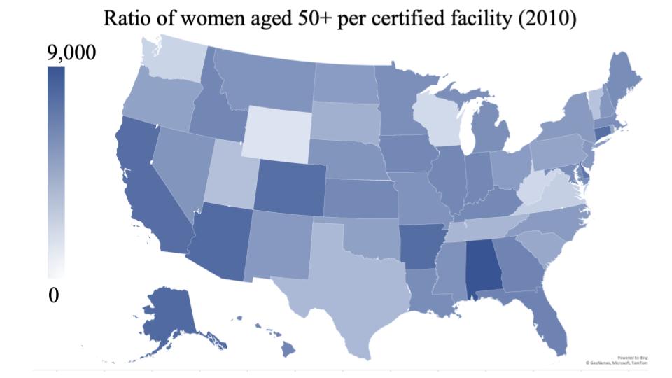
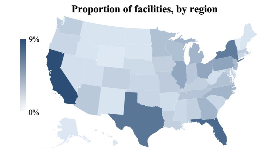
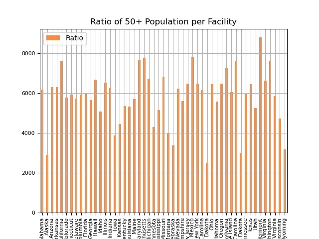
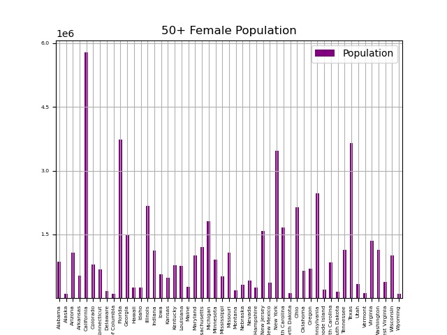
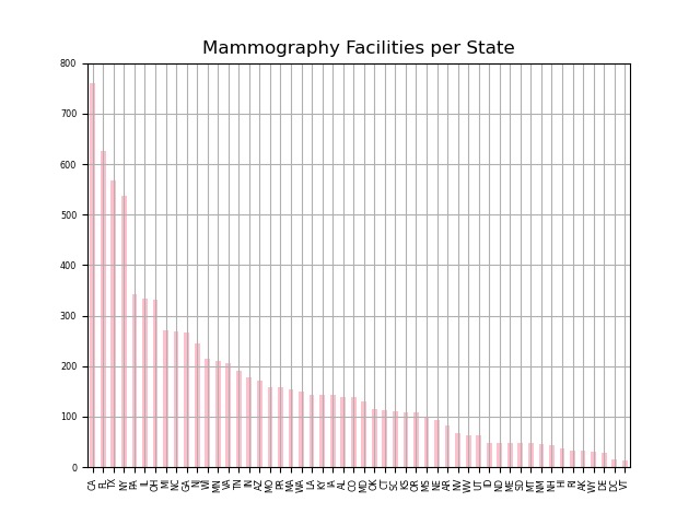
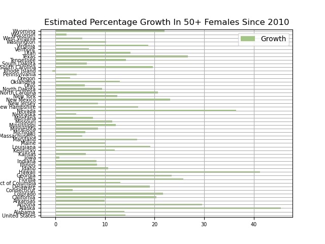
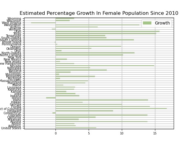
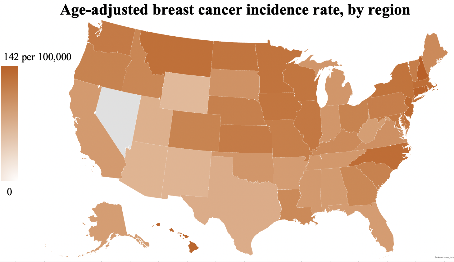
Our project analyses population data, as well as mammography facility data, to accurately determine which areas of the United States have lower access to mammograms. This was done by making various calculations with our given data to create graphs that display the end results. These graphs allow for the FDA to decide where to allocate funding.
How we built it
Python 3, Matplotlib, Pandas, STATA, Excel. We used Python to clean and organize all of the data. We then used Marplotlib and Pandas to plot different graphs with that data. STATA and Excel were used for the building of the heat maps.
Challenges we ran into
Unorganized datasets.
Accomplishments that we're proud of
Produced comprehensive graphs and charts and became more proficient with using large datasets in Python 3 and Visual Studio Code.
What we learned
Data cleaning and plotting different graphs.
What's next for DATAnonymous Project
Working with larger datasets and performing more analyses. We all learned a lot from this project, and are eager to apply our newfound knowledge to harder challenges.


Log in or sign up for Devpost to join the conversation.